Poll: Vote for the COH Forums Reskin
I like #1. but 2 is ok too.
So when will this be put up? Same day the poll ends or some time after?
Going to miss the fun and nice people here at CoH. Feel free to add me on PS3/XBox360
PS3X360: OmniNogard
Currently playing: Mass Effect 3(PS3) Minecraft(X360) Skyrim(X360).
I like #1. Yeah, #2 is more dynamic, but I like the poses better in #1.
Plus, #2 overemphasizes Skullcrotch McCrotchyskull's notable lower body feature.
Global @Twoflower / MA Creator & Pro Indie Game Developer.
Mission Architect Works: DIY Laser Moonbase (Dev Choice!), An Internship in the Fine Art of Revenge (2009 MA Award Winner!) and many more! Plus Brand New Arcs for Issue 21!
When are we getting the female costume pieces of that costume? I really like it!
Thanks!
@GD-Archmage
---------------
-->Infinity Server<--

Meh.
Option #1 for me since it has more detail for Shadowhunter.
I really want those gloves/mask of hers! 
Number 1 for myself as with the poses i feel that you can see more of the details on each person.
Edit: Plus she does look more her actual age in #1 thanks to the facial expression.
@Damz Find me on the global channel Union Chat. One of the best "chat channels" ingame!
Penny's face looks weird in #2.
My vote goes for #1.
| Home Server: Virtue |


Twitter: @ZFLikesNachos Save City of Heroes (Titan Network) [Successful "The Really Hard Way" runs: 4] [Click ^]
It's really ... blue.
Devs hate villains 
Option one because Pen-Yin smiling is too saccharine for my blood!
http://s305.photobucket.com/albums/n...stumes%202011/
Why not both as an option? vBulletin does allow for multiple skins to be available to users.
Everyone is going to see number 2 all the time the way it is, as it is the new login screen with issue 23. Because of this, I am voting number 1.
Also, hopefully next time we can vote for staying logged in longer between browsing sessions. >.<
My new Youtube Channel with CoH info
You might know me as FlintEastwood now on Freedom

I prefer #1 as well. Penny just looks better in that one, and Shadowhunter looks like a teddy bear. A big evil teddy bear, but still.
Aegis Rose, Forcefield/Energy Defender - Freedom
"Bubble up for safety!"
Penny looks weird in both. I like the action portrayed in #2 but Penny just looks silly. She looks less silly in #1 so my vote goes there.
Currently on Virtue:
Jinrazuo - Crab Spider
RWZ All-Pylon Solo Run
I'm torn. I like the dynamic action of #2, but #1 shows off the characters better. If I must choose, I guess I'll have to vote #1.
Although why not have both and let folks choose, like we do with the hero/villain skins?
http://www.change.org/petitions/ncso...city-of-heroes#
From those two, I'd have to say #1. However, I'm not really keen on either of them, to be honest.
@Roderick
I voted for Option 2 because they're actually... doing something.
Though I'd prefer it if it actually looked like superheroes doing superhero things. *cough*
@Galactoman
#1
#2 has too much goofy face on the right.
I like #1.
I don't always need to see heroes/villains in action poses. Sometimes I just like a nice clean pose.
Rest assured, they're both good skins, but I can't help but feel some concern of this rapid phase out of Statesman when I believed it was said some things would be kept in his memory feels a bit ill timed.
Not only that, but you seem to be pushing poor Penny harder than her mother did during labor (Assuming *SPOILER* Vanessa was like any sane woman any wanted the kid out when contractions started) and between her being said to be the world's most powerful psychic (though apparently downgraded in the upcoming SSA to ONE of the world's most power), her recent promotion to the Freedom Phalanx, the completely unique costume which no player has anything like (besides hair and face), and unique powers, and again, the pushing of her onto the players, you may yet end up with another situation like Statesman.
Now the truth is, I DO like Penelope Yin, but if you keep putting her in front of everything else (I mean she has nothing to do with the Nightward, much less Shadow Hunter who pretty much makes only a cameo) then it may draw some feeling of resentment even from me, and then your third SSA at this rate will be "We're killing Penny."
Anyway though, to give an answer, I kind of like 1 since we're basically going to be getting 2 as the login screen.
Click here to find all the All Things Art Threads!
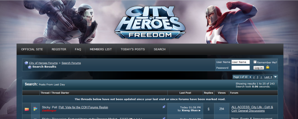
What I have now :-

What I will get :-

or

(I'll talk to the design team and see if we can't get a red layer put on with saturation turned way down so we're getting a subtle red to complement the fora body. No promises, because I'm not sure how their schedule currently is.)
Andy Belford
Community Manager
Paragon Studios


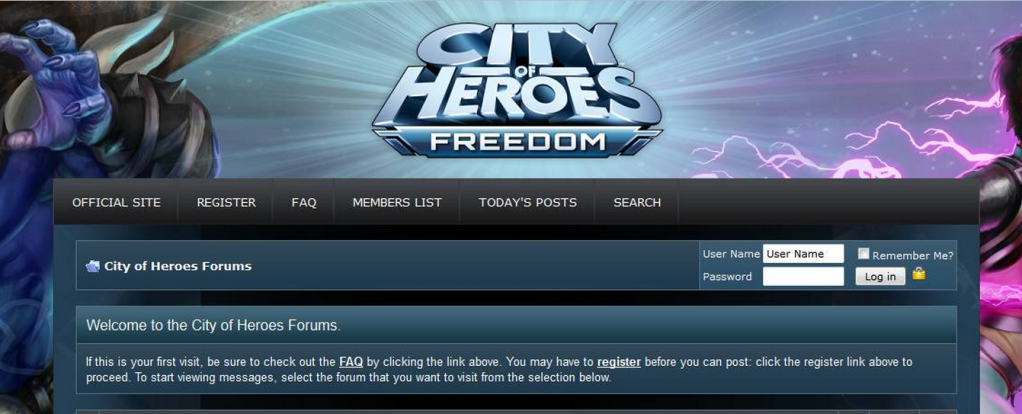
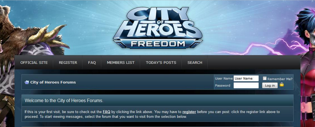
With Issue 23: Where Shadows Lie, we'll be rolling out a new look for the City of Heroes website and forums. I figured that since so many of us spend hours looking at the forums, why not let the Community have a say in what the skin of the forums will look like?


Take a look at the options below and be sure to cast your vote above!
Option 1
Click the image for full size.
Option 2
Click the image for full size.
We'll run this poll until Wednesday, May 9th, 2012.
Andy Belford
Community Manager
Paragon Studios