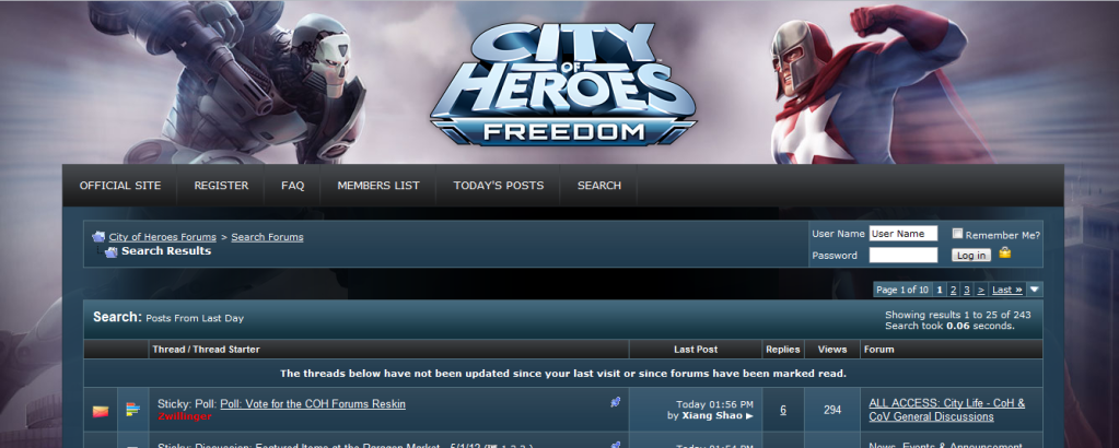
Poll: Vote for the COH Forums Reskin
By
00039,
Posted on: 2012-05-01 13:40 in CoH and CoV General Discussions
Quote:
When you put it that way...|
Originally Posted by afocks

What I have now :-
 What I will get :-  or  |
To be honest though, I actually think this brings up the very good point that I would rather not have excessively large margins or conversely detail outside the margins that I won't see. In both samples only slightly more than half the width of the screen is actually being used to show the actual forum content. That seems to be a rather low percentage that overlooks the primary function of the forums.
[Guide to Defense] [Scrapper Secondaries Comparison] [Archetype Popularity Analysis]
In one little corner of the universe, there's nothing more irritating than a misfile...
(Please support the best webcomic about a cosmic universal realignment by impaired angelic interference resulting in identity crisis angst. Or I release the pigmy water thieves.)
I pick neither. Penny looks awful in both shots... Well, she looks awful in general.
Option 1 since it doesn't twist Penny like the future splash screen.
Father Xmas - Level 50 Ice/Ice Tanker - Victory
$725 and $1350 parts lists --- My guide to computer components
Tempus unum hominem manet
Quote:
You just haven't accepted her into your life yet.
|
Originally Posted by Snowzone
I pick neither. Penny looks awful in both shots... Well, she looks awful in general.
|
@Golden Girl
City of Heroes comics and artwork
Quote:
I'd rather have Mother tell me what to do.
|
Originally Posted by Golden Girl
You just haven't accepted her into your life yet.
|
Quote:
Mother was no match for Praetorian Penny - the Yin is the supreme power in the multiverse.
|
Originally Posted by Snowzone
I'd rather have Mother tell me what to do.
|
@Golden Girl
City of Heroes comics and artwork
Quote:
Well Penny has that thing on her face that can burst even the most bountiful woman... And then there's the mask! I still don't see how such an imbecile managed to become a member of the Freedom Phalanx...
|
Originally Posted by Golden Girl
Mother was no match for Praetorian Penny - the Yin is the supreme power in the multiverse.
|
I voted on the one I prefer of the two (it's image #1), but to be honest, I find both overly large. The way the look on your screen, they'll end up badly cropped on my browser.
Blue
American Steele: 50 BS/Inv
Nightfall: 50 DDD
Sable Slayer: 50 DM/Rgn
Fortune's Shadow: 50 Dark/Psi
WinterStrike: 47 Ice/Dev
Quantum Well: 43 Inv/EM
Twilit Destiny: 43 MA/DA
Red
Shadowslip: 50 DDC
Final Rest: 50 MA/Rgn
Abyssal Frost: 50 Ice/Dark
Golden Ember: 50 SM/FA
Option 1
It is a clear representation of the two characters and even though they are facing off the page, their eyes engage the viewer thus holding the attention. Option 2 has both characters leaping away and off the page, almost to escape and not building confidence in the viewer to continue reading.
Just my observations.
"You sir, have never been in a hammer fight, that much is clear."
-Blast_Chamber
*yeah, I quoted myself.
I agree with anyone that says Pen looks bad. Id rather keep the current background. Too much anime for a superhero game
@Black Tabby, @Black Tabby2
S.H.A.R.P, Order of the Champion Member
Champion Server, 1402 Badges (recorded July 18th 2012)
I do not like either image and as such did not vote.
Quote:
She will never truly replace sister.|
Originally Posted by Snowzone
I pick neither. Penny looks awful in both shots... Well, she looks awful in general.
|
Sister is a celebrity Pen is just trashy -.-
@Black Tabby, @Black Tabby2
S.H.A.R.P, Order of the Champion Member
Champion Server, 1402 Badges (recorded July 18th 2012)
I really gotta say, my choice is "#3 - None of the above".
- Green Lantern
"Say, Jim...woo! That's a bad out-FIT!" - Superman: The Movie
Me 'n my posse: http://www.citygametracker.com/site/....php?user=5608
I vote for #3, neither. I really, really hate them both.
Forums are about the text. The messages. I've got a pretty big monitor, I like having the browser window nice and wide, and in the current layout, the text area grows with it. But in those, the space for messages is restricted to show the background image.
Even if there's two background images so the space between Yin and Shadowhunter grows, it's still going to force a much larger margin just so I can look at the same artwork every single day all the time never changing zero data using up all that space.
It's a lousy design and I'm really unhappy that you're foisting it upon us.
My arcs are constantly shifting, just search for GadgetDon for the latest.
The world beware! I've started a blog
GadgetMania Under Attack: The Digg Lockout
Quote:
Please elaborate on the how.
|
Originally Posted by Kheldarn
I've disabled the background image. |
If the game spit out 20 dollar bills people would complain that they weren't sequentially numbered. If they were sequentially numbered people would complain that they weren't random enough.
Black Pebble is my new hero.
Whichever one it is, I will be using AdBlock to get rid of it for my own sanity.
I prefer option 1
EU Global: @Night Druid
Little Squeak: Little Squeak talked to Me and Me said that Me is Me when Me thinks of me and Me is Me's name
Toxic Glow: I was tryin' ta teach her not ta refer ta herself in the third person, an it backfired
Penny is saddened by the negativity surrounding these new posters of her being put up all over the city, but as the new leader of Longbow and the Vanguard, and mayor of Paragon City, her first priority will be to set up a facility to help adjust the behavior of these people to help them overcome their problems.
@Golden Girl
City of Heroes comics and artwork
I voted 1, but I really wish there was a third option, "neither."
Does this mean you're getting rid of the villain skin? Cos I hate the blue, just sayin'.
Paragon Wiki: http://www.paragonwiki.com
City Info Terminal: http://cit.cohtitan.com
Mids Hero Designer: http://www.cohplanner.com
Quote:
|
Originally Posted by Dispari
I don't know why Dink thinks she's not as sexy as Jay was. In 5 posts she's already upstaged his entire career.
|
I voted 1, just to get the marginally better one voted for, but the real answer is "ick. neither." Also, I use AdBlock and completely block it out anyway, so I only have a black background behind the forum, which loads one heck of a lot faster than the pictures.
Prophecy & Dreams | Prophecy & Dreams Discussion
Nerd Flirting | More Nerd Flirting | Nerds Talking About Flirting
Unbidden | Star Patrol | Real World Hero
Quote:
I agree with this. Each and every other dang game I play has done this to its forums. Why on earth? All that wasted space on the sides with the text crammed in the middle...bleah. Why is this thought to be a better layout? I just cannot understand it at all.|
Originally Posted by GadgetDon
I vote for #3, neither. I really, really hate them both.
Forums are about the text. The messages. I've got a pretty big monitor, I like having the browser window nice and wide, and in the current layout, the text area grows with it. But in those, the space for messages is restricted to show the background image. |
Had to go with #3, none of the above.
Busting heads since 1938
Character references * My DeviantArt gallery * I am an altoholic
Quote:
This is the first thing I thought of, as well. At least with the current art, it's designed to be seen above the forum as opposed to the left/right of it.|
Originally Posted by afocks
What I have now :-
<...snip...> What I will get :- <...snip...> or <...snip...> |
Quote:
|
Originally Posted by Arcanaville
To be honest though, I actually think this brings up the very good point that I would rather not have excessively large margins or conversely detail outside the margins that I won't see. In both samples only slightly more than half the width of the screen is actually being used to show the actual forum content. That seems to be a rather low percentage that overlooks the primary function of the forums.
|
Record my vote as a "please fix these so that the art appears at the top instead of hidden on the sides." As it stands, they'll both look like garbage on my computer.
d
Quote:
Seconded.
| It's a lousy design and I'm really unhappy that you're foisting it upon us. |
Current Blog Post: "Why I am an Atheist..."
"And I say now these kittens, they do not get trained/As we did in the days when Victoria reigned!" -- T. S. Eliot, "Gus, the Theatre Cat"
Please try my custom mission arcs!
Legacy of a Rogue (ID 459586, Entry for Dr. Aeon's Third Challenge)
Death for Dollars! (ID 1050)
Dr. Duplicate's Dastardly Dare (ID 1218)
Win the Past, Own the Future (ID 1429)