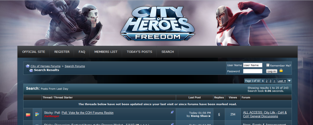
Poll: Vote for the COH Forums Reskin
By
00039,
Posted on: 2012-05-01 13:40 in CoH and CoV General Discussions
Sorry but ewwww.
I'll abstain.
I don't suffer from altitis, I enjoy every minute of it.
Thank you Devs & Community people for a great game.
So sad to be ending ):
As much as I like Penny, I really think you guys are pushing her way to hard.
If she was to become a major player within the game, there really needed to have been a gradual build up to it.
You could have put in some tip missions or something where she helps you out as a budding young hero. That would have at least given some measure of visual advancement for her character.
The way it is right now she goes from a virtual nobody to replacing THE face of the game (Statesman). That's just too big of a step.
In light of that, I vote neither. It's not that I don't like the art (though I don't frankly care for Penny's face in either), it's that I don't agree with the subject matter.
@Oathbound & @Oathbound Too

Quote:
If I understand what you're saying, then what you're saying is that the actual forums themselves have been incorrectly cut and pasted onto the background image at inaccurate scaling, which means it will never actually look like what is being represented.|
Originally Posted by Zwillinger

To be clear, this does nothing to change the actual view of the fora themselves. This is a background skin that will not in any way alter the VBulletin frame which the forums are in.
The image you're being shown is at full resolution. |
*If* I understand what you're saying, then in actual fact at that resolution if you actually opened a browser to that width exactly it would actually look like this:

Which seems a bit pointless, particularly for Penny. And if you shrink the window so that the actual forums are narrower but the background remains static rather than scaling, as the current forums do, then you'd get this by the time the forums themselves were as narrow as your images represent:

Which also seems kind of pointless, this time for ShadowHunter. I tried to be close to pixel perfect, and If I'm doing this right, it seems there's only an extremely narrow range of browser widths that will make this background (both of them really) not be obscured in odd ways. That's why our current one sits *above* the forum panel and not to either side: its reasonably visible at all browser widths.
Its not that the background isn't 100% visible, its that it truncates extremely badly in my opinion. Assuming you're correct and no changes are made to the stylesheet for the forums that alters the gutter proportions.
[Guide to Defense] [Scrapper Secondaries Comparison] [Archetype Popularity Analysis]
In one little corner of the universe, there's nothing more irritating than a misfile...
(Please support the best webcomic about a cosmic universal realignment by impaired angelic interference resulting in identity crisis angst. Or I release the pigmy water thieves.)
would it be possible to get some wallpaper(s) of these?
Quote:
I think the intent is not to replace Statesman but merely to match the loading screen of the game post-I23, which I suspect will be changing with each issue thereafter.
|
Originally Posted by Oathbound
As much as I like Penny, I really think you guys are pushing her way to hard.
If she was to become a major player within the game, there really needed to have been a gradual build up to it. You could have put in some tip missions or something where she helps you out as a budding young hero. That would have at least given some measure of visual advancement for her character. The way it is right now she goes from a virtual nobody to replacing THE face of the game (Statesman). That's just too big of a step. |
"You don't lose levels. You don't have equipment to wear out, repair, or lose, or that anyone can steal from you. About the only thing lighter than debt they could do is have an NPC walk by, point and laugh before you can go to the hospital or base." -Memphis_Bill
We will honor the past, and fight to the last, it will be a good way to die...
I chose 1, but it's a little weird how Shadowhunter's face has so much detail and there's like, almost none on Penny's in comparison.
In the room the women come and go
Talking of Michelangelo.
Quote:
(If I remember your real-life details via Polyana's (sp; nice business card by the way, but I screwed up and lost the one you gave me) descriptions right) what would your beard vote?|
Originally Posted by Kheldarn
I use Zombie Man's Villain Skin, and I've disabled the background image.
No vote from me, and don't you dare ask me to be a tiebreaker, because I'll totally break your (neck)tie! o_o |
Cause it was almost sounding like the beard was it's own entity.
Quote:
|
Originally Posted by Snowzone
And then there's the mask! I still don't see how such an imbecile managed to become a member of the Freedom Phalanx...
|
Kinda narrows the field.
Orc&Pie No.53230 There is an orc, and somehow, he got a pie. And you are hungry.
www.repeat-offenders.net
Negaduck: I see you found the crumb. I knew you'd never notice the huge flag.
Option C: Hell no! to either one.
Final Straw, DM/Regen Scrapper
Solari, Fire/Fire Blaster
Real Americana, MA/SR Scrapper
Task Force Timmy, Grav/Rad Controller
Astral Paragon, Spines/Regen Scrapper
Mr Drama King, Katana/Regen Scrapper
Psi-Stunner, Psi/Mental Blaster
I Study Comics Books before and one isn't really that good, there no Action Pose to it, Just them standing there, if it was a comic Book it won't ever be put on a Comicbook Cover.
2 Is alot better, it has them Jumping which give them a bit more of an Action Pose then just sanding there, I go with 2.
But a Comic-book Sells if there Action going, Dramatic Light effects to it or Special Effect like an Aura in the back ground. Before you go with either Make sure you have one of these in your new Forum Cover and you be all set.
Never play another NcSoft game, If you feel pride for our game, then it as well, I Superratz am Proud of all of you Coh people, Love, Friendship will last for a lifetime.
Global:@Greenflame Ratz
Main Toons:Super Ratz, Burning B Radical, Green Flame Avenger, Tunnel Ratz, Alex Magnus
I prefer Option #1 to Option #2.
**GUARDIAN**
Assault Ohm - Elec/Sonic Corruptor
Deadly Ohm - Elec/Will Brute
Invisible Ohm - Elec/Eng Stalker
Master Ohm - Elec/Elc Dominator
(1) is fine. (2) is sort of awful. Not the biggest fan of Penelope Yin either way, though it would help matters if her psychic spirit thing would spam its heals ... silently.
Please try MA arc ID 351455, "Shard Stories: Scavenger's Hunt." Originally created for the Dr. Aeon contest, it explores the wild potential of one of the City's most concept-rich but content-poor settings: the Shadow Shard.
Being really, brutally honest?
I use adblock, so I have no background at all. It's nice and clean. I would love an option like that. I know theming is a part of marketing as much as anything else - but an "official" option that looks just like I have it now, with the COH logo up top and nothing else, would be lovely.

Quote:
True enough, but it doesn't change the feeling that she's his replacement.|
Originally Posted by DarkGob
I think the intent is not to replace Statesman but merely to match the loading screen of the game post-I23, which I suspect will be changing with each issue thereafter.
|
Logically I get that if anything she's actually Sister Psyche's replacement, but Sis wasn't really a solo headliner in the manner that Penny is being represented here, that distinction always fell to Statesman.
@Oathbound & @Oathbound Too
Quote:
And I use Stylish, so my forums look like nobody else's at all.|
Originally Posted by Memphis_Bill
Being really, brutally honest?
I use adblock, so I have no background at all. It's nice and clean. I would love an option like that. I know theming is a part of marketing as much as anything else - but an "official" option that looks just like I have it now, with the COH logo up top and nothing else, would be lovely. |
(Heavily edited version of Zombie Man's skins)
Quote:
|
Originally Posted by Arcanaville
Softcapping an Invuln is fantastic. Softcapping a Willpower is amazing. Softcapping SR is kissing your sister.
|
Quote:
Is there an option for "If the two choices are how the forums will actually display, and the important part of the forums is the content, why do both options create so much dead space on the left and right that doesn't contribute to displaying the content and squash the content into the middle of the screen?"|
Originally Posted by Zwillinger
Take a look at the options below and be sure to cast your vote above!
|
Arcanaville's observations are trenchant if the proposal is just a background image, not a resizing of the content-to-window ratio; at the normal proportions of the window to the forum frame, the vast majority of both background choices will be hidden by the forum, which dilutes the choice
Rather than having a new background, I'd rather have the "Remember me" checkbox actually be a "Remember Me" checkbox, and not a "Remember me until I close the browser window, at which point you forget I ever existed" checkbox.
"But in our enthusiasm, we could not resist a radical overhaul of the system, in which all of its major weaknesses have been exposed, analyzed, and replaced with new weaknesses."
-- Bruce Leverett, Register Allocation in Optimizing Compilers
I chose option 1 because, not only is it better looking, it's different from the new loading screen. Having that bit of variety makes things more interesting. HOWEVER, I really don't like how Penny and Shadowhunter are drawn in different styles in option 1. Penny looks very out of place, and I'd really prefer if there was a different picture of her that could be used (though not the one from option 2, for various reasons).
I like #1 better than #2, but neither is better than the current background. If the devs change the background for Issue 23, I hope we get another change for Issue 24, and I hope Issue 24 releases real soon.
My Arc - #51736 Here Wolf... There Wolf... Werewolf!!!
Don't worry about the mule going blind, just load the wagon.
>")))>< ~~~~
like has been said a lot already, i like 1 more than 2 mostly because 2's the game loading screen for i23, but really dont like either.
not a fan of penny, but the devs sure seem to be.
i like shadow hunter, but he's not significant enough to be on the forums as a constant.
i really hope if the forums background and load screen changes, it changes with every issue from now on.
Quote:
Understood, and that's very fair. Thank you for considering it.
|
Originally Posted by Zwillinger
I understand, and appreciate what you're saying here.
I'll look into offering a generic skin for the forums, but to set expectations, this isn't something that would happen until Issue 24 at the earliest. |
I say option 1.
--Amercan Hawk (Level 50 Tanker/Guardian)
You plain vanilla people are so boring 
At first glance, I liked the first Penelope, but the second Shadowhunter (though both are cool). I voted for 1 because the expression on Penny #2 was just too weird.
If we're throwing out suggestions for further skins, I would like to see a way to have either several choices, or maybe a random selection that changes each time I log in. That way if there's one I don't like, it won't be there again for a while. Honestly, once you start reading a thread, whatever artwork is at the top is forgotten anyway.
Loose --> not tight.
Lose --> Did not win, misplace, cannot find, subtract.
One extra 'o' makes a big difference.
Quote:
This seems to sum it up for me.|
Originally Posted by afocks
What I have now :-
 What I will get :-  or  |
Where is the "Neither, please stop wasting dev time" option?
-D
Darkonne: Pinnacle's (unofficially) mighty Dark Miasma/Radiation Blast enthusiast!
Be sure to check out this mighty Arc:
#161865 - Aeon's Nemesis
Quote:
The community team run the website, not the devs |
Originally Posted by Darkonne
Where is the "Neither, please stop wasting dev time" option?
|

@Golden Girl
City of Heroes comics and artwork
Quote:
I've pared it down even more. Here's my forum view. It is kind of glorious.
|
Originally Posted by Memphis_Bill
Being really, brutally honest?
I use adblock, so I have no background at all. It's nice and clean. I would love an option like that. I know theming is a part of marketing as much as anything else - but an "official" option that looks just like I have it now, with the COH logo up top and nothing else, would be lovely. |
Paragon Wiki: http://www.paragonwiki.com
City Info Terminal: http://cit.cohtitan.com
Mids Hero Designer: http://www.cohplanner.com
Quote:
|
Originally Posted by Dispari
I don't know why Dink thinks she's not as sexy as Jay was. In 5 posts she's already upstaged his entire career.
|
I am begging whoever is in charge of this, if it must be option 1, please please PLEASE at least fix the eyes so they're looking to the side or something. It's incredibly unsettling.
@Golden Girl
City of Heroes comics and artwork