Informal Art Poll
I would prefer option 1, an update.
Only one worry comes to mind and its not a big deal, when you change a toon who was wearing the old stuff they become stripped bare, is there anyway for it to automatically match the toon old version costume to the newer updated stuff so you dont have to match it up and so saved costumes can "fix" correctly?
Many Sg's
3 Accounts
Over 60 toons
Endless Loyalty Art commissions! and wordpress!
Option 1 I guess.
Leader of The LEGION/Fallen LEGION on the Liberty server!
SSBB FC: 2062-8881-3944
MKW FC: 4167-4891-5991
|
Duly noted. If shiny finish and/or geometry were altered, I wouldn't have a problem with leaving the legacy version.
|
I, like some others have mentioned, had a "battle armor" character whose appearance was altered undesirably with the metallic updates.
I preferred the "flat" nonreflective colors- the army, for example DOES use nonreflective paints on the metal surfaces of combat gear, after all. That, and the "piston boots" weren't touched, so his super-shiny (and slightly bluish tint) armor looked off with his flat, drab boots.
That's my- and probably most of our concerns here. While ultra-mode reflections looked nice in a complete set, it made mixing sets more difficult. We have some other costume sets that- for shaders or whatever reason- don't seem to match when compared against other items at similar color settings. If caution is taken to not make these revisions "tough to mix" I have no issue with Option 1. While these sets look nice when taken as a whole, they don't add much to the much-loved flexibility of the character creator.

Option 1.
Freedom: Blazing Larb, Fiery Fulcrum, Sardan Reborn, Arctic-Frenzy, Wasabi Sam, Mr Smashtastic.
|
1. Break up the chest symbols list into sub-categories. Yes, I have packs and vet stuff. I have over 7 screenfuls of 35 items a piece. 245 items (and a few stragglers.) That's a LONG list to scroll through if I want to get to, say, the Circle of Thorns or Vindicator logo, or a "physical" chest piece like Vanguard armor.
2. For pieces that have a mask (armor plate, alpha, flak jacket, etc.) have that mask FIRST on the list, not last! Especially with a long list of patterns! |
Character index
|
Sure. Not saying that this is in the queue or anything, but take a look at the tank top. Currently, it's a simple cut-out without any details. Now look at a real-world tank top (like this one http://www.undershirtguy.com/wp-cont...n-tank-top.jpg) and note the trim and stitching along the edges and bottom. Also note the subtle folds and even subtler fabric texture. These are things that could be improved in an updated texture. Would it still be a plain white tank top? Of course! But it'd be a lot more realistic and convincing.
|
Apparently, I play "City of Shakespeare"
*Arc #95278-Gathering the Four Winds -3 step arc; challenging - 5 Ratings/3 Stars (still working out the kinks)
*Arc #177826-Lights, Camera, Scream! - 3 step arc, camp horror; try out in 1st person POV - 35 Ratings/4 Stars

All things considered? I'd rather just have more new stuff.
Mostro - Mr Methane - Beast Lightning - Akrasia - Contraindicator - BattleBomb - Norsewind - Poundy Hammer - Fatron - Mysteriesque - Chiisai Tora - Goth Claw - Mach Barrier - Bearly Human - Prototype Alpha - Crabbly - Puffy Morpheus
If you're talking about changes only on the level of the Gladiator Shoulders, then I say option one for sure.

(Giant image! Thanks for the picture, by the way. Although I'm not sure who I'm thanking.)
If it's more on the level that the shininess was changed on tech pieces, or the thigh high boots that I managed to miss out on, then I'd say option two.
Ideally, I would say option one, and then open a thread where people can request old textures. If particular pieces come up again and again, look into making them available.
Option 1, with one condition.
The new pieces are just as mix and match as the old ones. So Tanker top matches Tights which matches Strapless witch matches Skirts which matches Tee and so on.
If that's taken care of, then I won't miss the old ones. My Defender is at her.. 4th? texture for her skirt already, so a 5th wouldn't matter much, as long as it's flared and red.
Aegis Rose, Forcefield/Energy Defender - Freedom
"Bubble up for safety!"
|
Sure. Not saying that this is in the queue or anything, but take a look at the tank top. Currently, it's a simple cut-out without any details. Now look at a real-world tank top (like this one http://www.undershirtguy.com/wp-cont...n-tank-top.jpg) and note the trim and stitching along the edges and bottom. Also note the subtle folds and even subtler fabric texture. These are things that could be improved in an updated texture. Would it still be a plain white tank top? Of course! But it'd be a lot more realistic and convincing.
|
As for the concern that the menus are too cluttered, I don't think making an individual menu longer (as would be the case with option 2) adds to the clutter. It is the general flow of the UI that makes navigating confusing/cluttered.
I tend toward #2, but what actually appears best to me is hide those pieces by default and add a checkbox to reveal them.
And yes, I in fact have a character whose tail is simply a literal part of her costume and not supposed to sway.
OPTION 1
I was all for Option 1 even before bAss so eloquently and artistically illustrated it with his usual flair of bAss-Ad artz.
There are no words for what this community, and the friends I have made here mean to me. Please know that I care for all of you, yes, even you. If you Twitter, I'm MrThan. If you're Unleashed, I'm dumps. I'll try and get registered on the Titan Forums as well. Peace, and thanks for the best nine years anyone could ever ask for.
Option 1 sounds good to me.
"The Hamidon is a what what of what?" - Brian the mission guy.
|
And please for the love of Pete... REVAMP the friggin NPC/civillians... that's the biggest turn off for me right now, they look REAL old...
|
I though we would get rid of them in Praetoria, but they still there.
I HATE THEM!
New office missions in Praetoria with new NPC looks great for CoX
Having the almost 7 years old NPC in shiny Praetoria in almost 2011 make me wanna cry.
I would get rid off all them in Praetoria, hero and villain side, even if we end up being City of NPC clones.
Option 1 - and the gladiator shoulders is a perfect example. Keeping the old one would have made no sense despite the hue and cry and the gnashing of teeth from some people when it first changed.
Option One!
Arc ID 104041 Attack of the Mini Phalanx Solo Friendly; Custom Characters; Comedy.
Arc ID 292449 The Shadow of Eihbon Solo Friendly; Canon Related; Magic.
Thanks, David, for seeking our input!
|
Just so we're completely clear, the hypothetical 'new' pieces would look 100% identical at distance, use essentially the same geometry, and differ only in the sense that they look crisper/cleaner/sharper up close. There would be absolutely NO impact to a toon's theme because there'd be no discernable aesthetic change.
Would you really use the legacy asset w/ older, blurrier texture if a cleaner, sharper version was available to you? If so, I'd love to understand why you feel that way. |
When Cimerora was added to the game, so was a complete Gladiator costume set, minus a Gladiator Shoulder piece because that was already in the game.
But, a problem arose: The new Gladiator Set was hi-rez, the old Gladiator Shoulder piece was low rez, and it clashed. So, the Gladiator Shoulder piece was updated with a hi-rez skin.
But, that led to another problem: People had been incorporating the low-rez Gladiator Shoulder piece for years with the other low-rez costume pieces. When the Gladiator Shoulder piece went hi-rez, it now clashed with all the legacy pieces.
|
Good point. The Metallic set is something I'd like to deal with separately, but to weigh in really quickly: I agree that a certain look and feel is missing now, and we'd like to put that back for you but probably under a different name. I think 'new' Metallic is truer to the concept of an all-chrome character, but I understand that you'd like a mix-n-match plainer version as well. Totally understood.
|
|
Duly noted. If shiny finish and/or geometry were altered, I wouldn't have a problem with leaving the legacy version.
|
This goes back to my running plea: standardized 'skins'. All pieces ideally should be able to be skinned with a standard set of skins such as: matte flat, shiny flat (spandexy), leather rough, metallic shiny, metallic reflective, etc.... This should be the ultimate goal and all updates working towards it. This would be the costume creator 2.0 that CoH needs to move towards to stay competitive; otherwise, what is the jewel in the CoH crown will be dismissed as "it's no All Points Bulletin costume creator."
|
Thank you for giving us the opportunity to chime in!
Old vs. New 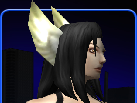 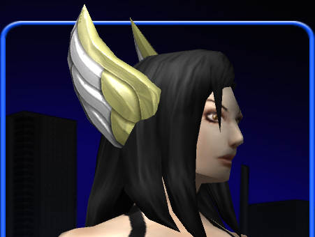 Look at that old wing detail. That looks like 18 polygons total. Yeesh. The texture is so blurry and the specularity is just a super-bright spot that doesn't (or barely) interact with the normal map. All of this combined just clashes with the character so profoundly. It is just infuriating to have these kinds of inconsistencies. I really don't believe any of the old pieces should be left alone. |
This brings me back to my point about 'skins' for pieces. It would be nice if there was a 'blank' skin that had no specific hi-rez texture precisely so that it can be colored to be almost anything.
Conclusions
Option 1.
Yeah, as much as I made an argument for Option 2, there is a reason why most of the old low-rez pieces must go away: Because others have to look at them.
Take, e.g., the competitor's creator which has taken an art style of human anatomy which I find sickening with it's shrunken cranial tops and jaws, over-pronounced brows, and slouching stance. I can use their sliders to correct all that on my toon. But the moment I go into the game, I'm sickened by seeing the uncorrected style on every other toon and critter around me.
If CoH is going to advance and be considered a modern game and not some six year old relic, it has to eject the old low-rez pieces.
But to that end, there are some rules of advancement that I recommend be followed to ameliorate the pain of change:
1. Start with complete sets. For example, the Steampunk pieces are horrendously low-rez. They should be updated and presented as a complete set... it will feel as if we have indeed received a brand new set.
2. Complete uncompleted sets: Steampunk is missing options, like Steampunk boots. Finish the set. Updating the look while leaving the gaps in the set will feel like salt in the wounds of all those who've been clamoring for the set to be completed for years.
3. Don't change the design. As mentioned above, the snowflake design got upgraded, and at the same time, redesigned. Don't do that! If the artist really, really wants to change the design, then add, don't change. Up-rez the old design and *add in* the new design.
4. Matching skins. See what I posted above. If you're going to up-rez the Steampunk set, then it would be nice to see a rusted skin, a shiny metal skin, and a UM reflective metal skin: Costume creator 2.0! Do something like that and no player crying over losing the old low-rez version will be heard over the ewwing and ahhing of the crowds over the new options.
5. Fix missing and broken pieces. I don't know how it can be justified for the Dev team to spend time up-rezzing pieces and not fixing what's been broken for a long time - a very long time. Really, I hate to be rough with you, David, but you've been pointed to a really broken part of the costume system and under your watch it hasn't been fixed yet. I regard that as a failure on your part and the other Devs involved. When are you going to fix the cape problem outlined here?
6. Join the Patch Notes process. It seems that the costume art department is immune to the patch notes process. When the Gladiator Shoulder piece was up-rezzed, there were no Patch Notes. In fact, except for when new costume *sets* are added, we're never informed of changes in the costume creator. Pieces go purposefully missing? No notes. Pieces not part of a set get added? No notes. Pieces that were broken get fixed? No notes. It makes me wonder if the costume department is in the same country as the rest of the Studio, let alone the same building. Getting back to the OP... it will reduce a lot of the anxiety and nerdrage of up-rezzing legacy pieces if you actually let us know which pieces have been up-rezzed when it happens rather than having to hunt through all the menus.
Speeding Through New DA Repeatables || Spreadsheet o' Enhancements || Zombie Skins: better skins for these forums || Guide to Guides
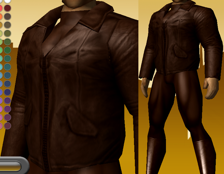
All for option 1. There's this really cool jacket I found, and it has a great shape and length. But it's texture is pretty freakin' dated.
As for the tails, well...
Back when tails were belts, the Magic Bolero would bring up a different set of tails, ones that curled in and stayed out of the way. When I first saw that, I thought it was wicked awesome. But those were removed when the tails became their own option. THOSE are the legacy tails we should have to choose from. If you're going to have a tail hanging out, you probably want it moving. If you don't want a tail moving, you'd probably want it to say out of the way.
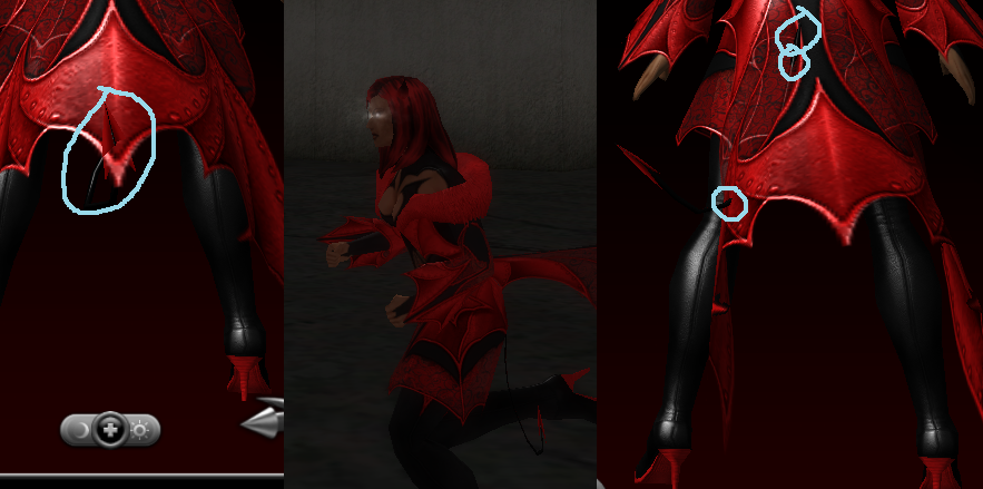
*Clipping in blue
That first shot is the hooked still tail, and that's just while standing in place. The second one is the curled-in legacy tail (that was the best shot I could get of it with the black screen capture problem I keep having with vista (and because the in-game screen captures aren't pngs)). The third is the animated tail, which can just go all over the place.
So Option 1, and keep legacy tails, but switch to the curled-in versions.


Definitely option 1, the old pieces can really be an eyesore with the horrid blurriness when compared to the new stuff. The creator would be way too cluttered with two of everything, unless they were all submenued with the new piece as default. I'm really stoked about even the idea that the old stuff would get updated. I may sound like a perv, but I like how the newer tops with skin pieces give a sense of cleavage. Even the simple tank top looks sexier in that regard than the older pieces, I'd love to see that applied to all the tops with skin. And those fishnets are horrifically blurry compared to something like the hearts plus pieces. Option 1 all the way.
Is this something that would happen gradually or all at once? Any possibility of some making it into issue 19 or would it be issue 20 at the earliest? Thanks for asking for our input.
David,
After reading all your replies (at midnight your time no less!) it sounds like you really want to make this change. Go for it. Get rid of the old costume pieces that look like crap and bring legacy stuff into 2010 with the rest of the costume pieces. They've been talking about upgrading buildings in Paragon City to be all shiny and new, and costume pieces are no different.
I would choose option 1.
Issue 16 made me feel like this.
Warning: This poster likes to play Devil's Advocate.

I'd generally prefer Option 2, since changing textures can indeed change the aesthetics. But that would make clutter bad too. Pushing the old options into a legacy tab would be good.
As much as I love some blurry old pieces, because of how they can combine in overall looks, I think if it's done right, and dolled out over time...Option 1.
I'm just wary of older pieces having weird lines or funny (not ha ha funny) textures. The "improved" Spiderman or Superman suit in one of the movies, well it just looked weird. Sometimes an understated look works better than a defined one, because it can be used in combination with other items to look like something else.
My thoughts on the winged head pieces, btw, to me they're different designs and I use both on different costume types.Just sayin'.
Pinnacle & Virtue:
A bunch of Heroes - Alpha Team, Legion of Order.
A bunch of Villains -Black Citadel , Pinnache.


I support option 1 because the costume creator is already pretty full as is.
Also, I would think that players with lower settings might choose a legacy option giving their character a worse look to those with higher end machines when they didn't mean to.
If there was an item that was changed generating tremendous nerd rage I imagine it might be easy to reinstate that item with relative ease.
Draggynn on Virtue: lvl 50 Storm/Psi, 1389 badges
Draggynn's Guide to Storm Summoning(Gale-Tornado, updated 6/25/2011)
Avatar by Wassy full reference here