Informal Art Poll
I honestly have to say that I like the idea of updates and worry about clutter...
But I am attatched to some of the older pieces. Namely my main katana scrapper uses an issue one face, I keep using that face because it looks like an Adult Japanese male (face 3, and not an adult Chinese male like one of the other options, or a Korean Male).
Then there's the young faces, one of which my blaster uses, also selected because it looks Japanese. (Despite it seeming to have blue-ish green eyes)
My DB brute uses an older face that clearly has brown eyes (Face 13)
Click here to find all the All Things Art Threads!
David,
If we are talking about the evolution of how this works, why not try and do what the story team did?
make a tool for players to craft some of our own costumes, and like dev choice, the best submitted go in the game.
only problem would be the loading of patterns.
other folks, ideas?
COMING SOON: A new Epic that will change the way you see Arachnos...
Brought to you by @Equation

|
Sure. Not saying that this is in the queue or anything, but take a look at the tank top. Currently, it's a simple cut-out without any details. Now look at a real-world tank top (like this one http://www.undershirtguy.com/wp-cont...n-tank-top.jpg) and note the trim and stitching along the edges and bottom. Also note the subtle folds and even subtler fabric texture. These are things that could be improved in an updated texture. Would it still be a plain white tank top? Of course! But it'd be a lot more realistic and convincing.
|
However, if this is the general case, would we also see hairstyles upgraded for conformity as well? As it stands, the classic hairstyles clash with all the new ones that were added about one or two years ago, especially when it comes to color attributes. I could see how some would prefer to keep the legacy hairstyles in that specific case, as an update to those would be on the scale of the ultra graphics reflective change. But even then, I would welcome the upgrade for the sake of conformity and visual fidelity.
second idea.
make aura glow effects, similar to the resistance and the mutant pack, as options for chest emblems as well.
on that note David, the praetorian star and resistance chevron are not chest emblem options, can this be amended?
Also, can the now much more expanded chest emblem series be available to SGs as emblems?
COMING SOON: A new Epic that will change the way you see Arachnos...
Brought to you by @Equation

The ever improving artwork of CoX is something that always astounds me and gives me plenty of enjoyment when putting together costumes etc, so I had to comment.
A lot of the existing pieces in low resultion, I would imagine are some of the tights, patterns etc that have been in the game since Issue 1. The tights, well they tint the skin, but the skin color still seems to show through, especially with lighter colors.
Now for some themes, it looks really great. Mixing a midtone skin with white tights gives a great etherial style look for undead characters, but it wouldn't look so good for characters wanting to sport actual white spandex.
I think the best option alas would be to give the players the choice of the old and new pieces, however as suggested updates to the categories these pieces are in would be required within the costume creator such as legacy tights / redux tights or therein.
I myself use some of the older textures on characters, but normally to depict T-shirts and such under newer items, such as the Praetoria Police chest detail.
I'm sure everyone here appreciates the time you have taken to at least ask the playerbase for input David, I surely do!

In-game and now on Twitter @Tsumiju Zero "The Nightmare of Dra'Gon"
"The flow of battle can only be influenced, not by realtime tactics, but by strategy."
Proud resident of the Union EU Server.
B.A.F. Trial Guide
|
Wasn't this already the case with female tank tops some time ago? I thought that change was out of left field, but still very much welcomed.
|
Personally I'd vote for option 2.
It happened with stuff like the Thigh Highs where I much prefered the old ones to the new ones and would like to have the option to switch back to them. However if the costume pieces are being changed in no way whatsoever (for example the thigh high boots merely got a spruce up in texture but did not exactly change shape as they did with the 'revamp') then I would go for the example of option 1.
Winner of Players' Choice Best Villainous Arc 2010: Fear and Loathing on Striga; ID #350522
|
Good point. The Metallic set is something I'd like to deal with separately, but to weigh in really quickly: I agree that a certain look and feel is missing now, and we'd like to put that back for you but probably under a different name. I think 'new' Metallic is truer to the concept of an all-chrome character, but I understand that you'd like a mix-n-match plainer version as well. Totally understood.
|
I know this isn't *precisely* your department, but since you're talking about "Do you want us to keep the old options," can we have you pester the interface folks about a few things?
1. Break up the chest symbols list into sub-categories. Yes, I have packs and vet stuff. I have over 7 screenfuls of 35 items a piece. 245 items (and a few stragglers.) That's a LONG list to scroll through if I want to get to, say, the Circle of Thorns or Vindicator logo, or a "physical" chest piece like Vanguard armor. This REALLY needs doing. Other longer lists should be like this as well. If I want the alphabet itself or a number, put those into lists. The vet greek letters? Their own list. Yes, it's more subcategries. Yes, it means when I go to the tailor my old outfits are "broken," as happens with every rearrangement. But it would be a HUGE QOL thing for these long freaking lists!
2. For pieces that have a mask (armor plate, alpha, flak jacket, etc.) have that mask FIRST on the list, not last! Especially with a long list of patterns!
3. Some of these ... I have to say, really don't need to be "saved." Female stripes (I think it is) - look at the side, and they don't match up. I don't mean by a pixel or two, but by half the "costume piece." They look absolutely horrible. But for the most part... I'd take option 2, where possible, preserve the old pieces. (Part of why I put in point 1.) I just can't put up, very often, with a "paint on skin" pattern mixed with a nice, newer item. I have to, on occasion, but I miss hems, depth, texture and the like. On the other hand, there are places where it just fits, and I'd hate to have that vanish.
4 (Wish list item) Could we get a variety of textures - and have them match, so all the "sleek" look the same, as well as a less-sleek and matte?
5. (Wish list item) Could we, possibly, get some conformity on points where, say, side stripes or side details match up? Some are REALLY close, but need a belt to hide the "step" where they meet.
Winner of Players' Choice Best Villainous Arc 2010: Fear and Loathing on Striga; ID #350522
|
Hey, folks. So I have two overarching philosophies when it comes to the Art Direction in COH: first, that we continue to improve the quality bar with every new initiative we undertake and second, that we not forget about the legacy art as this happens. But when it comes to legacy art, there are of course items in the Costume Creator that are starting to show their age. We could hypothetically remake these assets with crisper, more detailed textures and modern shaders and do our best to maintain the 'flavor' and 'feel' of the originals, with the goal of giving you the same stuff, only better.
-------------------------------------------------------------------------------------- But then there's a choice on how to deploy them, and that's where this very informal poll comes in: How would you, the players, want to approach this issue? |
|
HYPOTHETICAL OPTION 1: Old assets would be removed from the Costume Creator menu and you'd have the newer, updated ones instead.
Pro: This raises the overall quality bar of the game by eliminating the oldest, least-attractive pieces; players look cooler; everything looks more consistent and modern. Less menu clutter. Con: change is scary; perhaps some players will prefer the old pieces? |
Old vs. New
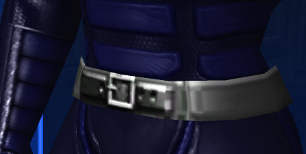
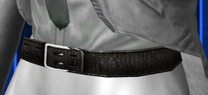
Just a hands down better texture. I don't even want to guess the texture size of the old belt compared to the new one.
Old vs. New
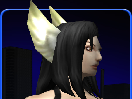
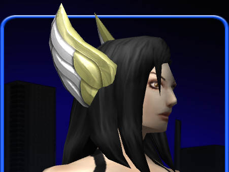
Look at that old wing detail. That looks like 18 polygons total. Yeesh. The texture is so blurry and the specularity is just a super-bright spot that doesn't (or barely) interact with the normal map. All of this combined just clashes with the character so profoundly.
It is just infuriating to have these kinds of inconsistencies. I really don't believe any of the old pieces should be left alone.
|
HYPOTHETICAL OPTION 2: We leave the old version alone and put the new version immediately below it in the Costume Creator.
Pro: Nothing is 'taken away.' Con: Outmoded art remains, clashes progressively more with newer, modern assets. Menus swell with 2 options for each basic piece, making it harder to navigate. |
|
-------------------------------------------------------------------------------------
So you can see where I stand on this.  Personally, I'd like to see the game's art evolve, improve, and remain consistent, so I much prefer Option 1. But as always, I'd be interested to hear what you guys think about this. Do me a favor and please keep your posts short and to the point. Personally, I'd like to see the game's art evolve, improve, and remain consistent, so I much prefer Option 1. But as always, I'd be interested to hear what you guys think about this. Do me a favor and please keep your posts short and to the point. |
No, I do not. This is a case where keeping the old makes sense for the characters out there that don't actually have one as a part of their body but do want to use a prop tail as part of their costume. There is no issue here for me, as there are no outstanding geometry and texture differences between animated and non-animated tails.
Playstation 3 - XBox 360 - Wii - PSP
Remember kids, crack is whack!
Samuel_Tow: Your avatar is... I think I like it

I'd prefer Option 2. I think leaving legacy options in, even at the expense of more clutter and less consistent design, is the better choice.
Chances are I'd like the new textures, but on the off chance I don't, I'd prefer being able to use the older ones.
My more is better side of me says Option 2. The problem though is if you decide to go with #2 there is no going back. You cant decide after you dont want to have the old ones anymore without a huge outcry from the comunity. That is why I will have to repress my urge and say I am voting for Option 1.
Virtue
--Blazing Tiger-- 50 Invulrn/Fire Tank
<<Virtues Tankiest Kitty>>
Try my Arcs: #4892 and #112548
@Blazing Tiger and @Aqua Fox
I'm voting Option 1.
And I concur with Bill about the pieces that have associated patterns, that specific pieces pattern should be at the top of the list not the bottom. It's rather annoying to select Bio-Organic head/chest/etc and the have to scroll to the bottom of the pattern list for Bio-Organic.
More comparisons.
Then, 2004:
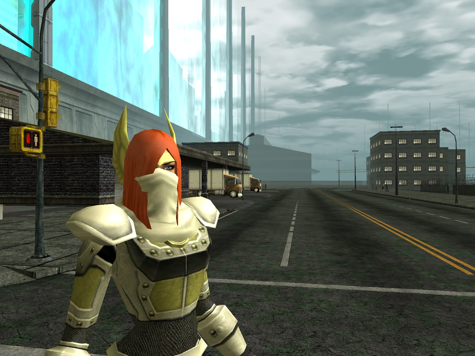
Now, 2010:
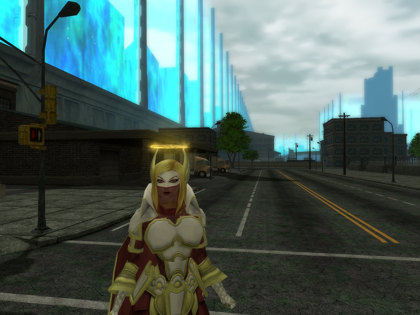
The old stuff needs updating.
Playstation 3 - XBox 360 - Wii - PSP
Remember kids, crack is whack!
Samuel_Tow: Your avatar is... I think I like it

I'm in favor of option #1, but as long as the changes are straight-up improvements.
Case in point, the gladiator shoulderpad got changed a bit more than just polished up. I don't miss the old one but I know people who do.
What shall claim a Sky Kings' Ransom?
PPD & Resistance Epic Archetypes
Option 1 EXCEPT in the cases such as where the Ultra Mode update left some costume parts that were fine before, clashing with other costume parts that had been mixed and matched. Then the alternative should be offered.
So kind of an Option 1.5, as you will.
ALSO!
I'd love to see more matching costume pieces for the older ones, I know that some are missing boot/glove options, but names elude me at the moment.
|
More comparisons.
Then, 2004: <pic> Now, 2010: <pic> The old stuff needs updating. |

|
I'm voting Option 1.
And I concur with Bill about the pieces that have associated patterns, that specific pieces pattern should be at the top of the list not the bottom. It's rather annoying to select Bio-Organic head/chest/etc and the have to scroll to the bottom of the pattern list for Bio-Organic. |
As for your question David, as long as you're not changing the geometry or adding reflection etc then Option 1. If something signifigant is changing then Option 2.
And I agree with leaving the old assets in there so if someone already has it they can keep it.
I would go with Option 1 also if it's only improving the old pieces without changing how they look or feel.
There's bound to be some legacy costume pieces that will be missed by some people, but all in all, I find myself often not using some costume pieces, or be tempted to replace them with more recent ones, just because they look so... old. And I don't think I'll miss those versions if the same pieces with better textures are released.
My YouTube videos of auras, emotes and other stuff from special promotions, incarnate purchaseables, etc...
|
Actually that example highlights one thing that annoys me about the Valk set. There's no "wings with headband" option, so my scrapper's forced to stick with the butt-ugly old ones
 |

Playstation 3 - XBox 360 - Wii - PSP
Remember kids, crack is whack!
Samuel_Tow: Your avatar is... I think I like it

|
You know you can go backwards through the list right? Click the back arrow from the top and you get the last item
|
* From my experience, it doesn't always seem to work when you're editing an old costume.
Option 1 definitely.
The new gladiator shoulder piece looks way better than the old piece.
Those head wings a few posts back are a good example of why old stuff needs updating/replacing. I have a character that uses a good few parts of the Valkyrie set, but she also wants the wings + headband. The problem is that the headband is only available with the old low texture quality wings and not the much better looking ones from the valkyrie set. So now I have to choose between ugly wings that clash with the rest of the outfit or no headband but nice looking wings, neither looks exactly right for the outfit I envision.
@True Metal
Co-leader of Callous Crew SG. Based on Union server.
Option 1
On a side note:
Would it be possible to list Chest Details in different drop lists?
Currently it it VERY cluttered.
If you added a drop list of TYPE:
Then a secondary drop list with items that go into that list.
I.E.
Type: Symbols
Secondary: Star 4
or
Type: Letters/Numbers
Secondary: <greek alphabet>
or
Type: Accessories
Secondary: Praetorian Police


Voting option one.