Champions Online: just doesn't cut it.
Of all the lackluster things you can find in CO, the costume creator isn't one of them. I just wish there were more faces to choose from, because you can't do crap with what they give you.
I've been playing CO a couple of days after black Friday and here's what I have to say about it:
The Pros:
-As mentioned before, the travel powers are a plus
-Freeform (create a hero with any mixture of powers you want (imagine a tank that uses blaster attacks)
-Canada at night (if you love Tron, youll understand it when you see it  )
)
The Cons:
-Yea, teaming doesn't happen much (though us refuges need to make it common)
-It's sometimes hard to know if you pick up a mission that requires a team or not
-Bugs galore in the APs
Please remember that the first thing that everyone mentions is to turn off the outline on the characters. It does look a lot better with it off (I don't quite understand why a small change like that does make a huge improvement but it does).
Also remember (and we can't stress this enough), IT IS NOT COH!!!
Greetings are who are doomed.
I think COX is it's own animal and going to just about any MMO, especialy one that is super hero themed and expecting it to be like COX or play like it or do things like it is a setting up for failure as no game will measure up and be a clone of COX.
One thing I do like about CO though is that if you are talking to a contact npc, especially one that is "hero" they dont just stand there and let you get ya face smashed in. They actually react.
Defender--lol. yea, he is one goofy character and the tutorial I actually liked because it actually prepares you for what to expect when coming in contact with tougher opponents. I hate tutorials that is all easy, nigh waste of time, only to get in game and things are nowhere near in the same league of difficulty as the tutorial.
Black Talon is a challenge at firts but once you done it, he's fairly easy and simple to beat. Dont be too proud to block and move around is the main thing and if needed, by that time there should be a heal thing in the inventory.
Not sure how some people as they posted get choppy movements. CO plays smooth if not smoother and more fluid than COX. Did they try to check and adjust settings?
And the lack of teaming here is kind of a pro for me. It's nice being able to actually play just about the entire game and not worry about "peak time" or slow days, or if people are interested or just did it, or waiting for people and etc. Just log on and go. Wanna do an Alert and team, the que in the game actually works and not much wait time. Then if a perso nwant to team it's easy to do to. In COX, there are times where teaming takes way too long but progress cant be made towards the goal without a team. Spend more time forming a team then doing the actual event.
The main though is people have to realize that Champions Online is not COX and never will be nor any other game will be unless it is The one and only City of Heroes and or Villians.
Oh yea like the fact that the CO enemy actualy prefer to fight instead of seeing most of their backsides running for the hills like in COX.
-Female Player-
ive never tried CO and dont plan to, from what i seen in screenshots, the graphics are just eye burning to me
and compared with all of the other stuff ive heard of it, i dont think i would ever like to play it either as it would just be the pale unloved stepchild of coh

|
You can remove those comic-book outlines in the video options btw. You can also remove the cel shading by turning off post-processing effects (there may be a separate option by now, but that's how I did it in beta). IMO CO didn't look too bad once those are turned off. The gameplay was another matter though; I thought the combat was horrible.
|
I dusted this off over the last week (played it for one whole night when it launched). General thoughts:
1. It's not CoH. That doesn't make it unbearable. Given the choice I'd play CoH, but come December 1 that's probably not going to be possible, so I'm trying to judge this one on its own merits rather than comparing it to CoH. It can't live up to that just because we all have too much history invested.
2. Graphics are an eyesore on the defaults, but the two biggest things that can help are turning off the godawful outlining (which improves performance to boot), and spending time with the sliders in the character creator. Shorten up those Gumby arms, shrink the basketball head and the pie plate hands. Lengthening the legs a tick also gets closer to the CoH proportions we're used to. Remember to check out the face sliders and squint the eyes unless you're an anime fan.
3. Once you get used to the graphics, the fact that it's five years newer than the original CoH zones becomes apparent. The city architecture for instance - it FEELS like a city, or at least a comic book version of one. It feels much closer to Nova Praetoria than Steel Canyon.
4. The tutorial is longer than the "new" CoH one but there's a lot of the same feel - that you're being led around by the nose. Once you clear that and train up it's starting to feel more like the sandbox we're used to, though there does seem to be a shortage of contacts compared to the KR-Steel-Sky range. Again, a Praetoria feel.
5. The character creator is a bit counter-intuitive but there's some good stuff there. For some reason they retain the ancient CoH model (when did it go away - issue 3 maybe?) of having to scroll through an ENTIRE list with a mouse instead of giving us clickable arrows. And if you choose something, it resets to the top of the list which is annoying if you're fiddling around. The free to play costumes are a bit limited on the armors and wacky stuff, but there's a good selection if you're into spandex and capes. And considering where we're coming from...
6. The big one: The free to play archetypes are really, REALLY limited. If you want to play a scrapper you'd better like swords, for instance. The freeform ATs, and most of the flavor on the basic ones, are all behind the paywall.
Like I said, if City stays, I'm staying here. But at least at the low levels, it's not bad. A few of us tried running the first post-tutorial missions as a team the other night. It went surprisingly well in the sense that it passes the test of being decent interactive social media; giving your fingers and eyes something to do while you're chatting with friends. And personally I've always been more into the social aspects of gaming than min-maxing anyway. I'm not saying it's great. But I'm hoping it will be "good enough."
Mr Slovakia, 50 DM/Inv Scr
Miss Slovakia, 50 Dk/Dk Def
Mr Czech Republic, 50 Earth/Sonic Ctrl
Miss Czech Republic, 50 Claws/Regen Scr
Miss Israel, 50 Rad/Elec Def
Mr Ireland, 50 Sonic/Fire Blst
And many, many Triumphant alts
"I'm not sure if I should offer congrats or a tylenol"-Catwhoorg
|
...I don't even like the character models. It looks too....potatoey to me. If that's a valid way to describe them. Lol.
|
|
The word you're both looking for is "Cartoony." CO may have those (IMO ugly) "comic book outlines", but the overall art style makes the game look more like your average cartoon than your average comic book.
|
Maybe it is because the characters just look like they are made out of plastic. I agree that they are "cartoony" (and, no, not due to the cell shading and lines). The humans/humanoids look like a rubber action figure of Plastic Man for some reason.
Honestly, the game looks somewhat like the Incredibles, more than what I think of as my preferred comicbook style.
Maybe they're "potatoey", because they kinda look like a shiny, plastic Mr. Potato Head (or maybe because they remind you of Toy Story).
Something about the textures, something about the stances and something about the bodies just do not appeal to me. Not only do they not appeal to me, they really, truly turn me off of the game.
So, okay, looking at this example:
It's all matters of opinion, of course, so to each their own, but...
I can understand how someone can say CO's graphics are better. There's greater resolution, finer detail... certainly more shine.
However, this picture, my eyes immediately see the CO character and my brain just scream NO. Something about the puffed out chest, but long (kinda gangly) arms. Hrm, maybes it's actually the sloped shoulders!
But, again, the greater details? They make it look worse to me, somehow. Likely due to the plasticy sheen maybe? Regardless... ACK MY EYES... those black outlines... just why? I stopped leaving outlines on my drawings when I was in grade school, heehee.

Anyway, I honestly didn't mean to make fun. There's nothing wrong with liking either one better than the other. My preference just happens to lie with the CoH style.
I have to admit, I was always a fan of the Sega Genesis and its graphics (for the time) and, while I love me some truly great graphics, if it's not super realistic, I prefer generic and less detail, so my imagination can make it look better, rather than super detailed, but not what I'd like.
For any Sega Genesis fans... something about CoH always feels a bit Sega Genesis-ishy... even the game play, really. Hm... odd.

and round up everyone that knows more than they do"-Dylan
I think the biggest problem is the cognitive dissonance of trying to play it and thinking about CoH. I hear a sound effect, see a costume piece, or get a feel that is almost like City of... but not quite... and then comes flooding in all the flaws I see. Like many, graphics style is one of them (though turning the black lines help, it's still... not as good as CoH in my opinion).
Everyone in my SG felt it when we tried a few weeks back. We are pretty much decided not to settle into any one game again to keep from getting so attached (only f2p or purchase once to play options are the current goal). I'm sure we'll find a few to settle in to after Nov 30th.
Champions Online will most likely be one of them, but only after a long break after the close of CoH. Then maybe it won't be so much like "This isn't like CoH" rather than "This is how it's similar to CoH".
I have the feeling a lot of people are in the same boat, so I'm tossing it out there for consideration.
Wait a while before trying to jump in. It's only been up for what, 3 years compared to CoH's 8? Besides, who knows, some folks from Paragon will (and are- coughcoughBack Alley Brawlercoughcough and who knows who else) undoubtably going to find their way over (or back) to Cryptic. Here's to hoping they take what they learned from CoH and apply it to Champions.
I hope I'm right about that. Only time will tell.
"I play characters. I have to have a very strong visual appearance, backstory, name, etc. to get involved with a character, otherwise I simply won't play it very long. I'm not an RPer by any stretch of the imagination, but character concept is very important for me."- Back Alley Brawler
I couldn't agree more.
|
Regardless... ACK MY EYES... those black outlines... just why? I stopped leaving outlines on my drawings when I was in grade school, heehee.
 |
If you don't like the Comic Style Outlining and don't want to see it in the game, turn it off. No one is forced to use the Comic Outlining.
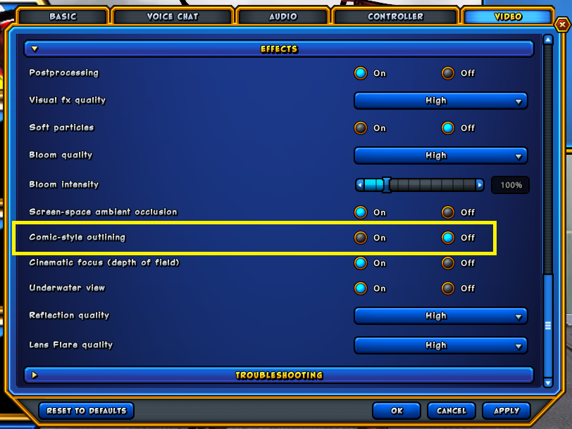
There are customers of that game that actually prefer the Comic Style Outlining. Why? I have no idea. I can't stand it myself, but when I do play I don't have to look at it cuz I have it turned off.
|
Which is why I think so many are unable to play it or even attempt to get any enjoyment out of it: because it just doesn't compare. Nothing is going to even come close to City of, not for the majority here. Nothing probably will. But such attitudes are likely killing your ability to find fun in any other MMO because of it, and that is a real shame.
|
I have about as much interest in Fantasy RPG MMOs as the government does in truly solving issues of "corruption". Maybe slightly less (if such a thing is possible). I still have friends trying to get me to come to WoW, talking about their level 80-something toons. Were I to overcome my dislike of FRPGMMO enough to just install it, I'd probably still not sub. That'd pretty much limit me to level 20. So playing with friend in World of Gearquest is pretty much out.
I'm NOT interested in PVP or "fighting" games (think Mortal Kombat platformers).
I'm NOT interested in playing on a console. And I'm not fond of compromises made to make a game console-friendly.
That basically means no DC. And is a big black eye for CO.
So CO?
- The art style and general aesthetic, is not only off-putting for me, it is actually nausea inducing.
- I'm not a fan of the blocking mechanic.
- The "break free" for status effects is attractive however.
- I'm a big non-fan of the Champions "universe". It's superhero pastiche with WAY too many expies and way too much tongue planted so firmly in cheek that it's fused with the aforementioned cheek.
- The online store is so ridiculously overpriced for so many things that I couldn't see myself using it much.
- Costume creation is a fricking mess. They took a straightforward masterpiece of the CoH costume editor and promptly screwed it up by turning it into a nasty, over-complicated mess of poorly explained controls, pointless alternate choices (like the cloth/metal/leather textures that, for most pieces, are virtually indistinguishable from one another), etc.
- Teaming in CO is, in politest possible terms, *********.
|
First off E-K I'm going to assume you don't know that you can do this
If you don't like the Comic Style Outlining and don't want to see it in the game, turn it off. No one is forced to use the Comic Outlining. There are customers of that game that actually prefer the Comic Style Outlining. Why? I have no idea. I can't stand it myself, but when I do play I don't have to look at it cuz I have it turned off. |
Although, as you said, some like it.
I was just reacting to that particular image and also wondering why that'd be the default appearance the developers decided upon.
Then again, clearly the entire visual style is just not for me, so what difference does it make, hehe!
Thanks though, Forbin.

and round up everyone that knows more than they do"-Dylan
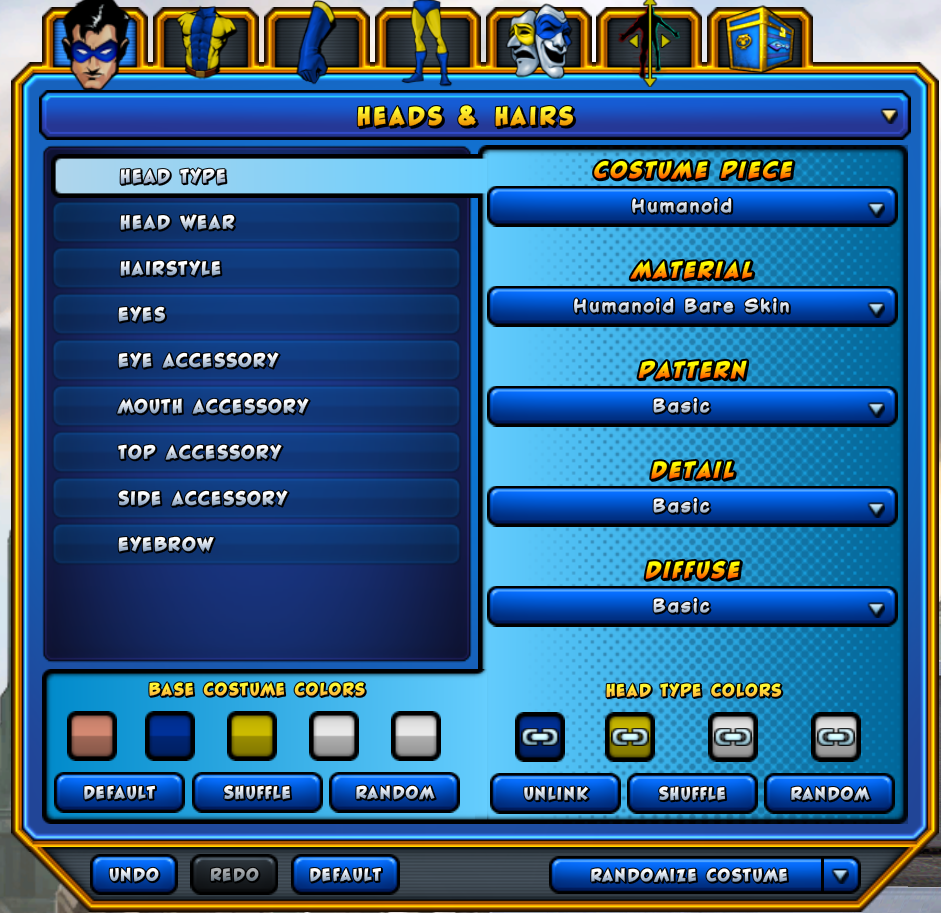
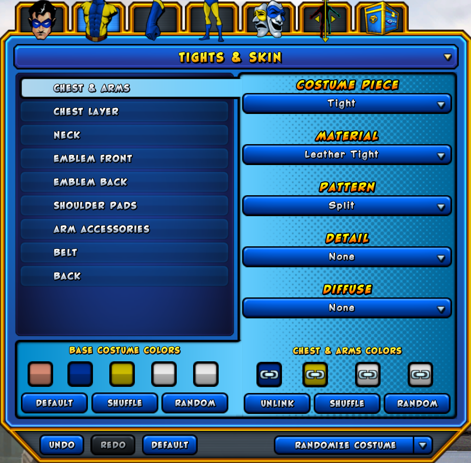
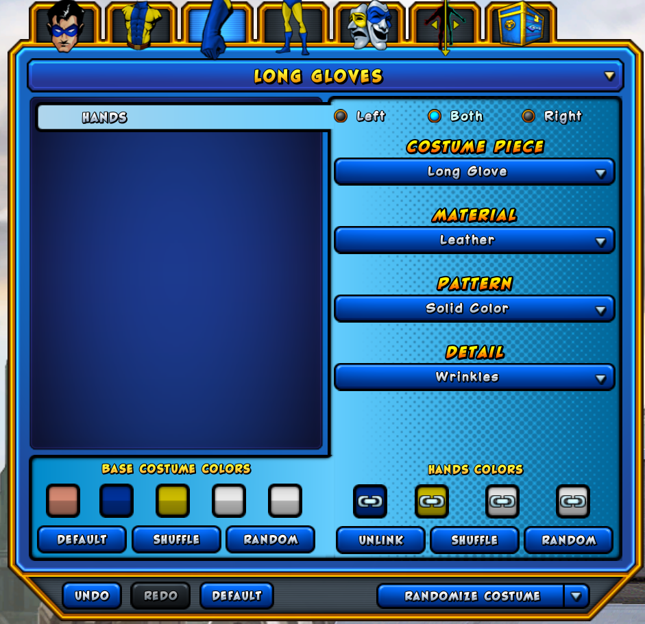
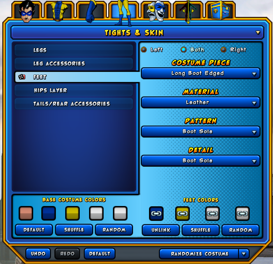
Their level of costume customization offers far more choices than anything we had in this game.
And did we ever have the ability to have up to 9 different colors on a costume piece?
Can we put emblems on our backs or on our capes? And patterns are not the same as emblems.
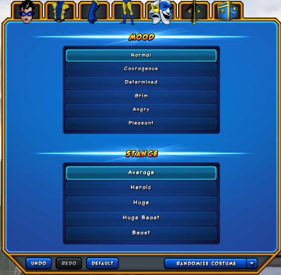
And when eactly was the last time anyone in CoH was able to customize their characters facial expression?
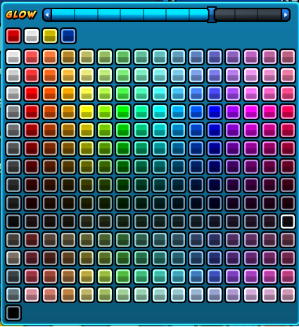
And how long was it before we got glowing costume pieces? Oh and are we able to control how brightly the costume pieces glow?
Now I'm not talking about the quality of the costume pieces appearence. Our costume pieces look a helluva lot better than CO's.
I'm saying if we had the features in their costume creator combined with the quality of costume design Dink and Sexy Jay put out we'd have had people subbing just for the joy of making characters.
|
I actually did know that (I knew I should have included that, hehe, any time this "feature" comes up, you/everyone/anyone has to make sure the person knows it can be disable... I mean, I agree, you have to make sure, because... yeah, it's nutty ridiculous! Haha).
Although, as you said, some like it. I was just reacting to that particular image and also wondering why that'd be the default appearance the developers decided upon. Then again, clearly the entire visual style is just not for me, so what difference does it make, hehe! Thanks though, Forbin.  |
But CO did do a better job designing a costume creator that has a lot more choices.
It's one of the very few things I give them credit for, and I wish the two could have been combined for our game.
I prefer the combat in ChO, and I find my characters feel more powerful there. The latter was not true at launch.
Overall, I prefer character/costume creation over here, though there are some nifty options nestled in ChO's obtuse UI. And we certainly get far more slots to make characters in by default over here.
And I like Superspeed and Teleport better in ChO, but I prefer Superjump over here. And Flight is about equal for me, though I do like that in ChO we can stand on a flying object and still use powers. But with all the extra travel options and the fact that they're not taking the place of a standard power selection I'd have to say ChO wins for me in Travel powers, too.
Back when Champions launched I chose to stay over here because of the character creation and the fact that my characters felt just as weak (if not weaker) over in ChO as here. Were the characters as sturdy in ChO now as then I probably would've stuck with ChO.
Goodbye may seem forever
Farewell is like the end
But in my heart's the memory
And there you'll always be
-- The Fox and the Hound
Don't the fairly successful games Borderlands and Borderlands 2 also use a cel-shader with outlines style? So somebody must like it or choose to ignore it.
Father Xmas - Level 50 Ice/Ice Tanker - Victory
$725 and $1350 parts lists --- My guide to computer components
Tempus unum hominem manet
Personal opinion, cell-shading sucks for immersion. It's dulls the perception of being part of the game.
"Samual_Tow - Be disappointed all you want, people. You just don't appreciate the miracles that are taking place here."
I tried CO a few days ago for the second time played for about an hour but just could not get a feel for the game unlike CoH which is why I have played it for over 6 years,yesterday I spent 7 hours downloading the free trial of Secret World, unfortunately I played it for about an hour and because of the controls all I could think of was GW1.It would seem all that time playing CoH has spoilt me as I just cannot get a feel for either of these games looks like my MMO play ends when CoH does,so I will have to find something else to fill the time until someone brings out something that has the feel of CoH ,even if its not a super hero MMO.Good luck to all in your search for a new MMO home
Prof Radburn controller,Celtic Ice Maiden,blaster,Miss Knockout scrapper,Mistress Davina controller,Stone Hart,tank Split Personality PB.Queen Lostris controller,Fridgid Mary blaster,Shocking Fire blaster Future Elfling defender, Little Weed controller,Capo Angelo MM, Commander Buzzsaw MM, Justice Tank tank all 50,s
My biggest problem is the lack of concept variety in CO powersets. I've said this before, but I think it bears repeating.
Let me use two of my CoH characters as examples. One is an Elec/Elec Blaster, the other is an Elec/Inv Brute. In CoH, they are entirely different characters with entirely different playstyles.
In CO, were I to try to recreate these characters, they'd be almost identical, because there's only one Electric powerset in CO. They'd have different Roles and different Passives, but they'd have the same attack powers.
And it's not just Electricity. In CoH, if you want to make, say, "a fire-based character", there's still lots of choices for powersets and playstyles (Fire Melee, Fire Armor, Fire Blast, Fire Manipulation, Fire Control, Fire Assault, and/or Thermal Radiation, plus the half-dozen fire-based Epic powersets, Flame/Fire/Blaze/Pyre/Heat mastery). In CO, if you want to make a fire-based character, you pick the Fire set, and that's it. You shoot fire.
Admittedly, what CO does better is not single-element themes, it's mixing and matching. If you want a character who shoots fire, lightning, and ice, while summoning support robots and stone golems, with Invulnerability as a defensive power, you can do that in CO. (The problem with mixing-and-matching, however, is that then you have to worry about which stats support what attacks, and a jack-of-all-trades with stats spread thin is weaker overall than a specialist with one really high Super Stat supporting all their skills)
My thoughts.
I only just started playing this game for a month or so, and the only reasons I am is
a) it is F2P after all, so why not.
b) I think its a good way to keep in touch with other CoH players, after all there is a CoX channel with over 600 members. plus I have played STO on and off for years, and the games talk with each other, good stuff there.
Its free, might as well try and make something work, even if its just a temporary thing until CoH V2.0 comes out and we all go over there instead.
I am the first to admit that CO... needs help, it does, now those who like it don't get all defensive, I am enjoying it so far! 
The costume creator gets you by, first time I started playing it though I was told that you get more options once you get a character up to lvl 10. not sure if that is still the case or not. DO use those body sliders, omg, I think i'm too used to CoH in that reguard 
With the graphics, just turning off the comic outlines and ramping the detail up to max made it very nice to look at, something my machine actually struggled with on CoH.
The power choices do seem limiting, but I haven't looked at doing free form or anything like that yet.
Travel powers are quite varied, they at least got teleport right, and during flight characters banked while turning (something we only saw on the issue 7 test server)
I will never never ever ever, like the blocking mechanic!!!
Gahh that is annoying. I created a behemoth just so I wouldn't have to put up with it as much.
Teaming is a little light, but I enjoy duo'ing with the misses. she helps keep my behemoth in check and she loves that her 'healer' also puts out a lot of damage 
I understand how some people say the animations are off. I think they are a touch, my character using a leap (which is like statesmans flying punch where you zoom towards your target, fist first) but in melee range, caused the weirdest animation i've ever seen, it reminded me of one of the moves from the Double Dragon game. Oh, and Jumping on a female character.. wtf O.o its like, oh look at me, im a dainty little flower!! (I keep the travel power on continuously just to get rid of that  )
)
I guess, think of it as CoH's younger sibling. its going to be an obnoxious but parts of it will aspire to be like its elder. It still needs time to mature.
Combat Kangaroos, Justice Server. First 50's
Jirra Roo Plant/Storm/Stone/Musculature Controller
Combat Kangaroo Rifle/Energy/Mace/Spiritual Blaster
Kung Fu Kangaroo Martial Arts/Reflexes/Body/Spiritual Scrapper
Tribal Arc Shield/Elec/Mu/Spiritual Tanker
I wish more people were clear on the distinction between "this is bad" and "I do not like this." CO is not a bad game (although it is definitely below its potential), but disliking it for not being CoH isn't a mark of quality, but preference.
Elsegame: Champions Online: @BellaStrega ||| Battle.net: Ashleigh#1834 ||| Bioware Social Network: BellaStrega ||| EA Origin: Bella_Strega ||| Steam: BellaStrega ||| The first Guild Wars: Kali Magdalene ||| The Secret World: BelleStarr (Arcadia)
|
I wish more people were clear on the distinction between "this is bad" and "I do not like this." CO is not a bad game (although it is definitely below its potential), but disliking it for not being CoH isn't a mark of quality, but preference.
|
Can you find me something that's universally and objectively bad?
CO is a bad game because it's an ugly game. I am allowed to call it bad because I consider a bad game. And, yes, I killed the black outline and had everything set to max.
Be well, people of CoH.




I'm not talking about running into buildings and such (troll much) I'm talking about how the characters look when the move. It's not as fluid as CoH. And the one uniform pose for flight looks silly. Just because I don't like the game doesn't mean I want to keep people from making it their choice game. Just stating my opinion. Like it or not CO won't measure up to everyone's standards. No amount of trolling (something I find very lacking about their community toward CoH players I might add) will change that viewpoint. And thank YOU for making it that much easier for me to uninstall it, again.