Informal Art Poll
|
Sometimes, the lack of texture actually works to the advantage . Yes, a bikini with "real strings" would be great, but then it would destroy the "bare" illusion I can get when I put it under an open jacket, like so:
|
It's probably glued down.

'Course, if that's a bikini top in that pic and the string just isn't visible because it's white, that's different. I suspect you can just switch to the Eden top though.

|
On the other hand, I can see where some folks might want the "body paint" option as an actual body paint option.
|
Assuming that having a bunch of painted toons running around wouldn't violate the whole "T for Teen" thing, of course.
My postings to this forum are not to be used as data in any research study without my express written consent.
|
If it was just a tidying up of old stuff, rendering them in higher res and so on, then I'd go for Option 1.
If though, there were any real changes, then it's Option 2 for me. I'm talking about things like the alterations to thigh high boots, or the "shinyness" added to many metallic pieces with Ultra Mode. If the changes are like this, then I would still want access to the old stuff. |
Difficult decision. While I'm tempted to say "Option 1" to improve the look of the entire game, I know from long experience that "improvements" to costume items actually means "removing options from the costume creator." I've had too many characters stuck with costumes I can no longer edit because they use costume items that no longer exist, such as the pointed ears from the "pointed ears" face.
My ideal solution would be to have every costume part examined on a case-by-case basis, having some entirely replaced (e.g., replace existing "body paint/patterns" with better "body paint/patterns") and some split into new and old versions (e.g., keep old Metallic as "Metallic Legacy" and add a shinier version as "Metallic Reflective"). I'm realistic enough to recognize that this won't happen, though.
Essentially, I don't mind improvements, but I don't want the look of a character completely altered because the art team's understanding of what a piece is meant to be doesn't match mine. For instance, I don't want to log into a character with the Steampunk pants one day to discover that they can no longer be matched with any kind of boot, no matter what color one tints the boot. (Incidentally, this isn't just a problem for older sets and mixing and matching; it's impossible to get the same look on Organic Armor boots, for example, as on the gloves in the same color.)
As a corollary of this point, while the new costume sets created over the past year and a half are excellent, I dislike the fact that they seem designed to work only as sets. For all their low-res-ness, one thing that the older pieces do well is work in a variety of combinations. Please, please, whatever you do to the costume creator, keep in mind that its role is not to give us the longest list of costume sets possible, but to enable us to pick and choose from individual pieces to create characters who may or may not use entire sets.
So, in the final analysis, I have to choose Option 2. Based on prior costume creator alterations, I believe the art team has a much more restricted understanding of how costume assets can be used that players do. To avoid interfering with player flexibility and to avoid more "orphan" costumes that can no longer be edited due to removal of entire concepts from the costume creator, leave what exists there.
That said, while I'm sure it'll strand dozens of my costumes, just as past changes have, I wouldn't consider going with Option 1 the end of the world, either. This is an important point to keep in mind as you make your decision; while most people probably have a preference one way or another, that preference may not be all that strong.
"Bombarding the CoH/V fora with verbosity since January, 2006"
Djinniman, level 50 inv/fire tanker, on Victory
-and 40 others on various servers
A CoH Comic: Kid Eros in "One Light"
|
This perfectly sums up why I'd be in favor of legacy updates. You guys are providing lots of great edge cases to consider--keep 'em coming. We want to be extremely cautious when touching old stuff, and to make sure that everyone walks away happy.
|
Either way, let it be known that you rock as Lead Art Dev, David.
Ya got any need for an intern?

|
GG, I would tell you that "I am killing you with my mind", but I couldn't find an emoticon to properly express my sentiment.
|
|
I would support this. In fact, I'd say that a lot of the "tight" legacy pieces could be ported into a menu called "body paint" and left basically as-is.
Assuming that having a bunch of painted toons running around wouldn't violate the whole "T for Teen" thing, of course. |
Will someone think of the children?!

|
GG, I would tell you that "I am killing you with my mind", but I couldn't find an emoticon to properly express my sentiment.
|
|
Thanks, David, for seeking our input!
This goes back to my running plea: standardized 'skins'. All pieces ideally should be able to be skinned with a standard set of skins such as: matte flat, shiny flat (spandexy), leather rough, metallic shiny, metallic reflective, etc.... This should be the ultimate goal and all updates working towards it. This would be the costume creator 2.0 that CoH needs to move towards to stay competitive; otherwise, what is the jewel in the CoH crown will be dismissed as "it's no All Points Bulletin costume creator." |
|
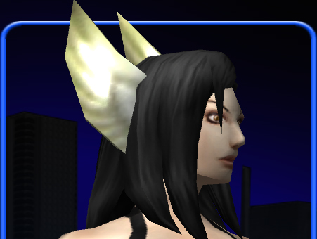
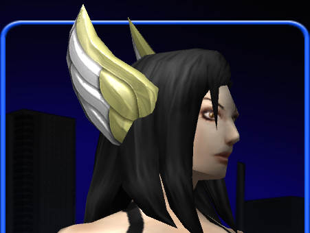
What if players have been taking the low-rez version and coloring it to be horn ridges or ear flaps? One of the advantages of the low-rez 'blurry' pieces were how they could be re-purposed. This brings me back to my point about 'skins' for pieces. It would be nice if there was a 'blank' skin that had no specific hi-rez texture precisely so that it can be colored to be almost anything. |
Apparently, I play "City of Shakespeare"
*Arc #95278-Gathering the Four Winds -3 step arc; challenging - 5 Ratings/3 Stars (still working out the kinks)
*Arc #177826-Lights, Camera, Scream! - 3 step arc, camp horror; try out in 1st person POV - 35 Ratings/4 Stars

|
I think the only 'rule' I'd advise is with the metal costume options. A 'matte' and 'shiny' sub-option for them would be good, because not all metal is shiny.
|
My main villain runs around the Isles in a tank top. It'd be very nice for it to have the stitching detail that you mentioned earlier, David. And while we're on the subject, what are the odds of us getting a teeshirt that isn't glued directly to the torso?

Main Hero: Chad Gulzow-Man (Victory) 50, 1396 Badges
Main Villain: Evil Gulzow-Man (Victory) 50, 1193 Badges
Mission Architect arcs: Doctor Brainstorm's An Experiment Gone Awry, Arc ID 2093
-----
|
Just so we're completely clear, the hypothetical 'new' pieces would look 100% identical at distance, use essentially the same geometry, and differ only in the sense that they look crisper/cleaner/sharper up close. There would be absolutely NO impact to a toon's theme because there'd be no discernable aesthetic change.
Would you really use the legacy asset w/ older, blurrier texture if a cleaner, sharper version was available to you? If so, I'd love to understand why you feel that way. |
If it is such a case where chrome is added or some other QUALITATIVE aspect (I would like to have more glow options like the resistance armor), option 2.
A game is not supposed to be some kind of... place where people enjoy themselves!
Voting for option one.
I'd vote for option 1, provided no changes were made to things like reflectivity or material type. If there was any significant change to the surface finish I'd want the old option to remain available since that can really mess up a costume... for instance, try matching "leather" and "cloth" items. Pick the same color for both and you still get a different tint on the leather so they clash.
Cascade, level 50 Blaster (NRG/NRG since before it was cool)
Mechmeister, level 50 Bots / Traps MM
FAR too many non-50 alts to name
[u]Arcs[u]
The Scavenger Hunt: 187076
The Instant Lair Delivery Service: 206636
Please do not replace things that look "painted on" with things that do not look "painted on". This is a change in basic function of a costume piece for anyone who has intentionally gone for the "painted on" look, which is actually fairly staple of real comic graphics.
So long as we're only talking about sharpening up edges on things that are currently blurry, I'm fine with option 1. The instant a change migrates over into changing the general appearance of something, changing its shape in any way form or manner, I'd want at least that change to be managed as option 2.
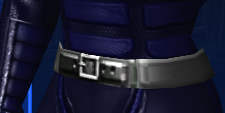
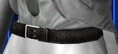
The belt example posted early in this thread is a great example of what I mean. That was not just a sharpening up - that texture change completely modified the feel of that costume piece. The old piece, with its blurry and shiny look, would fit well on a metallic or tech costume, whereas the newer one, which looks like a normal piece of clothing, would not.
Blue
American Steele: 50 BS/Inv
Nightfall: 50 DDD
Sable Slayer: 50 DM/Rgn
Fortune's Shadow: 50 Dark/Psi
WinterStrike: 47 Ice/Dev
Quantum Well: 43 Inv/EM
Twilit Destiny: 43 MA/DA
Red
Shadowslip: 50 DDC
Final Rest: 50 MA/Rgn
Abyssal Frost: 50 Ice/Dark
Golden Ember: 50 SM/FA
A game is not supposed to be some kind of... place where people enjoy themselves!
|
'Course, if that's a bikini top in that pic and the string just isn't visible because it's white, that's different. I suspect you can just switch to the Eden top though.
 |
.
|
Don�t say things. What you are stands over you the while, and thunders so that I cannot hear what you say to the contrary. - R.W. Emerson |
YUMMY Low-Hanging Fruit for BASE LUV

|
I would support this. In fact, I'd say that a lot of the "tight" legacy pieces could be ported into a menu called "body paint" and left basically as-is.
Assuming that having a bunch of painted toons running around wouldn't violate the whole "T for Teen" thing, of course. |
|
Violate...what? A body like a dress makers maniquin with no detail at all?
|
And you'll notice that I said "Assuming," which would tend to indicate that I would assume it wouldn't violate anything - but also that I don't put it past regulatory bodies to be random in their decision-making.
My postings to this forum are not to be used as data in any research study without my express written consent.
The loss of the old Gladiator shoulder is one reason I favor option 2. I realize that this also entailed a geometry change, so it might no be subject to the same considerations as stated in the OP.
Basically, I feel that the costume interface has already outgrown itself. I don't really like the idea of any sacrifice being made with an eye to extending it's life. Every time i go to get a geometrical chest emblem, I am reminded about how insufficient the system is.
All in all, I would rather have more options, even fugly ones, when making my costumes. I am sure that, even with the best intentions, there will be old pieces that I prefer.
Sermon
@sermon
One of Six, Cannibal 6
Sermon
@sermon
One of Six, Cannibal 6
I would go with Option 1. If nothing drastic is changed and it's just a texture touch-up, I don't see why anybody would complain.
Arc ID: 348998 - Becoming a villain
Arc ID: 373341 - To Save a Hero
Got Inf?
I vote for option 1, replacement. I would even say I'd be fine with core replacement of the art for the ones that are simple cleanups like your t-shirt example. I probably wouldn't be offended if my older costumes pieces were automatically changed. It's nice that you give us plenty of costume tokens to fix things with.
I can understand a few ultra popular pieces being left behind with updated secondary versions. The rest can vanish completely.
It can get rather tedious having to manually fix so many costumes on so many alts when 90% of the time I'd want the old replaced with the new.
A computer lets you make more mistakes faster than any invention in human history--with the possible exceptions of handguns and tequila. -Mitch Ratliffe, Technology Review, April, 1992
Yeah, I highly suggest visiting the Post Your Best Costume Designs thread (Although, it has tons of pages, so, for more recent ones, visit the later pages... do go through the whole thing over time though, it rocks!) and see the versatility that people get out of items (And also just because it is a great thread).
Regardless of the intention... Different is different. Better detail is detail that shifts away from versatility.
It is unavoidable and, frankly, I am surprised to see how many people vote for option 1 (Although, with David detailing how much and why he so wants that option 1 [and zero offense, David, I luvs ya], I'm not entirely surprised. That and... it's not like everyone pushes costume design to the extent of others).
I can see some case by cases basis... but, for the most part... any path an artist chooses for greater detail will lead to limiting the flexibility of an art item.
and round up everyone that knows more than they do"-Dylan
David:
After reading your clarifications, where the old textures are updated with higher resolutions without any other changes, I'd have to vote for option 1.
Caveat: Leave the lower resolution versions in the files for the graphics engine to reference when someone's computer is running lower resolutions or running under safe rendering mode, etc.
Caveat 2: Many costume pieces now look seamless when worn together. This *must* remain the case.
Fight The Clutter
I vote option 2


Is this going to affect my framerate? ;p
Dawncaller - The Circle of Dawn
Too many blasted alts to list, but all on Virtue.


at a must

re-order / alpha sort the darn things...
notable for me is fur shoulders with tights... no option
option 1 would be best for that... but could we get a legacy editor so to speak so if you have magic bolero and wings and go to tailor your options aren't replace costume entirely or keep as is?
So you could keep the legacy pieces that you no longer can access but still be able to change your costume in other areas or power customize
as it is... you try to tailor and poof half your costume goes
Saber Spectre Inv / EM Tanker on Guardian
Wraith Scimitar EM/ EA Brute on Guardian
Attack of the s00p3rphr34k ID 49744