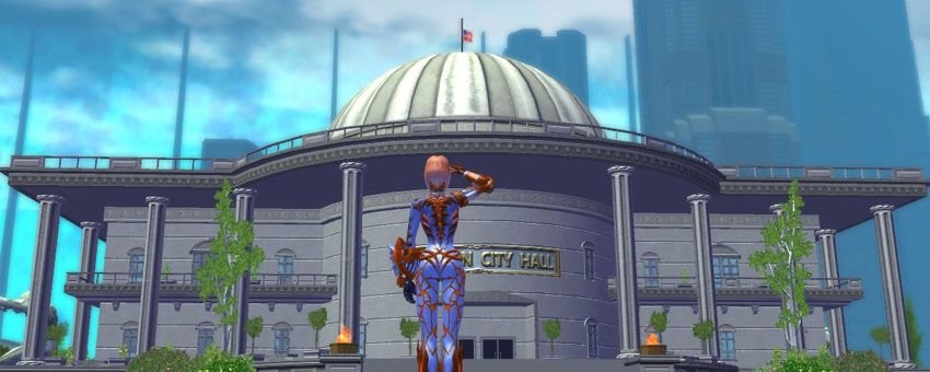
Statesman's Log-in Screen Flatness...
There's nothing wrong with Penny's pose 
It's a frigging comic book style piece of artwork!
While I don't care for Penny's face, the face gear or the white leggings of the outfit, it's still quite a great piece!
I hope to see more pieces! 
BrandX Future Staff Fighter

The BrandX Collection
I agree with BrandX regarding the pose. It's typical comic-faire.
Her face, though. It's just... off.
Overall the picture just strikes me as "swing and a miss" or coupled with her expression, sort of a playful punch to a buddy. It doesn't strike me as particularly threatening.
I don't care for this new screen at all.

Thank you, Champion.
|
http://maxiandapril.tumblr.com/
Two girls out to prove that those "ridiculous poses" aren't that ridiculous after all. My favorite is the one where she's showing off her new shoes. |

Oh yeah. Now that's some "boobs and butts" I can get behind!


I know some folks replace their log-in screens with custom screens, and stuff like that probably happens when they do, depending on the image they pick. I have never replaced mine, and having seen this screen, I now know that if I ever do, I want low-frequency clutter over by those UI elements.
Blue
American Steele: 50 BS/Inv
Nightfall: 50 DDD
Sable Slayer: 50 DM/Rgn
Fortune's Shadow: 50 Dark/Psi
WinterStrike: 47 Ice/Dev
Quantum Well: 43 Inv/EM
Twilit Destiny: 43 MA/DA
Red
Shadowslip: 50 DDC
Final Rest: 50 MA/Rgn
Abyssal Frost: 50 Ice/Dark
Golden Ember: 50 SM/FA
|
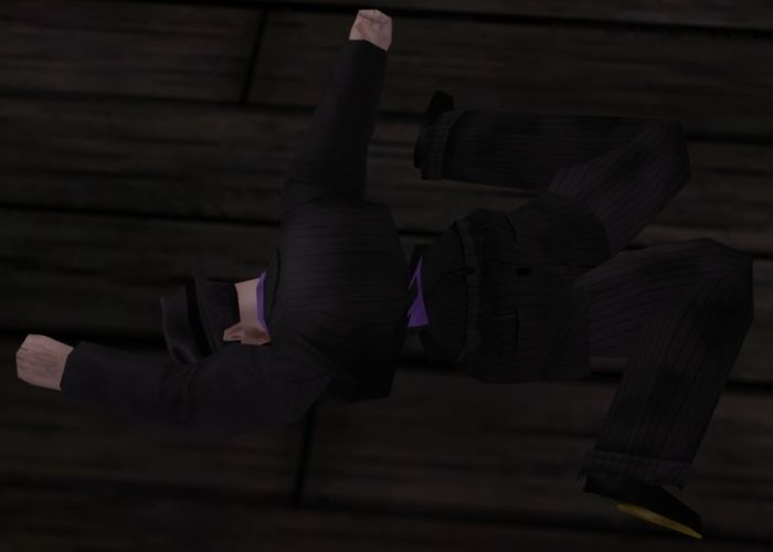
Hey, I just ran into something that put's Penny's pose in perspective. She's not trying to be sexy or awkward or anything like that. She's actually just mirroring the game, and she's doing a pretty good job of it. I mean, look at the pose of your average Marcone goon:
 See? Totally appropriate. |

Father Xmas - Level 50 Ice/Ice Tanker - Victory
$725 and $1350 parts lists --- My guide to computer components
Tempus unum hominem manet
|
http://maxiandapril.tumblr.com/
Two girls out to prove that those "ridiculous poses" aren't that ridiculous after all. My favorite is the one where she's showing off her new shoes. |
|
I actually dislike it for a reason that has nothing to do with the art, per-se. Having accessed it, I find it too busy. If you think about our last two load screens, the area to the right, where the input boxes and buttons are, has been white with no artwork. This one has visual clutter over by those UI elements - the "psi lightning", Penelope's leg, and transition between the sky and a building. For whatever reason, that bugs me.
I know some folks replace their log-in screens with custom screens, and stuff like that probably happens when they do, depending on the image they pick. I have never replaced mine, and having seen this screen, I now know that if I ever do, I want low-frequency clutter over by those UI elements. |
|
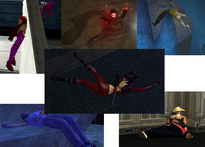
You sir have given me an idea. Why not have a collage for our next load screen?
 |
 What did you do to Bellarose? I remember having a collection of those, but this was back before the ragdolls acted like literal ragdolls.
|
Samuel_Tow is the only poster that makes me want to punch him in the head more often when I'm agreeing with him than when I'm disagreeing with him.
|
Speeding Through New DA Repeatables || Spreadsheet o' Enhancements || Zombie Skins: better skins for these forums || Guide to Guides
|
Samuel_Tow is the only poster that makes me want to punch him in the head more often when I'm agreeing with him than when I'm disagreeing with him.
|
the problem is regarding them as poses
Take a still frame of Bruce Lee fighting, then call it a pose and it will be ridiculous
People moving adopt endless ridiculous poses - because they are not poses, they are part of moving.
The official marvel drawing style (at least back in the day) was to draw the most extreme part of the action so that you got the sense of action.
A person punching should not look like a person standing around.
OK Let's try an experiment.
Young Penelope:

Grown up Penelope:

There's actually a couple things that bother me about Penelope's new story now. One is how to explain my own toon's aging process to compare Yin's sudden growth development. She was a young kid... now she's an adult. My toon has got to be at least 5 years older now. Makes it hard for Us RPers out there to explain that one...
Then there's the portrayal of her in the SSA Arcs themselves. She shows up as a newbie heroine and a mission or two later, she's deflecting godlike beams of energy. For all your efforts you get a press conference. She gets into the Freedom Phalanx.
Now she's going to be respeccing I guess, switching powersets or what not, so she can be Psychic Melee, give her own TF and now is appearing on a load screen. I'm afraid people are just gonna get tired of her real fast. For all the efforts of making our toons the center of attention, having this NPC suddenly reach ultimate "bad assery" just makes it seems like going in the opposite direction.
And.... her costume needs work...
Maybe the devs can come up with a storyline for her though that involves the Clockwork King again. I'd like to see what he's been up to lately and what he thinks about his princess running around in skintight underoos.
Haha, ahhhh the classic "breasts and butt" pose.
It wouldn't be a comic book game without it.
I think the stomach window is hilarious though.
Note to devs: No. I do not want the next costume alteration to be a Yinkini.
|
Maybe the devs can come up with a storyline for her though that involves the Clockwork King again. I'd like to see what he's been up to lately and what he thinks about his princess running around in skintight underoos.
|

@Golden Girl
City of Heroes comics and artwork
|
OK Let's try an experiment. Young Penelope vs. Grown up Penelope
|
|
There's actually a couple things that bother me about Penelope's new story now. One is how to explain my own toon's aging process to compare Yin's sudden growth development. She was a young kid... now she's an adult. My toon has got to be at least 5 years older now. Makes it hard for Us RPers out there to explain that one...
|
|
Then there's the portrayal of her in the SSA Arcs themselves. She shows up as a newbie heroine and a mission or two later, she's deflecting godlike beams of energy. For all your efforts you get a press conference. She gets into the Freedom Phalanx.
Now she's going to be respeccing I guess, switching powersets or what not, so she can be Psychic Melee, give her own TF and now is appearing on a load screen. I'm afraid people are just gonna get tired of her real fast. For all the efforts of making our toons the center of attention, having this NPC suddenly reach ultimate "bad assery" just makes it seems like going in the opposite direction. |
I don't know... It'd be nice to look at, what with her pale skin, and at least it would be honest.
|
Samuel_Tow is the only poster that makes me want to punch him in the head more often when I'm agreeing with him than when I'm disagreeing with him.
|
|
I don't know... It'd be nice to look at, what with her pale skin, and at least it would be honest.
|

@Golden Girl
City of Heroes comics and artwork
From an RP stand point, Penny's been aging this whole time. So the question is really, how old was Penny when your character entered the scene.
You did a low level story arc that was created ages ago. I know as an RPer, I've RPed Penny being an adult for quite awhile now, when she's both grown up in GR and the devs have said she was college age now, here on the forums.
BrandX Future Staff Fighter

The BrandX Collection
|
While I wouldn't go quite this far, I simply find her costume chaotic and vastly over-done. Zippers, buckles, belts, padding, midriff, multiple colours, face plates AND face paint, and none of it really feels like it follows any rhyme or reason, at least not such that are easy to determine at a glance.
|
I would easily see a rookie hero putting together a busy outfit that'd belong in a JRPG.
I'd love some JRPG options myself. I do love the look of a group of belts hanging loose on one side of the hips.
I sit in my zen of not being able to do anything right while simultaniously not being able to do anything wrong. Om. -CuppaJo
It is by caffeine alone that I set my mind in motion. It is by the beans of Java that thoughts acquire speed, the hands acquire shaking, the shaking becomes a warning. It is by caffeine alone that I set my mind in motion.
|
OK Let's try an experiment.
Young Penelope:  Grown up Penelope:  <snip> |
Apparently she developed early, and needed some time to grow into them.


|
Samuel_Tow is the only poster that makes me want to punch him in the head more often when I'm agreeing with him than when I'm disagreeing with him.
|
|
Yes, but again - we're delving into the territory of intentionally bad. I respect David so I don't want to bring Yahtzee down on him, but let's just say that even if an intentionally bad costume makes an ironic statement, it's still bad. And this is twice as notable because Penny is getting such a push that it feels like she's cheating. People WILL latch onto any obvious defect she has, and an ironically bad costume is a primary one such.
|
BrandX Future Staff Fighter

The BrandX Collection
|
When all they have to do is make the white leggings, black, and the costume is no longer bad for many!
|
Why didn't I think of that?
|
Samuel_Tow is the only poster that makes me want to punch him in the head more often when I'm agreeing with him than when I'm disagreeing with him.
|
WHy the change to her face anyway? The original Penny had a better face.
BrandX Future Staff Fighter

The BrandX Collection


I do not like the new splash screen. The pose looks silly, even if it is anatomically possible.
I would like it better if they gave Penelope a top hat. I think that's all that's missing from her costume.