Retro Sci Fi Costume Set: Space Suits! - Vote for what we make!
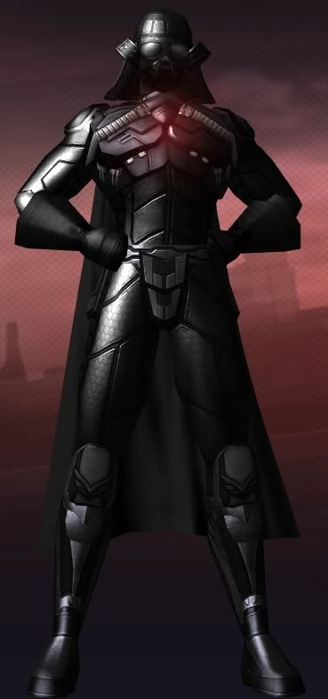
Option A looks the most like a retro space suit. Option B's glowing lines would make it look too much like Tron, and option C looks a little too much like powered/robotic plate armor than a space suit.
Loth 50 Fire/Rad Controller [1392 Badges] [300 non-AE Souvenirs]
Ryver 50 Ele� Blaster [1392 Badges]
Silandra 50 Peacebringer [1138 Badges] [No Redside Badges]
--{=====> Virtue ♀
If we are to die, let us die like men. -- Patrick Cleburne
----------------------------------------------------------
The rule is that they must be loved. --Jayne Fynes-Clinton, Death of an Abandoned Dog
|
Option A looks the most like a retro space suit. Option B's glowing lines would make it look too much like Tron, and option C looks a little too much like powered/robotic plate armor than a space suit.
|
Totally went for B for the tron-ness of it
"Play Nice and BEHAVE! I don't want to hear about any more of your shenanigans brought up in our meetings at Paragon"-Ghost Falcon @Tritonfree @Philly's 2nd Convenient CIGAL BoBC/INOANN Arts&Crafts Sporks
Average Joes FAP THE MENTOR PROJECT Justice Events
A with B shoulders and C knees. I like the bendy-straw like joints.
I am the Blaster, I have filled the role of Tank, Controller and Defender
Sometimes all at once.
Union EU player! Pip pip, tally ho, top hats and tea etc etc
I like the style of C, but the glow effect of B.
Buy Eben Brooks' new CD Geek Mythology, with four City of Heroes/City of Villains themed filk songs, for only $10!

Loth 50 Fire/Rad Controller [1392 Badges] [300 non-AE Souvenirs]
Ryver 50 Ele� Blaster [1392 Badges]
Silandra 50 Peacebringer [1138 Badges] [No Redside Badges]
--{=====> Virtue ♀
Yeah, I'm gonna add to the lots of people who would love to have the chest detail from A as an option. But i picked B 'cause I felt the pieces would be a lot more versatile in different costume combinations.
"...his madness keeps him sane.": My Profile on VirtueVerse
Can You WIN the Internet? MA Arc #85544
Inhuman Resources - At Work with IE #298132
Task Force Mutternacht #349522 <-- 1st AE Challenge
C, with B's glowy parts (or at least the option)
"I play characters. I have to have a very strong visual appearance, backstory, name, etc. to get involved with a character, otherwise I simply won't play it very long. I'm not an RPer by any stretch of the imagination, but character concept is very important for me."- Back Alley Brawler
I couldn't agree more.
I'd go with C. It's the most interchangeable, allowing for more than just the intended use.
It would double as armor. Any kind of armor from a suit to a robot.
Edit: Switching to B.


Well i voted b cause i like glowies and main structure of B. the chest thing on A should be a chest detail IMHO for all of them. and i also prefer the gloves and boots on A.
B, without a doubt. C looks too much like some of the other armored/robotic/metallic parts we already have, and B has the slightly-oversized gloves (want).
Please try MA arc ID 351455, "Shard Stories: Scavenger's Hunt." Originally created for the Dr. Aeon contest, it explores the wild potential of one of the City's most concept-rich but content-poor settings: the Shadow Shard.
I voted for A but there are parts from all three that I like. Mooshing together bits of A and C would work well.
I had to go with B for the glowy lines but I do love the boots and gloves from C quite a bit.
Sorry but for me, glowy lines > ringy gloves & boots.
www.doomheroes.com
Looking at B, I was wondering if maybe we could get a Stripe 5 for torsos out of it, assuming it wins. (noting again that Stripe 4 is still only available for Male, but not Female and Huge torsos)
Look at where the padding/ribbed glow part outlines. Seems like it would be a nice simple pattern line.
I already mentioned this Facebook but I'll repost my thoughts here: Option B's side panel-quiltiing looks extremely similar to the side-panel quilting in the Stealth set we already have. I just see way too similarities between that set and this draft image to vote for B.
Ideally I prefer C - if only because it looks more metallic/spacesuit-y. I can almost imagine that suit would/could look very Buck Rogers if the shiny texture is done right.
EDIT: But don't let my opinion sway you. 
and round up everyone that knows more than they do"-Dylan
A, please. And thanks for letting the voting run till my birthday.
I ultimately went B. All of them have their pros, but I personally felt the torso especially was a bit too "armory" on C and thus partially replicated a costume option we already have represented. I liked the sleekness of A more than B, but I felt B provided the most novelty in terms of expanding the costume space. I also felt that while the gloves and boots were not quite as stylistic as A or C, they would also be most likely to be reusable in other costumes.
All just my opinion of course.
[Guide to Defense] [Scrapper Secondaries Comparison] [Archetype Popularity Analysis]
In one little corner of the universe, there's nothing more irritating than a misfile...
(Please support the best webcomic about a cosmic universal realignment by impaired angelic interference resulting in identity crisis angst. Or I release the pigmy water thieves.)
|
About Design C ...
When I look at Design C, I don't see a Sci-Fi "space suit" so much as I see a Space 1899 Knight In Plate Mail Armor. It looks like something more fit for robotics than humans, and makes for a much better ARMORED look than either A or B. I'd even go so far as to say that Design C would make a good start for a Medieval Costume Set (minus the Sci-Fi bits on the Gloves and Boots). I just look at Design C and think "metal plates" for some reason. |
My favorite parts were tied to my least favorite parts.

I'd find it much easier to vote on this costume piece if I knew what parts of the item were affected by color selections. For instance, do the glowing lines on B take the color of the rest of the suit, only glowing, or do they take the other color selected?
Put more simply, could we have a variation on the picture in highly-contrasting colors such as bright red primary/bright blue secondary to help us make this decision?
Thanks for working so closely with the fan community on this, development people!
"Bombarding the CoH/V fora with verbosity since January, 2006"
Djinniman, level 50 inv/fire tanker, on Victory
-and 40 others on various servers
A CoH Comic: Kid Eros in "One Light"

 there needs to be an option D


 I just got excited and wanted to share.

Please don't try to influence other people's votes. We want for everyone to vote their own preference (if there was an option to do this completely blind, we would).
Please try my custom mission arcs!
Legacy of a Rogue (ID 459586, Entry for Dr. Aeon's Third Challenge)
Death for Dollars! (ID 1050)
Dr. Duplicate's Dastardly Dare (ID 1218)
Win the Past, Own the Future (ID 1429)