Art Poll: Signature Characters
|
Samuel_Tow is the only poster that makes me want to punch him in the head more often when I'm agreeing with him than when I'm disagreeing with him.
|
Foreshadow has higher quality parts than anyone, BUT I wouldn't say his design is the most iconic.
Personal top 3 guys;
1. Recluse
2. Noble Savage (Asymmetry!!)
3) Black Scorpion
Best NPC non-sig?
The Olympian Guards
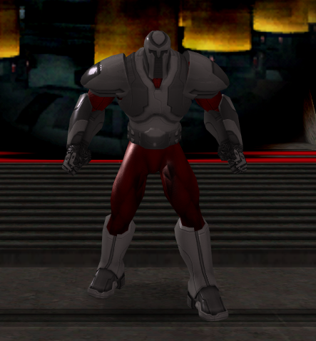
These guys just RADIATE faceless menace. (And god do they deliver >_< )
|
GG, I would tell you that "I am killing you with my mind", but I couldn't find an emoticon to properly express my sentiment.
|
I'm gonna agree with Foreshadow, both the original and in-game designs. It gets across the image of young, determined man who kicks PANCAKEPANCAKEPANCAKE with feet and chi.
[edit]...it seems we have a new profanity filter. Well played, mods. /slowclap
What shall claim a Sky Kings' Ransom?
PPD & Resistance Epic Archetypes
I voted Mirror Spirit and Foreshadow back on like page 3 or something. I'll stick with that.
Dr. Vahzilok and The Television.

As for the helmet, I think that's actually a regular helmet with regular horns but a unique face plate. The Roman Armour set comes with its own face plate for Half Helmets, and I just think that Rommie gets his own, fancier one. And, yes, I would want this, too.
 These guys just RADIATE faceless menace. (And god do they deliver >_< ) |
 I hadn't seen those before, but I agree - THIS is faceless menace in its purest form. Awesomesauce!
I hope more people have this reaction so we can get rid of this stupid meme quicker.
|
Samuel_Tow is the only poster that makes me want to punch him in the head more often when I'm agreeing with him than when I'm disagreeing with him.
|
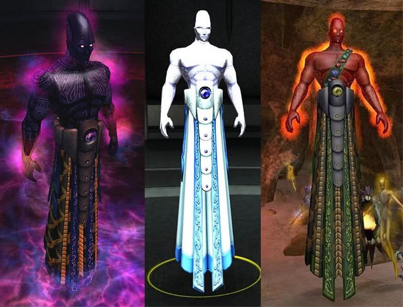
I vote for the Rularrus, awesome costume and concept, you know already they are some kind of powerful beings.
[center][IMG]http://i1111.photobucket.com/albums/h461/cohroguemagazine/Logos/sig.png[/IMG][/center]
[center][size=1][color=#FF99CC][font=Tahoma] GLOBAL: @Antoinette |[/font][/color][color=#FF99CC][font=Tahoma] MAIN: [/font][/color][url=http://www.virtueverse.net/wiki/Pinkrise][color=#FF99CC][font=tahoma]Pinkrise[/font][/color][/url][color=#FF99CC][font=Tahoma] | SG: [/font][/color][url=http://www.wix.com/netherealist/spitfire][color=#FF99CC][font=Tahoma]The Ethereals [/font][/color][/url][font=Tahoma][color=#FF99CC] | PROJECTS: [/font][/color][url=http://cohrm.wordpress.com][color=#FF99CC][font=tahoma]Rogue Magazine [/font][/color][/url][/size][/center]
Best male design .... difficult to choose just one, but I'll go with Nemesis.
***
I see there's a lot of love for Mirror Spirit and Foreshadow. Personally, I think Mirror Spirit has a beautifully done model, but I hate the washed-out color choices, the mismatched textures, and the overly busy design. I would have no idea she has a convoluted anime backstory about changing from good to evil or something (still not real clear on it) if I hadn't read it when City of Hero came out.
Foreshadow is more interesting in that he appears to be what one would get if one asked Apple Computer to outfit a superhero, but I don't think that's what his look is supposed to convey.
I wonder if what really appeals to people about these designs is that they're supposed to reflect manga, which I really, really don't care for, personally. Please don't take away from this thread that "the players want everything manga-style!" That's already a strong influence on the art style of several other MMO's, and I'd prefer CoH to remain more unique, for the most part (a manga-faction or two is fine, and I think we have one now in the new Circle of Thorns). Options are fine, but don't discount the value of more classical designs.
"Bombarding the CoH/V fora with verbosity since January, 2006"
Djinniman, level 50 inv/fire tanker, on Victory
-and 40 others on various servers
A CoH Comic: Kid Eros in "One Light"
|
...Please don't put a lower boundary that "Your piece must be at least this---> awesome to be made." Not every piece you make has to turn heads.
|
--This has never been, nor will it ever be the way we evaluate pieces. We make sets according to a theme, and that's ultimately what helps decide reflectivity levels.
--I've heard plenty of requests for a matte Metallic option, so I will pitch that to the team. Cheers.
David Nakayama, Lead Concept Artist
COH Concept Art Gallery now open at http://pixelsaurus.deviantart.com/
|
...Best NPC non-sig?
The Olympian Guards  These guys just RADIATE faceless menace. (And god do they deliver >_< ) |

David Nakayama, Lead Concept Artist
COH Concept Art Gallery now open at http://pixelsaurus.deviantart.com/
|
These guys are meant to be souless, pumped-up versions of Cole. Glad that's working for you.
 |

|
GG, I would tell you that "I am killing you with my mind", but I couldn't find an emoticon to properly express my sentiment.
|
Best Male: Hero 1, simple but really effective
Best Female: After Ghost Widow, I'll throw my 2-cents in for Dominatrix
Certified: Altaholic as defined by Memphis_Bill since 2005
Coming to you from a galaxy far, far away...
|
We've been on the subject a while, and I've said pretty much all I can on the topic, but to recap:
--This has never been, nor will it ever be the way we evaluate pieces. We make sets according to a theme, and that's ultimately what helps decide reflectivity levels. --I've heard plenty of requests for a matte Metallic option, so I will pitch that to the team. Cheers. |

I know we've been over the "shininess" argument quite a few times, and I can see how you may be more than a little tired of it. And I can't really blame you, we do tend to go on, especially the TechBot and I, it seems. We share a pet peeve, maybe?
 So no worries here. You've handled the thread marvellously from where I'm sitting, and I look forward to your future posts.
|
Samuel_Tow is the only poster that makes me want to punch him in the head more often when I'm agreeing with him than when I'm disagreeing with him.
|
Best male design? ... That's really a toss-up for me. I like Nemesis' design a lot, but the various aspects of Rularuu are also favorites.
I really don't think I can choose between them. They're equally interesting and distinctive from a visual point of view and also equally tell you pretty much exactly what you need to know about the characters in question.
@Brightfires - @Talisander
That chick what plays the bird-things...
Best Male: Hero 1 (He has an iconic look that just says who he is)
2nd place Male: Recluse (He looks like evil incarnate when you see him.)
2nd Place Female: Mirror Spirit (An amazing look that lets you know who she is just from a glance.)
|
Yeah, David, I have to side with the others here - "metal" isn't always synonymous with "reflective." Off the top of my head (and with the help of about 60 seconds of Google image search), I can come up with the following examples of non-reflective metal: an M1A2 Abrams main battle tank, a Komatsu D575A superdozer, a ye olde wood stove and a run-of-the-mill shipping container. What you have to remember here is that you're not just making brand spankin' new shiny tech that just came out of the spray booth. Some of these metal armour suits have been through hell and back and would be scratched up, dinged up, dirty, rusty, dented and otherwise worn out. Not all of them have to look like they stepped out of an art deco paining.
|
I don't think the art team is fixated on shiny and ornate costume pieces so much as the advances in rendering technology is allowing them to add the costume pieces that they couldn't do in the past because the rendering engine wouldn't support it. Look back at the costume pieces that were available when CoH released; you had 'Metallic' and 'Medieval Armor', and that was pretty much it for 'shiny'. All of the other metal pieces were dull and flat, sometimes -- as with the 'steampunk' pieces, to such a degree that they soak up any color you try to apply to them.
Consider also that a character's costume is supposed to be iconic; which hero presents a more compelling figure -- the one who is clad in polished, gleaming armor, or the one that looks as if he barely survived his last fight, with dents and scrapes and rips and tears all over? It's one of the tropes of the superhero genre that damage to your costume disappears when it's no longer significant to the plot.
I expect that, once the art department has gotten over the first flush of 'look what we can do now', they'll go back and address some of the other issues people have raised about the costume items. In the meantime, if you don't like them, don't use them.
"But in our enthusiasm, we could not resist a radical overhaul of the system, in which all of its major weaknesses have been exposed, analyzed, and replaced with new weaknesses."
-- Bruce Leverett, Register Allocation in Optimizing Compilers
@Golden Girl
City of Heroes comics and artwork
|
The ones mentioned the most so far are Statesman and Foreshadow.
|
His Korean Costume, the one he showed up in the Cinematic trailer with?
Or the.. ahem... THING... he got shoved into because somebody in marketing thought his Korean look wouldn't go over well outside of Korea?
|
Can we call it? Is it safe to say that Ghost Widow is the single most compelling character design in the game, as voted by the COH forums? Reading through all the posts, I don't think we can make any conclusions about single best Male character design, but Ghost Widow appears to get the trophy for "Favorite Design" and "Favorite Female Design" by a pretty wide margin.
Wonder if it's possible to identify a "Favorite Male Design"? Or a 2nd favorite female design, since GW ran away with the top spot. |
I like the new look for Mother Mayhem as well. It fits her well with the slutty look that suits her desire to be "loved by everyone", whether they want to or not.
My actual favorite female character design is Numina. I like the semi-transparent look very much, and she also has a relatively simple functional outfit. Gravity powers are just cool too(if I remember correctly that she has them).
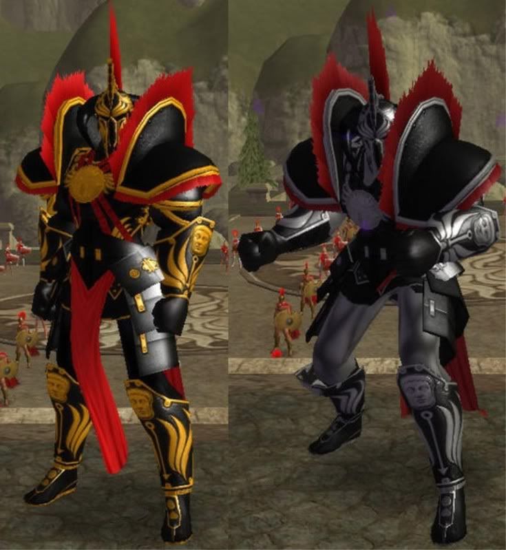
As for favorite male design, it has to be Tyrant-Emperor Marcus Cole in his golden armor. It really suits his actions and personality while also being one very nice outfit, which looks functional yet again. I would love those gauntlets and shin-guards around his forearms and shins for my own character as well as the chest-plate.
Why can't we have rather simple and smooth metallic armor pieces like that?
It would be awesome especially if we had a lot of texture options for putting something like metallic versions of the chest emblems on both the chest-plate and gauntlets and shin-guards.
I would so pay for that in the new Paragon Market immediately.
"Just take my money, please just give me those costume pieces! I'm begging you!"
I'm definitely a sucker for simple-fancy outfits that look like they would actually be comfortable and easy to fight in. That's why I use the metallic tights most common, fancy and shiny yet simple and comfortable(I imagine it as a sort of liquid metal skin). I also love sleek non-segmented armor pieces.
Edit:
This is what I absolutely NEED:
http://wiki.cohtitan.com/w/images//0/0a/Tyrant.png
That armor is absolutely amazing. Maybe the shoulders are a bit bulky, but I want the chest-piece, gauntlets(or are they bracers?) and shin-guards, without being stuck with the leather boots underneath on any of those pieces please(I want my own under-layer).
I would love to put them on the current segmented full metallic tights, or a new non-segmented version(yes please).
Please!!!!!????? Pretty please with sugar on top and a cherry!?
Edit 2:
I actually like the way the metallic tights look most with reflections off as a graphical option. It looks more like actual metal, more of that "matte metal" look you(Noble Savage) were posting about(in my opinion). I prefer that metallic look over anything else, with a close second being the widow tights that don't change with reflection settings but seem slightly too shiny so that you lose the detail of the contours.
I would love the same sort of "shine" of the basic metallic tights to be applied to those smooth armor pieces like those Emperor Cole-Tyrant has if/when we get them.

Pleas and thank you from the bottom of my heart if I can at least purchase these armor pieces in a booster/paragon market a.s.a.p. for use with metallic tights.
|
Can we call it? Is it safe to say that Ghost Widow is the single most compelling character design in the game, as voted by the COH forums? Reading through all the posts, I don't think we can make any conclusions about single best Male character design, but Ghost Widow appears to get the trophy for "Favorite Design" and "Favorite Female Design" by a pretty wide margin.
Wonder if it's possible to identify a "Favorite Male Design"? Or a 2nd favorite female design, since GW ran away with the top spot. |
Spark Blade's gotta be my favorite male character design.
Shame he's not in game, thought understandable.
Click here to find all the All Things Art Threads!



|
|
|
See him? I want his shoulders. Preferably without the shoulder fur. Just those shoulders.