Art Poll: Signature Characters
Oh don't get me wrong ... Belladonna has a great story behind her making her a wonderful character. But the *LOOK* she presents when you see her isn't really telling you that story. Belladonna doesn't have an *iconic* appearance, like her counterparts do. She *is* however very well suited for the environment she lives in (she's hunted and on the run) and her appearance matches up very well with living the life of a scrounger, so everything "fits" in very well with her story and circumstances. It's just that she isn't visually arresting in the way that Ghost Widow and Sister Airlia are.
Belladonna Vetrano has a relatively "normal" human appearance (as she should!) ... while Ghost Widow and Sister Airlia are flat out EXOTIC.
Case in point ... the most exotic thing about Belladonna Vetrano's appearance is the fact that her face is asymmetrical.

David Nakayama, Lead Concept Artist
COH Concept Art Gallery now open at http://pixelsaurus.deviantart.com/
|
David, on the topic of the reflectivity of new costume pieces, I noticed some time ago that the Valkyrie swords that came with the Apple version (and later to the rest of us) used to be reflective like the costume pieces. At some point, the swords went back to being matte and I was wondering if that was intentional? They used to be really fabulous.
|
David Nakayama, Lead Concept Artist
COH Concept Art Gallery now open at http://pixelsaurus.deviantart.com/
Ok tweaked some more stuff for a very stylish option. On the lower part, the first pic is regular cut, it's traditional panty, and the second one is called Boy Cut, because it's almost like shorts.
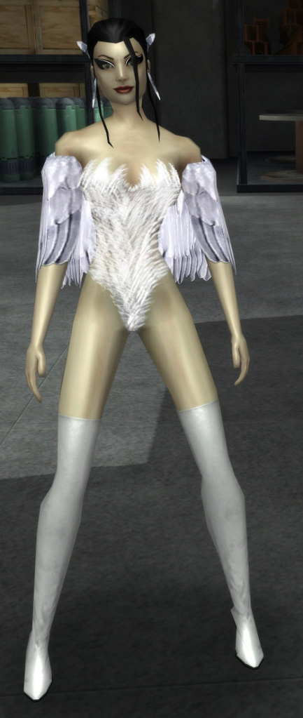 or
or 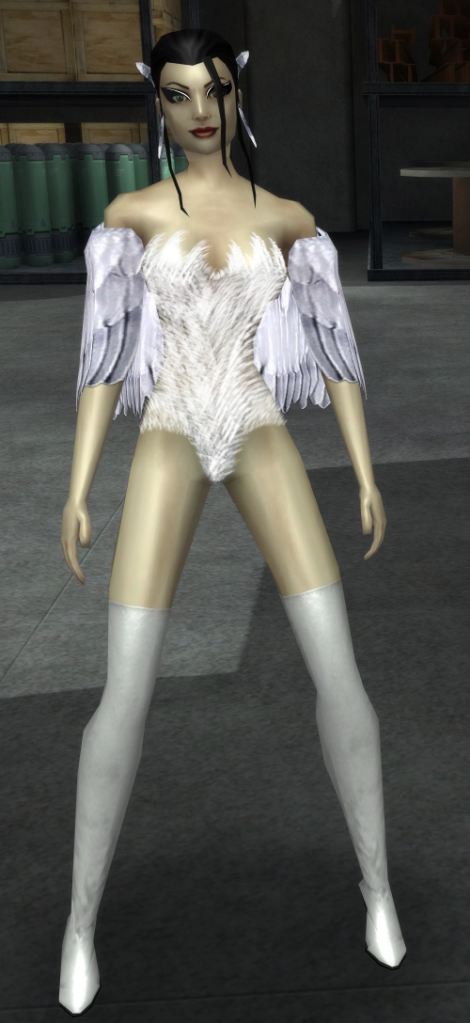
[center][IMG]http://i1111.photobucket.com/albums/h461/cohroguemagazine/Logos/sig.png[/IMG][/center]
[center][size=1][color=#FF99CC][font=Tahoma] GLOBAL: @Antoinette |[/font][/color][color=#FF99CC][font=Tahoma] MAIN: [/font][/color][url=http://www.virtueverse.net/wiki/Pinkrise][color=#FF99CC][font=tahoma]Pinkrise[/font][/color][/url][color=#FF99CC][font=Tahoma] | SG: [/font][/color][url=http://www.wix.com/netherealist/spitfire][color=#FF99CC][font=Tahoma]The Ethereals [/font][/color][/url][font=Tahoma][color=#FF99CC] | PROJECTS: [/font][/color][url=http://cohrm.wordpress.com][color=#FF99CC][font=tahoma]Rogue Magazine [/font][/color][/url][/size][/center]
|
I am honestly hard pressed to decide which of these two is better designed and more ... signature ... in appearance.
|
I do agree the Praetorian version has silly shoulders though.
 And its hard for me to think of her as GW's counterpart visually. I almost wish she was an actual ghost (the transparent green radiating kind) just so she could sort of tie into the general theme of her variations rather then just be the "girl who lived" version.
Want better looking NPCs Contacts? Check out this NPC Contact/Trainer/Etc Revision Thread and Index
-
Remember: Guns don't kill people; Meerkats kill people.


A statement like that is dishonest at best.
Yes, I get it, some people don't like 'fantasy' armor. But you know what? I like them. It was a hole in the costume creator that now is getting filled.
Now for some proper chain mail and I'm all set.
@True Metal
Co-leader of Callous Crew SG. Based on Union server.
[center][IMG]http://i1111.photobucket.com/albums/h461/cohroguemagazine/Logos/sig.png[/IMG][/center]
[center][size=1][color=#FF99CC][font=Tahoma] GLOBAL: @Antoinette |[/font][/color][color=#FF99CC][font=Tahoma] MAIN: [/font][/color][url=http://www.virtueverse.net/wiki/Pinkrise][color=#FF99CC][font=tahoma]Pinkrise[/font][/color][/url][color=#FF99CC][font=Tahoma] | SG: [/font][/color][url=http://www.wix.com/netherealist/spitfire][color=#FF99CC][font=Tahoma]The Ethereals [/font][/color][/url][font=Tahoma][color=#FF99CC] | PROJECTS: [/font][/color][url=http://cohrm.wordpress.com][color=#FF99CC][font=tahoma]Rogue Magazine [/font][/color][/url][/size][/center]
|
You are right of course. I guess what I meant is that we'd want to draw a contrast between the modern stuff (more shiny and reflective) and the "older"/ historical stuff. Would still have some shine, but I'd downplay it just a bit.
|
What we the players are asking for is OPTIONS. I'd like to have the OPTION of new tech armor in both a matte or shiny finish. I don't want EITHER/OR. Think about War Hammer armor - as described in the books, it's not reflective most of the time. Who says the current metallic skin has to be shiny? I could come up with a million reasons to have it non-reflective - need for stealth being the first on the list. Just because something is matte or flat finish doesn't make it old - look at current trends in automotive finishes. Flat paint is very cool right now.
So the big question becomes, can BOTH options be done?

For the swan redesign, I think id keep the feather cloak, but lose the feathered costume. Make it solid white, with a wonder-woman type swan-styled bikini (white instead of gold). It also needs a belt.
131430 Starfare: First Contact
178774 Tales of Croatoa: A Rose By Any Other Name ( 2009 MA Best In-Canon Arc ) ( 2009 Player Awards - Best Serious Arc )
|
Very funny.
 But really, reflectivity only comes up if we're looking at a new part that would logically be shiny (like metal armor). By contrast, it's not going to come up on materials like cloth and fur, which you'll see on future costume options just as much as metal and other materials. Given the choice between a measured amount of reflectivity on metal and none at all, we've of course chosen the more visually impressive and modern option. Over time, we'll have to reconcile that decision with the older parts, but that's part of ongoing development. Work in progress. But really, reflectivity only comes up if we're looking at a new part that would logically be shiny (like metal armor). By contrast, it's not going to come up on materials like cloth and fur, which you'll see on future costume options just as much as metal and other materials. Given the choice between a measured amount of reflectivity on metal and none at all, we've of course chosen the more visually impressive and modern option. Over time, we'll have to reconcile that decision with the older parts, but that's part of ongoing development. Work in progress. |
Now it's so shiny that it can be nothing BUT ludicrously shiny metal. And I do mean ludicrous; even real metal, polished for days on end my midget polish-pigmy's never looks like that. It's kind of a disconnect.
Again, more is Better; why not add in the reflective metal version AND keep a non-reflective version (drop down menus, etc) that can be ethier matte coloured material or dull metal? That's a win/win, surely?
|
GG, I would tell you that "I am killing you with my mind", but I couldn't find an emoticon to properly express my sentiment.
|
|
As you've seen, visual updates for signature characters often coincide with major new storyarcs involving those characters (for example, the Praetorian storyline at the heart of GOING ROGUE). So Art would have to get a plan from Design before it really makes sense to massively rework those characters.
Which characters might Design have in its sights? I'll never tell, but I do like your ideas about new shinies.  |
Why do you need an excuse to take a BAD looking character and make them look GOOD? That's a...well, I guess it's a resources and time thing, but even so. I personally think that's horrible 'logic' there.
(Yes, I'm an opinionated one. I'm an artist!
 )
)
|
GG, I would tell you that "I am killing you with my mind", but I couldn't find an emoticon to properly express my sentiment.
|
|
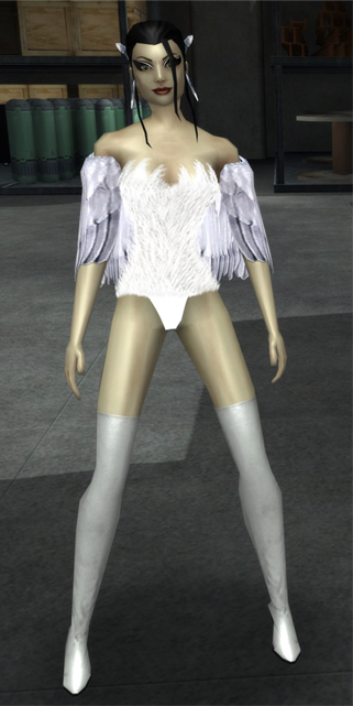
Ok tweaked some more stuff for a very stylish option. On the lower part, the first pic is regular cut, it's traditional panty, and the second one is called Boy Cut, because it's almost like shorts.
 or or  |
So, I suggest making a slightly darker, solid colored swimsuit underneath first, and then drawing the texture on top. That would give a better representation that this is supposed to be a suit and not some really bad hair condition, I think.
"But in our enthusiasm, we could not resist a radical overhaul of the system, in which all of its major weaknesses have been exposed, analyzed, and replaced with new weaknesses."
-- Bruce Leverett, Register Allocation in Optimizing Compilers
|
My problem with this is that, yeah, looks a bit too much like hair. I kind of figure that's the intent, a soft downy texture to go along with the whole bird motif... but the problem looks like the hair isn't part of a suit, it's actually growing out of her skin. Looking at the pictures again, there doesn't seem to be anything under the hair/down texture, and you can see some bits of skin here and there. This makes it look like the costume is part of her, as opposed to just being a costume.
So, I suggest making a slightly darker, solid colored swimsuit underneath first, and then drawing the texture on top. That would give a better representation that this is supposed to be a suit and not some really bad hair condition, I think. |
[center][IMG]http://i1111.photobucket.com/albums/h461/cohroguemagazine/Logos/sig.png[/IMG][/center]
[center][size=1][color=#FF99CC][font=Tahoma] GLOBAL: @Antoinette |[/font][/color][color=#FF99CC][font=Tahoma] MAIN: [/font][/color][url=http://www.virtueverse.net/wiki/Pinkrise][color=#FF99CC][font=tahoma]Pinkrise[/font][/color][/url][color=#FF99CC][font=Tahoma] | SG: [/font][/color][url=http://www.wix.com/netherealist/spitfire][color=#FF99CC][font=Tahoma]The Ethereals [/font][/color][/url][font=Tahoma][color=#FF99CC] | PROJECTS: [/font][/color][url=http://cohrm.wordpress.com][color=#FF99CC][font=tahoma]Rogue Magazine [/font][/color][/url][/size][/center]
|
Oh I'm so sorry if I was not clear, I mentioned on my earlier post that my photoshop skills are not that good. I did this in like 1 minute to show the concept I have in mind. Thank you so much for the feedback, I appologize if it looks aweful, again nothing final on these just concept.
 |
If some people think that the feathers are too much, a good textured white strapless one-piece with some feathered trim around the leg openings and the bustline might be a good substitute. With the shawl, there probably is a danger of overloading the feathered theme.
Attache @ deviantART
Attache's Anti-401k Art Collection
|
Oh I'm so sorry if I was not clear, I mentioned on my earlier post that my photoshop skills are not that good. I did this in like 1 minute to show the concept I have in mind. Thank you so much for the feedback, I appologize if it looks aweful, again nothing final on these just concept.
 |
----
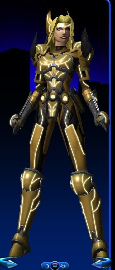
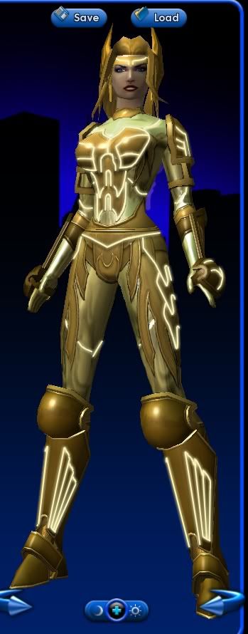
Regarding dear Valkyrie, I've been tinkering with photoshop and came up with a couple of concepts attempting to nail the myth-tech look. The first one is one of my old designs with added glow patterns. The second is a combination of the Metallic underlay with the Valkyrie motif, with added glow lines. YMMV with the glow designs, but these are just ideas.

----- Union's finest underachiever -----
Farewell CITY of HEROES
The First, the Last, the One.
Union: @ominousvoice2059
|
I'm liking the direction you're going here. It adds to the theme without being too OTT.
---- Regarding dear Valkyrie, I've been tinkering with photoshop and came up with a couple of concepts attempting to nail the myth-tech look. The first one is one of my old designs with added glow patterns. The second is a combination of the Metallic underlay with the Valkyrie motif, with added glow lines. YMMV with the glow designs, but these are just ideas.   |
The Alt Alphabet ~ OPC: Other People's Characters ~ Terrific Screenshots of Cool ~ Superhero Fiction
|
Ok tweaked some more stuff for a very stylish option. On the lower part, the first pic is regular cut, it's traditional panty, and the second one is called Boy Cut, because it's almost like shorts.
*pics of Swan here* |
Keep the tight smooth outfit look.
BrandX Future Staff Fighter

The BrandX Collection
|
Okay David this is just silly thinking. Old stuff doesn't automatically equal non reflective and new stuff doesn't automatically mean shiny.
What we the players are asking for is OPTIONS. I'd like to have the OPTION of new tech armor in both a matte or shiny finish. I don't want EITHER/OR. Think about War Hammer armor - as described in the books, it's not reflective most of the time. Who says the current metallic skin has to be shiny? I could come up with a million reasons to have it non-reflective - need for stealth being the first on the list. Just because something is matte or flat finish doesn't make it old - look at current trends in automotive finishes. Flat paint is very cool right now. So the big question becomes, can BOTH options be done? |
@True Metal
Co-leader of Callous Crew SG. Based on Union server.
Signature characters
Great designs:
Black Scorpion -- distilled armored evil, extremely iconic
Captain Mako -- this is crazy sweet with a hint of lemon and tartar sauce; love it
Citadel -- iconic and cohesive modern look
Coyote -- I know this was a player design (R.I.P.) but it's absolutely brilliant; it manages to combine both spandex and Native American better than any comic book character. You guys really need to find a place for Coyote in the revamp.
Foreshadow -- this is just total modern cool
Ghost Widow -- one of THE great character designs in any game or comic; whoever came up with it was hitting on all cylinders that day
Lord Recluse -- really looks like he could kill you and the modified samurai-type look works great
Ms. Liberty -- she looks like her name; can't ask for more than that
Scirocco -- like Ms. Liberty, the look evokes his essence
Synapse -- without knowing anything about him, at first glance I knew he was a speedster; that's good design
Good designs:
Manticore -- mostly it's the head gear that elevates him above just okay; could use a spruce
Mirror Spirit -- I like it, but it doesn't say iconic or superhero to me; that said, I wouldn't change it
Mynx -- I'm of two minds on this one, but the Tigra + Josie and the Pussycats look mostly works
Numina -- it doesn't wow me, but I like it
Swan -- I think her outfit needs to be brightened, but otherwise it's fine
Okay designs:
Aurora Borealis -- the "fresh out of ideas" look
Back Alley Brawler -- like the character, not crazy about the lazy look
Infernal -- my life on the D list
Luminary -- evoking Sorayama is fine, but it's rather dull
Statesman -- it's the cape and goofy faceplate that drop it from "great" to "meh"
Terrible designs:
Positron -- easily the worst offender to my eyes, just a really bad look all the way around
Sister Psyche -- just blah and boring
Valkyrie -- apparently taking too many cues from Positron; needs to be awesomized stat
The Alt Alphabet ~ OPC: Other People's Characters ~ Terrific Screenshots of Cool ~ Superhero Fiction

I love Belladonna Vetrano.
Her costume, design, hair, and pistols are just too awesome.
Ghost Widow, and her Praetorian and Cimeroran versions are amazing.