Art Poll: Signature Characters
|
Okay David this is just silly thinking. Old stuff doesn't automatically equal non reflective and new stuff doesn't automatically mean shiny.
What we the players are asking for is OPTIONS. I'd like to have the OPTION of new tech armor in both a matte or shiny finish. I don't want EITHER/OR. Think about War Hammer armor - as described in the books, it's not reflective most of the time. Who says the current metallic skin has to be shiny? I could come up with a million reasons to have it non-reflective - need for stealth being the first on the list. Just because something is matte or flat finish doesn't make it old - look at current trends in automotive finishes. Flat paint is very cool right now. So the big question becomes, can BOTH options be done? |
About a hypothetical new medieval set: So my personal artistic taste would be to go a little less reflective on "period" outfits. I feel like the full-chrome look makes more sense on modern and futuristic costume sets. But really, this is a decision that'll be made by the character artists.
David Nakayama, Lead Concept Artist
COH Concept Art Gallery now open at http://pixelsaurus.deviantart.com/
I'd like to see other looks for Praetor Tillman personally. 
|
Signature characters
Okay designs: Statesman -- it's the cape and goofy faceplate that drop it from "great" to "meh" |
That and standing all day in that spandex and helmet HAS to get hot.
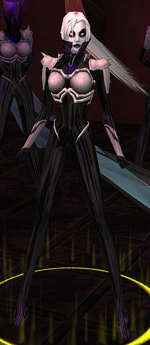
Can we call it? Is it safe to say that Ghost Widow is the single most compelling character design in the game, as voted by the COH forums? Reading through all the posts, I don't think we can make any conclusions about single best Male character design, but Ghost Widow appears to get the trophy for "Favorite Design" and "Favorite Female Design" by a pretty wide margin.
Wonder if it's possible to identify a "Favorite Male Design"? Or a 2nd favorite female design, since GW ran away with the top spot.
David Nakayama, Lead Concept Artist
COH Concept Art Gallery now open at http://pixelsaurus.deviantart.com/
|
Can we call it? Is it safe to say that Ghost Widow is the single most compelling character design in the game, as voted by the COH forums? Reading through all the posts, I don't think we can make any conclusions about single best Male character design, but Ghost Widow appears to get the trophy for "Favorite Design" and "Favorite Female Design" by a pretty wide margin.
Wonder if it's possible to identify a "Favorite Male Design"? Or a 2nd favorite female design, since GW ran away with the top spot. |
Playstation 3 - XBox 360 - Wii - PSP
Remember kids, crack is whack!
Samuel_Tow: Your avatar is... I think I like it

Foreshadow for Best Male. He has a clean and unique look, and he's got that Asian hair that really sets him off and that many, many people want.
S.
Part of Sister Flame's Clickey-Clack Posse
Rabbits & Hares:Blue (Mind/Emp Controller)Maroon (Rad/Thermal Corruptor)and one of each AT all at 50
MA Arcs: Apples of Contention - 3184; Zen & Relaxation - 35392; Tears of Leviathan - 121733 | All posts are rated "R" for "R-r-rrrrr, baby!"|Now, and this is very important... do you want a hug? COH Faces @Blue Rabbit
|
Can we call it? Is it safe to say that Ghost Widow is the single most compelling character design in the game, as voted by the COH forums? Reading through all the posts, I don't think we can make any conclusions about single best Male character design, but Ghost Widow appears to get the trophy for "Favorite Design" and "Favorite Female Design" by a pretty wide margin.
Wonder if it's possible to identify a "Favorite Male Design"? Or a 2nd favorite female design, since GW ran away with the top spot. |
If GW must be the absolute favourite female, I still think Swan is very good. Again, minimalist simplicity can be beautiful sometimes.
Rabbits & Hares:Blue (Mind/Emp Controller)Maroon (Rad/Thermal Corruptor)and one of each AT all at 50
MA Arcs: Apples of Contention - 3184; Zen & Relaxation - 35392; Tears of Leviathan - 121733 | All posts are rated "R" for "R-r-rrrrr, baby!"|Now, and this is very important... do you want a hug? COH Faces @Blue Rabbit
|
Can we call it? Is it safe to say that Ghost Widow is the single most compelling character design in the game, as voted by the COH forums? Reading through all the posts, I don't think we can make any conclusions about single best Male character design, but Ghost Widow appears to get the trophy for "Favorite Design" and "Favorite Female Design" by a pretty wide margin.
Wonder if it's possible to identify a "Favorite Male Design"? Or a 2nd favorite female design, since GW ran away with the top spot. |
Ms Liberty for iconic look, Mirror Spirit for cool.
@True Metal
Co-leader of Callous Crew SG. Based on Union server.
|
Options are great, and I think everyone's made a good case for a non-reflective Metallic-type set. Best I can do is to pitch it as a Quality of Life improvement addition for a future issue, but I will do that.
|
Also - and please understand that I say this with the utmost respect to you, David - I feel that you are a bit too focused on literally and figuratively "shiny" new costume additions. Whether we're talking actual shininess and reflectivity or just general complexity of detail, striking visuals or anything else that turns heads and catches the eye, you seem to all too easily neglect the simpler, stylised, basic costume elements that make characters great. Ghost Widow comes up in your poll again and again not because of her flowing hair rig or the shiny tights or the high-resolution textures or whatnot. She comes up because her design is simple, elegant and memorable. I get the feeling that the mentality around the studio goes along the lines of "Why have metal armour when we can have reflective, shiny, bump-mapped, glowy, ornamental, decorated metal armour?"
Sometimes, less is more. Sometimes, simpler designs without overbearing fancy effects are the most appropriate thing. Sometimes, simple flat colours work better than complex textures. I mean think about it - when was the last time the art team produced metal armour comprised of large smooth plates without some kind of abstract ornamentation to them? The last one I can thin of, really, is Armour Plate from back in 2004, possibly Techbot from 2005. Enforcer only partially counts, since only the chest is flat metal plate, with everything else being ornamented.
Please don't take this as a putdown. It really, really isn't. And don't take it to mean I don't want new fancy costume items. I LOVE the glowing wings tech. I LOVE the reflective Valkyrie pieces. I LOOOVE the glowing resistance gear. But that's not all there should be. Simple, stylised, basic costume pieces cannot be put by the wayside or, worse still, taken out of the game. People cling on to their old pieces not because they're great (most of them aren't even good), but rather because they represent something that the current art team doesn't seem interested in making more of - simple things. Just an easy example: While I appreciate the glowing, spiky, detailed, ornate Ascension shoulder pieces, I still want "just medieval shoulders." Do you remember Romulus? Do you remember what shoulders he uses? Slightly touched-up Gladiator shoulders, only he uses the big shoulder on both sides. Far more than the Ascension shoulders, THAT is what I want - just a simple big Gladiator shoulder on both shoulders. It looks cool, it looks big and I could SO use that, but we've never had that in the game, I assume because it's not fancy enough.
Please don't put a lower boundary that "Your piece must be at least this---> awesome to be made." Not every piece you make has to turn heads.
|
Samuel_Tow is the only poster that makes me want to punch him in the head more often when I'm agreeing with him than when I'm disagreeing with him.
|
I think Foreshadow could be our male winner.
And Mirrorspirit our second female winner.
Just so I can also post on topic:
  I am honestly hard pressed to decide which of these two is better designed and more ... signature ... in appearance. All it takes is one look at these character designs and you just KNOW that you need to watch your step around these women. You don't even need dialogue to get that sense of menace that their costumes convey. |
Sister Airlia, by contrast, is complex. VERY complex. You have the black and white belt, the-black-and white bracelets, the black-and-white gauntlets, the black-and-white choker, all with fine, intricate designs, all distracting from the character's overall look. When you look at Ghost Widow, you see a woman in a black catsuit with white flowing hair. When you look at Sister Airlia, you see a jigsaw puzzle, a mish-mash of shapes, lines, contours and images. You also see a lot more of her white skin contrasting with her black clothes, so a lot of the simplistic stylised design is lost to what I can only describe as patchwork contrast.
This is a design pitfall I've fallen into many times before, giving every piece as many colours as it can hold. Here's a simple lesson I had to learn the hard way - just because a costume piece CAN be given two contrasting colours, it doesn't mean it SHOULD be given two contrasting colours. Sister Airlia's design would be far, far, FAR superior if her gear were all black, instead of black and white. This would have given a stronger contrast of the black clothes against her white skin and made her design simpler to look at. And, no, black-on-black pieces don't compromise detailing. You'd still be able to see the engravings on her boots, gloves and belt because they're all bump-mapped, so they'd have shown up regardless.
|
Samuel_Tow is the only poster that makes me want to punch him in the head more often when I'm agreeing with him than when I'm disagreeing with him.
|
|
Signature characters
Great designs: Black Scorpion -- distilled armored evil, extremely iconic Captain Mako -- this is crazy sweet with a hint of lemon and tartar sauce; love it Citadel -- iconic and cohesive modern look Coyote -- I know this was a player design (R.I.P.) but it's absolutely brilliant; it manages to combine both spandex and Native American better than any comic book character. You guys really need to find a place for Coyote in the revamp. Foreshadow -- this is just total modern cool |
|
Wonder if it's possible to identify a "Favorite Male Design"? Or a 2nd favorite female design, since GW ran away with the top spot.
|
My second favourite would have to be Lord Recluse. I love how well he pulls off that complex design, and the way he manages to combine class with menace. This is an exquisite example of combining two disparate themes in a single character without making it look juxtaposed. Recluse is both threatening in a brutish way, in that he looks like he could rip you in half, as well as threatening in a sinister way, in that you've already fallen into his spider's web and you don't even know it.
Those are my top two votes for males.
|
Samuel_Tow is the only poster that makes me want to punch him in the head more often when I'm agreeing with him than when I'm disagreeing with him.
|
For males, I'd probably go with Dr. Vasz and the Clockwork King. Both are eyecatching, memorable and tell you a lot about the character.
Always remember, we were Heroes.
My personal choice for most iconic look is Captain Mako. While all Arachnos patrons looks awesome and get their message across, Mako with his unique design stands apart from them. Seeing him first time on CoV loading screen I remember myself thinking "That guys favorite pass-time is blood bathing for sure". Mako looks dangerous, scarry and sexy as hell. Perfect combination for a predator which he is. I have to admit during Statesman TF he is the only villain makes me uncomfortable. I know he is not tough like Lord Recluse or Ghost Widow but still seeing him on screen makes me feel like a prey. Maybe foolish but only when I face Mako I feel like I am fighting for my life.
Among heroes even I hate Statesman with such passion, he has most iconic look. After Captain America and Wonder Woman best stylized flag costume I've seen. That face-plate gives him a nice edge over other spandex wearing heroes. I hate to admit it but he looks so cool on IP or on comic pages.
If we also talk about who needs an update desperately among Freedom Phalanx; Manticore and Synapse comes to mind.
Synapse is my favorite hero in CoH universe. He gives the message of "I'm a speedster" perfectly with his current outfit but somehow his over all look is pale. He needs bolder design to show he means business. Although he needs a serious rewamp over all (like his Task Force, AT (I think being a scrapper suits better for a speedster) etc), starting with his looks is a good idea.
Manticore has wonderful mask/head design but rest of him... blank? I can't remember if he has any gloves or boots. Just dark red spandex with black blend.
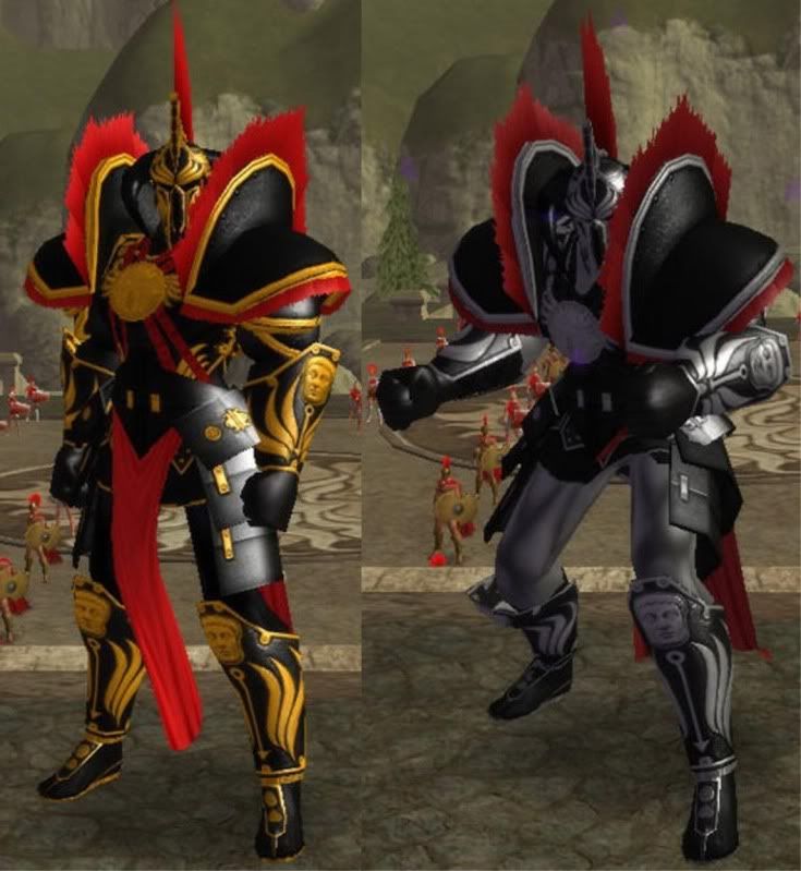
Best Male design i think goes to one of these

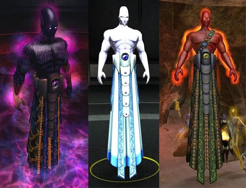
or

note for Noble Savage I think you should of had categories to start out with like best Female Hero, Best Female Villain, Best Male Hero, Best Male Villian, Best Hero group and Best Villian group, Best GM, then from the winners pick the winner over all. There are a lot great designs to choose from.


This shield model:
Has an animated texture where the glowing lines brighten and fade. The same tech could also be used for custom weapons at least. And probably "normal" costume pieces.
Many possibilities with that.
I do not suffer from altitis, I enjoy every character of it.