Art Poll: Signature Characters
#1 is GW.
#2 Romulus
131430 Starfare: First Contact
178774 Tales of Croatoa: A Rose By Any Other Name ( 2009 MA Best In-Canon Arc ) ( 2009 Player Awards - Best Serious Arc )
I think she should have the knee-pads...and her hair needs to be properly blonde, not yellow. That and, honestly, her having a uniquely tooled variant of the kit would be better, but...
That all said, the reflective version is actually starting to grow on me, more and more everytime I look at it XD Give her a few more unique pieces (she IS a Signature, after all) and it'd look good.
|
GG, I would tell you that "I am killing you with my mind", but I couldn't find an emoticon to properly express my sentiment.
|
|
Although not too much. I do sometimes worry about you guys; there's a fast growing, almost Liefeldian obsession, albeit with shiny instead of pouches
 "It needs more reflections! MORE! Put reflections on the hair! And the teeth! And the EYES! Bwuahahahaha!" |
 But really, reflectivity only comes up if we're looking at a new part that would logically be shiny (like metal armor). By contrast, it's not going to come up on materials like cloth and fur, which you'll see on future costume options just as much as metal and other materials. Given the choice between a measured amount of reflectivity on metal and none at all, we've of course chosen the more visually impressive and modern option. Over time, we'll have to reconcile that decision with the older parts, but that's part of ongoing development. Work in progress.
David Nakayama, Lead Concept Artist
COH Concept Art Gallery now open at http://pixelsaurus.deviantart.com/
David Nakayama, Lead Concept Artist
COH Concept Art Gallery now open at http://pixelsaurus.deviantart.com/
Does the current game engine allow for blinking lights or animated computer screens on costume parts?
@Golden Girl
City of Heroes comics and artwork
Click here to find all the All Things Art Threads!
|
Given the choice between a measured amount of reflectivity on metal and none at all, we've of course chosen the more visually impressive and modern option. Over time, we'll have to reconcile that decision with the older parts, but that's part of ongoing development. Work in progress.
|
Please try my custom mission arcs!
Legacy of a Rogue (ID 459586, Entry for Dr. Aeon's Third Challenge)
Death for Dollars! (ID 1050)
Dr. Duplicate's Dastardly Dare (ID 1218)
Win the Past, Own the Future (ID 1429)
|
By contrast, it's not going to come up on materials like cloth and fur, which you'll see on future costume options just as much as metal and other materials.
|
*faints*
Rabbits & Hares:Blue (Mind/Emp Controller)Maroon (Rad/Thermal Corruptor)and one of each AT all at 50
MA Arcs: Apples of Contention - 3184; Zen & Relaxation - 35392; Tears of Leviathan - 121733 | All posts are rated "R" for "R-r-rrrrr, baby!"|Now, and this is very important... do you want a hug? COH Faces @Blue Rabbit
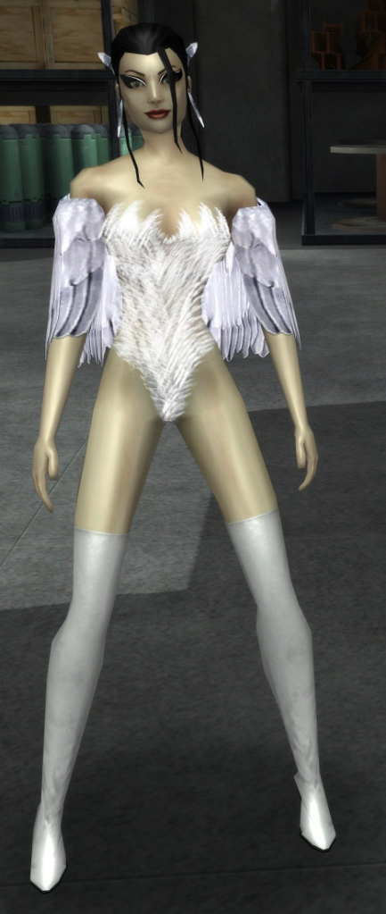
This is my take on Swan. Photoshop is so bad, but I hope you guys get the idea. I'm so so sorry if it's a bad edit.
Changes:
Makeup
Skin Tone
Clothes

[center][IMG]http://i1111.photobucket.com/albums/h461/cohroguemagazine/Logos/sig.png[/IMG][/center]
[center][size=1][color=#FF99CC][font=Tahoma] GLOBAL: @Antoinette |[/font][/color][color=#FF99CC][font=Tahoma] MAIN: [/font][/color][url=http://www.virtueverse.net/wiki/Pinkrise][color=#FF99CC][font=tahoma]Pinkrise[/font][/color][/url][color=#FF99CC][font=Tahoma] | SG: [/font][/color][url=http://www.wix.com/netherealist/spitfire][color=#FF99CC][font=Tahoma]The Ethereals [/font][/color][/url][font=Tahoma][color=#FF99CC] | PROJECTS: [/font][/color][url=http://cohrm.wordpress.com][color=#FF99CC][font=tahoma]Rogue Magazine [/font][/color][/url][/size][/center]
But that was just that one costume piece that "didn't fit" on her (imo), because of the shape and styling. If unique kneepads were designed for Valkyrie, I'd want them to match the styling used for the Enforcer Chest Detail and actually be affixed to the knee(s), rather than being a plate that sticks up from the shin of the boot.
Oh I don't disagree with you there. I just didn't spend the time to keep running back and forth to ICON so as to exactly match the precise shade of blonde that (original) Valkyrie has. Or if you've got a better color mix for blonde you'd like to suggest, I can whip up a new costume on the Test Server really easily to make use of it and go and grab some new screenshots using it. It's not like I'm "wedded" to that exact pair of shades of yellow. The thing is, when I tried deviating from it, I kept winding up with something that looked "too brassy" and kept backing out the changes. I just went with "good enough" to get the idea across in this case.
|
That and, honestly, her having a uniquely tooled variant of the kit would be better, but...
|
|
That all said, the reflective version is actually starting to grow on me, more and more everytime I look at it
|
In fact, it's getting to the point where I look at the original Valkyrie costume ... and feel disappointed (and sorry for her). Now, granted ... I'm a bit more biased in favor of my own creation than most people around here (I assume), and I'm not ashamed to admit it. But I still think it would be totally awesome if David had the NPC Costuming Team use "my" Valkyrie as the basis for a Valkyrie 2.0 when Steel Canyon gets revamped (or even earlier, if they can swing it on the schedule).
|
Give her a few more unique pieces (she IS a Signature, after all) and it'd look good.
|
So I work with what've got available to me, and figure that if Noble Savage (and friends) *do* pick up "my" Valkyrie as the basis for a Valkyrie 2.0 update, the final result won't look exactly like my costume code save file (and I'm fine with that).

Anevern
---
@KytheraOA
Guardian: Yina Draconaiis, Morgu, Kythera, Clodagh | Virtue: Sulphury, BrassOrchid, Baroness Eisen
David Nakayama, Lead Concept Artist
COH Concept Art Gallery now open at http://pixelsaurus.deviantart.com/
|
This is my take on Swan. Photoshop is so bad, but I hope you guys get the idea. I'm so so sorry if it's a bad edit.
Changes: Makeup Skin Tone Clothes  |
And I think those p'shoppin' skills are pretty solid. Nice job.

Attache @ deviantART
Attache's Anti-401k Art Collection
|
Does the current game engine allow for blinking lights or animated computer screens on costume parts?
|
Attache @ deviantART
Attache's Anti-401k Art Collection
@Golden Girl
City of Heroes comics and artwork
|
I was thinking you could use effects like that to really go to town on an update for Citadel and Luminary.
|
Which characters might Design have in its sights? I'll never tell, but I do like your ideas about new shinies.

David Nakayama, Lead Concept Artist
COH Concept Art Gallery now open at http://pixelsaurus.deviantart.com/
|
As you've seen, visual updates for signature characters often coincide with major new storyarcs involving those characters (for example, the Praetorian storyline at the heart of GOING ROGUE). So Art would have to get a plan from Design before it really makes sense to massively rework those characters.
Which characters might Design have in its sights? I'll never tell, but I do like your ideas about new shinies.  |

Story arcs:
The Golden Scepter: #9852 [Winner of American Legion's July 2011 AE Author Contest]
Let your voice be heard! Sign the petition to keep CoH alive.
|
This is my favorite of any of the re-designs posted here so far. Very true to the original while still being new look. Something along these lines that really played with the feathers theme would be great.
And I think those p'shoppin' skills are pretty solid. Nice job.  |
[center][IMG]http://i1111.photobucket.com/albums/h461/cohroguemagazine/Logos/sig.png[/IMG][/center]
[center][size=1][color=#FF99CC][font=Tahoma] GLOBAL: @Antoinette |[/font][/color][color=#FF99CC][font=Tahoma] MAIN: [/font][/color][url=http://www.virtueverse.net/wiki/Pinkrise][color=#FF99CC][font=tahoma]Pinkrise[/font][/color][/url][color=#FF99CC][font=Tahoma] | SG: [/font][/color][url=http://www.wix.com/netherealist/spitfire][color=#FF99CC][font=Tahoma]The Ethereals [/font][/color][/url][font=Tahoma][color=#FF99CC] | PROJECTS: [/font][/color][url=http://cohrm.wordpress.com][color=#FF99CC][font=tahoma]Rogue Magazine [/font][/color][/url][/size][/center]
|
Yes, totally agree. Were we to do more medieval armor, I'd like to see it accurately represent the time period, i.e. not very reflective at all.
|
So you might have a polished but still dark utilitarian armor, like that of Count Galleazzo da Arco from 1445, contrasting with the highly polished and reflective armor parade of Emperor Maximilian I in 1490 (when he was still Archduke, and the ornately enameled parade armor of Prince Nikolaus IV ('The Black') from 1555:

And could you please find someone to look at the code for the forums to find out why I can go to the root forum page, be welcomed by name, click on the 'City Life' forum, be told there that the forum doesn't know who I am and I have to log in, doing so, then opening a forum message, clicking on a 'Quote' button to open a reply editor, then when I click on 'Submit Reply' be told again that the forum doesn't know me from Adam's off ox, and when I sign in again it throws everything out the window and shows me a black page with no content... three times... all in the space of five minutes?
"But in our enthusiasm, we could not resist a radical overhaul of the system, in which all of its major weaknesses have been exposed, analyzed, and replaced with new weaknesses."
-- Bruce Leverett, Register Allocation in Optimizing Compilers
David, on the topic of the reflectivity of new costume pieces, I noticed some time ago that the Valkyrie swords that came with the Apple version (and later to the rest of us) used to be reflective like the costume pieces. At some point, the swords went back to being matte and I was wondering if that was intentional? They used to be really fabulous.
#141757 We Are Legion, #99205 We Too Are Legion, #5514 Bug Hunt
VIRTUE HEROES: Ebon Witch, Essense, Ossum Possum, Eversoul, Jacob Ravenshire
VIRTUE VILLAINS: Gentleman Caller, Little Green Vistor, Black Apple, Emily & Timothy Ravenshire
Chiming in to +1 Ghost Widow, by far my favorite signature.
The Toy Collector: arc #4948
When Models Attack... #8099
On Guardian:
Dark Sentry: Lvl 50 FF/dark defender
Cyclone Commando: Lvl 50 Robot/traps MM
Diablo Mk I: Lvl 50 Fire/fire tank
Arc Torch: Lvl 50 Ele/fire brute


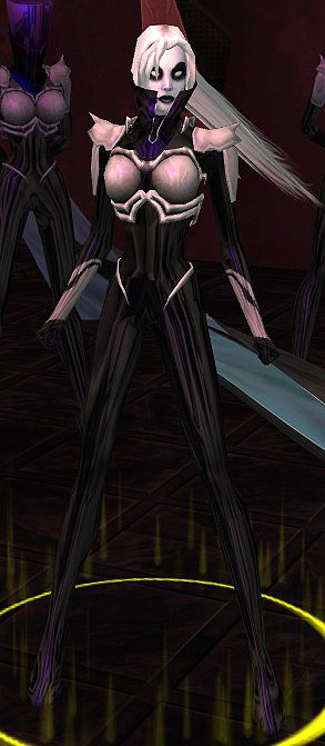
I am honestly hard pressed to decide which of these two is better designed and more ... signature ... in appearance. All it takes is one look at these character designs and you just KNOW that you need to watch your step around these women. You don't even need dialogue to get that sense of menace that their costumes convey.
Contrast their visual impact with Belladonna Vetrano ...

I look at Belladonna, and the first thing I ask myself is ... "why do you have police siren lights on your shoulders?"
Belladonna is neither anywhere NEAR as imposing, nor has the PRESENCE, that either Ghost Widow or Sister Airlia do, just on purely visual inspection.


"Men strunt �r strunt och snus �r snus
om ock i gyllne dosor.
Och rosor i ett sprucket krus
�r st�ndigt alltid rosor."