First Look, ThunderCats Reboot
If you think Liefeld is "awesome."

Liefeldian crosshatching is pretty much: "Let's obliterate all of the negative space to cover up my obvious lack of talent."
Now look at that Kricfalusi painting. He didn't need to crosshatch and obliterate the negative space to produce a good cartoon piece.
You realize that hatching in the Samurai Jack pic is rain, right? Not shadows, like Liefeld uses them for?
Hell, even Liefeld can produce decent work - or at least he used to. Take a look at his very early stuff when he was still a junior up and comer, compare it with his later "star" work. You might swear they were by different artists - his early work was downright "normal" and "decent".
One other thing that comes to mind - one of the big differences between a "good" artist and a "bad" artist is how MANY styles they can do.
Take ten different Tartakovsky characters, and while they all will be wildly exaggerated and stylized, and you can generally tell it's his work, they're mostly exaggerated in different ways.
Samurai Jack does not look like Clone Wars, which does not look like PowerPuff Girls. They all are distinctly different, even if they're all visibly Tartakovsky. And they're all internally consistent within their respective series. Samurai Jack characters all have a certain look, Clone Wars characters have a distinctly different look but are easily identified as being Clone Wars, and so on.
Contrast with a lot of bad artists - many derive their "style" by imitating another artist's style without understanding the structural underpinnings of that other artist's work. And this copied "style" is ALL they can do.
-np
I see myself as witty, urbane, highly talented, hugely successful with a keen sense of style. Plus of course my own special brand of modesty.
Virtue: Automatic Lenin | The Pink Guy | Superpowered | Guardia | Guardia Prime | Ultrapowered
You're kidding, right? There's a lot more crosshatching in that picture than rain. No single spot of negative space was left alone without a shadow or gritty line added to it. Liefeld pulls the same damn crap.
Furthermore, the cartoons you listed look very much the same to me. That black ninja from the video Cowman posted earlier could have easily fit in the Power Puff Girls without any problem. Hell, Power Puff Girls and Dexter's Lab could easily mix and match. Mako could be a friggin' Power Puff villain for chrissake.

That SJ picture has a little hatching around the edges of the shadows. The shadows themselves are solid blacks, and there's some solid greys scattered among the blacks. Very little hatching at all, really.
All the rest of the vertical lines? Rain.
As I said, since you can't see the differences presented, I think there's little I can say that will change your mind.
I'll just leave it with this: Pretty much any given character from those shows, even ones I've never seen or heard of, I can generally immediately peg which show they're from just seeing the artwork. PowerPuff Girls is (as intended) a parody of Anime. Samurai Jack takes a riff from Japanese brush and wood-cut block art. Clone Wars has a slightly Greek look to the art.
But I'm starting to repeat myself, so I'm out.
-np
I see myself as witty, urbane, highly talented, hugely successful with a keen sense of style. Plus of course my own special brand of modesty.
Virtue: Automatic Lenin | The Pink Guy | Superpowered | Guardia | Guardia Prime | Ultrapowered


You may try to continue claim there's a difference, but there isn't. I believe the phrase about wearing blinders comes to mind.

On the one hand, I agree with everything NinjaPirate is saying about art.
On the other hand...

Weight training: Because you'll never hear someone lament "If only I were weaker, I could have saved them."
|
I still don't see the difference. They look practically the same. They might as well be the same.
|
When it comes to art, I think you have the aesthetic equivalent of being tone deaf. If you genuinely can't tell the difference between something that is "stylized" and something that is actually "not good," then there is a perception problem somewhere in there.
The Alt Alphabet ~ OPC: Other People's Characters ~ Terrific Screenshots of Cool ~ Superhero Fiction
Powerpuff Girls AREN'T Tartarkovsky's design, it was his classmate's Craig McCraken's for crying out loud. "Whoopass Stew", the prototype for PPG must be online somewhere.
But hey, let's not cloud your hate of Tartarkovsky with facts shall we. There must be a few other series whose character design you hate you can wrongly credit him with.
Father Xmas - Level 50 Ice/Ice Tanker - Victory
$725 and $1350 parts lists --- My guide to computer components
Tempus unum hominem manet
|
I know you're going to see this next comment as insulting but it's honestly not meant to be...
When it comes to art, I think you have the aesthetic equivalent of being tone deaf. If you genuinely can't tell the difference between something that is "stylized" and something that is actually "not good," then there is a perception problem somewhere in there. |

Goodbye may seem forever
Farewell is like the end
But in my heart's the memory
And there you'll always be
-- The Fox and the Hound
You would probably enjoy the documentary My Kid Could Paint That. It's an interesting look at the difference between talent and intent.
The Alt Alphabet ~ OPC: Other People's Characters ~ Terrific Screenshots of Cool ~ Superhero Fiction
|
Anyone can see the difference in line quality and dynamic composition. You may as well compare it to South Park while you're at it, since your ability to distinguish the artistic style seems limited to "they have big circle heads and large eyes so they are the same." Similar to someone pointing out that the aforementioned Beetle and 911 are German automobiles with four wheels and round bits so they must be the same.
|
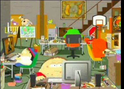
Nevermind the fact that the very first episode, "Cartman Gets an Anal Probe" was completely animated with construction paper by hand which in itself is a feat of patience and perseverence. I'd doubt Tartakovsky had ever approached such an arduous process as that. No, he just scribbles a couple eyes and legs on a square and calls it a mad scientist boy and neglects to give his sister a torso.

Holy crap....
This is the next "Raphael vs. Wolverine" thread.
good god no...and my thread was productive for once...
Goodbye, I guess.
@Lord_Nightblade in Champions/Star Trek Online
nightblade7295@gmail.com if you want to stay in touch
|
Powerpuff Girls AREN'T Tartarkovsky's design, it was his classmate's Craig McCraken's for crying out loud. "Whoopass Stew", the prototype for PPG must be online somewhere.
But hey, let's not cloud your hate of Tartarkovsky with facts shall we. There must be a few other series whose character design you hate you can wrongly credit him with. |
http://www.youtube.com/watch?v=Qsx0uF80n8U
lolz


Awesome.