First Look, ThunderCats Reboot
Your position is rather pointless, because art *is* subjective. Sometimes you just love something or hate it. Music is intensely personal, for instance, and everyone likes something different. Whatever you're in to, I can find 20 million people in America who think it's stupid, and any art you find attractive there is someone else who thinks it's ugly as sin.
Along with comic and representational art I really like modern art, counting among my favorites Jackson Pollock's #31, Mark Rothko's Orange & Yellow and a guy I found on Deviant Art named SkaPunk who did a painting called "Livingston" which most people would probably call "crappy fingerpaints" but I think it looks awesome. Many people dismiss artworks like these, but I think they're amazing.
The Alt Alphabet ~ OPC: Other People's Characters ~ Terrific Screenshots of Cool ~ Superhero Fiction
um.."art sucked" isn't a critique and wouldn't calling someone a hack imply that they're bad at their job?
|
Yes it did. Squares, rectangles, and circles with legs and faces is not "good art." If this is what you call "stylized" then I have a few drawings from my childhood that will probably "do it" for you.
|
and yes, you are being irrational and overly defensive.
|
um.."art sucked" isn't a critique and wouldn't calling someone a hack imply that they're bad at their job?
|
| I could say the same thing about the Timm-verse. |

|
He IS bad at his job. His characters look like they were drawn by a child, which by the way, since you missed it, was the actual critique after the first reply.
Does anyone in the Timm-verse look like squares, rectangles and circles with eyeballs and legs? |
Do not try to change your argument and the answer is yes, just about every male character looks like they were chipped from a block of stone.
If he was bad at his job, he wouldn't have survived in the industry as long as he has. Just because you don't like his art work, does not make it bad. I don't know about you, I like to see different styles of drawing being thrown out there, rather than how it was in the 80's where most of our cartoons were done under one house.
|
You do not understand the definition of "critique" sir.
Do not try to change your argument and the answer is yes, just about every male character looks like they were chipped from a block of stone. If he was bad at his job, he wouldn't of survived in the industry as long as he had. Because you don't like his art work, does not make it bad. |
(Dexter the mutant square in background.)

A child can draw this crap.

It was simple and it worked.
When you get too hung up on the shows art work, you genuinely miss out on a good show. There are exceptions to this...but Dexter's Lab and Samurai Jack are not those exceptions.
Samurai Jack Seasons: 4 Seasons
Dexter's Laboratory: 4 Seasons
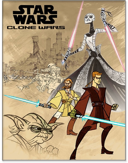
Star War's Clone wars: 3 Seasons
To date, Tartakovsky has amassed 13 Emmy nominations and four wins. He has also been nominated four times for Annie Awards, winning once for Clone Wars.
Various info from Wikipedia
Seems he has done quite well in his career so far. I'd like to see the child that competes with his sense of action and humor.

Does not always detect CoH
Personally i'm reserving judgment on the new Thundercats cartoon until i actually see some of it. Character designs are only part of what makes a cartoon good or bad.
Dr. Todt's theme.
i make stuff...
If these were one-off images, yes, the disproportions and irregular angles could be considered an issue of competence. However, if you look at things like line regularity, where and how different line thicknesses are used, color palette selection, and even the character geometry, a learned person has to conclude that these were all deliberate actions precisely delivered and intended to convey a certain message when taken in synthesis.
Dee Dee's spindly legs and clownlike oversized feet convey personality characteristics that get across even before you hear that grating voice actress. Samurai Jack's angular design reflects the rigid discipline of the character, while the surreal landscape around him relays some of Jack's own sense of being out of place. Even the ridiculously-styled ultra-deformed Powerpuff Girls exaggerated proportions convey intentional meaning. Heck, even using styles that DO sometime seem to use a child's perspective is a an intentional communication through the art.
Now, you may intelligently disagree with the merits of the style taken. You might even be disgusted with how he applied it to iconic Star Wars characters, or how mixing that style with the computer-generated ships in the Clone Wars miniseries meshed so damn badly. Those are all valid intelligent uses of analysis on a style. (And I don't say that just because I found PowerPuff Girls too grating to even sit through a commercial... and the Clone Wars miniseries sometimes painful to watch (and sometimes excellent)... and don't get me started on Dexter...)
...But when you disregard all that with a shallow statement that this is what "a kid would draw", you're not seeing what the artist is trying to do or communicate.
-----
All that said, there's also one other factor that does weigh in your favor-- all artistic decisions aside, this art style is incredibly cheap to do. By limiting character angles, making more abrupt movements the norm, and keeping the detail low, viewers don't notice just how littile work needs done in the "tween" frames. If you did something like that on a more realistic model, it would be much MUCH more visible. It makes for much more cost-effective production work, but it does also contribute to the "cheapness" feel for one used to higher-production-cost work like a Disney feature film.

Powerpuff Girls were Craig McCracken's creation not Genndy Tartakovsky, though he worked with Craig on the series (they were classmates at CalArts).
Anyway he's, Tartakovsky, is now more of a director than character designer/storyboard artist. And then only on Dexter's and Samurai Jack, not Clone Wars.
Father Xmas - Level 50 Ice/Ice Tanker - Victory
$725 and $1350 parts lists --- My guide to computer components
Tempus unum hominem manet
|
Powerpuff Girls were Craig McCracken's creation not Genndy Tartakovsky, though he worked with Craig on the series (they were classmates at CalArts).
Anyway he's, Tartakovsky, is now more of a director than character designer/storyboard artist. And then only on Dexter's and Samurai Jack, not Clone Wars. |
Furio--Lvl 50+3 Fire/Fire/Fire Blaster, Virtue
Megadeth--Lvl 50+3 Necro/DM/Soul MM, Virtue
Veriandros--Lvl 50+3 Crab Soldier, Virtue
"So come and get me! I'll be waiting for ye, with a whiff of the old brimstone. I'm a grim bloody fable, with an unhappy bloody end!" Demoman, TF2
I'm talking about the mini-episodes. As far as I can tell all he did with that series was produce and direct. The only mentions in the art or animation departments were animation director and additional scene layout.
Paul Rudish, Lynne Naylor and Andy Suriano were the character designers, Naylor and Suriano were also CDs for Samurai Jack. Storyboards were done by Bryan Andrews and Mark Andrews. Bryan also did storyboards for Samurai Jack.
Sounds like Lucas hired as much of the crew who did Samurai Jack and asked them to do the same "no edge line" style to a Clone Wars series.
Father Xmas - Level 50 Ice/Ice Tanker - Victory
$725 and $1350 parts lists --- My guide to computer components
Tempus unum hominem manet
|
Powerpuff Girls were Craig McCracken's creation not Genndy Tartakovsky, though he worked with Craig on the series (they were classmates at CalArts).
Anyway he's, Tartakovsky, is now more of a director than character designer/storyboard artist. And then only on Dexter's and Samurai Jack, not Clone Wars. |
Tartakovsky directed, wrote, produced, and storyboarded the clone wars miniseries, -- a series of shorts that aired between Eps 2 & 3. While he was director, his influence on the character design was still heavily credited at the time. As much as I disliked some of the long-neck-character design, it was well deserving of its two emmy awards.


You're right in that he wasn't affiliated with the OTHER computer-generated series.

|
I'm talking about the mini-episodes. As far as I can tell all he did with that series was produce and direct. The only mentions in the art or animation departments were animation director and additional scene layout.
Paul Rudish, Lynne Naylor and Andy Suriano were the character designers, Naylor and Suriano were also CDs for Samurai Jack. Storyboards were done by Bryan Andrews and Mark Andrews. Bryan also did storyboards for Samurai Jack. Sounds like Lucas hired as much of the crew who did Samurai Jack and asked them to do the same "no edge line" style to a Clone Wars series. |
Probably would have been better if I had referenced the team that shared many duties against these shows that thus shared many common art elements, but I was most aware of the director.

ya, thats the one i meant.
Furio--Lvl 50+3 Fire/Fire/Fire Blaster, Virtue
Megadeth--Lvl 50+3 Necro/DM/Soul MM, Virtue
Veriandros--Lvl 50+3 Crab Soldier, Virtue
"So come and get me! I'll be waiting for ye, with a whiff of the old brimstone. I'm a grim bloody fable, with an unhappy bloody end!" Demoman, TF2
|
All that said, there's also one other factor that does weigh in your favor-- all artistic decisions aside, this art style is incredibly cheap to do. By limiting character angles, making more abrupt movements the norm, and keeping the detail low, viewers don't notice just how littile work needs done in the "tween" frames. If you did something like that on a more realistic model, it would be much MUCH more visible. It makes for much more cost-effective production work, but it does also contribute to the "cheapness" feel for one used to higher-production-cost work like a Disney feature film.
|

Furio--Lvl 50+3 Fire/Fire/Fire Blaster, Virtue
Megadeth--Lvl 50+3 Necro/DM/Soul MM, Virtue
Veriandros--Lvl 50+3 Crab Soldier, Virtue
"So come and get me! I'll be waiting for ye, with a whiff of the old brimstone. I'm a grim bloody fable, with an unhappy bloody end!" Demoman, TF2
I'm a bit wary of this quote:
|
MTV: Another thing everyone's asking about is the characters we don't see in the new image. What's up with Snarf, or WilyKit and WilyKat? Will we see them soon? SPAULDING: Yeah, you'll see them. We're going to slowly reveal that stuff. Rest assured, they're in there, and they look great. They're redesigned in a little different way, though, and you'll see what I mean when it comes time to reveal them. |
I'm also eager to see how Studio 4c does MUMM-RA, THE EVERRRRRRRRRR LIVIIIIIIIIING.
1) "Lazy" would be if these guys were putting in a 2-4 hour workday, phoning this much in, then going off to play xbox the rest of the day. Look at the production histories of these guys and how tight together many of these projects are. They're not dawdling around doing nothing-- their schedules are rather packed. Heck, Tartakovsky's work was prolific enough that he one two emmies for two different shows in the same year!
2) If they DID do an art style that required more robust 'tweening' work, they wouldn't be the ones doing it. Cheap animation shops in Korea and China do that for most non-computer animated work nowadays.... so they really didn't cause themselves much personal labor savings while taking this route. They just saved money.

|
I'm a bit wary of this quote:
It makes it sound as if Wilykit and Wilykat are going to look different than the rest of the Thunderians--if they even are Thunderians. I'm also eager to see how Studio 4c does MUMM-RA, THE EVERRRRRRRRRR LIVIIIIIIIIING. |
- If they do at least keep the 'last survivors of a doomed world' theme... and the main four are all that's together at the start, then it'll be that the ship broke apart and Wileykit and Wileykat's capsules landed elsewhere... where they've struggled to survive on wits and agility. Thus, while the main four will have a blend of tech and magic, kit and kat will have something of a more 'feral' style.
This will also introduce a good pattern for keeping fresh merchandise on the store shelves. First half of the season brings first few characters for the toy line. Half a season later, introduce 3-4 more.... next season... hey! we found more! (Bengali, Pumyra, Lynx-O) and half a season later, all new thundercats...etc etc.

This thread has already been modded once, lets keep it that way.
|
http://www.craveonline.com/entertain...dercats-122011
I'm diggin' it. It's kinda hard to screw up a show that wasn't all that great in the first place anyhow *damn you nostalgia warping things*  |
Bump and Grind Bane/SoA
Kenja No Ishi Earth/Empathy Controller
Legendary Sannin Ninja/Pain Mastermind
Entoxicated Ninja/PSN Mastermind
Ninja Ryukenden Kat/WP Scrapper
Hellish Thoughts Fire/PSI Dominator
Thank You Devs for Merits!!!!


I'll also agree with whoever said there should be more spots on Cheetara.
The spots were hot.