Poll: Vote for the COH Forums Reskin
Bah, then why even have a poll in the first place?

of course my character is a carnival ringmaster who can turn into a jester and a tiger, so I can't complain much about not fitting a superhero theme
Option 1 por favor.
H: Blaster 50, Defender 50, Tank 50, Scrapper 50, Controller 50, PB 50, WS 50
V: Brute 50, Corruptor 50, MM 50, Dominator 50, Stalker 50, AW 50, AS 50
Top 4: Controller, Brute, Scrapper, Corruptor
Bottom 4: (Peacebringer) way below everything else, Mastermind, Dominator, Blaster
CoH in WQHD

85+% Option 1
14+% Option 2
What do we get? OPTION 2!
Why bother having the poll in the first place?
Together we entered a city of strangers, we made it a city of friends, and we leave it a City of Heroes. - Sweet_Sarah
BOYCOTT NCSoft (on Facebook)
https://www.facebook.com/groups/517513781597443/
Governments have fallen to the power of social media. Gaming companies can too.
I prefer #2.
aLSO IT LOOKS LIKE A TELEKINETIC MELEE SET IS COMING.
A game is not supposed to be some kind of... place where people enjoy themselves!
|
If you take option 1 and option 2, and have to edit them to just show the top half of the bodies instead of the original idea of havng rthe 2 figures down the side of the forum, then the one they chose is a better fit.
|

Behold, a solution as elegant as it is timeless. As you can see, my copy of Photoshop was abducted by miscreants but I think the point is clear and I give Zwillinger my permission to use the new design at his leisure.
|
85+% Option 1
14+% Option 2 What do we get? OPTION 2! Why bother having the poll in the first place? |

@Golden Girl
City of Heroes comics and artwork
The power of the voice of the people shines through yet again!
@Golden Girl
City of Heroes comics and artwork
That's right!
Those dastardly tyrants behind CoH...
Suuure, they might let us come up with themes and designs for costume packs...
And they might let us pitch powersets and zone revamps...
But we see their real evil at work by going against this poll's result!!
Rebel! Rebel!
and round up everyone that knows more than they do"-Dylan
Sooo can we at least have say a wallpaper of the other option?
Together we entered a city of strangers, we made it a city of friends, and we leave it a City of Heroes. - Sweet_Sarah
BOYCOTT NCSoft (on Facebook)
https://www.facebook.com/groups/517513781597443/
Governments have fallen to the power of social media. Gaming companies can too.
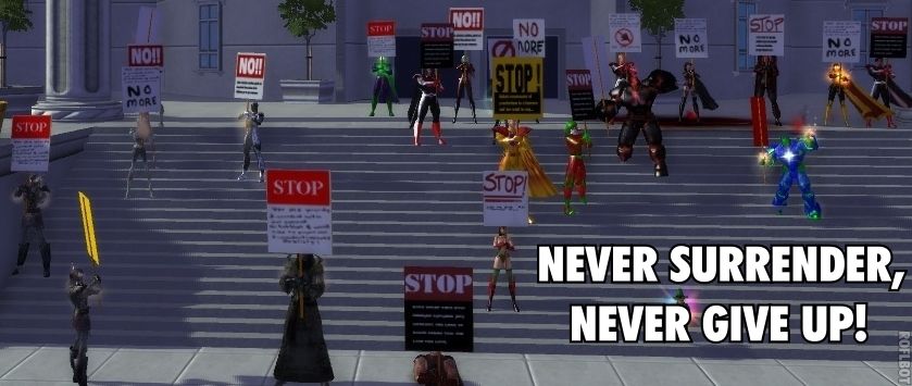
So... After voting... Posting ideas and suggestions for 14 pages... We are given NONE of the above.
This is a slap in the face!
(runs around corner before the rocks are thrown)
He he he.
"You sir, have never been in a hammer fight, that much is clear."
-Blast_Chamber
*yeah, I quoted myself.
Drink!
|
The orginal 2 options both had ManBearPig and the Tummynator to the sides of the forum - but player feedback pointed out that both designs didn't work well on smaller monitors, so they had to scrap the whole idea of chaarcter pictures down the side, and make a 3rd option, which was similar to the existing Statesman banner - that meant they had to use cut down versions of the more dynamic poses, as cut down versions of the standing poses would have looked weird because they were designed only to work with as side images, unlike the fighting poses which were designed to be used in several ways, just like the Statesman and BCU fighting poses.
|

@Golden Girl
City of Heroes comics and artwork
My PhotoShop-Fu is not the best. In fact, it downright sucks. I leave it to an actual expert in the program.

|
Make a banner using only the top halves of the 2 standing poses.
|
Their bodies could even peek out from behind the forums via fancy CSS (although I don't have a lot of faith in Seattle's fancy CSS department, to be honest).
Paragon Wiki: http://www.paragonwiki.com
City Info Terminal: http://cit.cohtitan.com
Mids Hero Designer: http://www.cohplanner.com
Well folks, I wanted #2, so... 
@Captain-Electric � Detective Marvel � The Sapien Spider � Moravec Man � The Old Norseman
Dark-Eyes � Doctor Serpentine � Stonecaster � Skymaiden � The Blue Jaguar
Guide to Altitis � A Comic for New Players � The Lore Project � Intro to extraterrestrials in CoH


@Golden Girl
City of Heroes comics and artwork