Freakishly Long Toes
Well, you guys should know by now, they don't go back and fix art/geometry of things they release unless it's a massive clipping issue. It's 'release and forget' with them. On to the next shiny! No looking back!
Shadowblaze - Lvl 50 Dark/Thermal Cor, Alexander Kalsoa - Lvl 50 BS/Regen Scrapper, and a whole bunch of other Alts. Global is @Shadowblaze.
Hm... those are some pretty long toes.

Little known fact: The ladies of Paragon are in reality not female humans, but genetically engineered gibbons.
Arc #40529 : The Furies of the Earth
Wow... Just... wow.
Don't know if I want to buy that, because I won't use those shoes ever.

my lil RWZ Challenge vid
This explains why melee attacks let us go toe-to-toe with the enemy even when we're several yards away.
@Golden Girl
City of Heroes comics and artwork
|
This explains why melee attacks let us go toe-to-toe with the enemy even when we're several yards away.
|
What I see here is gender exclusion! Females are now able to make characters like Hank McCoy (The Beast from X-Men) but males are not! Not fair I say!
Note: I am kidding, I am not serious at all.
Types of Swords
My Portfolio
Whoever thought normal mapping on faces was a good idea (Hint: IT'S NOT!) obviously thought this was a good idea too.
Dear god, QA people, what is this I don't even
|
GG, I would tell you that "I am killing you with my mind", but I couldn't find an emoticon to properly express my sentiment.
|
|
Originally Posted by Vyver
Do I want to know how stupid the hair is?
I almost don't want to look. |

Global - @El D
Servers - Protector
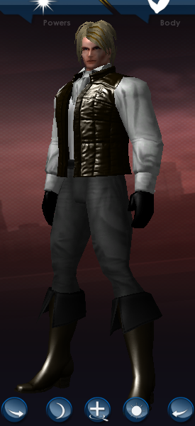
I have no problem with the styling, per se, but what is his hair doing WAY UP THERE!?
|
There was plenty of "constructive criticism" offered to the Devs about this while this was on beta some weeks ago. Nothing was fixed at the time. My guess is that we may be stuck with the "big-foot feet" with this option.
 |
Much like that horrible looking foot.
Never surrender! Never give up!
Help keep Paragon City alive with the unofficial City of Heroes Tabletop Role Playing Game!
The Gibbon dna has been removed from this foot model (not that I am anti-gibbon, they're a fine example of primate excellence), you should see this in an upcoming patch or ~I22 timeframe.
I blame it all on this newfound obsession with "realism" in a character creator that just doesn't support it. Specifically pertaining to feet, you can't have a realistic-looking stiletto-heeled shoe, because putting heels on your character doesn't actually make her taller, it just shortens her calves. You can only make the heel so high before it looks odd. The old-school stilettos solve that problem by being unrealistic, and having tiny feet to give the illusion of a higher heel. The newer ones seem to try to solve it by ignoring what actual human feet look like. They have three options: go back to the stylized stilettos of old, stick with "high-ish" heels rather than high heels (and I wouldn't actually mind some chunkier heels, since the actual heel on these shoes also looks nothing like the heel on any shoe I've ever seen) or the monstrosities we've been getting. These ugly sandaled feet look much the same to me as the witch, Barbarian, and bridal feet, it's just so much more glaringly obvious how misshapen they are when the foot is bare.
Eva Destruction AR/Fire/Munitions Blaster
Darkfire Avenger DM/SD/Body Scrapper
Arc ID#161629 Freaks, Geeks, and Men in Black
Arc ID#431270 Until the End of the World
For all the other freakish boots I've justified them to myself as extending beyond the toes. This, on the other hand, is a completely different case.
|
The Gibbon dna has been removed from this foot model (not that I am anti-gibbon, they're a fine example of primate excellence), you should see this in an upcoming patch or ~I22 timeframe.
|

@Captain-Electric � Detective Marvel � The Sapien Spider � Moravec Man � The Old Norseman
Dark-Eyes � Doctor Serpentine � Stonecaster � Skymaiden � The Blue Jaguar
Guide to Altitis � A Comic for New Players � The Lore Project � Intro to extraterrestrials in CoH
Sorry for the double post. Eva Destruction (punny name thar) does have a point, in that sometimes I think you should employ stylized realism for the sake of consistency with the rest of your models. But I just want to say, "stylized" does not mean quite the same thing as exaggeration in the way I'm using it, which is what turns me off about certain other super hero games (Saturday morning cartoon exaggeration). A lot of City of Heroes is stylized realism, and it looks awesome to my eyes. I'm not sure if reading that will make a lot of sense, but I do think Noble Savage could read this and know what I'm getting at.
@Captain-Electric � Detective Marvel � The Sapien Spider � Moravec Man � The Old Norseman
Dark-Eyes � Doctor Serpentine � Stonecaster � Skymaiden � The Blue Jaguar
Guide to Altitis � A Comic for New Players � The Lore Project � Intro to extraterrestrials in CoH
Good to hear there is a fix in the works. I previewed it in the costume creator with one of my existing toons. Whew! Those are some man feet!
@Mental Maden @Maden Mental
"....you are now tackle free for life."-ShoNuff
The new man hair looks better on the Huge model, IMHO. The bulk of huge model helps make the new hair look more normal where as the slimmer male model really makes the overall size of the new hair stand out.


|
Sorry for the double post. Eva Destruction (punny name thar) does have a point, in that sometimes I think you should employ stylized realism for the sake of consistency with the rest of your models. But I just want to say, "stylized" does not mean quite the same thing as exaggeration in the way I'm using it, which is what turns me off about certain other super hero games (Saturday morning cartoon exaggeration). A lot of City of Heroes is stylized realism, and it looks awesome to my eyes. I'm not sure if reading that will make a lot of sense, but I do think Noble Savage could read this and know what I'm getting at.
|
that hair is awesome
I can imagine orange hair with black stripes on a tiger character
or a savage with black hair and red blood stripes
I'd have to see how the whole character looks but I am happy to have male hair that is actually decorated.
I don't know about the rest of you, but my male characters are costumed superheroes and unusual and exotic is de riguer in their costumes.
Though I do agree the male hair seems set a bit high on the head compared to the advertisement, but overall it's not so bad. I'm personally reminded of Jpop singers and now want to make Gackt.
Click here to find all the All Things Art Threads!
|
Kind of like the... Issue 13 faces compared to the uncanny valley Normal-Mapped Steampunk faces? I love the issue 13 faces. I can't stand the normal-mapped ones.
|

But that's not as interesting as the context of your criticism, in response to a post about stylized realism in general (unless you were really just talking about that one thing specifically
 ). Criticism against realism in art design after years of collective complaining about mitts.
It's not bad because it's criticism, it's bad when it's not specific. If we're not specific about our criticisms, it can make us look like an audience that doesn't know what we want.
New faces were also released with Going Rogue, if I remember correctly. Those were well-received for their stylized realism, but for a simpler reason, because they were just more expressive. Those faces hint at what sorts of personalities might lay beneath. Yet, they are very subtle hints.
But personally speaking, the Steampunk faces were a win in their own right. I've seen them utilized with masks for just their eyes, and with unsettling villain costumes for their full uncanny nature.
@Captain-Electric � Detective Marvel � The Sapien Spider � Moravec Man � The Old Norseman
Dark-Eyes � Doctor Serpentine � Stonecaster � Skymaiden � The Blue Jaguar
Guide to Altitis � A Comic for New Players � The Lore Project � Intro to extraterrestrials in CoH


Yeah...
The shoes/ boots are nice enough, but those toes just don't work. I don't expect any change, though. A number of us have been asking for a fix to bare feet for a long time to no avail.
Est sularis oth Mithas