|
Originally Posted by Clockwork O1

The Gibbon dna has been removed from this foot model (not that I am anti-gibbon, they're a fine example of primate excellence), you should see this in an upcoming patch or ~I22 timeframe.
|
Freakishly Long Toes
|
The Gibbon dna has been removed from this foot model (not that I am anti-gibbon, they're a fine example of primate excellence), you should see this in an upcoming patch or ~I22 timeframe.
|
However....this was mentioned in Beta. A lot. Why does it have to be until now till it's fixed?
|
GG, I would tell you that "I am killing you with my mind", but I couldn't find an emoticon to properly express my sentiment.
|
|
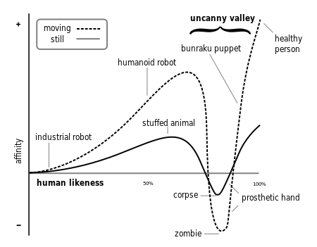
Kind of like the... Issue 13 faces compared to the uncanny valley Normal-Mapped Steampunk faces? I love the issue 13 faces. I can't stand the normal-mapped ones.
|
The Normal map faces are not good. They are about as far from good and right as you can GET in this game. They are the antithesis of everything graphically good in this game! They are EEEEEEVVVVVILLLLLLL!!!
Hopefully that makes the point. Please, guys, STOP using the uncanny valley inducing Normal maps on faces. NMs work great on clothes. But all you've successfully proved is how BADLY they work on faces. Please, enough?
|
GG, I would tell you that "I am killing you with my mind", but I couldn't find an emoticon to properly express my sentiment.
|
|
The Gibbon dna has been removed from this foot model (not that I am anti-gibbon, they're a fine example of primate excellence), you should see this in an upcoming patch or ~I22 timeframe.
|
add in a monkey tail...I can sorta make Zidane from FF9 o.o
|
The Gibbon dna has been removed from this foot model (not that I am anti-gibbon, they're a fine example of primate excellence), you should see this in an upcoming patch or ~I22 timeframe.
|
P.S. The thigh-hi Witch boot could use the same "toebotomy" treatment, but if that can't be done then these new strapy boots need to be the priority.
Loth 50 Fire/Rad Controller [1392 Badges] [300 non-AE Souvenirs]
Ryver 50 Ele� Blaster [1392 Badges]
Silandra 50 Peacebringer [1138 Badges] [No Redside Badges]
--{=====> Virtue ♀
@Golden Girl
City of Heroes comics and artwork
|
Hopefully that makes the point. Please, guys, STOP using the uncanny valley inducing Normal maps on faces. NMs work great on clothes. But all you've successfully proved is how BADLY they work on faces. Please, enough?
|
I'm sure that's meant to make them as flexible as possible for different avatars, but almost all the non-normal mapped faces have some form of expression, like a small smile, or a frown, or a slightly puzzled look, and so on - those are what they need to add to the normal mapped faces.
@Golden Girl
City of Heroes comics and artwork
|
Normal mapping works fine on faces - but they need some kind of expression on them to bring them to life - the ones we have so far are all too blank.
I'm sure that's meant to make them as flexible as possible for different avatars, but almost all the non-normal mapped faces have some form of expression, like a small smile, or a frown, or a slightly puzzled look, and so on - those are what they need to add to the normal mapped faces. |
As for the toes: I'll agree that the witch boot could use a quick once over to make the toe more in-line with the barbarian boots. Not holding my breath but hoping. Glad to hear that the shiny shoes will at least be getting a once over.
Est sularis oth Mithas
TargetOne
"If you two don't work this out RIGHT NOW, I'm turning this invasion around and going home!" - Emperor Cole
|
I am a bit of an artist. Here is the "trick" to drawing feet. Or really anything. Do not "draw feet." Take a few colored pencils. A good eraser, and a smudging tool. Have a friend with a few minutes prop up a foot on a pillow while they read/have tea. Now. DO NOT draw the foot. Pick the 3 largest areas of the item you are looking at (in this case a foot) and quickly and lightly color in those values in the correct physical relationship to one another. There will be a lot of white space, its cool. Use the eraser to better shape the areas. Now, repeat. Now start very lightly coloring a few connecting areas between the three shapes. Big Shadows? Glowing bright areas? Concentrate on Value and positional relationship. Add a few details. Done. Seriously, dont overdraw it. The human mind looking at it will pick out a foot. If you try for photographic realism you are doing yourself no favors.
|
Orc&Pie No.53230 There is an orc, and somehow, he got a pie. And you are hungry.
www.repeat-offenders.net
Negaduck: I see you found the crumb. I knew you'd never notice the huge flag.
|
Normal mapping works fine on faces - but they need some kind of expression on them to bring them to life - the ones we have so far are all too blank.
I'm sure that's meant to make them as flexible as possible for different avatars, but almost all the non-normal mapped faces have some form of expression, like a small smile, or a frown, or a slightly puzzled look, and so on - those are what they need to add to the normal mapped faces. |
All normal mapping does for faces is slam it straight into uncanny valley territory.

We already have examples of great faces; the Praetorian Clockwork faces and the Bioluminescent and Organic Armour faces were incredibly highly detailed and looked great. They worked with the existing CoH style and were far better quality than all the old faces.
The new normal mapped faces, Steampunk and Monster packs along with the upcoming Chinese Dynasty face, all look terrible. Given the general negative feedback both in Betas and from what I've noticed in game, I know I'm not alone in that.
Not to mention tripping into the Uncanny Valley is a pretty amateur error that I'd expect from myself and people on my Uni course (digital animation, so I'm not just talking outta my butt-plate) not from people in Industry.
|
GG, I would tell you that "I am killing you with my mind", but I couldn't find an emoticon to properly express my sentiment.
|
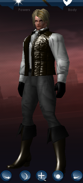
I'm going to quote someone whose name I don't remember, but those shoes look like someone sawed off the woman's feet and replaced them with hands. Those toes are a mile long! I mean, OK, the Witch boots are infinitely goofy, but at least they're still boots. You can claim the woman simply has no taste in footwear. But those are actual bare feet! There's no excuse for that. It makes every female character I've tried them on look like a manatee!
On the plus side, I like a lot of the other stuff in the pack. I'll personally be buying it for the Jeans and Penny's hair. And I suppose for the Marty McFly lifejacket. The rest of the stuff doesn't interest me. The "metallic" top and bottom for women look so "realistic" with all their creases and crinkles it's just ungainly.
As for the male "dyed" hair... I don't know, it just looks like one of the Deckers from Saints Row: The Third. It's not so much bad... OK, it IS so much bad, but more than that, it just looks so cartoony as compared to the rest of the set I'm honestly starting to get conflicting messages. First David stands up strong and tall for hyper-realism (as I read his posts) and we get those photo-realistic crinkled textures, then we get this hair, which looks like something out of Worms 3D. It doesn't even look like hair, it looks like a quill rat is sleeping on my head. Either that, or like I haven't washed my hair in six months and it's clumped together in leaves of a sort. And it still looks like those hair clumps can be used as deadly weapons.
|
Samuel_Tow is the only poster that makes me want to punch him in the head more often when I'm agreeing with him than when I'm disagreeing with him.
|
|
All normal mapping does for faces is slam it straight into uncanny valley territory.
|
All this hyper-realistic texturing makes everything look so bad. This goes for things like the new Pocket D realistically crinkled jeans. I'm sorry, but they just look wierd in the context of CoH's already well established visual style.
I just realised something. Do you know what the new male hairstyle reminds me of? Knuckles the Echidna!

I'd also like to cast my vote AGAINST further hyper-realistic textures making their way into the game. City of Heroes has always had an art style that's part serious mimicry of real life, part stylised, idealised representation. All the Unreal engine games that keep coming out these days do look more realistic, but that's the style they're going for. I don't believe City of Heroes would look better with such a style.
|
Samuel_Tow is the only poster that makes me want to punch him in the head more often when I'm agreeing with him than when I'm disagreeing with him.
|
|
The Gibbon dna has been removed from this foot model (not that I am anti-gibbon, they're a fine example of primate excellence), you should see this in an upcoming patch or ~I22 timeframe.
|
I find it highly ironic that people have been clamoring for realistic hands for years now - but when we finally get them, the fingers have been attached to.... feet. I remember looking at this on Beta and thinking "wtf...." lol

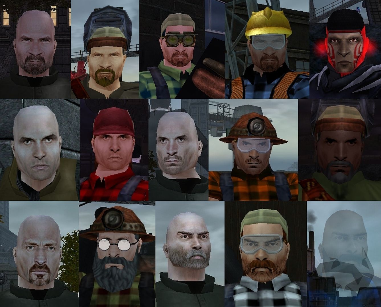
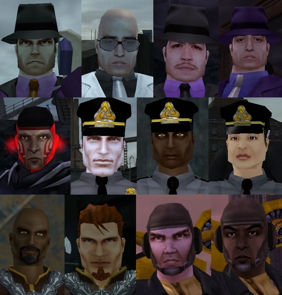
Speaking of uncanny valley. CoH already has highly photorealistic faces that everyone accepts (well, at least, they did for years until pointed out, at which time some people suddenly have issues with them <sigh>) which *do not* fall into the uncanny valley. They were introduced in CoV for the Luddites, Scrapyarders, CoV Family, Gold Brickers, and Arachnos. Then they stopped being used for a while. When I pointed them out to Noble Savage for Player use, all of a sudden, they started to be used again for NPCs, such as the Praetorian Police (the humans, anyway). But still, not for players.
What makes them successful compared to the waxy Normal Mapped faces is that they're not waxy or shiny, but very flat matte. And they have a bit of a graininess and uneven shading to them that resembles human skin rather than mannequins.
Come on, Paragon Studios. You know that sooner or later you *will* release these for players. It's inevitable. Please make it sooner than later.
To wit...

Newer ones v. old low rez...

Speeding Through New DA Repeatables || Spreadsheet o' Enhancements || Zombie Skins: better skins for these forums || Guide to Guides
Yup. I guess it's MORE disappointing, knowing that they HAVE and CAN make faces look awesome, yet the whole 'OMGNew Shinies!' thing gets in the way of what actually works and is proven to work pretty much without fail.
|
GG, I would tell you that "I am killing you with my mind", but I couldn't find an emoticon to properly express my sentiment.
|
|
Yup. I guess it's MORE disappointing, knowing that they HAVE and CAN make faces look awesome, yet the whole 'OMGNew Shinies!' thing gets in the way of what actually works and is proven to work pretty much without fail.
|
After seeing a certain other dev team fail basic concepts of HCI and GUI design, I'm willing to cut Paragon a little slack for being magpies.
Brawling Cactus from a distant planet.
If you think all or even most of the player base would agree that adding nothing but grizzled lumberjack faces with wicked witch noses from here on out would be awesome, well, I suppose my diction so far in this sentence makes my thoughts on that clear enough. It's worth considering that those "great, realistic" faces were all added for CoV and are all clearly designed to give CoV a drearier tone than CoH had already established.
|
I'm hearing people ask for more variety, and tossing out different ideas. That's great! Look at the whole thread, not just individual posts.

@Captain-Electric � Detective Marvel � The Sapien Spider � Moravec Man � The Old Norseman
Dark-Eyes � Doctor Serpentine � Stonecaster � Skymaiden � The Blue Jaguar
Guide to Altitis � A Comic for New Players � The Lore Project � Intro to extraterrestrials in CoH
Fair point. Talk of how that was the golden age of CoX faces strikes me as slightly odd though, as that does more than just slightly imply that they should go back to doing those. The thing is, all of CoV's faces look the same to me because they're all gruff and grumpy and weird. I doubt the devs would consider those faces suitable to be ported to players given the wonky nose issue alone, but more generally the fact that they are complete packages not designed to be customizable with masks, beard options, and so on.
|
And in a way that fits the game, rather than the horrors that are the normal mapped faces. See also the bioluminescent and organic armour faces. They are too limited and specific to see much use...BUT they are incredibly high quality. THAT is what should be the norm.
|
GG, I would tell you that "I am killing you with my mind", but I couldn't find an emoticon to properly express my sentiment.
|
do the faces really affect your enjoyment of the game?
I mean I take a minute to choose a face when I make a character, but in game I almost never see someone's face from closer than 10 feet or more.
I play in a 3rd person view so I never see my own face, and I would have to zoom into first person view and walk right up to see someone else's face in detail
the general appearance of faces I see is fine for me when playing the game. I would rather the devs made new backpacks or wings than revised faces

