The New Look for Circle of Thorns
Feedback;
Need less of the pattern. It's a tad overkill. Give them some flat space.
Colours; they need points of interest, a third colour to break up the two-tone (which doesnt work too well, btw)
Get rid of the pink gems. Seriously. Pink? Dark red, fine, purple, fine. Pink? Heck no.
And yes, still a tad too spiky.
BUT...much better than they were at first glance.
|
GG, I would tell you that "I am killing you with my mind", but I couldn't find an emoticon to properly express my sentiment.
|
i want those..costume sets...can i beat a Death mage up and steal one!!!?
|
Like I said - I don't find "flamboyant pope" to be bad thing. We need a few of those in there, as well. I like that they managed to combine what was sinister about the old CoT with what made that very same group so very goofy, and still keep them stylish, at least in my eyes. I'm sure we'll see more hoods and simpler designs for the low-level minions, but the flamboyant, over-dressed grand masters are pretty much exactly as I'd have liked to see them, given the limitations of the engine, back spikes and all.
|
This is still a flamboyantly ridiculous "re-interpretation" of the Circle, and still a completely unnecessary change, and poorly executed on top.
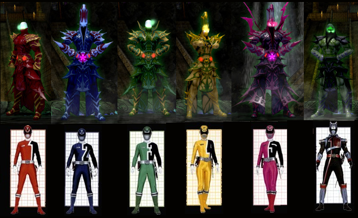
As for the color choices, which have come under the most criticism of any aspect of the updated redesign, there's no denying their origins:

The Death Mage clearly developed a crush on the Pink Ranger from watching children's TV. That might be even creepier than any of the CoT's occult rituals.
I have to say this.
The Death Mage Just. Looks. Awesome. ...even if he has a flower on his belt Oo

@Redcap

ANARCHY = A Society that does not need government
114. Ahrouns do not appreciate my particular brand of humour, so I should stop bleaching bulls-eyes in their fur.
|
The artwork looks wonderful... BUT!!!! and that's a big one....it doesn't translate well at all in the field.
I'd been reading about the new COT in forums, and on the beta chats so I mozied over to the Hollows to check them out and I thought they looked HORRID! And I don't mean that in a good way at all. The COT now look like just another creature (a la coralax and spawns) only with points. Pretty shapeless, and even less recognizable as anything that ever started out as human beings. (At least the old mages still looked somewhat human.) Maybe in other environments they translate better, but I gotta say that I'm terribly disappointed. Too pointy/blobby.  |
Also I thought I saw similar designs before and found an image which I'll host to not steal bandwidth....Warhammer 40k.


Click for bigger image
None the less I want these outfits!
 and the damn carnie stuff we've been asking for for years which the new Carnival of War/Light has. Sashes & Face Masks to say the least
Djeannie's Costume Creator Overhaul Wishlist
Carnie Base
"Once the avalanche has started, it is too late for the pebbles to vote" -Kosh
I really liked old CoT ragged nazgul look. Now their too much spikes look gives "little kid cool" feeling :/
Perhaps its cultural thing. Europeans likes their christmas tree with some decorations and americans don't care is there actually tree under the decorations.
edit. actually I generally like CoT as enemy group. I like their maps, mobs and bosses. They are one of less annoying enemy group in game 
Prunejuice is warriors drink.

LOVE The look of the Death Mage.. hope he doesnt love me back
|
Also I thought I saw similar designs before and found an image which I'll host to not steal bandwidth....Warhammer 40k.
|


Despite the ostentatiousness of the CoT redesign, it still gets lost in the pack with all the other trend-followers of this style of fantasy art.
|
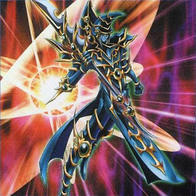
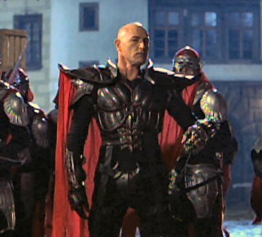
Warhammer pioneered the spiked 'n' staked pauldrons look. It's now become so common as to be generic, which makes it a shame to have this redesign dilute CoH's distinctive and creative art direction. By way of illustration, here are some examples from, variously, card games, RPGs, tabletop strategy, and tie-in movies. Although the CoT redesign is on the more elaborate end of this spectrum, they all have the same look and feel.
|
|
I really liked old CoT ragged nazgul look. Now their too much spikes look gives "little kid cool" feeling :/
Perhaps its cultural thing. Europeans likes their christmas tree with some decorations and americans don't care is there actually tree under the decorations. edit. actually I generally like CoT as enemy group. I like their maps, mobs and bosses. They are one of less annoying enemy group in game  |
The Death Mage looks ridiculously over the top.
While these pics do look sick. I just saw them in game and they look hella stupid. Costumes are far far too busy.
|
I don't recall anything about the Circle of Thorns ever being "goofy." As far as I can tell they're a pretty hardcore group of soul-stealing, kidnapping, power-hungry ancient mages, which is pretty cool. There are "goofy" villain groups in the game (Skulls, Freakshow, etc) and I was pretty happy with the Circle not being one of them. It certainly makes one of my character's backstories less meaningful when it turns out she was kidnapped by a hot pink wizard.
|
If being kidnapped by a hot pink wizard causes you to question your masculinity, then you are missing the point - irrespective of what they look like, these guys are the real deal. They've lived for 14 thousand years, they possess arcane knowledge and power unparalleled in the modern world and they have no respect for our laws, culture or traditions. If they want to dress in ridiculous hats, absurd shoulders or pink robes, then they are simply going to go ahead and do that because no-one can really stop them from doing it.
The Circle of Thorns have always been over-the-top in terms of looks but ridiculous in terms of appearance. A lot of magical factions in City of Heroes are. Or are we somehow considering men dressing as shamen and not wearing underwear, or men wearing ridiculous car grill helmets to be any less absurd?
What, really, changed about the CoT aside from the extra detail? They have the same hats, they have the same shoulders and they have very similar robes. The colours are loud, but no less so than before. The only truly significant change is the addition of a ton more detail, but that was kind of the point. And that, believe it or not, was the problem with "damn sexy energy mage" - he was too plain to qualify as a mage.
|
Also I thought I saw similar designs before and found an image which I'll host to not steal bandwidth....Warhammer 40k.
|
I firmly believe that just because something has been done before by other people, it doesn't mean that it can't be done WELL if you put an interesting spin on it. The new Circle do that quite well, I think.
I'm a European and I don't even want a Christmas tree for Christmas. I've been arguing up a storm against the overly complex character designer currently on Beta. I still love those Circle designs. They're ancient. They're arcane. It makes sense that their design would be overloaded with details, because of the complexities of their art. Yes, these no longer look quite like clothes. To this I say "meh." The CoT still have their hoods and their concealed faces, which is all the link I really wanted with them. If they no longer look like monks, that just fine, too.
|
Samuel_Tow is the only poster that makes me want to punch him in the head more often when I'm agreeing with him than when I'm disagreeing with him.
|
|
The unreasonable hatred of pink aside (it's only been "girly" in the last few decades), it's the Circle's BACKSTORY that was always serious and grim. Their attire, however, has never been so. Aside from the few robed minions, most of these guys ran around in funny hats, huge shoulders and long skirts. Most traditional "high mage" outfits are goofy, and that's the POINT.
|
Thanks for the in-game screenshot. The new CoT definitely clashes with the environment more than the old design ever did - they look like invaders from another game entirely. The Circle of Thorns could give the Nemesis Army a run for its money in the "out of place" category the way things are going.
|
Warhammer pioneered the spiked 'n' staked pauldrons look. It's now become so common as to be generic, which makes it a shame to have this redesign dilute CoH's distinctive and creative art direction. By way of illustration, here are some examples from, variously, card games, RPGs, tabletop strategy, and tie-in movies. Although the CoT redesign is on the more elaborate end of this spectrum, they all have the same look and feel.
Despite the ostentatiousness of the CoT redesign, it still gets lost in the pack with all the other trend-followers of this style of fantasy art. |
 Check out art by Rodney Matthews. His art is fantastic in that its very sleek, curvy and yet spiky too.
Djeannie's Costume Creator Overhaul Wishlist
Carnie Base
"Once the avalanche has started, it is too late for the pebbles to vote" -Kosh
I think all that really needs to be done is a few color changes to some of the CoT and the removal of a few of the spiky patterns here and there. Wouldn't need much at all really.
Djeannie's Costume Creator Overhaul Wishlist
Carnie Base
"Once the avalanche has started, it is too late for the pebbles to vote" -Kosh
|
I think all that really needs to be done is a few color changes to some of the CoT and the removal of a few of the spiky patterns here and there. Wouldn't need much at all really.
|
Also:
|
The Circle of Thorns could give the Nemesis Army a run for its money in the "out of place" category the way things are going.
|
,'&#
{}... .-
01234
"*_
?;!hgfauirebcew
All righty...
1) Pointy hats for Bosses/EBs/AVs only, give all minions the hood.
2) Death Mage should be wearing what the Madness Mage has
3) Tone down the patterns, outfits are way too busy
4) Overall colors could stand to be darkened
5) Change the color of the crystals in the belts...
I kind of want to see minions with the huge model wearing this
Anyone Who wants to argue about my usual foolishness can find me here.
https://twitter.com/Premmytwit
I'll miss you all.
that shot. That doesn't look too close to the promo shot, yeah.
Kind-of looks more like the CoT got access to Stone Armor's power customization menu, and
just went with the first colors it gave them.


The artwork looks wonderful... BUT!!!! and that's a big one....it doesn't translate well at all in the field.

I'd been reading about the new COT in forums, and on the beta chats so I mozied over to the Hollows to check them out and I thought they looked HORRID! And I don't mean that in a good way at all. The COT now look like just another creature (a la coralax and spawns) only with points. Pretty shapeless, and even less recognizable as anything that ever started out as human beings. (At least the old mages still looked somewhat human.)
Maybe in other environments they translate better, but I gotta say that I'm terribly disappointed.
Too pointy/blobby.