|
Originally Posted by Samuel_Tow

Now, if we could shoot sonics out of our hands like Spider-Man villain the Shocker, that I'd probably play.
|

|
Originally Posted by Samuel_Tow

Now, if we could shoot sonics out of our hands like Spider-Man villain the Shocker, that I'd probably play.
|

Some aura suggestions:
- Alternate versions of Victorian decor: geometric patterns, mystic sigils, honeycomb forcefields, etc
- Hand auras that only show on hands instead of the whole arm like many existing auras.
- Tail auras: small fire at the tip is most obvious, but also electricity, sparklies, glows, etc
- Outline auras: where part of whole of the character has a glowing outline. We already have this with "glowing aura" but versions with different effects could be added. Such as the lines/circles that seem to connect the character to she space around them that were mentioned some posts back. Or one those CoL swirling portals, set to always face camera and draw behind character geometry, with a smaller "head" version.
- Inanimate companions: small crystals, cards, spoons, holographic screens, hightech bits that hover around the character. Different from magnetic/tarot in that they are static relative to character instead of orbiting around it. The HUD and winter halos are examples but so much more could be done here.
Regarding powersets, I would very much like a new "rays of light" alternative to the current "globs of stuff" effects on Radiation blast. Something similar could work for energy blast as well.
And on a more general note. I guess this might not be for your department, but then you can carry the message to the Static box in the tunnels that you.. mrm... rat ?
Some time ago players asked for new(er) shader model 3 effects on powers - most notably "real" distortion effects. Back then the reply was that the game only allowed one effect "package" and devs could not create power effects that would look good both with and without SM3.
Now, we do have tech for alternate animations/FX. And the definition of "low end" and "average" hardware has shifted. Could this thought be revisited ?
|
Samuel_Tow is the only poster that makes me want to punch him in the head more often when I'm agreeing with him than when I'm disagreeing with him.
|
|
To end the theme on fire, check out the difference between a gasoline explosion and an RDX explosion. One is a huge, relatively slow-burning fireball, the other is a high-velocity explosive. I'm not sure if both count as fire... In fact, I'm pretty sure the high explosive doesn't. But that's kind of the point - if we view fire as meaning burning, then that leaves the door open for explosions as another theme.
|
|
Want this be available in Paragon Market!
I'll call it, Soul Path Aura! 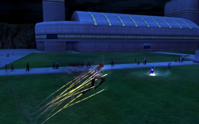 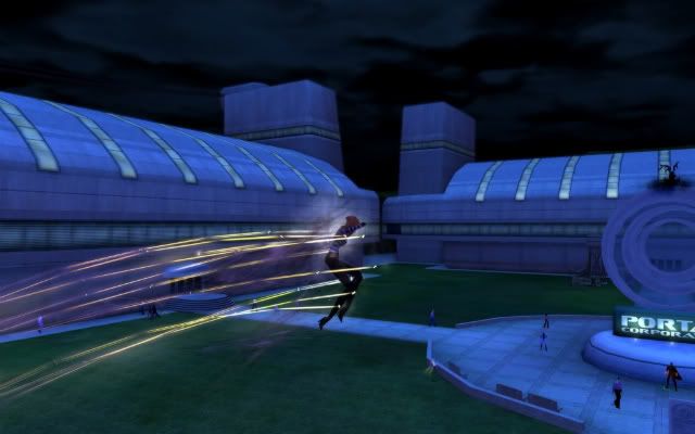 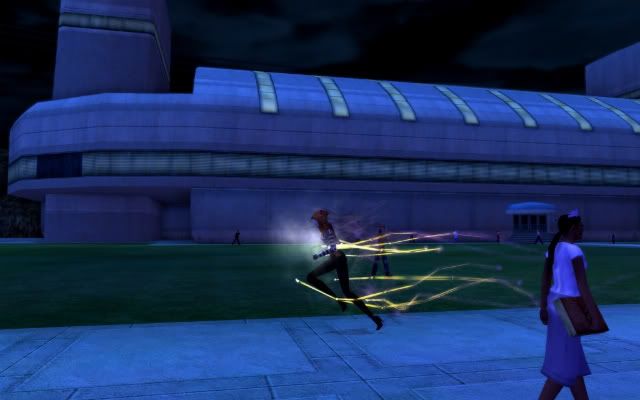 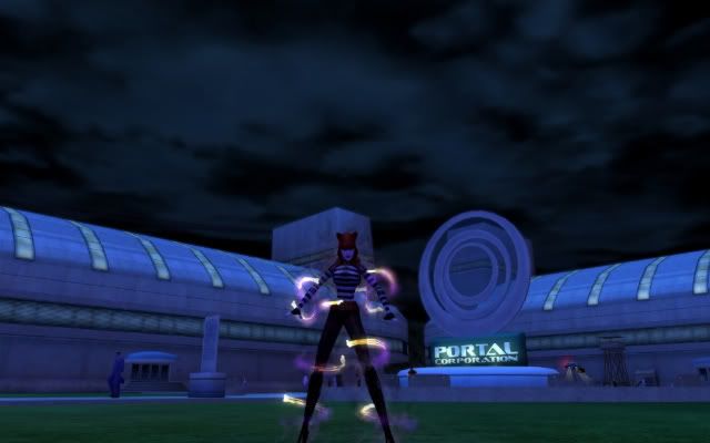 |
Really not sure if this is the right thread but I'd really appreciate a Minimum FX or FX in PVP Only for Hide in the Stalker Dark Armor powerset.
I'll respond later with some Aura ideas, woo!
Emote Request:
1. Start with the Wedding Pack's /em throwrosepetals
2. Edit the particles thrown to not be rose petals ... substitute dollar bills instead
3. Name new emote /em throwdollars
Temporary Power Request:
The Dance Gun ![]()
![]()

|
Except that Radiation *does* have a real world visual effect associated with it which everyone should recognize ... Cherenkov Radiation.
|

|
Minor point, from being trained in these sorta shenanigans... Explosions are scientifically nothing more than EXTREMELY rapid combustion reactions. AKA a campfire is the same as an extremely slow explosion, and an FAE cloud going "Foomf!" is a very rapid fire. Explosions need heat and pressure to work properly, and the pressure acts as an accelerant.
|
|
Fun fact, as long as you don't kick/stomp/drop the pot on it, you can cut a chunk of C4 (common, stable explosive), light it on fire with a match/lighter, and cook over it without a threat of explosion.
Again, don't curb-stomp it while burning, though. That'll be bad. |
|
Samuel_Tow is the only poster that makes me want to punch him in the head more often when I'm agreeing with him than when I'm disagreeing with him.
|
First off, thanks for checking back in Tunnel Rat. The potential for a dual aura system sounds great. If you guys move in this direction, please consider proliferating the right fist/left fist exclusive auras to all existing auras. And also then consider the use of duplicate auras so a player could conceivable make a character with blue fire on one fist and green fire on the other fist.
Second, finally started badging some Baby New Year missions on some newer characters this year. A while back you had mentioned more environmental and weather effects coming into the game via fx. Y'all done real good with the subtle update to the BNY map with the intermittent snow and fog. Very effective, if subtle.
|
Sonics: BABs once said "I locked myself in a dark room and yelled until I saw colour. I saw orange" as an explanation for why Defender Sonic powers are orange by default. But what do you, personally, see sonics as being? Do they represent us literally yelling at people? Are they some kind of sub-audible ultra-sound? Are we affecting people's hearing or are we, err... Liquifying their organs? Or are we just producing supersonic shockwaves like those of true explosions?
|
|
I don't know if this would fall under copyright issues or not, but I'd like to see an aura similar to the various Lantern Corps' from DC. We have something similar in starburst glow and... the other whos name I can't recall offhand, but I'd like something a bit more subtle and tighter to the character, just a simple colored outline. This could again be used for a variety of purposes as well as explaining away armor.
|
Tunnel Rat, I'd like to bring a couple of issues to your attention, and I want to bring them to you personally because I've been reporting these bugs since I16 and nothing has happened with them. I hope that if you see what I'm talking about, you'll recognise why these are genuine problems.
First is a problem with Forcefield Generator from the Mastermind -> Traps powerset. When not customized, the power works correctly. However, when set to Colour Tintable, the forcefields the generator puts on other people become displaced. The forcefields only track people's absolute position, but in no way account for the character's animations - they are not bound to the model, but rather to the model's location. This is immediately obvious because the forcefields are set too high and people's legs stick out from below. It's also obvious because many animations - Titan Weapons especially - cause us to lean, duck or jump out of our forcefields which do not follow us. I even have pictures.
This is what Forcefield Generator looks like when I colour it yellow:
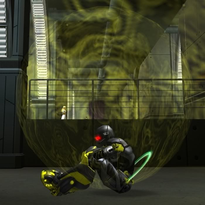
Notice how my character's butt and legs are outside of the forcefield. Notice also how the forcefield is slightly above the ground, this making it impossible for anyone standing to be inside it. Notice also how my character is scrunched down towards the bottom of the forcefield, yet the field will not come down to cover him.
Compare this with how the Original Forcefield Generator forcefield looks:
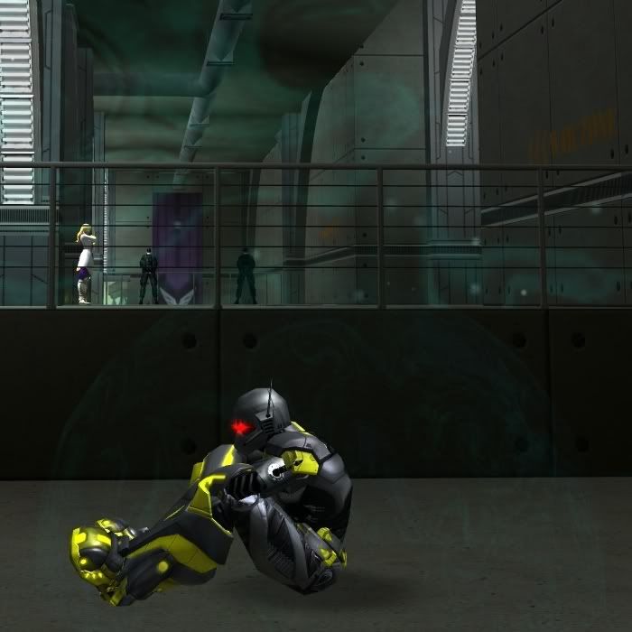
Notice how much better the field is here. My character is wholly enveloped with the field, which has come down, intersected with the ground and is following the position of his torso. Yes, my legs are still off to the side and the character is sitting left of centre, but that's because the forcefield follows his chest like a backpack. Also, even though he's displaced, he is still inside the forcefield, thus looking like the field is doing its job. If he were to use Total Focus or Arc of Destruction, the forcefield would move with him as he hopped and leaned back.
---
Then there is the other issue: Poison Gas Trap. This one I've reported till my fingers turned red and I don't get why nothing has happened to it. When not customized, Poison Gas Trap works just fine. When given custom colours, however, it's really bad. As you know, Poison Gas Trap summons a bottle - a vial of poison, presumably - which, when triggered, sprays an aerosol out and creates a cloud of gas. The problem is that the Poison Gas Trap's custom colours only apply to the bottle and the spray it shoots out, but NOT the cloud of poison gas it creates. This is always the same light cyan colour irrespective of what colours I pick. Have a look:
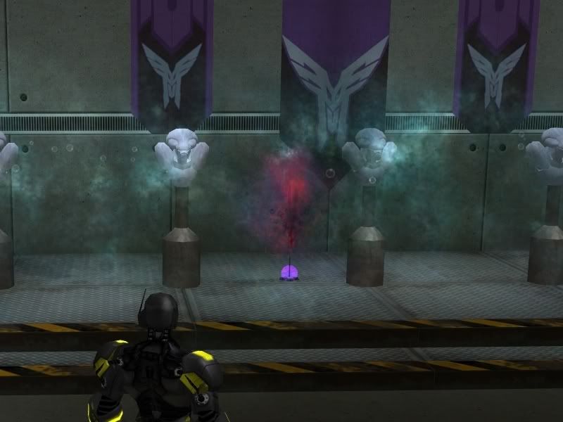
Notice how the bottle is a purplish pink and the spray is a combination of red and blue. The power is using a Colour Tintable theme, and I have coloured red and blue because it produces what looks like a foul, toxic, noxious-looking chemical. The bottle is pink because the colours mix, and the spray is blue and red. However, notice the cyan cloud of gas that looks almost like steam. That's the "poison gas." A bottle full of pink liquid should not produce a cyan gas cloud, at least I don't want it to do that. I want to have control over the colour of the poison gas cloud if that's at all possible. However, there really is no point in customizing this power if we can't customize the cloud, because the cloud is by far its biggest effect.
---
I am right now forced to use the Original theme for both Forcefield Generator and Poison Gas Trap. Especially Poison Gas Trap, I would really, REALLY like to customize to match my blue and red Acid Mortar for which ALL effects customize properly, but I can't. I can't because the custom tintable version of the power doesn't actually tint. I've grown used to using the default Forcefield Generator just because it matches the forcefields from the Protector Bots, which I can't customize, but the Poison Gas Trap is something I'd really, REALLY like to swap the colour of.
I have it on good authority that Trip Mine doesn't take custom colours correctly - it ignores its secondary selection entirely - but I don't have the power on hand to test it yet. That's just what I remember from a collection of Devices Blasters I have since deleted.
---
Please understand that I don't ant to bug you about this personally, but submitting bug reports about these issues has simply not helped, and I think I16 to now is a long enough wait time.
*edit*
Is it possible to get Detonator to have a tintable explosion, or is the power too convoluted to customize?
|
Samuel_Tow is the only poster that makes me want to punch him in the head more often when I'm agreeing with him than when I'm disagreeing with him.
|
Tunnel Rat, I really like the Rainbow Path Aura (as I mentioned to you in person at the Player Summit) ... I think it looks wonderful! But one thing that I don't particularly care about about with it is that that pathing aura "distance" is so ... short. I for one would like to see the option for the Rainbow Path Aura to have Short (ie. what we have now), Medium (ie. double what we have now) and Long (ie. triple what we have now) "durations" for the rainbow color FX so as to be able to make "rainbows" that aren't just a single (short) length of "bow" when jumping (or flying, or running) around.
Would this be something especially "difficult" to tweak, or are there some sort of Technical Limitations (like, Lag, for instance) which would prevent making longer duration FX on the Rainbow Path Aura possible/practical?

I have dark miasma on my mastermind and use it to good effect via power customization to make it look like vanilla frosting. It's not quite perfect, which makes it look even more "wrong" and that works for me since my character wants it to look mutagenic, but I can see frustrations others might have with that. It was even odder before power customization, though!
I hope this is not some sort of blasphemy or disrespect, but I'd really like it if you guys in the "let's give customization to the players" department had some guys on sound customization. There's more than a few sound effects in the game that frustrate me because they're fine for what they do, they just get REAL nerve-wracking when they're on repeat so much. psychic, sonic, electric stuff are just so crazy. even the masterminds. robots are cool and put on a light show, but demons are just so TERRIBLE at karaoke. If you could, please forward that request to someone. (I know there's ways to permanently mute sound effects, but it bothers me to mod the game like that for some reason)
With regards to player options, may I please make this very simple request:
polygon-free player skin. I mean like, my character is a hovering suit of armor with nothing visible inside. There might be an aura at work, turning me into a big fireball or cloud of gas, but it would be particularly cool (and hopefully very simple) to simply "delete" the visible components of the player parts. Whether this results in an invisible (but not stealthed, cause the game's mechanics wouldn't be affected) player, or enables some new transparency effects is sorta irrelevant. New stuff like that adds value to all the "piece" costume options in the game already.
To prevent that from breaking the game in pvp, in pvp zones, the "invisible" effect would be replaced with that hologram look from the architect's default mission giver, and everyone in the pvp zones would be given a "buff" that says "you can see some invisible foes with these nifty goggles. This effect does nothing for your in-game perception mechanics, but will allow you to see players who made their costumes invisible."
In addition to all this, would it be possible to change all of the controller, dominator, blaster, and corruptor powersets to give them a very simple "gun" option for their "blast" powersets?
For example:
I create a science or tech blaster and choose fire blast/fire assault. On my powers customization, I choose "gun." then when I use those powers, instead of having the effect come out of my hand or mouth, the effect's origin comes from a gun that my character pulls out when attacking. This is not the same gun used for assault rifle powers or pulse rifle/beam rifle powers. Basically it's an alternate animation set.
What's cool is if I chose assault rifle and fire assault, I could make my fire assault powers come out of a gun, as if I was using two different kinds of guns.
I'm aware that you wouldn't be able to customize the gun that much, but the concept is cool and it would be a nice step in the right direction for players that don't want flames coming out of their hands.
|
There's more than a few sound effects in the game that frustrate me because they're fine for what they do, they just get REAL nerve-wracking when they're on repeat so much.
|

I'm not really sure if this is the place to put this, but...
Why in the hell is Dark Armor so insanely lag-inducing? I never really have lag issues until I log on my DA character and the camera gets too close. Is there anything that can be done to make DA less of a graphical hog?
Secondly, again, not sure if this is the right place, I've got a bone to pick with Bioluminescent and Ascension Radiance parts: Why do I need to change the WORLD shaders to change the way my CHARACTER looks?? I could max out every single character-related graphics slider and be fine, but mess with the world settings too much and I lag like nuts. It's incredibly frustrating that these two things are conjoined, why can't we change character and world shaders separately. Now, of course, I'm no programmer so it may not be possible, but has anyone at least thought of this and how much this can limit player options?
I'm sorry to keep banging on Traps, Forcefield Generator and Poison Trap, but I figured pictures and explanations weren't enough. So I made a video! Right here!. It depicts what I'm talking about in motion and should be easier to follow than my screenshots.
|
Samuel_Tow is the only poster that makes me want to punch him in the head more often when I'm agreeing with him than when I'm disagreeing with him.
|
|
Also, a special request from the Honey Badger (I know he wants a "cooler" redname but he is SO stuck with that.) We have some time coming up that will be specifically scheduled for auras. If you haven't gotten your aura or path aura suggestions in yet, please post them! We love hearing your ideas!
|
|
Good question, Sam. Let's talk shop!
The fine details of what the power is actually doing, I'll usually leave up to the player. Are Darkness' effects shadows or illusions? Is that actually a chattering skull erupting from your face, or is it just a product of your target's hallucinations? Are you causing permanent damage with your Sonic attacks, or temporarily deafening your target? That's up to you, and really, answering those questions doesn't change the look of a power much, from an artist's perspective. When we design powerset effects, we keep two goals in mind. The visuals should be easily associated with the powerset's theme, while being consistent with the amount of detail and stylization in the game. (I think CoH shoots for a simplified, but still dynamically exaggerated version of realism, and I try to reflect this in the effects I make.) We also treat each powerset as its own specialized case, and make sure the visuals are appropriate for its mechanics. To put it simply, attacks should look damaging and painful. Buffs should look protective and rejuvenating. Mez attacks should look like they're inhibiting the target. When it comes to the players' acceptance of the effects, I find that believability - that is, whether the power represents the theme and the mechanics of the power well - is more important than the actual type of fire being used. You mentioned you would have expected a different kind of explosion for Pyronic than the one the FX team ultimately delivered. But you still seem to like the power. Really, any number of huge, fiery explosions would have worked just as well. But the type of explosion isn't as important as selling the feeling of a huge, deadly fire-based attack. And obviously this doesn't apply just to fire, but to all of our power themes. The process gets a little trickier with abstract concepts, like Empathy and Darkness. I'd also lump in real-world concepts that don't have an easily recognizable visual, like Radiation and Gravity, into this category. These are the more difficult sets where expectations will be all over the place. And it's not just a division between the expectations of players and developers. There will be tons of variation in the answers of any two players, and any two developers, when they are asked, "What does the physical manifestation of Gravity look like?" You may find some common themes - and these are important to pay attention to - but you'll likely not reach a consensus on details. This is where the artist has to sit down and invent a visual language that represents that abstract concept. I didn't work on most of the powersets you mentioned, but I feel the approach to Sonic and Radiation is a common solution for these abstract themes. Sonic's expanding rings and Radiation's green light and orbiting electrons aren't inventions of CoH artists; they are common, and therefore easily recognizable, representations of those themes, borrowed from movies, games and comics. Similarly, this is why Psychic powers are pink and Empathy powers are green (though I think their shapes and animation sell the effects just as well as their color). The current FX team borrows just as aggressively. I borrowed Time Manipulation's characteristic swirl from old sci-fi shows. Honey Badger borrowed Beam Rifle's effects from, what's it called... that movie about ghosts?  We add a lot of our own ideas on top of these borrowed ideas, but the reason we stick to these conventions at all is because it's crucial for our effects to read clearly. We add a lot of our own ideas on top of these borrowed ideas, but the reason we stick to these conventions at all is because it's crucial for our effects to read clearly. This is why adding a bright palette to Darkness, for example, gives me pause. It violates one of our two main goals in designing a powerset - making sure the effects clearly represent the theme. Players are free to pretend their fire is pollen. But ultimately, I have to focus on making fire look like fire, not pollen. Likewise, players are free to pretend that their Darkness powers are souls, or demons, or chest hair. But because Darkness, by its most basic definition, suggests dark colors, I feel obligated to offer you options that are in the spirit of that theme. |
|
Would it be possible to design a bright variant of Darkness as essentially "Souls" or "Ectoplasm"? These seem like they would fit the theme but be brighter variants, well, pending on where you consider darkness coming from. Plus, Ghost Widow already has a soul variant.
|
|
Samuel_Tow is the only poster that makes me want to punch him in the head more often when I'm agreeing with him than when I'm disagreeing with him.
|
I would like some skulls or some ghosts, or some other way of visually conveying a supernatural origin, please.
I know there is a ghostly aura, which is the same as the fear effect in a few powers. But it's quite indistinct in the purchased ghostly aura. I would love to see something really spooky. Ghosts (like the white-sheet kind). Skulls that are more distinct than the screaming-fear deal that already exists. Or maybe something entirely different that I can't think of?
I have a few supernatural types for whom none of the existing auras really work. The magic runes, ghosts, etc. don't really convey any spooky supernatural origin to me.
Thank you!
I'd like the devs to get the idea that "dark = dark color no ifs ands or buts" out of their heads and get the idea "dark = negative energy damage type with a variety of possible looks" in its place.
I'd absolutely KILL for a soul variant for all dark powers tbh. Soul Storm and Soul Tentacles look awesome.
Dear Tunnel Rat,
I have been asking for this since i noticed it over a year ago.
ALL Crab Spider, ALL Bane Spider (NPC, Contact and Lore pets) have glowing eyes.
CoV Reward Helmets ALL have glowing eyes.
VEATs: Players Huntsman helmet have glowing eyes.
VEATs: Player's Crab/Bane helmet does not have glowing eyes.
Can we please fix this?

Perhaps I should have posted this here instead on War Witch's thread, but.... I was just wondering, are there any plans in the future to update the animation/graphics for travel powers? The flight and hover specifically have kind of awkward poses. I know there are macros that can be created for flight, but they have to be clicked on everytime you're in motion, and they deactivate the moment you come to a stop. I was wondering if maybe there were plans to change the default flight "pose" in the options menu? And if you are maybe considering doing the same with hover? The current poses just look so stiff and awkward, and havent been updated since launch. Just wondering. 