All Things Art - FX Edition
I have a request for a trail aura: A solid colored line of energy. Ideally it should persist for a second or two.
Like this!
Yup, I'm asking for a trail similar to that of the Powerpuff Girls. 
Aegis Rose, Forcefield/Energy Defender - Freedom
"Bubble up for safety!"
|
Well, I have a feeling that those four powerset auras are the reason why we don't get multiple other aurs.
|
The thing with defence set auras is that not only are they designed as though your character is the only one on-screen who is running an aura, but also as though that one aura is the only one you'll ever run. For EACH of the three or four auras you have. This produces a lot of graphical slowdown for an effect that's actually WORSE because auras end up stacking with each other into a complete mess.
Once upon a time, BABs sat down to redesign the whole of Invulnerability, because every toggle had many of the same effects which stacked overtop each other and produced system slowdown. The effect of it was probably the smartest aura design in the entire game. Allow me to explain:
Temp Invulnerability: "Visual toughness" sparkles along the body.
Unyielding: Ring of light around the feet.
Invincibility: Large glowing aura at the chest.
Dull Pain: Small glowing aura all over the body.
The Invulnerability auras complement each other, and each constitute a distinct, unique logical part of an overall view of what the character should look like with all four auras on at the same time. No aura stacks with another, no aura is a double of another, no aura hides or overshadows another. And all of them are fairly low-key.
Now compare this to what may well be the WORST example aura design - Fiery Aura. The set has three auras on it - Fire Shield, Plasma Shield and Blazing Aura - and all of them are essentially the same effect. Sure, if you use default colours, Fire Shield is orange and Plasma Shield is blue, but they are THE SAME EFFECT, just recoloured. If you do like I do and customize them to the same colour, you simply have the same effect twice that doubles in intensity when you stack it.
---
ALL defence sets need to receive a pass by the art team, and be optimised such that their auras don't lag when close, don't stack with each other so much and that they constitute logical parts of a singular whole, rather than each a complete visual unto itself. Energy Aura needs a pass BAD. That used to just about kill my PC when I backed up against a wall, and most of its auras are a blur anyway. Willpower needs a pass, as well. It essentially has the same chest glowing aura four times over. And there are others, besides.
This really should happen at some point.
|
Samuel_Tow is the only poster that makes me want to punch him in the head more often when I'm agreeing with him than when I'm disagreeing with him.
|
I would like a "hole to another universe" effect. Not just a hovering bitmap showing an image from Atlas Park or Anti-Matter's space station, but a window into another three-dimensional space, so that when you look at it from different angles, you see different views of that other space.
Option 1: The edge of the window could be sharp, or a distortion of this space as if it was stretched around the hole, or a cloudy border.
Option 2: The other space could be hell, heaven, Praetoria, Atlas Park, Grandville, cyberspace, a nebula across the galaxy, a black hole, or beyond the stars where Hastur sleeps.
This could be cossie pieces, auras, or effects on Negative Energy attacks. And, of course, on any kind of portal, including those in Oranbega, PortalCorp and Grandville.
Still @Shadow Kitty
"I became Archvillain before Statesman nerfed himself!"
I´d love to get the Kheldian/Nictus Aura from the comics... yes, the energy-tendrils from the back.
Or how about a spectral/possessed Aura? With a monstrous, translucent form laid over the toon. Kinda like this
 ...just not that extreme and a little bit more sophisticated (and ghostly of course).
And maybe a costume change emote where the character gets Engulfed by Darkness. Most of the current CCEs are just way too flashy for Dark/Dark-Toons
@Redcap

ANARCHY = A Society that does not need government
114. Ahrouns do not appreciate my particular brand of humour, so I should stop bleaching bulls-eyes in their fur.
|
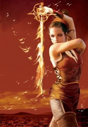
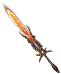
...How about Fire Swords that didn't make me snort soft drink out of my nose every time I see someone pull one out? Some cool new fire swords?
Ice Swords could also use more options. The ones we have now are just.... ugh. My ice and fire people all skip the swords because of how ugly they are. |


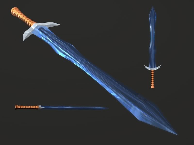
[imghttp://th09.deviantart.net/images/PRE/i/2003/6/b/0/An_Ice_Sword.jpg[/img]
Fire Swords...



- The Italian Job: The Godfather Returns #1151
Beginner - Encounter a renewed age for the Mook and the Family when Emile Marcone escapes from the Zig!
- Along Came a... Bug!? #528482
Average - A new race of aliens arrives on Earth. And Vanguard has you investigate them!
- The Court of the Blood Countess: The Rise of the Blood Countess #3805
Advanced - Go back in time and witness the birth of a vampire. Follow her to key moments in her life in order to stop her! A story of intrigue, drama and horror! Blood & Violence... not recommend to solo!

I think the "problem" with those is that most seem to be physical swords endowed with an element rather than swords created from the element out of thin air. It would be cool for some of those though.

|
I have a request for a trail aura: A solid colored line of energy. Ideally it should persist for a second or two.
Like this! Yup, I'm asking for a trail similar to that of the Powerpuff Girls.  |

"But in our enthusiasm, we could not resist a radical overhaul of the system, in which all of its major weaknesses have been exposed, analyzed, and replaced with new weaknesses."
-- Bruce Leverett, Register Allocation in Optimizing Compilers
Kinda like this?

@Redcap

ANARCHY = A Society that does not need government
114. Ahrouns do not appreciate my particular brand of humour, so I should stop bleaching bulls-eyes in their fur.
So it's coming in Freedom? I'll put aside some points for it, then. Do want.
Aegis Rose, Forcefield/Energy Defender - Freedom
"Bubble up for safety!"
I would love a new fire sword. I think such a thing would benefit many sets, and if built right, could be very flexible. Here's my thoughts.
The base image would be in two parts, 'blade' and 'hilt'. The blade would be cylindrical and translucent, like a real blowtorch flame running oxygen starved. Of course, color tintable.
Alone, this cylindrical flame could be used for plasma blades, force swords, psionic blades, etc.
The hilt could be three or four skins over the same cylindrical model. I'm thinking bare metal, leather wrapped, rough stone, and crystal as the textures. Maybe tintable, maybe not, depending.
Here's a picture of the simplest variant, the plain blade tinted blue and the bare metal hilt.
http://s1214.photobucket.com/albums/...lame_Sword.jpg
Why, yes, it IS just a blowtorch. 
A third, highly desirable, element, would be the 'flames' element like on Infernal's axe. Being able to add flames to the base translucent blade would allow low-tech feels to be implemented. Indeed, if the flames were substantial enough, I could see a more magical/cosmic/psionic feeling with JUST the flames aura as the blade.
The best part is, no animation changes needed, just reskinning the current blade and maybe adding a few more customizeable elements.
This model could be used for fire melee toon and blade melee toons alike, of which there are MANY, so it'd be widely useful. 
Also:
I dislike stone armor and ice armor intensely, because they hide my costume, and I find them to be frankly ugly.
(That said, the current Granite armor animation is MUCH BETTER than the original giant Mister Poo look, so thank you devs for that.)
However, there exists in-game already a MUCH better animation which I feel could be used for both stone or ice as a choosable or unlockable alternate.
I refer, of course, to the sadly neglected faction, the Igneous. The Igneus are a fantastic looking faction crippled by some of the dumbest AI in the game. Specifically, I refer to the visually stunning look of the Magmites.
If you look carefully, you will see that the Magmites are HOLLOW, with flames inside, and a series of floating plates make up the outer layer.
In my mind, it should be fairly simple to adapt that same sort of idea to stone and ice armor: namely, an overlay layer ABOVE your current costume. Make the layer big enough, and you should be well away from any clipping issues.
Make the plates stoney for stone, or icy for ice.
Voila! 

What I´d realy love to get are color tintable Halo Auras.
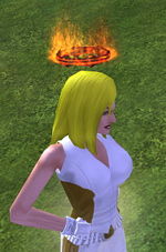
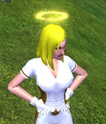
You know Tunnel Rat, as they were meant to be from the beginning. And when you ask for FX-ideas, then hopefully you can spare some time to fix this.
@Redcap

ANARCHY = A Society that does not need government
114. Ahrouns do not appreciate my particular brand of humour, so I should stop bleaching bulls-eyes in their fur.
Can we get the ascension armor auras as an actual aura? This would let us have the glow color not be tied to the color of the other costume pieces.
Issue 16 made me feel like this.
Warning: This poster likes to play Devil's Advocate.

Hi! I posted this over in Suggestions and Ideas and they said it'd be better to post it here, so here goes!
--------------------------------------------------------------------------------
I hope this is the right place for this and that there isn't already a thread somewhere, but I couldn't find one.
Click powers like Rage and Strength of Will--powers that represent emotional states and aren't actual depictions of powers like "Ston Armor" or "Fiery Armor"--often have auras (in the case of rage, it's one heck of a really bright one) that you can't turn off like other toggle auras. This can be a problem in low FX hero concepts.
For example, I have a SS/WP who I don't want to have any auras for concept, and I can turn off the FX in most of the WP powers, but the best I can do is to grey Rage and SoW out. With SoW it's not that bad, but when I gray out the Rage aura he ends up looking, well, kinda hazy around the edges, like he's blurry and out of focus.
Is there a reason that these particular representation powers don't have a "no aura" option? Would it be a big deal, since the interface for Primary and Secondary powers is already set up anyway, to just give us the option to turn them off in PVE also?
BTW, I love that COH has auras associated with both powers AND emotional states or things like "being invulnerable". I think the aruas are great, but I also think it was great to give the conceptual flexibility of being able to turn them off. In the case of Rage, I have to either glow like the sun or look out of focus like Bigfoot in a video sighting :P.
Thanks!
With Dark getting ported over to blasters, is there any chance we can get a skullless version of the blasts and whatever else?
For equality, you can make a Many Skulls version too, because those skulls have to go somewhere
I forget if this ever got mentioned in the thread before ... but would it be possible to get 7 year anniversary emotes for Resistance and Loyalists?

I'm not sure if this is the right place to suggest this but it's the only place I can see that's relevant.
Can we have 2 sets of colour options (primary and secondary) for the Cloud and Cloud & Thuder path auras? At the moment you can only set the effect colour of the flashes of lightning themselves and that means that even when you set the thunder to white, the cloud is still dark grey. If we could get the primary colour to set the colour of the cloud and the secondary to set the colour of the flashes this would allow much more freedom in customisation and general use of this path aura.
Also, can we have it so that Path auras are classed differently so that we can have an aura and a path aura on the same character at the same time?
In general, I'd like to see all costume auras given two colours to them. I know this is not a technical limitation, since we've already see customizable power auras using two colours, but are costume auras still lag far behind. And while we're at it, could we please, please, PLEASE get "Dark" these for the existing costume auras? I'd kill for dark fire 
|
Samuel_Tow is the only poster that makes me want to punch him in the head more often when I'm agreeing with him than when I'm disagreeing with him.
|
I hear these travel auras can't be used with costume auras. This is a no-go for me, I had assumed these would be part of the Prestige Sprint set.
"Samual_Tow - Be disappointed all you want, people. You just don't appreciate the miracles that are taking place here."
I would personally love to see those ridiculous sparkles removed from Dark Armor's Murky Cloud. Or at least some alternate effects. It's difficult to take a DA toon seriously when they twinkle like a particularly depressed Twilight vampire.
As for alternate effects, how about a void vortex swirling around the character, drawing in the surrounding shadows, sucking the very life from the air like an abyssal black hole.

----- Union's finest underachiever -----
Farewell CITY of HEROES
The First, the Last, the One.
Union: @ominousvoice2059
Repost from Sugg Forum:
More for RP/Aesthetic purposes, can you guys throw in an option on how an ambush arrives on the scene?
Its good that the status quo is to have them run through the halls shouting that they're coming but I think it would also be good to have the option to have them spawn directly into the room; whether its by rift, glyph, gradual opacity, physically ripping through (or other method) from the room's floor, ceiling or walls.
(Existing example would be Demon Pets, Thug Lts, Merc Commando, Zombie Apocalypse critters, Rikti/CoT type portals, the DE tree spawns (Razorvines?), etc)
We already have a plethora of CC emotes that could be applied as well...
[as a sidenote; being able to apply the CC emotes as an alternate animation for MM/Controller pet summoning/dismissal might not be such a bad idea either ]
Apparently, I play "City of Shakespeare"
*Arc #95278-Gathering the Four Winds -3 step arc; challenging - 5 Ratings/3 Stars (still working out the kinks)
*Arc #177826-Lights, Camera, Scream! - 3 step arc, camp horror; try out in 1st person POV - 35 Ratings/4 Stars


...How about Fire Swords that didn't make me snort soft drink out of my nose every time I see someone pull one out? Some cool new fire swords?
Ice Swords could also use more options. The ones we have now are just.... ugh. My ice and fire people all skip the swords because of how ugly they are.