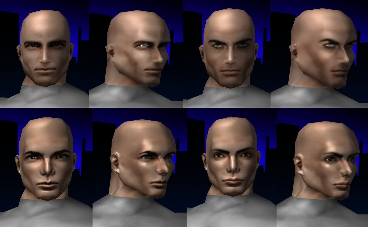
Normal mapped faces rankle me.
I agree. Those normal mapped faces look off to me too, and like you I can't really put my finger on why. I think it's something about how the light falls on them.
@True Metal
Co-leader of Callous Crew SG. Based on Union server.
I think it's your standard uncanny valley problem; they look just real enough that their flaws are much more noticeable than the older, "lower quality" faces.
Omnes relinquite spes, o vos intrantes
My Characters
CoX Chatlog Parser
Last.fm Feed
I'm still prefereing Young Face 6 on my main than any other face avilable to females. And yes, I prefere the older style faces to the Steampunk and Halloween style faces (whch are all just terrible).
BrandX Future Staff Fighter

The BrandX Collection
The new Vampire face for females is quite possibly the ugliest thing I've ever seen in the character creator. If that's what they were going for then grats, you nailed it, but that doesn't make it any less ugly.
A circle forms, everybody comes round
Just to hear the incredible sound
Of a genius smashing expectations
- Jonathan Coulton
Copy Pasta from the main new stuff thread.
RANT MODE ENGAGE.
;_; why do they keep trying to use the normal map tech on the faces, sure its halloween and stuff and they certainly do look scary..ish but it just looks bad. Please devs stick to what you're good at!
Heres my reasons why!
NUMBER ONE! 99% of the costumes pieces lack that shader tech and it makes anything with it stand out in a bad way. (and please don't retroactively add it..)
Number two! Either its something about how the game renders or who knows but the normal maps are way too harsh, the way the game shades does not compliment it very well at all. Alot of areas on the textures either end up too dark or bright and end up with really muddy look. Subtle-ness is awesome! So far the faces with it (steam punk/halloween pack) are overdoing it, I don't think anyone would be against toneing it down.
Number Three! Refer to number one.
I know you guys are super excited about having the option to make use of the new technology made available but .... A little goes a LONG way.

D: Toss me a hai @DarkNat My Fify glory: Renzer Dark/Dark Corr., Renzro Dark/Dark Def., Amartasu Dark/Dark Scrap.Less important ones: Fire/Fire Blaster,Ice/Ice Blaster,Ele/Ele Brute, Mind/Storm Troll,Fire/Kin Corr.,Bots/FF MM., DB/Regen Scrap.
The problem here is that the normal mapped faces are far too specular, as in, shiny. Faces are not normally very shiny at all, and giving it even the slightest bit of shine can make it seem like it's been oiled up or reflective in some way.
Normal skin is not very shiny, it only gets shiny when wet and as we know, this game doesn't support any effects like looking damp when treading puddles or swimming in bodies of water.
If Normal-mapping is to be used again and made to look right, it must not make skin-like textures appear shiny; only subtle, barely-visible shine will pass.
That's how I see it anyway.

Home server: Victory
Characters on: Victory & Virtue
My first 50(0)! 18/11/11
@Oneirohero
|
The problem here is that the normal mapped faces are far too specular, as in, shiny. Faces are not normally very shiny at all, and giving it even the slightest bit of shine can make it seem like it's been oiled up or reflective in some way.
Normal skin is not very shiny, it only gets shiny when wet and as we know, this game doesn't support any effects like looking damp when treading puddles or swimming in bodies of water. If Normal-mapping is to be used again and made to look right, it must not make skin-like textures appear shiny; only subtle, barely-visible shine will pass. That's how I see it anyway. |

D: Toss me a hai @DarkNat My Fify glory: Renzer Dark/Dark Corr., Renzro Dark/Dark Def., Amartasu Dark/Dark Scrap.Less important ones: Fire/Fire Blaster,Ice/Ice Blaster,Ele/Ele Brute, Mind/Storm Troll,Fire/Kin Corr.,Bots/FF MM., DB/Regen Scrap.
Agreed. The normal mapped faces DO. NOT. WORK.
Please listen to players on this.
-They don't fit the aesthetic of the existing pieces.
-The primitive lighting system in the game doesn't suit them.
-The primitive shaders in the game doesn't support the needed translucency and specular effects to make it look good.
-The existing head/face geometry also doesn't support the normal maps well.
-They're just plain overdone.
The female vampire one is especially horrid, and not in the intended way.
Organic Armor is still the best looking face in the game, IMO.
.
|
Agreed. The normal mapped faces DO. NOT. WORK.
Please listen to players on this. Organic Armor is still the best looking face in the game, IMO. |
Do more sets using the very well mastered bump and spec maps like you have before and you guys will be GOLDEN.

D: Toss me a hai @DarkNat My Fify glory: Renzer Dark/Dark Corr., Renzro Dark/Dark Def., Amartasu Dark/Dark Scrap.Less important ones: Fire/Fire Blaster,Ice/Ice Blaster,Ele/Ele Brute, Mind/Storm Troll,Fire/Kin Corr.,Bots/FF MM., DB/Regen Scrap.
Organic is the best face in game.
But also, I hate the older faces and hairstyles with passion. They look so date, poor textures and low on polygons.
I like the Steampunk faces.
|
Samuel_Tow is the only poster that makes me want to punch him in the head more often when I'm agreeing with him than when I'm disagreeing with him.
|
Female faces 10 and 14 (And Male face 13) are still the only good ones, to my oddball eye. They're the only faces I've used for almost six years, now (mostly Face 10) - and they're the only ones I'll ever use, if this current trend continues.
But to be fair, I thought the 'old new faces' were awful, too. Steampunk and newer are just magnitudes worse.
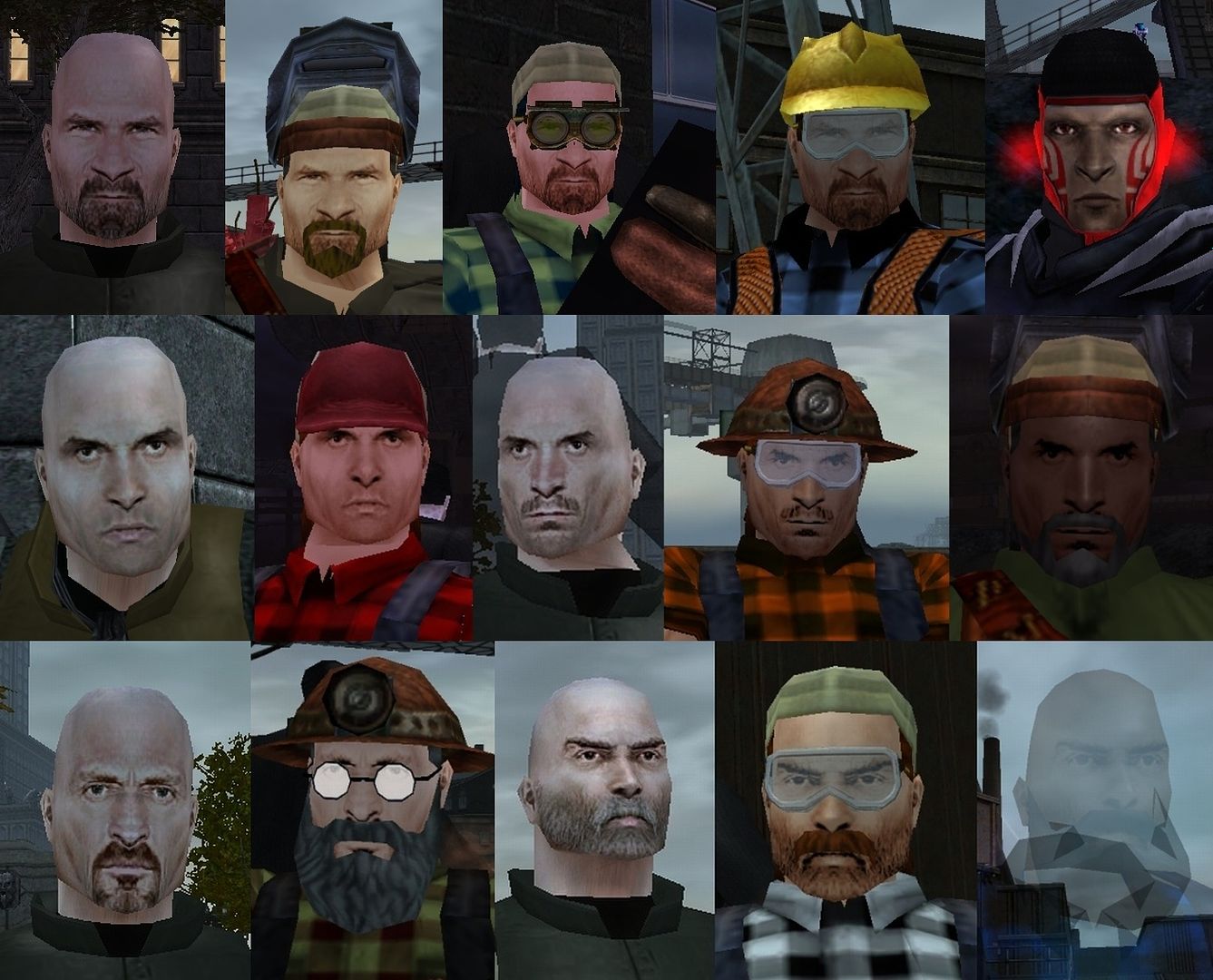
These are the best faces in the game:

The Devs just love to use them on NPCs (they exist in the Devs' version of the character creator and have been used quite often in the past year in new factions), but they won't give them to me!
The Devs hate me.
The above are better than:

Speeding Through New DA Repeatables || Spreadsheet o' Enhancements || Zombie Skins: better skins for these forums || Guide to Guides

D: Toss me a hai @DarkNat My Fify glory: Renzer Dark/Dark Corr., Renzro Dark/Dark Def., Amartasu Dark/Dark Scrap.Less important ones: Fire/Fire Blaster,Ice/Ice Blaster,Ele/Ele Brute, Mind/Storm Troll,Fire/Kin Corr.,Bots/FF MM., DB/Regen Scrap.
I love the normal mapped faces - because to me they look more realistic and higher quality than the old faces, they interact with light sources better, and they just look so much "current" than the old ones.
I would still like to see all the old faces get a HQ lift.
Yeah add me to the list of those considering normal mapped faces a failed experiment. It was worth a shot, but, compared to the other faces, they really do run, skip and throw themselves head first into the uncanny valley.
|
GG, I would tell you that "I am killing you with my mind", but I couldn't find an emoticon to properly express my sentiment.
|
|
I love the normal mapped faces - because to me they look more realistic and higher quality than the old faces, they interact with light sources better, and they just look so much "current" than the old ones.
I would still like to see all the old faces get a HQ lift. |


D: Toss me a hai @DarkNat My Fify glory: Renzer Dark/Dark Corr., Renzro Dark/Dark Def., Amartasu Dark/Dark Scrap.Less important ones: Fire/Fire Blaster,Ice/Ice Blaster,Ele/Ele Brute, Mind/Storm Troll,Fire/Kin Corr.,Bots/FF MM., DB/Regen Scrap.
The normal-mapped faces don't mesh at all with anything but Tights Sleek and look... really derpy, for lack of a better term.
My guides:Dark Melee/Dark Armor/Soul Mastery, Illusion Control/Kinetics/Primal Forces Mastery, Electric Armor
"Dark Armor is a complete waste as a tanking set."

I beg to differ.


Again, "beauty" is in the eye of the holder

If your graphics card isn't up to par... well, then, I could see where it might be jarring

Normal mapping is a superb technology. It allows a low poly model (like the faces in CoH) to look like a high poly model. But when your first reaction is "OH MY GOD WHAT'S WRONG WITH YOUR FAAAAAAAAACE", you're doing it wrong.
No, really. As much as the graphic artist in me is happy that the devs are getting these neat new toys to play with, I still recoil away from these faces. I kinda got used to the Victorian faces, but the Vampire face looks like a god damn wax model. Totally unnatural and too shiny. I believe we've managed to fall into the uncanny valley here. Which is a damn good achievement given how static, low-res and low-poly the faces have been.
Necrobond - 50 BS/Inv Scrapper made in I1
Rickar - 50 Bots/FF Mastermind
Anti-Muon - 42 Warshade
Ivory Sicarius - 45 Crab Spider
Aber ja, nat�rlich Hans nass ist, er steht unter einem Wasserfall.
|
OK so if you hide the neck and most the skin...they still look wrong tough.
|
Not to me.

So while Normal Mapped faces might rankle a few I do notice a lot of players using them. I use them as often as I can (depending on the character theme.)
Oooh, Normal Mapped skull face


Art Team: Normal Mapped Skull Face
The Victorian faces usually look weird, but I have a character that managed to use them and have it work well. I think the secret was that her dominant color is black while her hair was light-colored - the overall effect was that the shine didn't stand out against the hair, but it did highlight her face very well.
I do love the new halloween faces Voodoo posted.


Does anyone else feel this way? Looking at the faces added to the costume creator utilizing Normal mapping, they just look so...
Fake? Plastic? Sleek?
Almost like they don't fit with the rest of the body. I love the faces they added in... Issue 13, wasn't it? And the Organic Armour face I like as well. But the Steampunk Faces and the new Vampire Face for females...
Can't we have more faces done in the old style, where they don't look like they've had liberal amounts of polish layered on?
Also, if anyone ever thinks about replacing the old style faces with normal mapped ones, I will not be amused. :<
It's hard to quantify really, but I wouldn't touch any of them with a ten foot, normal mapped pole. Unlike my precious female Face 17, 23, 24, Young Face 1, Young Face 13, Supernatural Face 1, Supernatural Face 12, and many more.
SUPPORT - IT'S NOT JUST A GROUPING OF ATs
-
More Than a Game
-