
I like having tabs.
@Kyuu

Quote:
giggle, more than half of your screen is covered by windows. |
Originally Posted by MondoCool

If I had enough room on the screen I'd have the salvage and recipe windows up, too, and the Combat tab in it's own window. Just because I like having information.
|


I guess I should stop thinking of my window less as 'cluttered' and more as 'average'.
Quote:
No it's not, I still have plenty of room left to see.
|
Originally Posted by Twilight_Snow
giggle, more than half of your screen is covered by windows.
|
I'd post mine, but right now it is a cluttered mess since my cats knocked over and broke my flat panel and I am now reduced to using an old CRT monitor 
"Life is what happens when you are making other plans"
You all have such messy screens!

"The Hollows was a cover up; it was really caused by Blue Steel experimenting with Foot Stomp." - Steelclaw
<-- boy
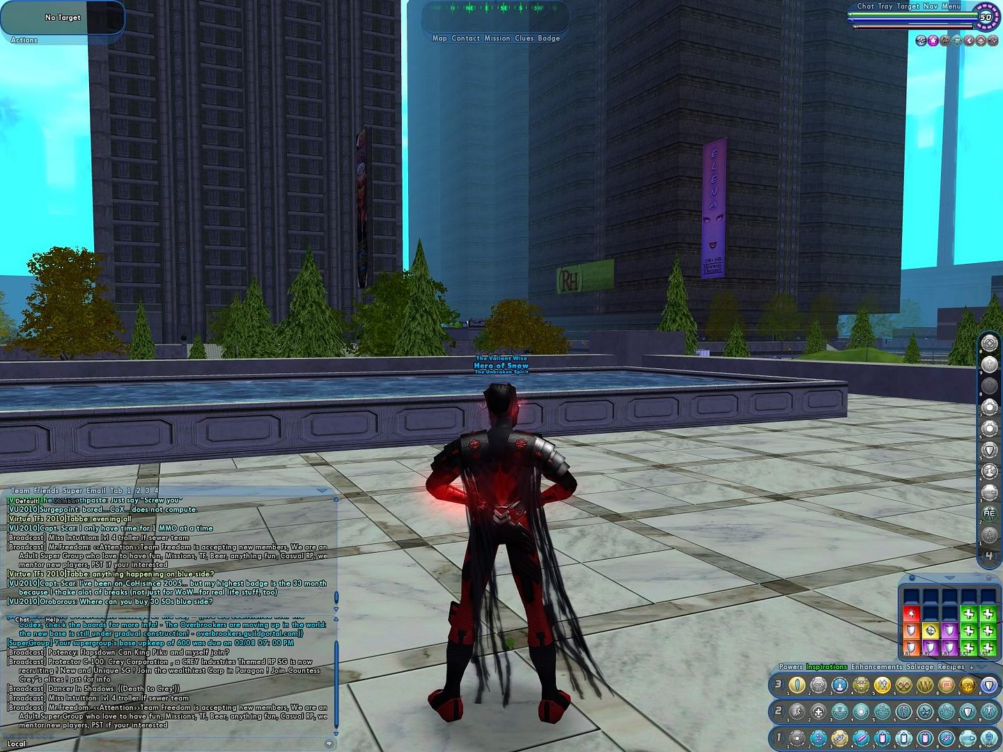
Hmm, This is my current UI -- I've been playing with the Chat Channel locations though
HERE
Issue 24 PPM Calculator // The Great Makeover: The Vindicators
Mine is pretty basic.

They ALL float down here. When you're down here with us, you'll float too!
@Starflier
whats that one window with the regen/reov/ect?
i know its not the combat attribtes window and something like that would be nice to have, but im not sure where to fnd the window or if its a tab or something.

Quote:
Right click on the attributes within the combat attributes window that you want to monitor, select "Monitor"
|
Originally Posted by Necrotech_Master
whats that one window with the regen/reov/ect?
i know its not the combat attribtes window and something like that would be nice to have, but im not sure where to fnd the window or if its a tab or something. |
Quote:
thx |
Originally Posted by MondoCool
Right click on the attributes within the combat attributes window that you want to monitor, select "Monitor"
|
 , i honestly did not know those things did anyting when clicked lol
post more UI's ... i love looking at these
Issue 24 PPM Calculator // The Great Makeover: The Vindicators

I like as much of that beautiful world to see to be seen. The less obtrusive the UI the better.
Mine is almost identical to Dragonslay's except my lifebar etc is in the upper left corner and I keep my map as small as possible (usually).
Also, I just recently found the option to change the window scaling and have that turned down to 80%.
Global @radubadu
Usually playing one of the following toons blueside on Virtue:
Cadler 50 WP/SS tanker
Radubadu 46 Fire/Fire blaster
Hell Runner 35 Fire/Fire brute
I'm new to CoH, but here's my screen so far. I keep the map in the upper left when I need it.
Peace, RainbowSerpent.

My Format... I HAVE No Format (Matrix)
Don't closet me and I won't out you... Maybe. (Me)
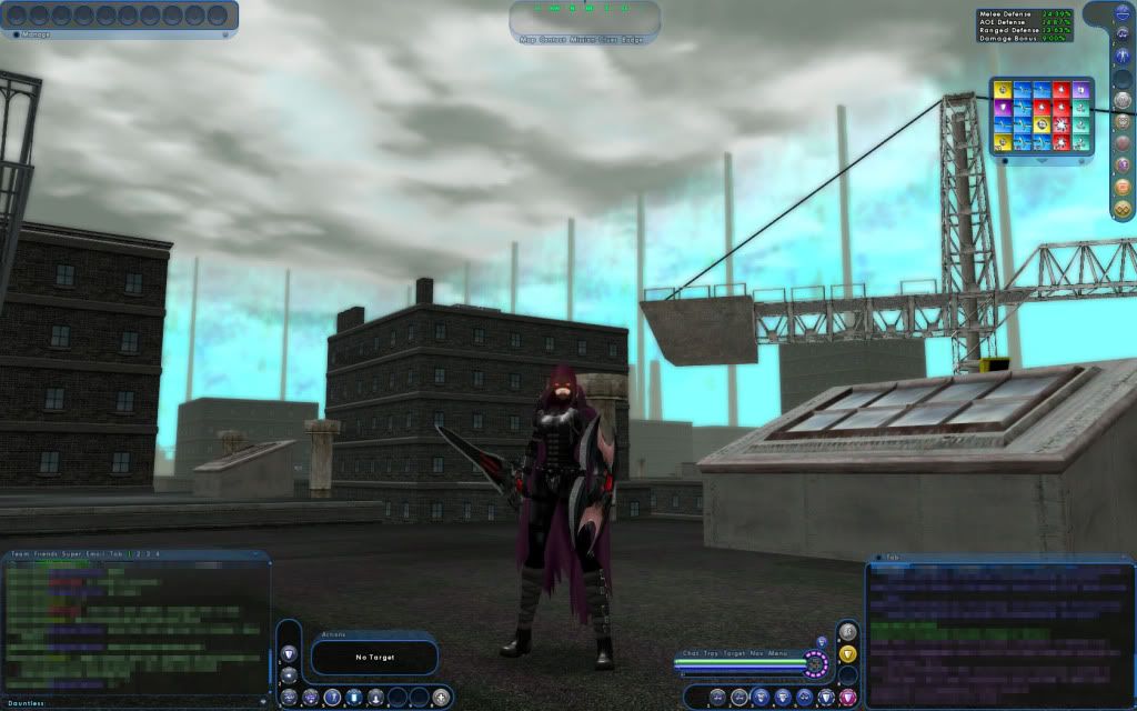
Mine is fairly simplistic.
I just use the default layout. Like Hero_of_Snow's but my chat window is smaller and I don't have all three powertrays open at once. I use the ctrl-# and alt-# commands (replacing # with whatever number the power is in the tray) to access those trays.
@LightofthePhoenix - Virtue server
http://riskovinsheen.deviantart.com/
Light of the Phoenix - lvl 50 Fire/Emp Controller; Snow Panther - lvl 50 Cold/Ice Defender; Dragonfly. - lvl 50 Willpower/Fire Tanker; Magic Minx - lvl 50 Ill/Rad Controller; Dust Walker - lvl 50 Storm/Dark (Sand) Defender; And more...
http://riskovinsheen.deviantart.com/
Light of the Phoenix - lvl 50 Fire/Emp Controller; Snow Panther - lvl 50 Cold/Ice Defender; Dragonfly. - lvl 50 Willpower/Fire Tanker; Magic Minx - lvl 50 Ill/Rad Controller; Dust Walker - lvl 50 Storm/Dark (Sand) Defender; And more...


Normally ran at 1920x1080 windowed.

This is what I've been using since they added the little power bars. A neat side-effect of disabling the main power bar, is that drawn weapons are never sheathed after x seconds. So you can have a sword drawn indefinitely (barring power activation/zoning).
The only annoyances are the HP bar is just far enough from the bottom that it defaults to buffs on the underside, rather on top. A simple replacement on first logging in is all that's needed. Also, the inspiration bar has a habit of slowly migrating downwards each time you log in. It's subtle, but after a few times, you'll have to reposition it.
I would like to issue a plea on behalf of Paragon's diminutive protectors, please watch where you step. We're four feet tall in a six foot tall world, we've been cast adrift in a sea of butts. -Pillbug
Mine looks just like Starflier's but I like the map idea that Dragonslay has, gonna try it out next time I'm on. I like using as less tabs as possible, it took using a scrapper for me to finally use 2 action tabs instead of one, always just used binds instead lol.
EDIT: OK that's new to me, how did you bend your bars like that?
Globals:
@Animorph
@Animorph 2
Also known as;
Maverick, Living Phantom, Role-Player, Live-Wyre, Eagle Eye, Toy-Man, Cartoon, Jetfire, Reflex, Mer-Man, Spartacus, Step, Reaver...

Quote:
the expansion bars will bend when pushed against a "wall".
|
Originally Posted by Animorph
EDIT: OK that's new to me, how did you bend your bars like that? |

What the title says.

If I had enough room on the screen I'd have the salvage and recipe windows up, too, and the Combat tab in it's own window. Just because I like having information.