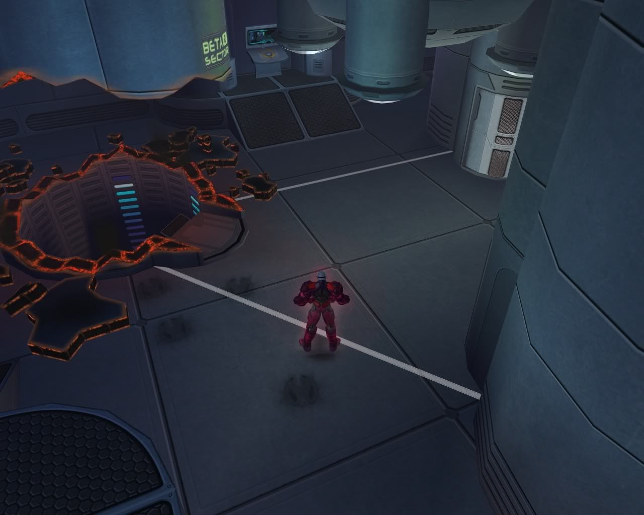
New Warehouse Skins
The thing that most impressed me was being able to jump down the elevator shaft and get to the next level.

|
Really like the aesthetics of these new skins. Not yet done any abandoned warehouse missions, but I agree that the old skins would likely be better there. In fact, wouldn't mind seeing the old warehouse skins still show up from time to time. Also have not yet encountered the frame rate killing rooms. Hopefully fixes for both these oversights are in the patch pipeline already.
|
Yes, forums, please remember me!
---
Something I just noticed in certain warehouses is that at times the textures are applied haphazardly, like they mixed textures from different sets. We know we used to have one hero and one villain version of the basic warehouses which, to the best I can tell, have been replaced with one teal and one brown warehouse. Here's the thing, though: These are sometimes mixed.
Just yesterday, I came across a map that had old hero textures, od villain textures, new teal textures and new brown textures... ALL ON THE SAME ONE WALL. It looked really bad, especially from a distance, because it was just a mishmash of colours and patterns. I've seen this on a lot of the new maps, where one wall in one room will be wholly from a different set, but this one room was just... Absurd. And yes, I bugged it.
|
Samuel_Tow is the only poster that makes me want to punch him in the head more often when I'm agreeing with him than when I'm disagreeing with him.
|
The new warehouse racks include particle board, sheet rock and... wrapped pallets of Enriche.
In Paragon City.
This has totally ruined my immersion and gaming experience. 
I don't think the old warehouses have been replaced, by the way - I just ran five tip missions yesterday and they were all still in the old maps.
~union4lyfe~
The Alt Alphabet ~ OPC: Other People's Characters ~ Terrific Screenshots of Cool ~ Superhero Fiction
Don't like that the new warehouse maps replace the old ones. Less varity now, which is not a good thing.

Founder/Leader of the JUSTICE F0RCE
http://JusticeForce.guildportal.com
|
Yes, forums, please remember me!
--- Something I just noticed in certain warehouses is that at times the textures are applied haphazardly, like they mixed textures from different sets. We know we used to have one hero and one villain version of the basic warehouses which, to the best I can tell, have been replaced with one teal and one brown warehouse. Here's the thing, though: These are sometimes mixed. Just yesterday, I came across a map that had old hero textures, od villain textures, new teal textures and new brown textures... ALL ON THE SAME ONE WALL. It looked really bad, especially from a distance, because it was just a mishmash of colours and patterns. I've seen this on a lot of the new maps, where one wall in one room will be wholly from a different set, but this one room was just... Absurd. And yes, I bugged it. |


|
Ah, but this isn't "burned", it's the normal Blue tech labs, but some of the walls have big holes blasted in them, with debris lying around that's still glowing red from the impact.
The thing that most impressed me was being able to jump down the elevator shaft and get to the next level.  |
|
I used to have the same problem in the "white maps" - longbow and Praetorian lab. Terrible framerate, hitching, skill lag, I basically couldn't play any mission on those maps. Turning off my sound helped a little, but it didn't get better until I upgraded to a Radeon 5770 video card. Something about those white maps really eats up video memory and is hard to process, I have no idea why.
|
Aesthetically, I dislike the new textures. They have a higher-quality look about them, but, IMO, they look nothing like a warehouse. They remind me of the basement of old institutional buildings from the sixties and seventies, like hospitals.
Actually, the fact that the blocks are green makes them look like public washrooms you would see in a state-built public rest stop.
As textures in an isolated sense, they're nice. Visually, I don't find them appropriate for purpose.
Blue
American Steele: 50 BS/Inv
Nightfall: 50 DDD
Sable Slayer: 50 DM/Rgn
Fortune's Shadow: 50 Dark/Psi
WinterStrike: 47 Ice/Dev
Quantum Well: 43 Inv/EM
Twilit Destiny: 43 MA/DA
Red
Shadowslip: 50 DDC
Final Rest: 50 MA/Rgn
Abyssal Frost: 50 Ice/Dark
Golden Ember: 50 SM/FA
Blue
American Steele: 50 BS/Inv
Nightfall: 50 DDD
Sable Slayer: 50 DM/Rgn
Fortune's Shadow: 50 Dark/Psi
WinterStrike: 47 Ice/Dev
Quantum Well: 43 Inv/EM
Twilit Destiny: 43 MA/DA
Red
Shadowslip: 50 DDC
Final Rest: 50 MA/Rgn
Abyssal Frost: 50 Ice/Dark
Golden Ember: 50 SM/FA
|
Aesthetically, I dislike the new textures. They have a higher-quality look about them, but, IMO, they look nothing like a warehouse. They remind me of the basement of old institutional buildings from the sixties and seventies, like hospitals.
Actually, the fact that the blocks are green makes them look like public washrooms you would see in a state-built public rest stop. As textures in an isolated sense, they're nice. Visually, I don't find them appropriate for purpose. |
The Alt Alphabet ~ OPC: Other People's Characters ~ Terrific Screenshots of Cool ~ Superhero Fiction
That mission is where I snagged one of my most awesome screenshots of cool:

The Alt Alphabet ~ OPC: Other People's Characters ~ Terrific Screenshots of Cool ~ Superhero Fiction


And I'd definitely lump the Praetoria tech maps in there as being harder on my video card. I know I don't have one that's all that great (Radeon 3400 or thereabouts), but it runs most other maps/areas fine.