Just U and I - your UI setup?

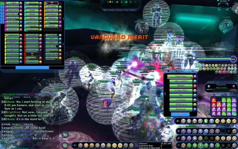
Like a lot of Kheldian players, I make heavy use of binds. Most of the powers you see are bound to keys that are independent of the powers' tray locations. My binds automatically switch out Tray 1 to Trays 8 and 9 for Dwarf and Nova. Due to all the binds I mainly just have the powers on the trays to make it clear when they've recharged. The combat stats window shows damage resistances. This way I can easily tell if Eclipse has expired.
I have the locations of the Nav and targeting windows inverted from what I'm seeing in most people's images. I started doing that way back in the day when I was running on a much older system. At the resolution I ran in at the time, opening the map at the size I preferred obscured my view too much. I got used to having it that way and have kept the habit ever since, even though with my current resolution it's not really all that necessary any more.
I run in fullscreen, 1920x1080 on a 23" monitor.
Here's mine:

The open space above the main chat window is for the League UI, and the space between the Combat Info window and the Nav bar is for the Trial UI pop-up.
Dunno why it came out quite so dark. It doesn't look that bad in-game.
@Demobot
Also on Steam
Together we entered a city of strangers, we made it a city of friends, and we leave it a City of Heroes. - Sweet_Sarah
BOYCOTT NCSoft (on Facebook)
https://www.facebook.com/groups/517513781597443/
Governments have fallen to the power of social media. Gaming companies can too.

I just threw everything on the bottom. Also, ew, imgur converted it to a jpg.
Heres mine, don't know why but I have to have the chat on the right

Here's my UI.
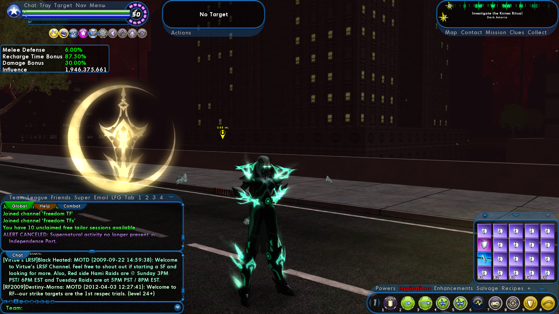
Pretty vanilla really xD
I use a combo of Num, Ctrl-Num, and Alt-Num to use different powers. My primary bar uses 1 through 0, my Alt bar pops up when I press alt, and it uses Alt+1 through 0, same for my Ctrl bar but with the Ctrl key instead.
I also use various keys on my keyboard. Q, E, T, and F are common, G is my "goto" macro for Masterminds.
If needed I'll set up Alt/Ctrl + Q, E, T, or F
I don't like tiny UIs, and I'm running at 1920 x 1080, so I scaled it up to like 150 or something lol.

This is about my most complicated UI character; I think only this one and my tri-form PB use 5 trays. Mostly I get by on 3:
Tray 1 and 2, slots 1-6: most-used attacks; if I have heals, they usually go in slots 5 & 6
Tray 3, slots 1-4: summons, as a rule, sometimes longer-recharge attacks
Tray 1, slots 7-0: toggles
Tray 2, slot 4: travel power
Tray 2, slots 5 & 6: heals
Tray 2, slots 7-0: more toggles
Tray 3, slots 5-0: long-recharge but frequently used click powers
Tray 4: temp powers and the occasional macro
So other than that I UI scale down to 85% and cannot begin to imagine how anybody plays this game with the map hidden or with it rolled down in its standard placement, and that optional tray for temp powers, it's a pretty stock UI. Oh, yeah, and I detached the team and league windows, team above chat, league below. (Why I can't save my league window options and its location, I don't know. Drives me nuts that every time I enter a league I have to resize and reposition that window.)
Here's mine:

I always focus on the middle of the screen, thats where the action always is, so i have my mouse. powers and everything there so i can see all 
chat to the side so i can see whats going on
and omg!! always have my map open - for those with a big screen and av the room, its always very handy to see where u r, where ur team is etc 
Tray 1 - incarn pet, insp temp, mutation, ally rez, my rez temp, and rez vet power
tray 2 - main att powers inc incarn nuke, in order of what i use/rech the most
tray 3 - accolades, demonic, force of nature, heal, incarn regen heal, rage thingy power (allignment) hasten n rest
tray 4 - travel + def toggles
tray 5 - other powers- poc tp, mish tp reveal etc.
i have everything spaced out so i know whats what and where. i dont like over complicated things in the heat of the battle
+ i have my Hp right in the middle 2 so i know when ive been hit bad etc :P

One of my biggest annoyances with CoX is that the game remembers your UI settings based on the resolution of the last system you used. I have four machines I might play on and each of them has a different resolution - 1600x900, 1920x1080, 1920x1200 and 2560x1600.
So my bars move around. I leave some of my machines in windowed mode just so I don't have to deal with stuff moving around.
I'd like it very much if CoX supported multiple display configurations. I'd probably move at least the chat window and extra power trays to a second screen if II could.
Generally:
Target - top left corner
Nav - top Center
Toolbar - top right
Map - As small as possible, right below the toolbar and buff icons.
Chat - bottom left
Monitored attributes - immediately to the right of chat
Extra power/macro trays - bottom center, in rows of 3x3 boxes.
Normal power trays - bottom right (tray 1 - attacks, tray 2 - buffs or control powers, tray 3 - toggles or defensive powers)
Inspirations - right above the three power trays.
Things I hate: Anime. PvP. Lying MMO Developers. Outleveling content. Manga. ED. Comic Store Employees. Anime.
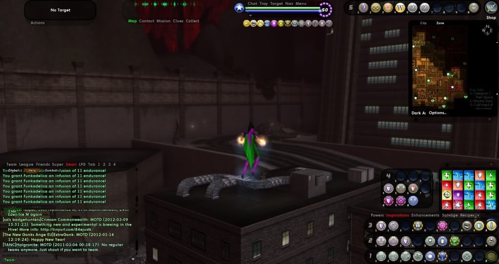
1920 x 1080 with 126% size windows
Can't abide anything at the bottom centre of the screen. I'm a clicker so my powers are always arranged in a specific way.
Best I could do on short notice, but you get the idea of how "classic" I keep things. I threw in my /info for the fun of it until I realized that it's hard to read. >.<

Mine is very traditional.
Only exception to this, is that I also usually monitor: last hit chance, ranged/melee defence and damage bonus.
And yes, my inspiration tray has to be nice and tidy 
Thought for the day:
"Hope is the first step on the road to disappointment."
=][=
|
Mine is very traditional.
Only exception to this, is that I also usually monitor: last hit chance, ranged/melee defence and damage bonus. And yes, my inspiration tray has to be nice and tidy  |
I'm not the Only one!
|
Um, doesn't it retain the same borders as your chat window? If you have things like that, then I'd imagine it Would be hard to see.
|
My biggest issue with it is the message list/message split. That *can't* be resized - and when you're going througha bunch of character items, I'd really prefer a longer list. Even if you split it from the message window and resize the entire thing vertically, you get about 4 1/2 (well, I do) messages listed up top.
I'd *love* to be able to resize that.
[center][IMG]http://i1111.photobucket.com/albums/h461/cohroguemagazine/Logos/sig.png[/IMG][/center]
[center][size=1][color=#FF99CC][font=Tahoma] GLOBAL: @Antoinette |[/font][/color][color=#FF99CC][font=Tahoma] MAIN: [/font][/color][url=http://www.virtueverse.net/wiki/Pinkrise][color=#FF99CC][font=tahoma]Pinkrise[/font][/color][/url][color=#FF99CC][font=Tahoma] | SG: [/font][/color][url=http://www.wix.com/netherealist/spitfire][color=#FF99CC][font=Tahoma]The Ethereals [/font][/color][/url][font=Tahoma][color=#FF99CC] | PROJECTS: [/font][/color][url=http://cohrm.wordpress.com][color=#FF99CC][font=tahoma]Rogue Magazine [/font][/color][/url][/size][/center]
|
Um, doesn't it retain the same borders as your chat window? If you have things like that, then I'd imagine it Would be hard to see.
|
Not talking about "width".
Talking about height.
I'd like to be able to pull the message list open "taller". Not the entire e-mail window.
So instead of 5-6 messages, I could maybe see 10 or so.
When the UI gets down below about 70%, some of the clickable areas are a bit wonky. Things at the top of various lists (like the first Incarnate enhancement in any given list, or the first e-mail at the top of the mail list) tend to be VERY hard to get a clickable area for.
And no, increasing UI size isn't the answer. I want as much of the UI out of the way when I'm playing as I can get.
Also, the image you're seeing here is a "thumbnail" version.
Click on the image to link to the original (at 1920x1080).
Then click on that image to make sure it's displaying full-size.
I'm playing on a 24" monitor. So it's quite readable.
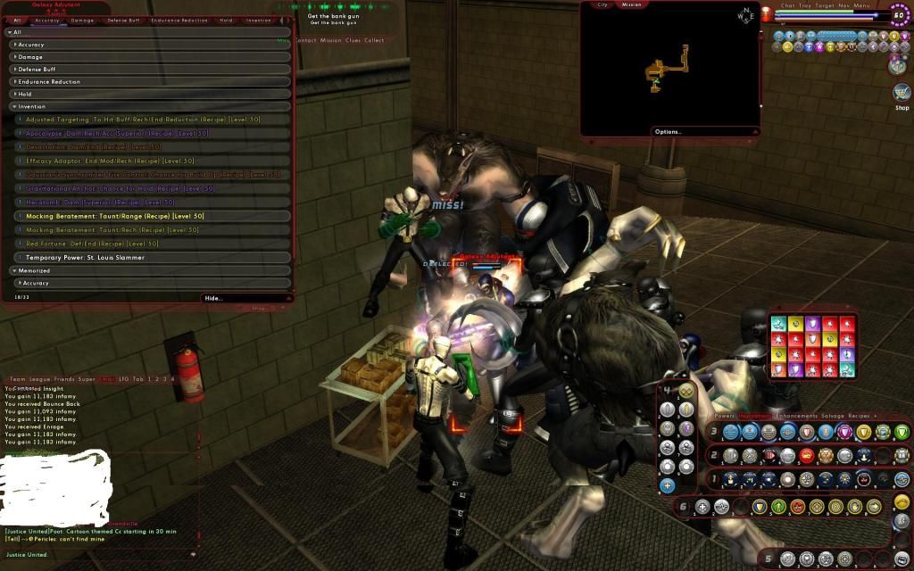
Alright I'll give this a try (not sure how it will turn out...not very good at this stuff).
Basically I keep all my melee attacks on row 1....starting with single target and ending with AOEs.
Row 2 starts with my ranged attacks, aoes(so they line up with my aoe's below them), and ends with taunt and my Incarnate pets.
Row 3 is all my toggles and then Barrier and Demonic.
Around those trays I have some extras to hold things like temps, pet commands, Ouro/Base porters, etc.
I normally don't have my recipes up, but I just had a very good day and wanted to see them continually  . What a way to start my weekend!!
Main servers: Victory and Justice. Main account: @Justice29 Secondary account: @Clever One
Main servers: Victory and Justice. Main account: @Justice29 Secondary account: @Clever One
Some of you have a lot of power trays open - are you familiar with the magic of "popmenus"?
http://boards.cityofheroes.com/showt...hlight=popmenu
________________________________
"Just cause you don't understand what's going on don't mean it don't make no sense
And just cause you don't like it, don't mean it ain't no good" - Suicidal Tendancies
|
Some of you have a lot of power trays open - are you familiar with the magic of "popmenus"?
http://boards.cityofheroes.com/showt...hlight=popmenu |
Main servers: Victory and Justice. Main account: @Justice29 Secondary account: @Clever One
Here's mine. Some characters will have an extra tray or two in the same configuration as tray 4, depending on how many temp powers etc they have (that they use).
I'm mostly a clicker, but if I lose my cursor I'll switch to keybinds until I find it again, and location powers I usually bind to shift/ctrl/alt + lbutton. Also, a couple powers get to sit in my mouse side buttons.
And since it was mentioned: I use popmenus, but can't screenshot those (hitting print screen with one open just closes it, instead of screenshotting). All of my characters have one for the various teleporter powers, and my MMs get one for summoning pets and another for commands.


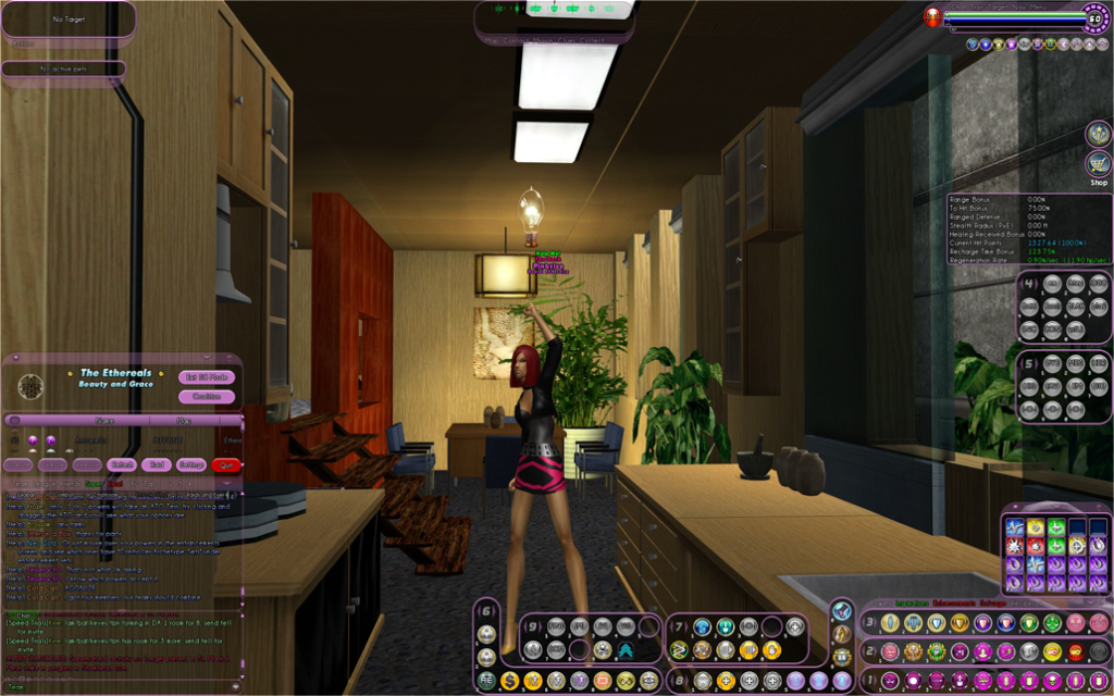


Awww, weird.. I used to have pink [Rest]. Wonder what happened to it... I need to re-download Corva's packs.
[center][IMG]http://i1111.photobucket.com/albums/h461/cohroguemagazine/Logos/sig.png[/IMG][/center]
[center][size=1][color=#FF99CC][font=Tahoma] GLOBAL: @Antoinette |[/font][/color][color=#FF99CC][font=Tahoma] MAIN: [/font][/color][url=http://www.virtueverse.net/wiki/Pinkrise][color=#FF99CC][font=tahoma]Pinkrise[/font][/color][/url][color=#FF99CC][font=Tahoma] | SG: [/font][/color][url=http://www.wix.com/netherealist/spitfire][color=#FF99CC][font=Tahoma]The Ethereals [/font][/color][/url][font=Tahoma][color=#FF99CC] | PROJECTS: [/font][/color][url=http://cohrm.wordpress.com][color=#FF99CC][font=tahoma]Rogue Magazine [/font][/color][/url][/size][/center]