Post your UI!
This is a subject of interest to me as well. I keep mine pretty basic though.
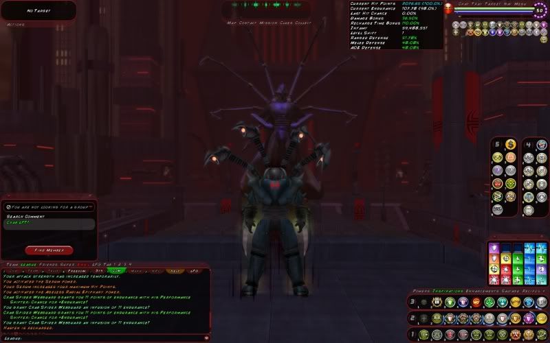
Pretty much some variant of this:

Of course, the combat attributes change - at least the stuff in the middle, seem to always have current HP on top, INF and either level shift or XP to next level at the bottom.
Mine is very basic and I hardly change it at all. I still always even have Brawl in slot 1 of tray 1, and sprint in slot 2 of tray 1. (Then attacks in first tray with slots 9 and 0 as travels [Hover/Fly, CJ/SJ, SJ/SS, etc.) I sometimes add a combat attributes window if I'm on a melee character.
@Memphis_Bill, what is power 6 in slot 6?
50s: Silent Spy - MA/Regen Scrapper | Tinkerhell - SS/Inv Brute | Extrasensory - Psi/Men Blaster | Ana Cruz - DP/PD Corruptor | Sara Thunderbird - Elec/Elec Scrapper | Pinstrike - Spines/SR Scrapper | Cold Feet - Cold/Cold Blaster
@Silent Spy, Champion Server

This is my typical setup. Tray 1 for attack powers, tray 2 for things that see a lot of use but that I want to be a little more deliberate about (mostly debuffs in this case, but I also use it for things like Build Up, Assassin's Strike, or Street Justice combo finishers) since I can use Alt+number for them easily. Tray 3 is miscellaneous other "basic" powers, but I usually put situational stuff like rezzes there, or anything that's going to make me drop a targeting reticle. Ctrl+number is a pain for me, so I figure if I want to use those powers, I'll just click the buttons, and putting things that are going to force me to reach for my mouse anyway there makes sense. Tray 4 is travel/mobility powers, mostly. Tray 5 is all my long-range teleports and other "out of combat" stuff. Tray 6 is a recent addition -- before I'd just stick my toggles and autopowers on the far end of trays 2 and 3, but this way just works better for me. (My masterminds take over tray 6 with pet summons and commands, so their toggles stay in the lower trays.)
I like having my health and endurance visible right in front of the character, so that's where my Combat Attributes window goes. I always display those at the top, XP to next and debt (or level shift for a 50) and inf at the bottom. In-between, it depends on the character. Melee types usually have defenses showing, blasters and brutes have damage bonus, etc.
FUN FACT: That burst of light when you level up is actually the effectiveness escaping from your enhancements all at once.

Once again after many alterations this is my new curreny UI look - this is the defualt UI i use on all toons minus the change depending on AT.
As you can see i like to have my HP n powers all dead set in the middle of the screen so i can see whats happening etc.. this is mainly due to the screens location as well 
Edit: my icons arent as small as the pic displays lol, but they smaller then the default coh size.

I posted this awhile back in a thread on the Liberty forum, and it pre-dates getting my new (and much, much larger-) monitor, but it'll cover the gist of it...
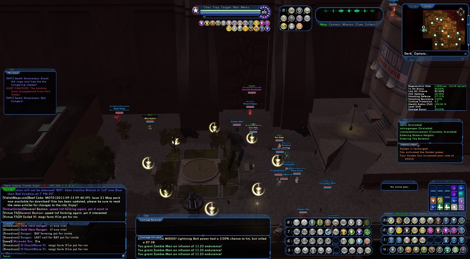
This is my "typical" UI, more or less. Kestrel has an extra third tray center-bottom to accommodate her ludicrous Lore pet collection... most only have two trays there... But otherwise this layout is what I've found works best for me on most characters.

With my current monitor, which is both larger and set to a higher resolution than this older one was, I have much more screen real-estate to work with, which has spread out my UI elements considerably. It's a definite improvement. I still have them set to 70% size and 15% opacity, but they're much less intrusive now.
ETA:
Here we go... This is what getting a new monitor did for my UI. XD

Like I said, much improved and much less intrusive, even though I kept the elements the same size under the control set-up.
@Brightfires - @Talisander
That chick what plays the bird-things...
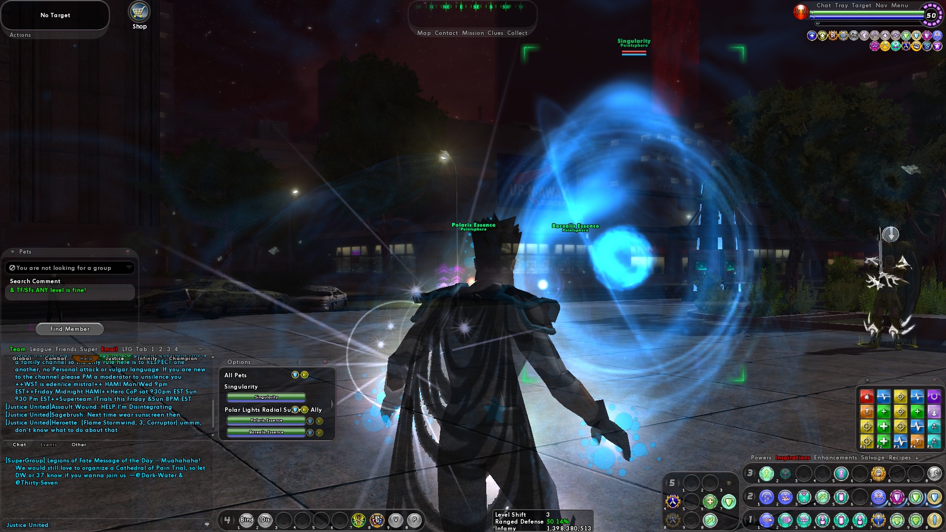
Though mine is pretty boring, I think... the one piece that is interesting to me, are the P and V macro buttons in Tray 4. The P is a popmenu with a ton of different powers, like Rest, Ouro Portal, TP to Mission, etc. And V is a popmenu with all of my Veteran powers in it. Very handy, and keeps my trays more empty.
|
What the title says, really.
I find that because the UI is so easy to change, it's very interesting to see what people run around with on the other side of the screen.  |

Triumphant Defenders Forever
Psylenz FF/Psi, ArticQuark Storm/Rad, Symon BarSisyphus Bots/psn, Max VanSydow Thugs/Dk, Cyclone Symon Bots/stm, Blue Loki Ice/Cd, Widow 46526
HelinCarnate:OMG it is so terrible. I have the option to take 3 more powers but no additional slots. Boo F'ing hoo.
Scaling the UI, or, Make Windows Big or Small!
Jus' sayin', folks.
Speeding Through New DA Repeatables || Spreadsheet o' Enhancements || Zombie Skins: better skins for these forums || Guide to Guides
|
Though mine is pretty boring, I think... the one piece that is interesting to me, are the P and V macro buttons in Tray 4. The P is a popmenu with a ton of different powers, like Rest, Ouro Portal, TP to Mission, etc. And V is a popmenu with all of my Veteran powers in it. Very handy, and keeps my trays more empty.
 |
 ), but ooooooooh boy, I have to have those inspirations. They just look awesome. Where can I haz?
@Captain-Electric � Detective Marvel � The Sapien Spider � Moravec Man � The Old Norseman
Dark-Eyes � Doctor Serpentine � Stonecaster � Skymaiden � The Blue Jaguar
Guide to Altitis � A Comic for New Players � The Lore Project � Intro to extraterrestrials in CoH
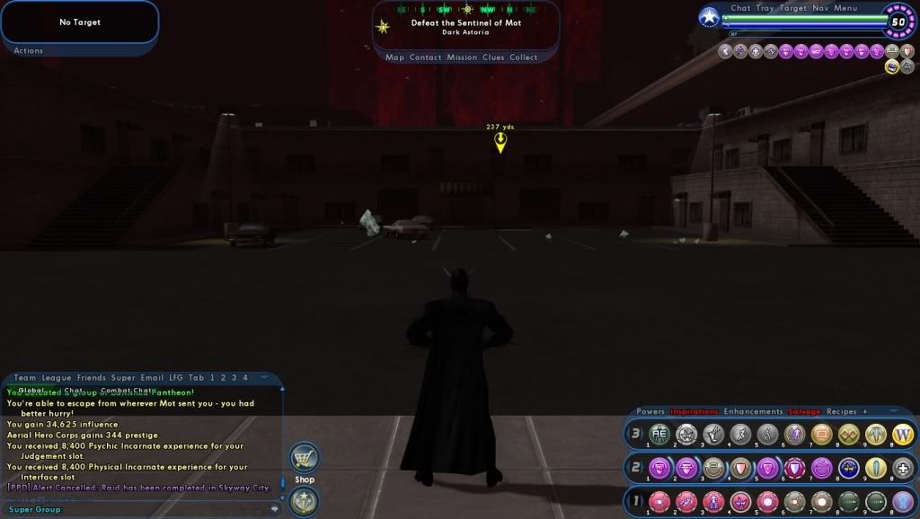
Very basic, which is about how it is in every MMO I play. I see these videos and screenshots where people have all manner of windows and trays everywhere to the point where all you can really see of the game is the toon's head.  I know everyone has their own style, but for me that's just way too busy and would be information overload. I'm sure it helps that none of my characters use pets, and I've never been one to care about how much damage I'm putting out, or absorbing, or what have you. As long as I take them down before they take me down I'm happy.
I was watching a video recently from a big space MMO where I couldn't even see the guy's ship. Just countless windows everywhere and what gameplay you could see was so zoomed out all you saw was beams of light firing off like a laser light show. That'd probably give me helmet fire.
Freedom
Blueside: Knight'Hawk, lvl 50, Scrapper
Yellowside: Dark'Falcon (Loyalist), lvl 20, Blaster
That Stinging Sensation #482183
linked to avoid any further screen-stretching.
fairly basic, although i usually have league directly to the right of chat.

You've wanted more control and now you have it.
|
linked to avoid any further screen-stretching.
fairly basic, although i usually have league directly to the right of chat. |

Plus when you go back and play some older games in really high resolution, it's almost like giving them a graphics face lift.
Where'd you get your power icons and inspiration icons?
@Captain-Electric � Detective Marvel � The Sapien Spider � Moravec Man � The Old Norseman
Dark-Eyes � Doctor Serpentine � Stonecaster � Skymaiden � The Blue Jaguar
Guide to Altitis � A Comic for New Players � The Lore Project � Intro to extraterrestrials in CoH
|
Where'd you get your power icons and inspiration icons?
|
(it just took me far too long to find that damn thread, eventually I had to dig through the posts by one person I remember commenting in it regularly since I couldn't remember who the thread author was..
 )
)
Warning:
The above post may contain Cynicism, sarcasm and/or pessimism. If you object to the quantities contained, then tough.
This is sorta an updated version of just because of constant changes


Nothing special, but it works for me.

|
Probably from here - http://boards.cityofheroes.com/showthread.php?t=213578 .
(it just took me far too long to find that damn thread, eventually I had to dig through the posts by one person I remember commenting in it regularly since I couldn't remember who the thread author was..  ) ) |

PM me your global and I'll shoot you some influence if you want. Or if you like tower defense, message me on Steam (same name) and I'll hook you up with Defense Grid plus all the DLC, I have an extra copy, it would be $25 if you bought it all.

@Captain-Electric � Detective Marvel � The Sapien Spider � Moravec Man � The Old Norseman
Dark-Eyes � Doctor Serpentine � Stonecaster � Skymaiden � The Blue Jaguar
Guide to Altitis � A Comic for New Players � The Lore Project � Intro to extraterrestrials in CoH
|
Thanks for going through the trouble to find that, especially because I don't think the posters are going to reply back.
 |
Hopefully you get some use out of Corva's pack. The amount of work he appears to have put into it, send him the inf/Steam code instead

(plus, I have absurd amounts of inf already <grin> )
Warning:
The above post may contain Cynicism, sarcasm and/or pessimism. If you object to the quantities contained, then tough.


What the title says, really.

I find that because the UI is so easy to change, it's very interesting to see what people run around with on the other side of the screen.
Goodbye. Not to the game, but the players. Goodbye. Everyone, remember to have fun. That's all I can say.