CoH Costume Makeover Contest
*taps thread*
This thing still on?
Hope you're getting better, Naz!
My Corner of DeviantART
The Queen's Menagerie
Wow seriously? I won? Thank you so much.
|
Grats Mariner!
Man Naz you just make this harder and harder! |

And here are you Captain Ultra results!
Gratz Henri!!
Yeah I was worried about choosing to stick with the color scheme. I liked my version of the costume a lot but definitely not how I'd color my own toon. Feel free to do some work on it Naz, just show me what you end up with is all I ask!
Only reason I think Burnt Matchstick will be difficult is because it is pretty specific and Bubba has done a great job of interpretting it in many ways already, but I'm up for the challenge!

Congratulations Henri!
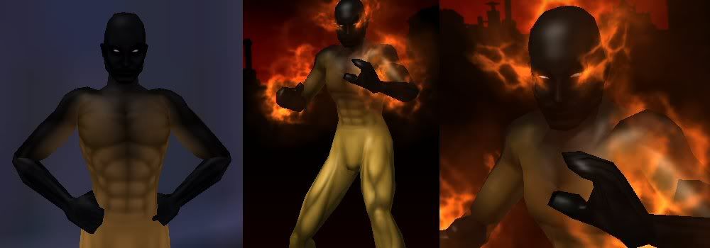
Alright Burnt Matchstick is such an iconic char and as has been mentioned already has multi-server looks and themes. This Burnt Matchstick is a Fire/Rad corruptor with the rad effects colored to appear as fire. I went back to the original concept where Bubba indicated that he was attempting to get a char to look like a burnt Matchstick. I've made the lower body all one color to represent the stick while charing the upper body and arms to resemble the burnt part. Nothing spectacular just add fire and viola!

...and in the "I wish *I'd* thought of that category"... dag Mariner, that is pure awesome on a stick.
The Alt Alphabet ~ OPC: Other People's Characters ~ Terrific Screenshots of Cool ~ Superhero Fiction
Yeah, Mariner nailed that one! Here's my attempt.

Obviously you guys are way better at this than I am but here is my attempt at Burnt Matchstick...

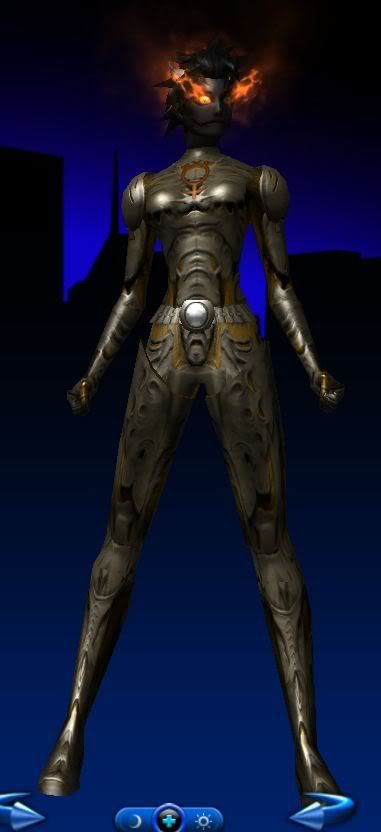
I was trying to convey wood grain without using the swirls pattern I've seen Bubba use before. The head is the bioluminescense face in black to show some scarring. It's hard to see with the flames on though... Of course I didn't hit save to go back and do one without the aura so use your imaginations.  I also wanted more of an armored feel as if the flames are being contained by the armor hence only the head is on fire... I really wanted to bring some blue into the head because as a kid I remember all our waterproof Boy Scout matches had blue heads, but I couldn't find a decent picture online as a reference.
Good luck everyone and I hope you get some useful costumes Bubba!

Well call me crazy, i've been drawing a blank on this all week, then suddenly something screamed 'GIMP SUIT!!' at me. So i thought, 'fair enough...' went and put my gimp suit on, and sat back down to design your costume... 
ok, stop calling me crazy now... thanks.
| Id like to see something villainous, and with some hint of either the stick or the matchhead. Male or Female is ok, though I tend to avoid playing males with a normal human face. |


This slipped all the way to page two. Two I said!
I wrote up all the judging, just waiting for Nazghul to post it now.
Ok, I got impatient waiting for Nazghul. Here are the results.
Mariner:
This design is so simple and elegant I can't believe I haven't really thought of it before. I really like the color choices for the lower half as well as the flame aura.
ZNRGY_XERONUS:
This is an interesting choice, it really screams futuristic and somewhat alien to me. I like the flares used for the flames and I hadn't thought of that sparkle aura for the head before, but I kind of like it. Though the lower half is a little bit too plain for my tastes.
Powerstream:
I like the direction this is going, and the hair is a good chioce, but I don't really feel the chitin armor or the grey color works for me.
Henri:
This is another one where I really like the direction, and I haven't thought of something like this before. I'm not really feeling the veil, but I really love everything else about the outfit.
In the end, it was a very close choice between Mariner and Henri, and while I like Mariner's concept, I think I'm going to end up with something much more similar to Henri's design, and so Henri is the winner!
Congratulatios Henri!
Grats Henri!
I personally would have gone with Mariner's piece only because it really feels like a matchstick. I think with the exception of myself, Bubba, you may have gotten some of the top costume designers on this one! Very cool!
Maybe I should find a toon for Naz to use as the next costume makeover! LOL

Thanks, Bubba, for posting your results. I'm sorry I fell so far behind. 
Sadly, I don't have as much free time as before, so I think it might be best to put the contest on "hiatus" right now - unless someone else would like to take charge.


Glad to hear you are feeling better Naz! I feel ya though, my allergies have been kicking my butt for the last week or so. I finally feel a little better today... or it could be the copious amounts of OTC drugs I've taken. :-P