Caemgen's Commission Corner
As some of you may remember, back in my last CCC (#4?) I was looking for scenes to have done for arts I had hired out from President Nelson http://presidentnelson.deviantart.com/ Had to scrap the scene idea since he wanted to just stick to more classic poses since these are more warm ups than his main arts but *shrug* Anyway, they're not done yet but he did throw up the line arts for two of them onto his DA page and I love them both so much I figured I'd share even though they're not done yet...
I love his Caemgen art since Caem just looks so kickbutt and mean in it... It's the side of character a lot of artists seem to jump at since it's the obvious one (he's actually a ***** cat at heart but *shrug* he does get nasty when villians tear him away from his lazy life of computer games and books...)
The Fenian one I love because of the detail and expression on her face. (And he even did throw in a little bit of a scene here...)
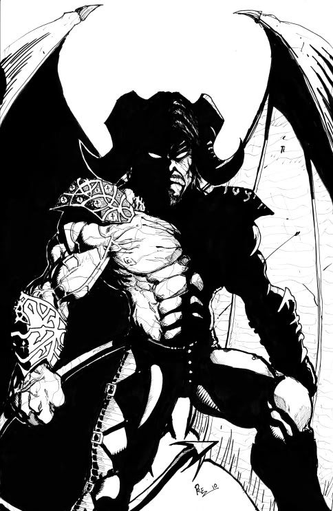
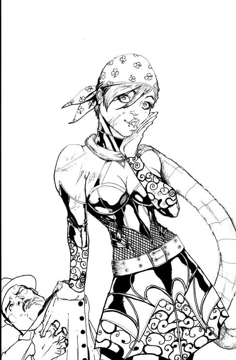
Also loved the first line he has in the Artist's Comments section: "Whoops.. did I just whoop your *butt*.....sorry about that"
(ok, not an EXACT quote...)
The Fenian one made me chuckle a bit because of her expression...
Congrats on the dual arts!
I love the detail in both of your new acquisitions! However, I think Caemgen is one of your best pieces of him yet! He looks rough and tough and mean as hell! Gratzzz on the new artz!! 
~*~VexXxa~*~
The City Scoop Art Correspondent/Writer "ART IS IN THE EYE OF THE BEHOLDER"//"Don't hate because VexXxa is HOT and you're NOT." - JOHNNYKAT
Heh, maybe this Caem pic is a bit of beefcake like some of the gals were suggesting? I'm not a good judge of that, though I do think the art is great 
Nelson has been great to work with so far... Only had much real interaction with him in the set up to the pics (haven't needed any changes or such so far) but in the set up he was great for bouncing ideas around with and such...
Caemgen is cool looking in that piece no doubt but I feel compelled to point out his horns are backwards... Morbid horns curve in towards the face not outward... they look a bit like spiral ram horns in his version. If the curvature was a little off it would be easy to overlook but pointing in the opposite direction jumps out immediately to me. If you look from the posted pic to your avatar an inch or so away you'll see what I mean.
Nelson does make good use of light and shadow though.
In the Fenian piece there is something amiss with her lips but it could just be that I'm not looking at in closely enough.
Also the point where here scarf meets her dress... the curve of the scarf is following the curve of the dress, I forget what
the technical term for this is but generally speaking you want to avoid doing this as it causes visual confusion when two separate
things flow into the same space and appear to overlap. Just moving the scarf up or down a little bit to break up the lines solves it easily.
Same with the lighting on her collar and her neck muscles above. Those are pretty minor though, probably not something to mention to him but
I would say something about the horns if it's not too late.
Heh, you really must have been sick what with it taking you this long to point out the horns!  . (hope you're all recuperated and stuff now though!)
Yeah, he didn't nail those dead on but I think they really work in this piece... I have no problem with artists taking some liberties as long as they look cool  and so long as they keep the flavor of the character. I think when an artist just uses generic horns with no curve at all that it's probably just laziness and I'll ask for a fix but here, to me at least, it seems he wanted the horns kind of spread out and open as if ready for a fight, as if trying to look more intimidating... Sure they don't really flex or move but *shrug* I think the horns here are more artistic license than wrong...
As for Fenian's lips... They did seem a bit odd to me at first but I think she's supposed to be doing one of those Ooops! looks where she has her lips puckered but also scrunched over to one side... I think it'll come across better colored. Least I'm hoping so because I real quickly grew to love that expression on her face...
As for the scarf/dress thing, you're taling how the scarf seems to flow into the one pattern part of the skirt, right? Hadn't noticed before... Probably shouldn't be a problem unless the colors are spot on... As for the neck/collar thong, not sure what ya mean but will look again once home...
I actually saw it almost instantly (having just recently had occasion to draw morbid horns again their curvature was fresh in memory) I just hadn't come to the thread in a while... some days I feel pretty good but a few were pretty brutal. I'm not 100% but I'm getting there. Thanks for asking.
On the horns if you are sending him the same refs you send everyone else then I agree he is probably doing on purpose for cool effect and as long as you are cool with it then it's all good just thought I'd mention it in case it was only OCR. 
~*~VexXxa~*~
The City Scoop Art Correspondent/Writer "ART IS IN THE EYE OF THE BEHOLDER"//"Don't hate because VexXxa is HOT and you're NOT." - JOHNNYKAT
VexX - Be gentle with him, he's not as tough as he looks 
CR - you don't check this thread first thing every day?? *gasp*
Yeah, these days all artists get link to the Cae photobucket gallery as well as direct links to the full size avatar pic and to the horn reference you did. I also mention the nose, the knotwork and... Err, maybe that's it? But while I do stress these things I also invite them to feel free to put their own spin on things. Within reason.
I just figure if I wanted the same exact thing over and over it would be easier to hire one guy full time  . I like seeing them in different styles and through different artists eyes... If not for that I probably would have left nose slide forever, wouldn't have made the knotwork (or some nod to it) a requirement, etc... Hell I'm still looking for the perfect wings, I've yet to fall in love with any artists version of them yet..
Course I am almost tempted to have a pic done of Nemesis or someone ripping them off him, while I like the wings in art, in game I find them a bit too big and obtrusive... I usually switch to a bat winged or a cape costume during battles so the don't distract me...
And the latest are by Clap-san from over at Deviant Art. Comic book art is not his typical style at all... He was a bit hesitant to tackle my trio at first but agreed to give it a try. His style definitely shines through on these pieces.
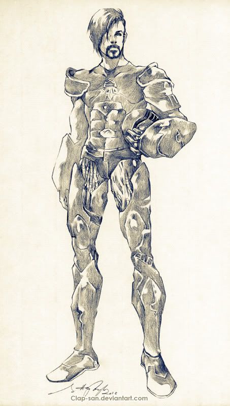
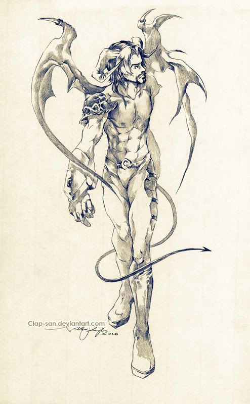
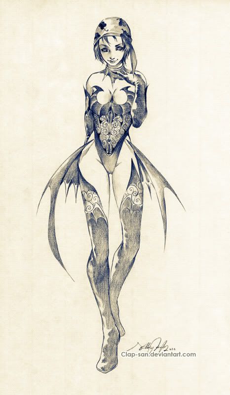
(Hopefully these images are ok, didn't get the hi-res copies yet... And I may come back and have more to say about these later but right now I have to scoot and go get ready to watch the USA vs Canada hockey game for the gold!)
OMG CAEMGEN!!! Those are so totally BEAUTIMOUS!!! I love all three of them equally....well, maybe I love the Caemgen a tad more!! Gratzzz!!! 
~*~VexXxa~*~
The City Scoop Art Correspondent/Writer "ART IS IN THE EYE OF THE BEHOLDER"//"Don't hate because VexXxa is HOT and you're NOT." - JOHNNYKAT
A cool new style to see the trio done in. I like it, it's very minimalist and clean.
The figures are thinner and lankier than usual but not overly so. Also I like the sepia look as well and those are some pretty unique wings on Caemgen.
Caemgen has a human nose though... Alpha's helmet monocle is missing (and so it the white stripe in his hair/beard)... Fenian's pinky is longer than her other fingers and oh yeah and she has 4 leaf clovers on her hat... ahem. 
Gorgeous, Caemgen. Congratulations of the lasts acquisitions.
Hmm. Not bad.
|
Originally Posted by CR
A cool new style to see the trio done in. I like it, it's very minimalist and clean.
The figures are thinner and lankier than usual but not overly so. Also I like the sepia look as well and those are some pretty unique wings on Caemgen. Caemgen has a human nose though... Alpha's helmet monocle is missing (and so it the white stripe in his hair/beard)... Fenian's pinky is longer than her other fingers and oh yeah and she has 4 leaf clovers on her hat... ahem.  |
And yeah, I love the sepia kind of look... I think it works particularly well with this style (specially Caemgen.) His wings are definitely unique here... Hardly even wings at all really but I think they look pretty damn cool and work well with the style. The horns aren't dead on either, pointing up too far at the end curve
 But again, they look pretty cool and to a large extent that's the main thing.
His nose is indeed very humanish... I may just need you to draw me a Cae Nose Primer I can pass along with the horn sketch ya did

To be fair, the Alpha white in his hair missing may be may fault... I don't think I was expecting him with the helmet off so may not have included that note. I really should write the notes up and save them along with my gallery addy's but I usually end up doing them off the top of my head each time. You'd think someone as lazy as me would take this effort saving step... But the procrastination kicks in
 And yep, just checked the notes exchanged, the white streaks weren't mentioned... Which actually means the blank eye is odd since the artists didn't know he had a bionic eye! lol... As for the helmet monocle, yep yep... Errrm, all three of these look like younger versions so maybe it's an earlier version of the armor?? (could explain lack of white streaks as well... but not really.)
The pinky? That's foreshortening!! (or not... lol)
Four leafs?? Ayup... I was going to mention that while posting the pics but I figured I'd let you have that joy.
 Maybe the Vietnamese don't have regular clover??? *shrug*
|
Originally Posted by VexXxa
OMG CAEMGEN!!! Those are so totally BEAUTIMOUS!!! I love all three of them equally....well, maybe I love the Caemgen a tad more!! Gratzzz!!!
|

I do believe this may be the first B&W art I did not see you ask about being colored!!!! I am shocked! lol...
If I had to choose, I would probably pick Cae as my favorite out of this bunch as well but it would be close... But I like his pose, how it's not just a straight on shot and there's the sense of movement to it...
And glad you like...

|
Originally Posted by Powerstream
These are absolutely beautiful. I love the Alpha one. I get a Post-Apocolyptic Knight vibe which I think is totally cool. Definitely my favorite of the three but all are great! Where ever you put these up in your house must be getting pretty full by now!
|
And funny, I got a similiar vibe from the armor... Except the big old gloves, it almost has the feel of one of those armors that somehow expands out of a belt buckle or something.
|
Originally Posted by Red Valkyrja
Gorgeous, Caemgen. Congratulations of the lasts acquisitions.
|
 I really like trying to add non-comic style arts to the gallery and was thrilled I was able to convince Clap-san to give these three a shot.
|
Originally Posted by Bayani
Hmm. Not bad.
|
As I mentioned, all three kind of appear to be younger versions of the actual characters but I think that was inevitable with the artist. If I was worried about all my art fitting my characters actual canon I probably would have passed on this artist nut personally I'm more about getting what I consider cool arts of the characters than in sticking to the canon... Though I suppose I could always call these the Praetorian versions

As noted above, there are a couple of quirks that I probably would have asked be corrected if there was draft approval but even with those quirks I really am loving these three pics and at this point I don't think any of them are worth trying to get changed...
And coolness... I missed the fact that I would be getting the originals sent to me

|
I do believe this may be the first B&W art I did not see you ask about being colored!!!! I am shocked! lol...
|

~*~VexXxa~*~
The City Scoop Art Correspondent/Writer "ART IS IN THE EYE OF THE BEHOLDER"//"Don't hate because VexXxa is HOT and you're NOT." - JOHNNYKAT
*Stupid double post* read bellow.
I was thinking color. but yeah... you'd have to check for fever if I wasnt. :3
Very nice, Caemgen. I like the Alpha one the best.
Cae and Fenian's feet bother me for some reason. Can't put a finger on it, but it drew my eye right away.
|
I was thinking color. but yeah... you'd have to check for fever if I wasnt. :3
|
And Viv - you know what they say about with big feet, don't ya?? Not sure how that applies to Fen though...


I had suggested a dark, dirty looking alley but silly me never thought to suggest graffiti! If I had I'd have thrown in nods to in game stuff... But since I never thought to do that I love what they did... I can't blame them for the K but yeah, I had noticed the m at the end but just didn't feel it was worth bothering to have changed... As for it being repeated but reversed on the back wall, heh that was a bit lazy... But nothing that distracts me so whatever.


I disagree a bit on the tails of the bandana... Having used to wear one quite often, seems to me the ends often stayed kind of curled up and thin looking. They got annoying and weird looking when they flared out too much, IMO... Actually wouldn't mind if they were exaggerated a bit to really trail behind a bit more and give some of that dramatic movement thing...
As for them blending with the power effect, I didn't notice that earlier, but can see it a bit more on my
mobile... Will have to look again on the big screen...
I really like the power effect colors each being isolated to one hand... If I could do that in game I probably would
anyway, thanks for the comments by ya both, nice knowing what others think