Caemgen's Commission Corner
And here we have Rhardo's portrait of Caemgen... http://rhardo.deviantart.com/ - He did great pieces for Alpha and the Daybreakers so I figured I had to get Cae and Fenian portraits as well  (Fen's in the works...)

And here is Becaro's version of Caemgen from previous but with some color correction from Suichiro - Thanks again for that, I really appreciate it! 

Great pieces and mighty fine of Suichiro to do that.
With all the art commission seeds you planted a while back, every week must feel like Christmas with something new rolling in 
 WOW! Look at the abs on that Caemgen!!! Yeah for EYE CANDY!!!
~*~VexXxa~*~
The City Scoop Art Correspondent/Writer "ART IS IN THE EYE OF THE BEHOLDER"//"Don't hate because VexXxa is HOT and you're NOT." - JOHNNYKAT

...and notice his hair.
Seriously has Caemgen never heard of conditioner??? 
P.S. All these browncoats runnin about and no one picked out the ff quote above?
/e disappointed 
Must admit, I'm missing the Firefly reference... But as much as I like the show I've never been one of those people good at remembering things line for line 
As for shampoo... LoL. I actually quite like the hair in the pic, ties in well with the beastly aspect of him I think. Besides, I've personally never used conditioner in my life 
As for looking up from the abs, I think you're just disappointed there's no Caemgen nipplage for you to look at!
And yeah, I think we've decided Becaro must have gotten the green from Eddy's piece... Either that or it was payback for me saying there should be drug testing in boxing in the comments section of his journal about the Pacqiano (sp?) Mayweather fight... 0,o
Joph - it is nice to have stuff coming in regularly  . Though pretty soon there should be a big break as I'm laying off commissions for a while unless unbelievable opportunities arise... Partly to let stuff catch up so it's easier to keep track of, partly to spend some funds on having some stuff printed and partly to save up for some really big pieces which I want to have done but which will be pricier than normal due to having multiple characters in them on wanting them to be top quality works... 3 of those will be the scenes PresidentNelson decided he didn't have the time to do justly and one or two are ideas I have which will involve some forumites characters... More on those when I get around to actually recruiting for them

~*~VexXxa~*~
The City Scoop Art Correspondent/Writer "ART IS IN THE EYE OF THE BEHOLDER"//"Don't hate because VexXxa is HOT and you're NOT." - JOHNNYKAT
And yet more new arts...
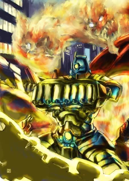
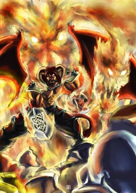
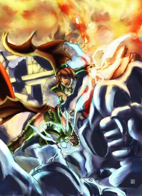
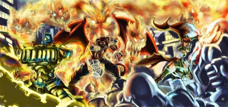
When commissioning Cric (http://cric.deviantart.com/) I ordered my usual 1 of each character and I mentioned it might be nice to have similiar backgrounds behind the characters, as if they were all up on the same rooftop or in the same scene... Something to bring the three individual pieces in together so if I printed them up for wall art I could put them side by side and they would gel together...
Well, here's the individual pieces:


Put them all together and you get....

You ask me, Cric went above and beyond!  Instead of three individual pieces I get one huge freaking battle scene!!
p.s. - Also got a certain resident colorist to work on my Tim Kelly pieces - they came out fantabulastic! I'm going to let him post those up though - He should be bragging about how good a job he did, not me bragging that I hired him 
Holy crap, Caemgen!! That is soooo totally AWESOME!!!! Gratz on the catch and kudos to CRIC!!! 
~*~VexXxa~*~
The City Scoop Art Correspondent/Writer "ART IS IN THE EYE OF THE BEHOLDER"//"Don't hate because VexXxa is HOT and you're NOT." - JOHNNYKAT
That's sweet man I love those three in one panel scenes like that. Not sure who they are fighting but it looks pretty epic. 
Thanks 
it does have that epic, raging through the city, fight til the end kind of vibe to it... I also have no idea who they're fighting - I might have to come up with some kind of story for that.... Hmmmmm.
Caemgen must have also made some kind of pact with a demon to have those fiery minions behind him  Looks cool as he'll, anyway.
The one part of the pic that did give me trouble at first was Alpha's fists. It took me a couple looks to figure that was what they were, first look I thought he had his right arm bent out in front of him and was using something with ridges as a shield...? But that may have been yet again caused by first looking at over my cell phone and not seeing whole picture at once...
Wow - Freaking very nice new volley of artz Caemgen! Congratulations on some really great pieces!
Sorry for the delayed response, I had to wipe my machine several days ago and I'm still playing catch up!
[url=http://starwindgraphics.deviantart.com/]My deviantArt page[/url]
[IMG]http://img.photobucket.com/albums/v292/AceFrankly/Starwind-Name-Signature1.gif[/IMG]
Proud member of The Impossibles/Pinnacle -[url="http://www.theimpossibles.org"]www.theimpossibles.org[/url]
That trio is superepic: I can imagine what the full size would look like. Very good score for you!
I missed the last piece you put up.
Faaaaaaaaannnnnnn-frickin-tastic!
|
I missed the last piece you put up.
Faaaaaaaaannnnnnn-frickin-tastic! |

Heh, I suppose I can't expect everyone to be as interested in my art collection as I am... No worries. But still, you really shouldn't miss this piece:

This was done by UndineCG http://undinecg.deviantart.com/ from over on Deviant Art... The cape could have used more detailing done on it, as it is it appears to basically just be a normal cloth type cape as opposed to the leather kind of look the Magic Bolero always seems to have for me... But to me that does little to detract from the awesomeness that is Fenian in this pic... I think she came out totally freaking amazing here!
Very sweet pic. I wouldn't have noticed the cape being "wrong" if you hadn't mentioned it (since I never use the bolero) so I wouldn't worry.
Caemgen!!! That piece by UndineCG, is freakin' AMAZING!! Definitely your best piece in your gallery thus far!! GRATZZZ!!! 
As for the bolero/cape, I think it works well being plain. Your eyez are drawn to Fenian's figure without being distracted by something else that has a lot of detail.
~*~VexXxa~*~
The City Scoop Art Correspondent/Writer "ART IS IN THE EYE OF THE BEHOLDER"//"Don't hate because VexXxa is HOT and you're NOT." - JOHNNYKAT
Don't get me wrong, the lack of detail on the cape doesn't diminish the pic in my eyes at all... The mentioning of the cape/bolero is partly because I was expecting more detail, not because I felt it was needed. I do really love the bolero details though but I'm still good without it 
It was probably also partly a PCR tactic (pre-empt CR) since if I hadn't mentioned it I'm sure he would have 
But ya, loved how this came out so much I fenangled her into doing Caemgen too! Will be interesting to see how he comes out in her hands since she's only got one (kind of effeminate looking) male in her gallery that I've noticed... But this was so great I was willing to risk it... Get the feeling she's not hot on doing Alpha though... *sigh* an incomplete set! 
And VexX- Trust me, not matter how much detail you put on the cape my eyes would have gone to her figure 
Nice piece Caem'. You should be careful though you wouldn't want to turn CR into some sort of internet meme. Given the 2012 EOW issue something like this could very likely make it a reality...
Roxy On DA...Finally!


It probably comes from Eddy's Caemgen piece if you are sending that around as a reference.
One --> Artz Giveaway <-- To Rule Them ALL!
I will settle this. ORANGE FTW! - Ex Libris