Caemgen's Commission Corner
So his origin is a floating rock with a tree and a BOOK! It all makes sense now!
<lurks out>
Roxy On DA...Finally!
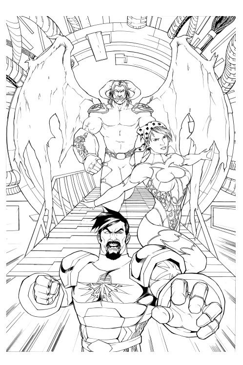
This latest is by Blewh and is unfinished, he'll be coloring it as well. Blewh is the artist who colored my androsm pieces (Caemgen in graveyard, Fenian in alley and Alpha busting up the Crey sign...) I don't think a background was included in the original offer but when he offere I certainly wasn't going to decline  I have him about a dozen screenshots to choose from and he chose this which I think works perfectly with the scene and it's nice to have such a tie in to the game in the art...

Caemgen's pose perhaps looks a bit stiff but besides that I am loving this piece

That is going to be awesome when it is done, Caemgen! The only thing that struck me at my first glance was that Fenian looks a tad too masculine or dykish to me. Not quite sure if her waist needs to be thinned a bit, or her neck a tad more slender, or maybe the shoulders/arms are a tad too manish. Not really sure. But I'm sure when it is colorized, I won't see her that way. 
Caemgen looks terrific, but I think he needs a little work below the belt. 
Alpha looks perfect! 
~*~VexXxa~*~
The City Scoop Art Correspondent/Writer "ART IS IN THE EYE OF THE BEHOLDER"//"Don't hate because VexXxa is HOT and you're NOT." - JOHNNYKAT
That's great line work, Caem, and gratz on the auction win. 
|
The only thing that struck me at my first glance was that Fenian looks a tad too masculine or dykish to me. Not quite sure if her waist needs to be thinned a bit, or her neck a tad more slender, or maybe the shoulders/arms are a tad too manish. Not really sure. But I'm sure when it is colorized, I won't see her that way.
 |
Personally, I like larger women. It's nice to see someone who doesn't look like they'd break in two when fighting a supervillain. Though it doesn't fit Fenian as much, based on the previous versions of her. I think that's likely where most of the issue lays.
http://www.virtueverse.net/wiki/Massacre_Melanie -the original Fire/Dark Corruptor -
http://boards.cityofheroes.com/showthread.php?t=115217
The Guide to BURN
|
That is going to be awesome when it is done, Caemgen! The only thing that struck me at my first glance was that Fenian looks a tad too masculine or dykish to me. Not quite sure if her waist needs to be thinned a bit, or her neck a tad more slender, or maybe the shoulders/arms are a tad too manish. Not really sure. But I'm sure when it is colorized, I won't see her that way.
 Caemgen looks terrific, but I think he needs a little work below the belt.  Alpha looks perfect!  |

As for Fen... I don't think she came out all THAT butch... I think she looks a bit more physically strong than usual but I also think that color will soften her up a bit... (and as for looking like a ****, well that wouldn't be entirely inappropriate...)
As for Caemgen needing work below the belt... You offering to give him such a workout??

But, I believe the intention is for him to be flying/hovering forward and that's why the legs seem a tad off...*
Thanks

|
That's great line work, Caem, and gratz on the auction win.
 |
 . Got the auction piece really cheap considering how much I love how it came out and I'm getting a print as well... *
|
I'd say it's mostly an optical illusion, since her hips are facing sideways but her chest is more straight on. The effect is making her shoulder seem bigger than her hips, which is adding to her already larger proportions here.
Personally, I like larger women. It's nice to see someone who doesn't look like they'd break in two when fighting a supervillain. Though it doesn't fit Fenian as much, based on the previous versions of her. I think that's likely where most of the issue lays. |
Anyway, thanks for the input all
 . I really appreciate it as I really think it helps me be more discerning and pickier going forward...
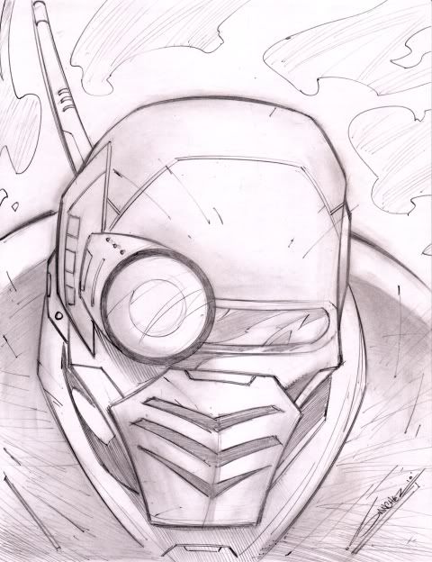
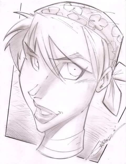
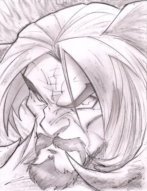
Ya, ya, ya... You've seen the other Steven Sanchez headshots people have gotten, well now mine came in so I figured I may as well share 'em 


3 very nice sketches ... I especially like the "in your face" look of the last one.

Char Site | My DeviantArt
Global=@Thornster
I'd say Fenian came out looking Amazonian, not butch per say. Very Wonder-Woman in terms of physique. The linework in that piece looks nice, but the composition could be better. The dude in the foreground has a strong reaction, as if he's ready to punch something, but the other characters don't really have any reaction or emotion. As a result, the characters don't look like they're in the same picture; it feels more like each character and the background were drawn separately and then layered in photoshop.
I don't recall seeing any Steven Sanchez headshots yet BUT these are great! I am especially digging the Caemgen piece. For some reason I am not getting the "Beast-from-Beauty-and-the-Beast" I sometimes get from Caem and I really like it! It may be the fact I don't see the "typical" feline mouth in this image. But I can tell ya, if that Caemgen was looking in my direction, I'd probably wet my pants.
The Fenian head shot it cool too. I'm not as big on the big eyed look though. As far as the previous pic I have to agree she looks a little over muscled. It drew my attention to it and it's really the only thing that bugs me about that pic. But if you're cool with it then it's great!
Oh and while I think the images of Alpha with the helmet off are great I agree with you and like the helmet on. They seem to really portray his strength better. When you humanize a battle suit it takes some of the shock n awe away, IMHO.
I just have to ask. Did you hit the lotto man? You have gotten a lot of great art in a fairly short time! I'm totally jealous!

All three of your Sanchez pieces are fantastic! Most especially the Caemgen piece!! Gratzzz!!! 
~*~VexXxa~*~
The City Scoop Art Correspondent/Writer "ART IS IN THE EYE OF THE BEHOLDER"//"Don't hate because VexXxa is HOT and you're NOT." - JOHNNYKAT
o.0 that must be one terrible piece of art... if your not going to post it atleast PM it to me, my curiosity cant be containted!
Was it the Graingnome piece? I saw that posted on his page; he does take alot of liberties with character designs. He did it to Planet Girl and Terratonic, if I remember correctly.
Yeah, it looks like an entirely different character. Caemgen, this is definitely a wakeup call that you simply cannot order any more art before you find yourself someone to do character bible sheets for you. Every artist is going to change details about him until you can provide good references for him. Even then, it won't stop, but it'll be more of their unique twists and less of not understanding his character.
http://www.virtueverse.net/wiki/Massacre_Melanie -the original Fire/Dark Corruptor -
http://boards.cityofheroes.com/showthread.php?t=115217
The Guide to BURN
Well didn't want to name the artist until they had a chance to respond... And they have just responded apologizing and saying they'll change the horns and add the tail... I'm actually ok with the rest, I don't mind an artists spin on my guys as long as the integral parts are all basically there...
And I am still searching for someone to do character sheets but in this case I just don't know how much they'd have helped. Maybe with the tail but with the horns it's not like they tried to do them and just weren't up to it or got it wrong... They pretty much just ignored the horns and just threw on generic ones. *shrug*
|
Blech. Nothing better after a really crappy night at work than coming home to a really disappointing new piece of art.
 I'm really thinking about retiring Caemgen altogether. I'm really thinking about retiring Caemgen altogether. |
Caemgen is a beautiful character in the hands of the right artists. Remember that...!
Global is @Mellissandria
I don't have that much art, but I do write stories and I do collect art on
my DA account
|
Well didn't want to name the artist until they had a chance to respond... And they have just responded apologizing and saying they'll change the horns and add the tail... I'm actually ok with the rest, I don't mind an artists spin on my guys as long as the integral parts are all basically there...
And I am still searching for someone to do character sheets but in this case I just don't know how much they'd have helped. Maybe with the tail but with the horns it's not like they tried to do them and just weren't up to it or got it wrong... They pretty much just ignored the horns and just threw on generic ones. *shrug* |
 It still looks cool, it's just not very "Caemgen-ish (tm
  )."
)." I don't think you should give up on him (and don't even think about killing him off!) until you have tried submitting a full on character ref with detailed images and then seeing how it goes.
If you are having difficulty finding someone who understands Caemgen to draw you up some detailed refs, you know I'll help you out buddy.
|
Yeah, it looks like an entirely different character. Caemgen, this is definitely a wakeup call that you simply cannot order any more art before you find yourself someone to do character bible sheets for you. Every artist is going to change details about him until you can provide good references for him. Even then, it won't stop, but it'll be more of their unique twists and less of not understanding his character.
|


WOW! A teenage Caemgen!! He looks so innocent! I lovez eet! GRATZZZ!!!
~*~VexXxa~*~
The City Scoop Art Correspondent/Writer "ART IS IN THE EYE OF THE BEHOLDER"//"Don't hate because VexXxa is HOT and you're NOT." - JOHNNYKAT