Show off your Signature Banners
By
Acemace,
Posted on: 2009-08-02 15:28 in Multi-Media Fan Creations
Here are my Guildportal Signature Banners... Not sure I I will use them here yet.
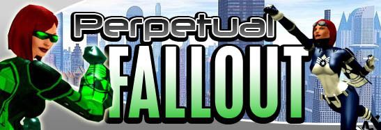
I didn't make them ... credit goes to @Johnny Raven
Quote:
I even put Comic Sans in at one point then shuddered horribly!|
Originally Posted by Trickshooter

At least its not Comic Sans!
|
Trick I love your sig! It is very clean which I like.
I made mine using Adobe After Effects (No, I don't have Powerpoint).
Tell me what you think!
Eradicate, Rampage, Annihilate
For Fame and Fortune ~ #109709
Google actually...then just poke around. I <3 Kudasai so long as I can get it big enough. Also, damn you Alt, I was all happy with the work and time I put into getting all my (currently) major characters with their right colors and icons into a sig and now that very simple crop of art is staring at me begging to be used instead...
Quote:
dafont.com!!!
|
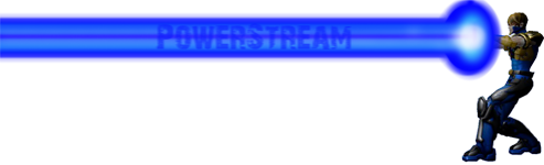
Originally Posted by PowerStream
I totally agree. Papyrus was NOT my favorite choice but I am on an old copy of Photoshop at home and don't have all the great fonts downloaded like I do at work. Do you all have a good source for good fonts for things like this?
I plan on playing with it more and getting a better font with some streaks running through it as if it's getting blasted by the toon. I'm just not that good yet. I did try darkening the blast and going with a lighter colored type but it didn't make sense with the main blast being an energy blast which is white and blues.... I really only do basic color corrections and very basic retouching at work and only when the main imaging guy isn't here. It's just something I've learned to do on my own when I was bored here at work. I work in a commercial photo studio and usually just get to retouch bad set building or match colors to merchandise. Anyway thanks for the great feedback everyone! |
Reminds me to go out and actually get some more fonts. I really just worked with what I had, and while I'm happy with how it turned out... I could probably do a little more with it. But it's not like mine was all that complicated.
The hard part was really splicing out the image from it's source-image. It took at least ten times as long to do that then it did the rest of it (which was literally just me playing around). Also intended to go with a lighter background color, but laziness kicked in (I was thinking a misty cloud blue).
Hmmm... now I'm tempted to play around with it more.
It isnt even close to being CoH related and the resolution sucks but...... here it is
I really need to take a better pic of it 
It looks funky being squished like that, also the paper and the pencils used were green... well the paper is a light greenish. So the colors arent messed up, just how clearly it can be seen.
"YOU DID NOT READ THE THREAD. GO READ THE LONG, LONG THREAD.
Then, perhaps your butt cheeks will relinquish their grip on your chin." -The_Zekiran
Here's mine! I created it not too long ago for use on the Fusion Force site. The previous one I had was about 3 years old. This is my main character in Founders. I used Photoshop to fill in the name over the blast and the SG name.
Feedback is appreciated! 

Fusion Force
Quote:
See now this is more like what I intended. Teach me your magic please!|
Originally Posted by Emerald_Fusion
Here's mine! I created it not too long ago for use on the Fusion Force site. The previous one I had was about 3 years old. This is my main character in Founders. I used Photoshop to fill in the name over the blast and the SG name.
Feedback is appreciated! |
Quote:
I love it. That screenshot is really sweet. I need to upgrade my machine so I can get nice looking shots like that.
|
Originally Posted by Emerald_Fusion
Here's mine! I created it not too long ago for use on the Fusion Force site. The previous one I had was about 3 years old. This is my main character in Founders. I used Photoshop to fill in the name over the blast and the SG name.
Feedback is appreciated! |
Paragonian Knights
Justice Company
What graphics card you have Emerald? Im not sure but im thinking I might need to get around to upgrading as well
"YOU DID NOT READ THE THREAD. GO READ THE LONG, LONG THREAD.
Then, perhaps your butt cheeks will relinquish their grip on your chin." -The_Zekiran
My sig is huge son
that's too big dude, you'll just make it hard to read threads, and i'm sure a mod will most likely react to it and remove it.
Nah, not that big. I have seen bigger. Lookin good Hallway Kid!
Dear god Hallway....... shrink that thing down a bit O.O
"YOU DID NOT READ THE THREAD. GO READ THE LONG, LONG THREAD.
Then, perhaps your butt cheeks will relinquish their grip on your chin." -The_Zekiran
So you guys don't like it?
Fatal error: Uncaught mysqli_sql_exception: You have an error in your SQL syntax; check the manual that corresponds to your MariaDB server version for the right syntax to use near 's Assassin'' at line 1 in /var/www/vhosts/cityofheroes.dev/forumarchive.cityofheroes.dev/topic.php:262 Stack trace: #0 /var/www/vhosts/cityofheroes.dev/forumarchive.cityofheroes.dev/topic.php(262): mysqli->query() #1 {main} thrown in /var/www/vhosts/cityofheroes.dev/forumarchive.cityofheroes.dev/topic.php on line 262
I plan on playing with it more and getting a better font with some streaks running through it as if it's getting blasted by the toon. I'm just not that good yet. I did try darkening the blast and going with a lighter colored type but it didn't make sense with the main blast being an energy blast which is white and blues....
I really only do basic color corrections and very basic retouching at work and only when the main imaging guy isn't here. It's just something I've learned to do on my own when I was bored here at work. I work in a commercial photo studio and usually just get to retouch bad set building or match colors to merchandise.
Anyway thanks for the great feedback everyone!