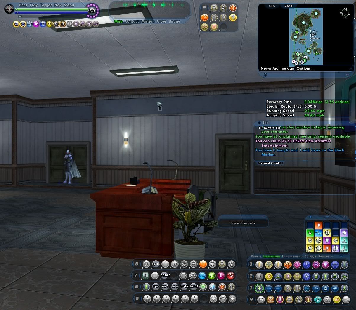
Fourth ( Attached ) Power Tray

|
GG, I would tell you that "I am killing you with my mind", but I couldn't find an emoticon to properly express my sentiment.
|
I'd love a 5th one!
I had 4 filled trays as it was, now with the chat window, I had to move my tray and add a 5th tray for my Lore Pet Commands. :/
BrandX Future Staff Fighter

The BrandX Collection
"If I had Force powers, vacuum or not my cape/clothes/hair would always be blowing in the Dramatic Wind." - Tenzhi
Characters
/signed x10000000
We should be able to stack up to the 9 bars if we want to. Attached, I mean.
Now we need this even more with the new team UI, and the bigger chat window.
Yes, please add this in. Post haste!
@Rylas
Kill 'em all. Let XP sort 'em out.
Yes please, a fourth, fifth and even a sixth should people want it, just keep stacking them on.
So, this isn't working for you?....

Speeding Through New DA Repeatables || Spreadsheet o' Enhancements || Zombie Skins: better skins for these forums || Guide to Guides
....not....attached to...edges of screen! /twitch
I have to stack them with my MM, but putting them right in the bottom corner causes them to switch to vertical/corner mode, which I dont want.
....
I'd also never have my power laid out like that, personally, as it would drive me mad XD
|
GG, I would tell you that "I am killing you with my mind", but I couldn't find an emoticon to properly express my sentiment.
|
But an aside, I have to admit I never thought of detaching the map from the nav and keeping it in a corner of the screen. I'm adding that the next time I log in


In NO way am I saying that is a bad layout its just not how I want it.
Me: well I want all the power trays to be the same size. You can see that 1-3 are smaller than the add-in trays (4-0).
Im paedantic and would want them all to be aligned.
Also if I stack them and I want to move that stack they should be docked/linked so I can move all at once (just like I can for the standard trays).
As an option add the dock/undock icon to the top-left of each tray number so each can be undocked independant of the other.
Well, tray 4 isn't lined up exactly, but you can use windowscale to get all the buttons the same size, or to get the tray the same size. Unfortunately, you can't have both.
As for not being attached to the edge, the space gives me a chance to click there if I have to, whether on a foe or to place a reticle for a power. This way, I don't have to look down first.
Speeding Through New DA Repeatables || Spreadsheet o' Enhancements || Zombie Skins: better skins for these forums || Guide to Guides
I dunno I don't see a need for none floaters I have mine set up like this

Main tray is probably more likely to get dragged because it has a large tab at the top. There's no 'feature' to the extra trays that make them more susceptible to being moved any more than the other windows you can have open.

|
I dunno I don't see a need for none floaters I have mine set up like this
|
Try playing that setup on a smaller resolution screen. You'll be fixing it. Then switch back to your larger screen. You'll be fixing it again. Attached stays attached and in place. All these floaty windows is getting to me too. I would love the option to lock them in place.

"Sorry bucko, but CoH and CoV are the same game." -BackAlleyBrawler
"Silly villain, CoX is for Heroes!" -Saicho
|
Try playing that setup on a smaller resolution screen. You'll be fixing it. Then switch back to your larger screen. You'll be fixing it again. Attached stays attached and in place. All these floaty windows is getting to me too. I would love the option to lock them in place.
|
and btw when I did do that on accident the other day when I switched back even the 3 attached bars had to be moved (as did the nav bar chat window and xp/heal/end bar)
|
why would I switch screen resolutions? am I buying an new monitor every day?
|
Day1 - play on your desktop (1680*1050)
Day2 - go to a mates place and play on your laptop (1440*900)
- UI element location gets muddled.
Day5 - play on desktop (1680*1050)
- UI element location gets muddled.
So as a side issue can the location of all UI elements be saved to a INI/Config file on each device - ovbiously if you add a new element on Device1 it wont exist on Device2 but that is a small price to pay in my opinion.
|
Originally Posted by Cheetatron
Lore pets take MM style commands?
|

|
Try playing that setup on a smaller resolution screen. You'll be fixing it. Then switch back to your larger screen. You'll be fixing it again. Attached stays attached and in place. All these floaty windows is getting to me too. I would love the option to lock them in place.
|
No matter which computer I'm at the local settings are saved such that typing:
/wdwloadfile wdwzombieman
Will put all the windows where they should be. (I use that system for character-specific setup. Just using /wdwload will do the same or hitting the button in the Options window.)
Speeding Through New DA Repeatables || Spreadsheet o' Enhancements || Zombie Skins: better skins for these forums || Guide to Guides
|
why would I switch screen resolutions? am I buying an new monitor every day?
and btw when I did do that on accident the other day when I switched back even the 3 attached bars had to be moved (as did the nav bar chat window and xp/heal/end bar) |
No, you could be like me and have CoH on every computer that you own. Not all have the same size screen. Laptops at 1024X768. Desktops at 1024x768, 1280x1024, and I don't even remember the resolution that is on my TV, its like 14xx x 9xx.
The problem with the floating trays is that they move, and they stack. They can hide under your normal tray so that an open slot in your normal tray will appear to be filled, but it's not. It's an unmanageable problem, but it would be nice to get at least one more permanent tray. It's not like I can't find enough things to put in it.

"Sorry bucko, but CoH and CoV are the same game." -BackAlleyBrawler
"Silly villain, CoX is for Heroes!" -Saicho
|
No, you could be like me and have CoH on every computer that you own. Not all have the same size screen. Laptops at 1024X768. Desktops at 1024x768, 1280x1024, and I don't even remember the resolution that is on my TV, its like 14xx x 9xx.
The problem with the floating trays is that they move, and they stack. They can hide under your normal tray so that an open slot in your normal tray will appear to be filled, but it's not. It's an unmanageable problem, but it would be nice to get at least one more permanent tray. It's not like I can't find enough things to put in it. |
Please describe to me how not having your trays attached forces so much more effort that the devs should be using *their* efforts to help you.


|
We currently have the ability to creating floating power trays and place anywhere on the screen. However, you cant dock them with the other 3 standard trays. ( if you can, I havent figured it out )
With the addition of incarnate powers, I'm having issues finding room on the standard trays, and floating trays I find to be somewhat awkward to use. (there's always something popping up to obscure them ) Suggestion: - Addition of a fourth attached power tray at the bottom OR - Ability to attach the floating power trays. |
I guess we're at a point where "I told them so" is appropriate to say.

Loth 50 Fire/Rad Controller [1392 Badges] [300 non-AE Souvenirs]
Ryver 50 Ele� Blaster [1392 Badges]
Silandra 50 Peacebringer [1138 Badges] [No Redside Badges]
--{=====> Virtue ♀


We currently have the ability to creating floating power trays and place anywhere on the screen. However, you cant dock them with the other 3 standard trays. ( if you can, I havent figured it out )
With the addition of incarnate powers, I'm having issues finding room on the standard trays, and floating trays I find to be somewhat awkward to use. (there's always something popping up to obscure them )
Suggestion:
- Addition of a fourth attached power tray at the bottom
OR
- Ability to attach the floating power trays.
131430 Starfare: First Contact
178774 Tales of Croatoa: A Rose By Any Other Name ( 2009 MA Best In-Canon Arc ) ( 2009 Player Awards - Best Serious Arc )