Cool Movie Posters
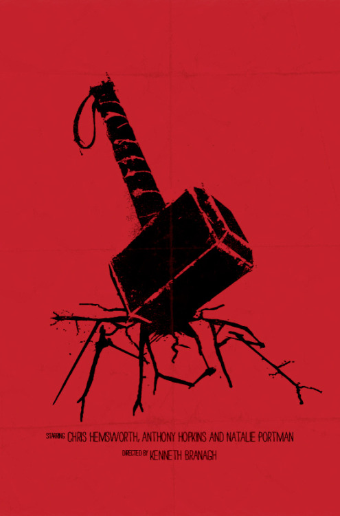
...and in honor of Thor's director, Kenneth Brannagh, here's one of my all-time favorite movie posters. If you've seen the film, you get how amazing this design is.

The Alt Alphabet ~ OPC: Other People's Characters ~ Terrific Screenshots of Cool ~ Superhero Fiction
Quote:
It is - the Saul Bass homage is wonderful. Then again, its sense of style and fun wouldn't fill the theater seats the way they must today. The official one, as a purely commercial piece, is trying to advertise the movie and nothing more. "From the Studio that Brought You Iron Man"!|
In the spirit of the Retro Star Wars Travel Posters, here's the website of graphic artist Olly Moss. He does cool stuff, such as the awesome Thor poster Marvel commissioned him to make for the film's cast and crew. So much better than the actual posters, isn't it?
|

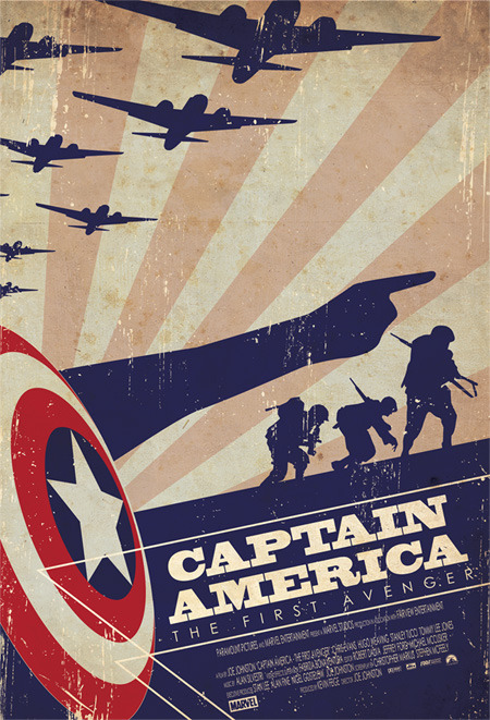
Incidentally, here's another retro-style superhero movie poster that's a lot more fun than any official one:

I almost bought this poster at Emerald City Comic Con... until my wife pointed out that I had nowhere to display it.
Comrade Smersh, KGB Special Section 8 50 Inv/Fire, Fire/Rad, BS/WP, SD/SS, AR/EM
Other 50s: Plant/Thorn, Bots/Traps, DB/SR, MA/Regen, Rad/Dark - All on Virtue.
 -Don't just rebel, build a better world, comrade!
 Awesome stuff.
The Alt Alphabet ~ OPC: Other People's Characters ~ Terrific Screenshots of Cool ~ Superhero Fiction
A couple more minimalist designs, courtesy of this tumblr.


Okay, that Cap poster is pure liquid awesome.
There is an art, or, rather, a knack to flying. The knack lies in learning how to throw yourself at the ground and miss. --The Hitchhiker's Guide to the Galaxy
I am drooling agreement. Plus with the news just now makes me feel all Cappy.
The Alt Alphabet ~ OPC: Other People's Characters ~ Terrific Screenshots of Cool ~ Superhero Fiction
The arm is bugging the crap out of me. Every other silhouette has great detail to it, but that arm is so horrible...
I also don't like have the lines above and below the movie title go over the shield and down at an angle. That's just weird.
I also don't like have the lines above and below the movie title go over the shield and down at an angle. That's just weird.
Yeah the arm is a too "stylized". I think it's the hand/wrist that looks a little too unrealistic. On the other hand (no pun intended) the "lines" you're talking about are obviously meant to be bullets being deflected by the shield. I don't really have a problem with that.
Loth 50 Fire/Rad Controller [1392 Badges] [300 non-AE Souvenirs]
Ryver 50 Ele� Blaster [1392 Badges]
Silandra 50 Peacebringer [1138 Badges] [No Redside Badges]
--{=====> Virtue ♀
Quote:
Oooohhhh...I would have bought that and MADE space for it. I'd put it on the ceiling if I had to. |
I almost bought this poster at Emerald City Comic Con... until my wife pointed out that I had nowhere to display it.
|

Thanks to this thread, I have just purchased the following print:

Thanks, thread!
(Sometimes, I wish there could be a Dev thumbs up button for quality posts, because you pretty much nailed it.) -- Ghost Falcon
Quote:
Your wife is evil. I want that poster now. Where get?
|
I almost bought this poster at Emerald City Comic Con... until my wife pointed out that I had nowhere to display it.
|
http://www.tstout.com/welcome
He's got a number of posters in similar style, including the original Star Wars trilogy, Kill Bill, et cetera. A lot of the posters are sold out, though.
He's got a number of posters in similar style, including the original Star Wars trilogy, Kill Bill, et cetera. A lot of the posters are sold out, though.
Comrade Smersh, KGB Special Section 8 50 Inv/Fire, Fire/Rad, BS/WP, SD/SS, AR/EM
Other 50s: Plant/Thorn, Bots/Traps, DB/SR, MA/Regen, Rad/Dark - All on Virtue.
 -Don't just rebel, build a better world, comrade!
Quote:
Obvious to you, not so obvious to me. Impact lines would have helped me identify them as bullet trails... or... perhaps... even show a white bullet silhouette with a trail behind it in a similar fashion... I can see one fitting between the top bullet trail and the line that defines the ground/sky.. and right in the middle between the shield and the soldier. |
Yeah the arm is a too "stylized". I think it's the hand/wrist that looks a little too unrealistic. On the other hand (no pun intended) the "lines" you're talking about are obviously meant to be bullets being deflected by the shield. I don't really have a problem with that.
|
I know, I know... I'm picky. I'm an artist too... Every detail counts. And, for what it's worth... I'm just as hard on my pieces as I am on this one. lol.
Quote:
I'm kind of surprised you didn't get that those were bullet trails. The entire point of that style of art is to abstract things out while still communicating the point. The fact that he used also as borders around the title is brilliant.
|
Obvious to you, not so obvious to me. Impact lines would have helped me identify them as bullet trails... or... perhaps... even show a white bullet silhouette with a trail behind it in a similar fashion... I can see one fitting between the top bullet trail and the line that defines the ground/sky.. and right in the middle between the shield and the soldier.
I know, I know... I'm picky. I'm an artist too... Every detail counts. And, for what it's worth... I'm just as hard on my pieces as I am on this one. lol. |
The Alt Alphabet ~ OPC: Other People's Characters ~ Terrific Screenshots of Cool ~ Superhero Fiction

Love this thread - the Iron Man II poster would look great on my wall (if it was still for sale)....
Go Team Venture!


In the spirit of the Retro Star Wars Travel Posters, here's the website of graphic artist Olly Moss. He does cool stuff, such as the awesome Thor poster Marvel commissioned him to make for the film's cast and crew. So much better than the actual posters, isn't it?

The Alt Alphabet ~ OPC: Other People's Characters ~ Terrific Screenshots of Cool ~ Superhero Fiction