LD's COH Sketchbook
I realized there is really no need for me to keep my fanart battle entries secret until I am finished. By sharing the progress, I will know if my entry does not meet the requirements before it is too late, and also be able to incorporate ideas from others that I may never have thought of, which would make the final piece better. Also making it a habit to show WIPs would help avoid waiting till the last minute to get something in.
I was going to do wrath for this month, but I got a new idea for envy out of nowhere today.
Title: Envy
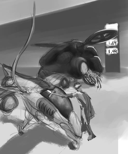
Synopses: It takes place at a gas station for aircrafts. In the foreground, you see a longbow warden refueling his beat up chaser. It is in a pretty bad shape, cracked windshield, duct taped panels, rust, etc. (Note the model number for his chaser is INVU.) As he begins to wipe bugs off the windshield, he sees a big shiny arachnos flyer land next to him. Even the sound of its fancy door opening has luxury written all over it. Out comes a happy and maybe slightly drunk arachnos agent accompanied by a hot chick. Warden lets out a sigh and begins to wonder what has gone wrong with his life.
Inspiration/references:
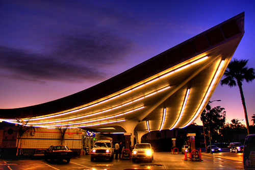
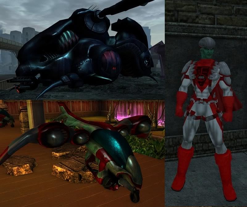
Rough sketch:
My Web Site and Portfolio
My DeviantArt Gallery
I haven't told Comrade Hero yet, but I am about halfway through a gift art for him. I am actually completely redoing a piece I did back in 2008. There were so many things wrong with it that it made more sense to start over rather than try to fix everything. If he wants to see the progress, I will post them here. If he wants to be surprised, I will wait till it is finished, which hopefully will be by Sunday.
My Web Site and Portfolio
My DeviantArt Gallery
It's a good idea for a piece and it could be very intersting, looking through your DA gallery there's some great pieces there, I love the kinda 1940s look some of them have.

My deviantART page (warning some images nsfw)
GGRRR Comic Series GGRRR Comics on Facebook
I think you have strong compositional skills and it's reflected in your work. The sketch you post above is very nice in the way it breaks up the space--the large dark geometric form of the gas station with the luminous sign between it and the arachnos ship. That and the highlights on the arachnos ship push it forward, and then you have the longbow ship in front with the contrasting value--with the shadow below to fix it in space and push it forward. It's a nice layout of forms on diagonal angles with an alternating pattern of light and dark.
My only qualm about it with respect to the challenge is that the idea of envy has to be communicated through the figures, which are a relatively small part of the composition. Don't get me wrong, I can still pick up on the idea looking at it and thinking about the elements you're presenting. But if I saw this sketch without reading anything about the theme, I would assume that it was concept art about the 2 spaceship designs, with a little bit of narrative thrown in to give it some human flavor. And given the female figure will be so small, it's possible that someone could look at the warden figure and assume that he's looking up at the price of gas.
Blacklisted
"I'AM SATANS FAVORITE CHILD!!"

I don't want to cause more work for you, LD, but I do think that, to emphasize the 'Envy', you could bring the Flier and its passengers in closer to the focus. Have them at the next pump over and not halfway across the lot. You may have to push the Chaser partway out of the picture to do it, but that would allow you to get in closer to it and allow more detail in its 'Tattooine Reject' look.
Be Well!
Fireheart
Heya Lousy,
I would suggest to move the warden to the left side of his chaser (so he is between us and the craft) it would block a little bit of the vehicle but the tradeoff is you would be able to see warden's face in profile and while it can be tricky to show emotion from a face in profile it's better in my opinion that trying to do it with his posture and body language alone.
Further more if you stoop him over a bit more you and lowered the camera angle and moved it more to the left you could get the side of his face and have him looking past/over the top of his dumpy craft at the shiny Arachnos flier (shouldn't be a problem as the Fliers are huge compared to the chasers and it would easily be visible as it towers over his tiny craft). Done right you could lead the viewers eye from saddened look on his face... to his beat up ride (the reason for the look on his face)... to the life he could've had instead, represented by the flier and the hot chick, (which I assume is the girl coming out of the flier?).
Also I would bring the flier closer and mover the gas pump with the cost off to the far left side (or even as suggested above between them but not in the line of sight) so it's not getting any undue attention. Oh yeah and if the Flier were close enough you could get bonus points by putting the light source on the far side of the flier so it's casting a huge shadow across the warden and his beat up little ship. Sunlight and maybe even a sparkle glints off the shiny flier while the chaser and warden are glumly "in the dark."
Just some thoughts I had when looking at it. Cheers. 
$1.49 for gas? I think I'm moving to the Rogue Isles!
Hey LD! I'm envious of your great idea! (heh heh)
Here's my suggestion: how about, instead of the "happy" Arachnos agent being accompanied by ...only ONE hot chick, maybe have him accompanied by THREE or Four!
Thanks Night Hornet. 
BW, your compliment and analysis of the composition came as a bit of surprise. Composition has been one of the most mysterious subjects for me. I think I started thinking harder about it when you indirectly referred to my February fanart entry and said it was a very basic composition and most visual artists will try to accomplish more. In his assessment of my previous work, Robert Chang said (among other things) my composition was weak, both in layout and tonal arrangements. Composition was the topic for the second week of the class. I guess I am starting to make some progress. 
I agree with the things you said in the second paragraph. It's challenging for me to find the right balance. When I got the idea in my head, I saw the scene zoomed in on the lb with clear sign of frustration on his face. But when I started sketching, I realized that most of the chaser would be cut off if I zoom in on his face.
Fireheart, I'm still only trying to visualize the scene, so it is easy to make major changes at this stage. In the first thumbnail, I was going for atmospheric look with deep perspective. I did new thumbnails with more direct size comparison.
Thanks CR. If I go with the first thumbnail, I will try the things you mentioned. 
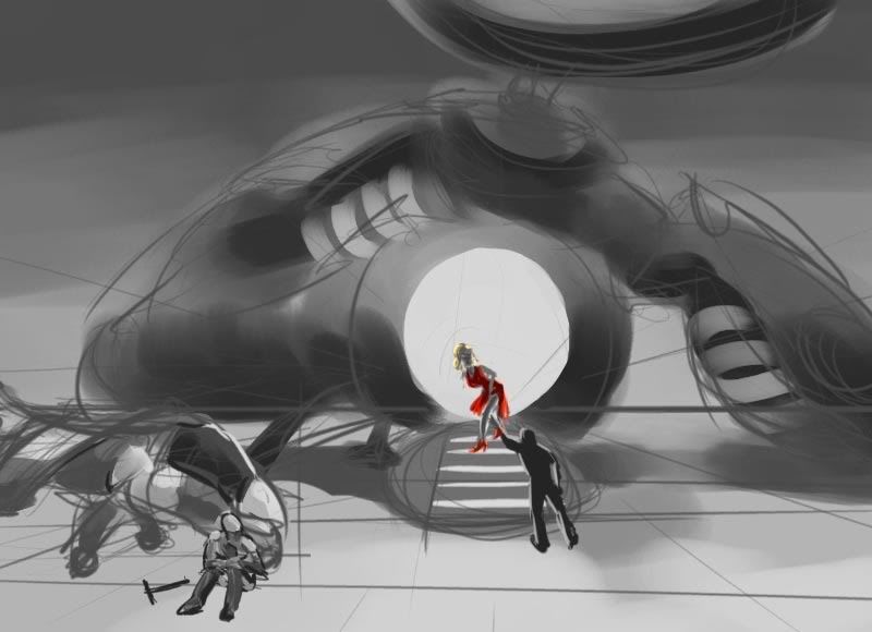

I am not sure if I like these very much. I think these will need to be cropped differently or more elements will need to be added to make the composition better, but just not sure how.
Bubbawheat, it could be 1.49 million inf per gallon. 
U-Naught, that's a brilliant idea! My mind was so preoccupied with the hot chick rule that it didn't occur to me I could have hot chicks. If I go with one of the second thumbnails, loading the flier with a bunch of hot chicks will be an easy way to avoid designing the interior.
My Web Site and Portfolio
My DeviantArt Gallery
Well, Comrade Hero is up for seeing the progress so far, so here it is:
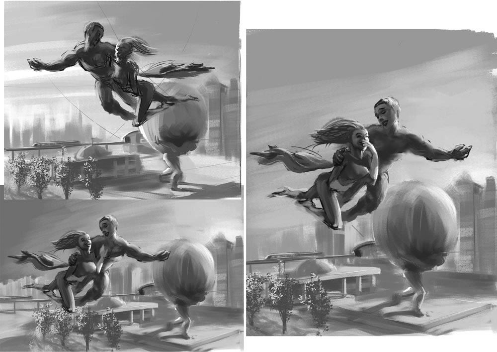
I am sort of doing this as my final image for the Robert Chang class. I liked the black and white thumbnails, but it was brought up that it looked like they were flying too low. I tried repositioning the characters and free transforming the background like crazy, but I wasn't happy with the results.

I redid the background with a birds eye view. I was avoiding using that view because I wanted to show the sky, but then I realized if I make the globe shiny reflective metal, I can still show the colors of the sky. Robert thought that was clever, kind like a composition within a composition.
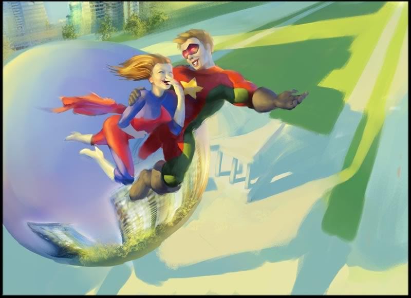
Robert suggested reversing the direction of the sun, so I tried it. I do think their faces look a lot better lit by the sun. I also moved the city hall so it is close to the center of the street and not right next to the road. The background is still largely unfinished, and I need to work more on the characters as well.
My Web Site and Portfolio
My DeviantArt Gallery
I like the original, and the second the best. I agree that the compositions are very strong. I think one thing you could try to convey the envy more strongly is, on the first one, to put the warden's fists on his hips. He can still have the squeegie in hand (that seems to be important to you and a very nice touch). Put the emotion in his body and I think it would be pretty strongly conveyed.
Edit: and wow! That comrade hero gift is looking incredible!
very nice!! I cant even color within the lines... 
No one goes there anymore, it's too crowded...
"The potato goes in the FRONT."
I like the darker version, or second to last one myself. I find the brighter one has too much emphasis now on the shadows below them. Where as the darker version has less geometrical distraction and pointing off the page in the upper right. I'm also slightly perturbed (sorry can't think of the right word) by his smile in the brighter version. It seems a little feminine. I tried finding you a proper smile and since SuperMaoriFulla prefers Viggo Mortensen as his model for CH, I went looking for a pic of him laughing. Let me tell you after 12 pages of Google Images and Deviant Art photos, that dude NEVER laughs...
But let me just make one thing clear, I love all these sketches, it's great to see your process.
Man, LD! Those're beautiful! I really love your painted grayscale comps! I'm torn between the dark & the light color versions - they each appeal to me in different ways. I like the shadows in the darker one, and the couple somehow feels ..richer. But the lighter one does bring out their faces more. I'm sure whichever one you choose will come out really well.
..and it sounds like you're getting good stuff outta the class!!
Peeking in on my cell phone so can't comment too much on the art (since it's so small on my phone) but in regards to the FArt entry ones I did want to mention that I think you should consider focusing more on the people than the crafts..
I think making the people as large as possible would ge beneficial to portraying the envy, be it through body language or facial expression... While I think including the whole crafts may make for a more interesting overall pic, I think you may end up minimizing the theme a bit...
Anyway, I think what I'm trying to say is that as a work of out for a much wider audience, I think full ships is better. For the FArt crowd factoring in theme, I think cropped ships and bigger people may be something to consider...
All in all, I think this could be boiled down to a LB scraping bugs off his windshield while watching a crab soldier (or whatever) walk past with a hottie on each and every arm. I think the ship comparison is interesting but I don't think it's neccessary to get the point across...
Anyway, just my thoughts...can't wait to get home to check out the comrade pieces, they look pretty cool on my tiny phone screen so wanna see them full sized! 
The comrade hero piece is looking real good, can't wait to see it finished.

My deviantART page (warning some images nsfw)
GGRRR Comic Series GGRRR Comics on Facebook
Those are really terrific, LD!! 
~*~VexXxa~*~
The City Scoop Art Correspondent/Writer "ART IS IN THE EYE OF THE BEHOLDER"//"Don't hate because VexXxa is HOT and you're NOT." - JOHNNYKAT
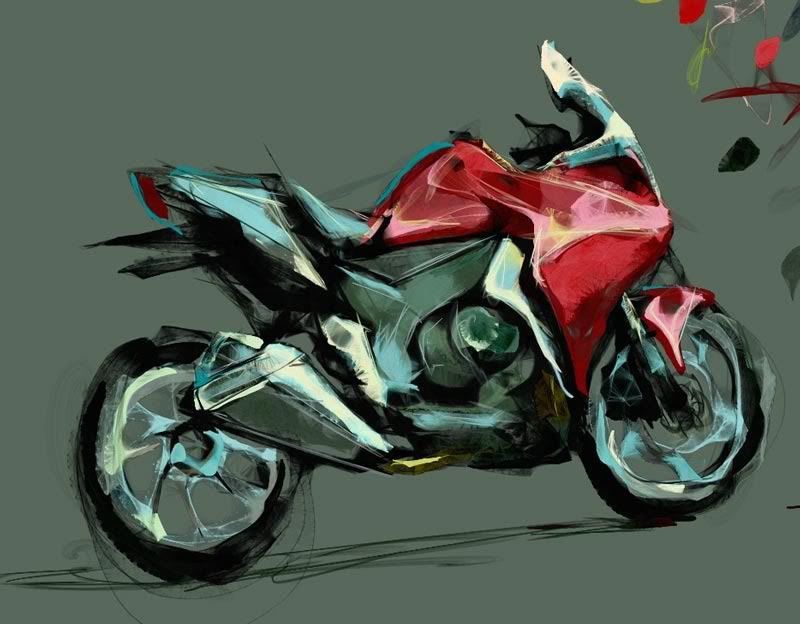
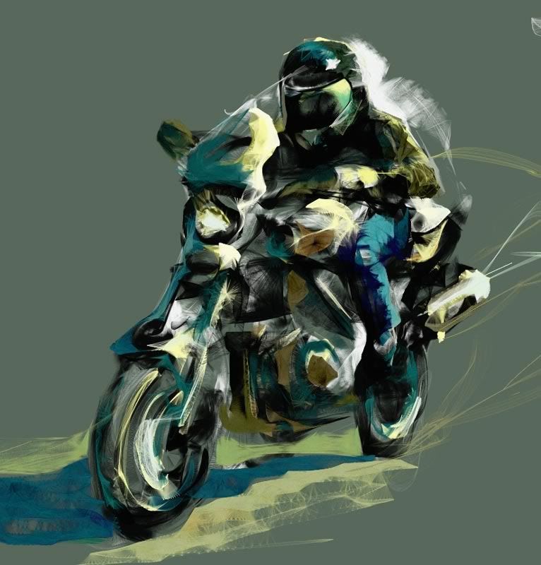
I've been trying to get back in the mood to draw stuff. Found an internet based drawing tool called Harmony, and I really like to play around with it. (It works best on Google Chrome for me, and doesn't work at all on IE.)
A couple of bike sketches from photo refs using Harmony:
And my entry for TA's contest:

My Web Site and Portfolio
My DeviantArt Gallery
I am suddenly hearing the 70s "Batgirl" theme song, but with "TA" sung in it's place...
 I redid the background with a birds eye view. I was avoiding using that view because I wanted to show the sky, but then I realized if I make the globe shiny reflective metal, I can still show the colors of the sky. Robert thought that was clever, kind like a composition within a composition.  Robert suggested reversing the direction of the sun, so I tried it. I do think their faces look a lot better lit by the sun. I also moved the city hall so it is close to the center of the street and not right next to the road. The background is still largely unfinished, and I need to work more on the characters as well. |

It would almost be as awesome as the above two pieces.
|
Well, Comrade Hero is up for seeing the progress so far, so here it is:
 I am sort of doing this as my final image for the Robert Chang class. I liked the black and white thumbnails, but it was brought up that it looked like they were flying too low. I tried repositioning the characters and free transforming the background like crazy, but I wasn't happy with the results.  I redid the background with a birds eye view. I was avoiding using that view because I wanted to show the sky, but then I realized if I make the globe shiny reflective metal, I can still show the colors of the sky. Robert thought that was clever, kind like a composition within a composition.  Robert suggested reversing the direction of the sun, so I tried it. I do think their faces look a lot better lit by the sun. I also moved the city hall so it is close to the center of the street and not right next to the road. The background is still largely unfinished, and I need to work more on the characters as well. |
The whole piece is looking much better now and I can't wait to see where you go with it.
Also on that TA piece... that headlight looks like some kind of really cool beam weapon.

|
I've been trying to get back in the mood to draw stuff. Found an internet based drawing tool called Harmony, and I really like to play around with it. (It works best on Google Chrome for me, and doesn't work at all on IE.)
|
That app is pretty nice!
Blacklisted
"I'AM SATANS FAVORITE CHILD!!"


I decided to start a new thread to post anything I do that is CoH related. I believe as fellow players of the game, people on this forum will be able to give valuable feedback I won't be able to get elsewhere. I will be posting polished works as well as WIPs and quicker sketches. I am pretty open to suggestions and critique. If you guys notice things that could be improved or simply suck, please don't hesitate to let me know.
My Web Site and Portfolio
My DeviantArt Gallery