
Lousy_Day
-
Posts
365 -
Joined
-
Oh wow, I totally didn't see this coming. Although I've rarely played in the past year, I am so sad to hear they are shutting it down. So many memories from the 7 years that I played it almost daily. And to think CoH had a direct influence on my artistic development...I did not even know how to draw when I started playing CoH. I still remember how much I was blown away when I saw this on TA's gallery and it got me hooked on digital painting, along with the Mmoart stuff and speedpainting artists. Lol, it doesn't look as amazing as it did back then, but it will still always be my all time favorite TA fanart. When I look at the stuff I've done, the vast majority of things I whipped out of my head for fun are CoH related. And the major artistic growth spurts I've had were when I was toiling for hours for days or even weeks on some of the fanart battle entries...
I regret I was too undisciplined to ever reach the commissionable artist status, but after pulling 12+ hour days for a year learning 3d, I've come to realize that I can do the same with 2d now, and I am seriously considering switching my focus to concept art. I've been painting like crazy for over a week now, and if I decide this is what I want to do, I might take some commissions down the road if anyone would be interested in immortalizing their CoH characters then.
Here's my facebook, web site, and deviantart.
I will miss this community and wish all the best to everyone. -
1. SyrusB / Liz - really cool water effect!
2. Leaf-nin
3. Tartyrsauce -
Hey guys, it's nice to see some familiar names.

Crescent, I used Zbrush and Maya for modeling, V-ray to render, and Nuke to composite different render elements. I haven't started texturing yet, but will be using Mari, which makes texturing in Photoshop so old school.
For polymodeling, it honestly doesn't matter which software package you use. It's just a matter of getting used to different menus and interface. Actually this was the first model for which I used Maya exclusively for polymodeling. My previous models were done in Softimage, which was the first software I learned in school. I was pretty fast with Softimage and didn't want to model in Maya initially. But now that I've gotten used to it, if I go back to Softimage, I will probably fumble around for a while before I can adjust again. I kinda have to know Maya because it is what most studios use around here. From what I've seen even free software like Blender is perfectly capable for modeling, although I have no idea how good their new render engine is.
Airhead, sorry to disappoint, but the entire room is a photograph. I was just trying to make it look like my robot belonged in the same picture. The only other CG elements are the shadows and reflection of the character on the round platform. Hmm, I am looking at the picture, and the room would be pretty simple to build in 3d for the most part. For the window I think all you'd need is a nice area light behind the window frame. -
Hi all! It's been a while, but I never really left. For the past year I've worked my *** off in school, and didn't have time or energy to play CoH or make fanart. I'm done with school, but will still keep working on stuff till I get hired.
This is not CoH related, but it is my first serious attempt at modeling a character and wanted to share it with those who are still here. I will be texturing it over the next few weeks. The concept is by Keith Thompson. I thought it would be cool for him to have a little flying pet, and made one using some recycled parts.


This is the life drawing room at my school. I tried to integrate my model into the picture using an HDR image of the room I made to light the robot.
Please visit my web site to watch my demo reel for more of Arch Guardian and my other projects. -
Quote:I believe Sculptris was the work of one person who shared it for free. Then he got noticed by Pixologic and they hired him. I am glad Pixologic hasn't killed it off.Originally Posted by BattleWraith
 They are giving it away for free at the moment, probably because it's still under development and it's considered beta, but if anyone is interested in 3d modeling/sculpting this is a great opportunity to get your feet wet.
 -
Wow, very tough month indeed. I am glad I am not competing for votes.
1. Liz
2. BW
3. CR -
Quote:Last couple of years I dropped out in the middle because I got lazy/burned out, but this time it's for the better. I just finished my first week at school, and I am basically staying there from 8:30 am - midnight mon-fri and 10-10 on saturday and enjoying every minute of it. I live only a half block away from school, so I just come home for lunch and dinner breaks and go right back. School is closed on sundays so I got to catch up on sleep and relax today. I've never been this diligent in my life, and I am excited to see where it will take me if I can keep this up for a year. I don't know when I will have time to work on personal or coh related stuff, but hopefully by this winter I will be able to do some decent 3d stuff.Originally Posted by ChristopherRobin
P.S. Lousy Day bows out of the FArt about this same time every year as he has classes starting up and while I never like to seem him drop (even though he regularly crushes everyone in the votes lol) it's to be expected and there are usually a few who go due to time constraints or RL stuff (Techbot?) but I hope that's it.
-
Bah, I give up. Every time I try to upload someone else has already made a change.
-
Congrats Liz!
Darn you Airhead for uncovering me, and also being the only one I was way off with my guess! I was surprised by how few people tried to guess the artists. Airhead and CR, what made you guys think #3 was me?
Liz was a tough one to guess because I hadn't seen much of her previous works. What made me rule out my initial guesses were small details like the shape of the cape and specular highlights on the hair.
After LJ posted I was pretty certain #5 was him.
I had Tartyrsauce and CR backwards at first because CR had asked me for 3d links earlier in the month. When he was very quiet on the forums last few days before the deadline I thought he must be learning 3d. CR almost got away with it, but upon a closer look I found a couple of clues he left behind: He used the same chat bubble and font for his March entry! And I think Tartyrsauce talked about poser or dazstudio on the forums a long time ago so he was the only logical choice I had left for #7.
As for mine I tried to do something totally different from what I normally do stylistically. I had never done comics/chibis so it was a learning experience. I also made a lot of use of lasso, masking tools, and gradients, which I haven't used much before but am trying to incorporate more into my painting process. I also learned to use some filters to create special effects instead of painting by hand, which you can see on the healing effect and on the spell around Amy's feet.
One thing I didn't want to compromise was realistic lighting. It probably has been my number one obsession when it comes to creating an image as long as I've been painting. I think realistic lighting makes even cartoonish sketches feel more immersive and believable, like in this Lost Ducky series and a lot of stuff you see in the "Art of" books for animations. I think it will always be a main focus in my personal works whether it be 2d or 3d.
Good luck on your June entries everyone. Now that I got eliminated I will be able to vote freely! -
Quote:I know it isn't even June yet, but I won't be able to submit a piece before the deadline, so I am eliminating myself now.Originally Posted by Bubbawheat
4. There will be eliminations this month instead of points, you may use the points you have accumulated through this point as you see fit, either privately or announced in this thread. At least 2 people will be eliminated this month, and at least 1 person will be eliminated through voting. If you don't submit this month, and don't use your points to save yourself you will be eliminated. The top 3 artists based on votes are safe from elimination no matter how many people use their points to save themselves from elimination.
-
This is a great theme, but it looks like I am the first one to get eliminated this year.

School starts in two weeks, and I know I won't have the time to participate anymore. Hopefully later this year I will be able to post some decent 3d sculpts of superheroes.
Great job Bubba on organizing this and good luck to the rest of the contestants! -
Quote:I've been playing like that since 2004. Well, I play in almost a square window now (so I don't have to change anything when I rotate my monitor vertically to make it easier to work on some paintings) but I used to play with a wider format. I basically wanted all the vital information (hp/end for team, target and myself, chat, and power trays) on the same side of the screen so it only takes a quick glance to be aware of everything that's going on. I found having hp windows all over and chat on one side and my powers on the opposite side made it more difficult to keep track of everything and slower to react. Chat window also used to be narrower before the latest issue made it wider.Originally Posted by Sapphic_Neko
I'm more baffled by the UI layout, how can you play like that?!
-
I think it's best to contact her by email. Not sure if she's trying to keep it a secret from her husband, but since she is new she may not know how pm works.
-
So I was doing my anniversary badge run before the end of the month, and it was Hyper Sloth's turn. Look at all of his dayjob icons! He's been a busy lil sloth. Has anyone seen more on an alt?
-
I will try to guess the artists. It took so long to decide some of them and I still can't make up my mind!
#1. Darth Delicious or Airhead.....Darth Delicious
#2. I thought it could have been Airhead, Techbot Alpha, or Darth Delicous, but I will go with Liz.
#3. Techbot Alpha
#4. Bubbawheat...or maybe the other BW, but I will stick with Bubba.
#5. Almost wanted to say LJ, but since he is not in the competition, Henri.
#6. Defiance Jones.
#7. Tartyrsauce? No clue really. I know Battlewraith knows 3d, but don't think this is him...
#8. Christopher Robin. -
Welcome Oya, nice efforts on those drawings!
One reason you feel you have more trouble with the face might be because as social animals, recognizing people by faces and reading facial expressions plays a vital role. Just a slightest change can turn a face into a different person, or change the expression to something you do not intend. It doesn't take a master artist to notice when something is not right with a face, even if we may not be able to pinpoint exactly what is wrong with it.
Other people have already mentioned some things about that head, but the ear is placed too far to the right of the picture as well, and it is hard to get a feel for the underlying skull.
One thing you can do to avoid these deformations is to construct your head (or anything else you draw) from basic shapes. We tend to get used to what we have drawn when we continue to look at it, so you should also check for distortions by holding it up against a mirror. Any major errors you didn't see before will pop out immediately. It is much easier to do that with digital since you can just flip images very quickly. Actually this is a very good practice many professionals will recommend you do with everything you draw/paint. Sometimes I feel like I drew a decent head, only to get absolutely horrified by what I see in the mirrored image.
If you are looking for more good books, Andrew Loomis books are my favorite. They've been out of print for a long time, but you still might be able to find PDFs online if you search. I believe Figure Drawing For All It's Worth and Drawing the Head and Hands are finally getting reprinted this year.
The Artist's Complete Guide To Facial Expression by Gary Faigin is also an awesome book on the subject. -
Quote:http://www.blendercookie.com/2009/12...t3-rs-part-01/Originally Posted by ChristopherRobin
P.S. 3d car you say? Got any links?
I will PM with a more detailed reply so we stay on topic.
Dooom!!! -
When did they change the date from December 2012? I'm going to be pissed if it's the end of the world. Just spent last two days learning to model a car in 3d.

-
Heh, I'm still painting but I don't know about masterpieces. Actually 2d is too competitive so I will be going to a 3d school to break into the movie or video game industry as a modeler or an animator. Once I'm there I think I may eventually want to get into concept art. School starts next month, so it will be an exciting year ahead for me.
-
Welcome back TA! That last one is amazing. So do you work in the video game industry?
-
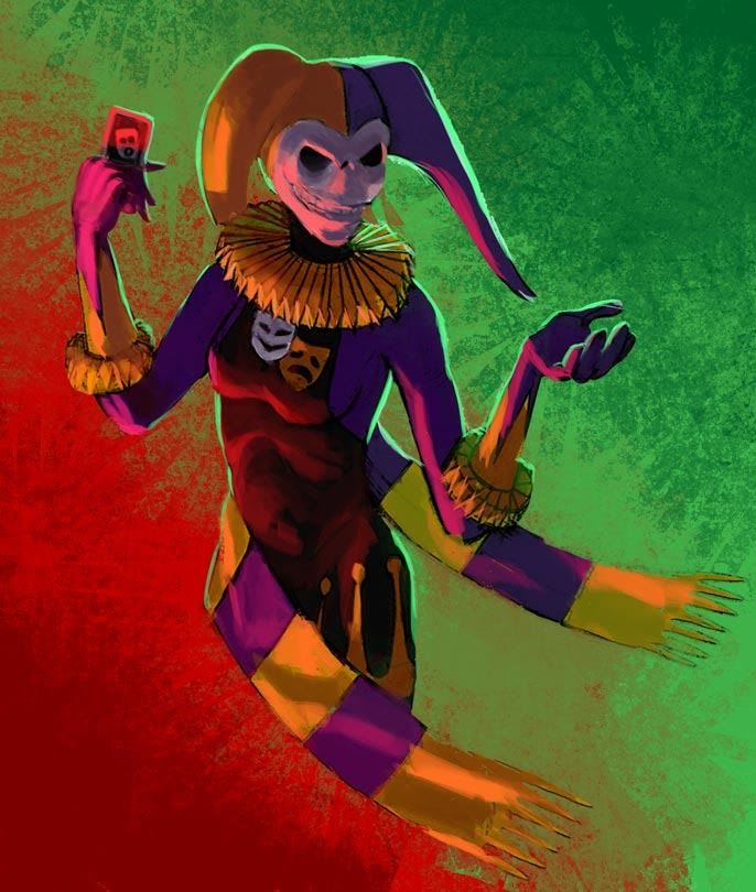
Quote:In that case, I just wanted to play with theatrical lighting.Originally Posted by ChristopherRobin
That chest emblem is actually the symbol of the theater (think plays not movies). The two masks represent comedy and tragedy.
It was just a brush that did the textures in the background. I used a tall rectangular brush with angle set to direction with a little bit of spacing, which is why you sort of see individual rectangles as it turns. I also checked the "dual brush" box with something that has a grainy texture to it.Quote:Originally Posted by ChristopherRobin
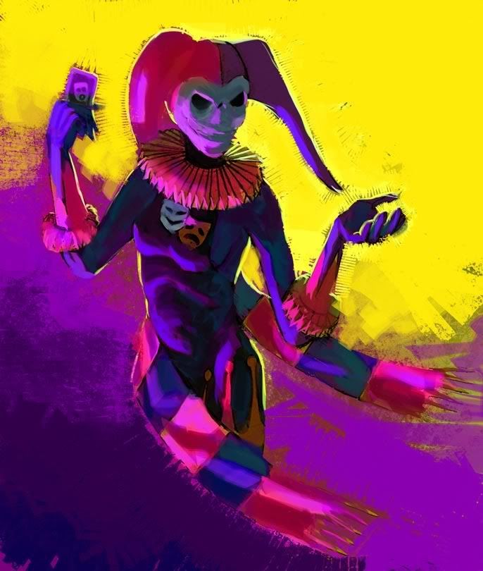
Nice paint overs LD (you fixed the hand too) I the red/green one best. Out of curiosity do you paint the
colors first and then do the texturing/patterns or do you apply the color with a brush that makes that pattern as you go?
Thanks Ruby for the compliment. Feel free to maky whatever changes you want. I think her hands could be more feminine, but I suck at drawing hands myself. -
Hey Ruby,
With the split personality emblem and the complimentary colors used on her costume, I think the opportunity presents itself to use complimentary colors in the background as well. I'm sorry I didn't ask for permission first, but I did a paintover with color variations to give you some ideas.
I used two strongly cololred light sources, one from her lower right and one backlighting. First one is red and green, the other complementary colors spaced equally from yellow and purple. For the second version, I used her costume colors for lighting as well.
-
Yay, thanks all for the votes!
Good luck on May fanart everyone. -
LJ, my short answer is a resounding yes. For long answer, simply take a look under "what you'll learn" on the course page and read the testimonials. Robert may not be the most technically talented digital painter out there, but he sure does have a wealth of knowledge to pass on in every aspect of creating an image, a lot of which many students never even thought of, including myself.
What I was equally impressed with was his dedication to the students and his passion to make us get the most out of the class. He put so much into going over the assignments of each student that we learned a lot just by reading his comments on other students homework. And he'd answer every question asked so thoroughly sometimes we felt bad we were taking so much of his time, but he was totally cool with it.
When I was applying to a 3d animation school months after the workshop was over, I emailed him to ask if he could write a recommendation letter for me. He didn't simply say yes, but for the next couple of nights we exchanged emails discussing if that's really what I want to do. He had a couple of concerns and it was only after I was aware of and understood them before he wrote the letter for me.
If you could afford it and had the time to the assignments and participate I'd say definitely go for it. He said after the new class it might be a few months to a year before it is offered again, since he repeated it like nonstop after the first one and almost everyone who was going to take the class has done it by now.
Sorry DD, didn't mean to threadjack. If you want to push further with that style, there is an easy way to prepare any image to study, but it doesn't seem to work well with color. In Photoshop, first go to Image -> Mode -> Grayscale. Discard color information then Image -> Adjustments -> Posterize. For the purpose of doing exercises, set the number of levels between 2-5. The real challenge comes in not copying what photoshop does exactly, but making changes as you see fit to make the shapes look aesthetically pleasing. Hmm, I remembered that you use Paint Shop Pro...hopefully it has a filter that does the same thing too...
-
Hey DD, I really like how you approached your fanart entry for this month. Using hard edges to define form is actually a very good exercise, and much harder than roughly suggesting it with a soft airbrush. I struggle with it enough in just black and white, but you pulled it off very nicely in color! I think some of the patterns on the rocks could be consolidated into bigger shapes to be less distracting (my drawing teacher used to say "don't make little islands!" when doing this type of value exercises) but I think the figure looks great.
Quote:When I saw that img I imediately thought it could be something Del did, and I was right!Originally Posted by ChristopherRobin
I should be more clear, as I don't want to give the wrong idea... it's fine to be able to see skin (or the sky in the
background for that matter) in between the individual strands but it shouldn't be for the whole length of the strand.
Even hair with a ton of flyaways can work (especially if it's windy) but where the hair comes from the head should
still have clumps and look like a solid mass and as it gets out towards the tips it can be more scattered and windblown.
Think more like this...

http://ceruleanvii.deviantart.com/gallery/#/d1lf03d
I've known her from CGtalk since when I got into digital painting, and she was actually one of my classmates in Robert Chang's workshop I took last year. Apparently that workshop has been very popular and Robert has already run it 4 or 5 times, and there's a new class starting in a few days. Anyways, I love Del's style, and have always been amazed by the richness of skintones in her paintings.