Ruby's Background Dilemma!
My first thought is something like this:

I took an image of falling cards from Google based on the suggestion from Bubba and combined it with a "scratchy texture" I found. Thoughts? Suggestions?

Hey there Ruby, glad to see you taking a shot at drawing.  Not sure the above background suits the character that well... is GG known
for playing cards or is it just a resemblance to the joker card that is the tie-in? Also the scratch pattern is okay but
it's kind of obscuring stuff more than it's anchoring the figure and the composition could be a bit
better (i.e. why is their black space around the one hand but not the other?
why is the lower corner dark?) arranged as well.
I would ask does the character have any powers or auras?
That might be a better place to start and if you are going to go with cards maybe just the 2 joker cards artfully arranged would work better.
Or you could try some either complimentary or contrasting colors (depending if you want the figure to blend in or jump out).
Finally I would point out the drawing is pretty good overall except GG's right hand which could use a little touching up.
The finger/joints are a little jumbled and it sticks out kinda like...
wait for it...
a sore thumb. 
Added some more thoughts to my post... also, woah, that crouching shot with the fireflies and glowing green eyes is wicked cool looking. 
|
Hey there Ruby, glad to see you taking a shot at drawing.
 Not sure the above background suits the character that well... is GG known Not sure the above background suits the character that well... is GG known for playing cards or is it just a resemblance to the joker card that is the tie-in? Also the scratch pattern is okay but it's kind of obscuring stuff more than it's anchoring the figure and the composition could be a bit better (i.e. why is their black space around the one hand but not the other? why is the lower corner dark?) arranged as well. I would ask does the character have any powers or auras? That might be a better place to start and if you are going to go with cards maybe just the 2 joker cards artfully arranged would work better. Or you could try some either complimentary or contrasting colors (depending if you want the figure to blend in or jump out). Finally I would point out the drawing is pretty good overall except GG's right hand which could use a little touching up. The finger/joints are a little jumbled and it sticks out kinda like... wait for it... a sore thumb.  |
I agree that the background isn't quite perfect yet, I'm just trying to throw ideas around that might stir up some inspiration. I'm also... uh... very horrible at making backgrounds from scratch. I always find existing images, textures, or patterns and alter them in some way with Photoshop in an attempt to hide my lack of ability.
The reason one hand is dark while the other is light... was not actually intentional.
 It just sort've happened. That's what I get for slapping it together and not paying attention to composition! I suppose I was just trying to convey insanity, really.
I appreciate the feedback you're giving me! Once I'm home tomorrow I'll see what else I can try.

Not sure if it helps but I did a bunch of hand studies a while back and this one, although it's facing the other way
(and is a hand instead of a glove) is pretty close to what you were going for so I went ahead and posted it in my thread.
What if you made the background one big card, like GG was part of the card as the Joker or something? It could look cool with some of that GIF transparency too because the corners would be more rounded like a card than the 90 degrees of a normal background.
Scarf_Girl�s Official Kid Brother!
Hey Ruby,
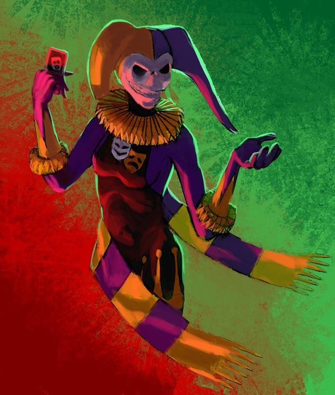
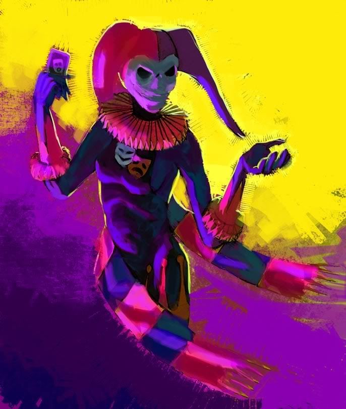
With the split personality emblem and the complimentary colors used on her costume, I think the opportunity presents itself to use complimentary colors in the background as well. I'm sorry I didn't ask for permission first, but I did a paintover with color variations to give you some ideas.
I used two strongly cololred light sources, one from her lower right and one backlighting. First one is red and green, the other complementary colors spaced equally from yellow and purple. For the second version, I used her costume colors for lighting as well.


My Web Site and Portfolio
My DeviantArt Gallery
Nice paint overs LD (you fixed the hand too
 ) I the red/green one best. Out of curiosity do you paint the
 colors first and then do the texturing/patterns or do you apply the color with a brush that makes that pattern as you go?

If you see any mistakes, feel free to let me know or refine it with your skillz! Like I said, I'm really not adept at digital painting.
|
That chest emblem is actually the symbol of the theater (think plays not movies). The two masks represent comedy and tragedy.
|

|
Nice paint overs LD (you fixed the hand too  ) I the red/green one best. Out of curiosity do you paint the ) I the red/green one best. Out of curiosity do you paint the colors first and then do the texturing/patterns or do you apply the color with a brush that makes that pattern as you go? |
Thanks Ruby for the compliment. Feel free to maky whatever changes you want. I think her hands could be more feminine, but I suck at drawing hands myself.
My Web Site and Portfolio
My DeviantArt Gallery
I am currently showcasing the image with a few more edits on my VirtueVerse! I am so in-love with how it came out, I feel like it could be used in a CoX playing card game. 


I'm not usually an artist, but I decided to give my main character, Grinning Guillotine, a shot. I played around with my base image to get some interesting results, but the bottom line is that...

I CANNOT THINK OF A BACKGROUND FOR THE LIFE OF ME!
Help!