+++ collab central +++
PsiBug, I don't think you should limit yourself.
However, if you think you have overstepped whatever value of 'collaboration' you think is appropriate, then I suggest two things:
- PM the original artist and discuss it. Perhaps you can work on the changes Together!
- Post the new art anyway, but be clear in the commentary that you feel you've made major alterations. Apologize, if you feel it's necessary.
But don't throttle the Art, or apologize for the Art itself.
Be Well!
Fireheart
Pretty much what Fireheart said...
I think some standard rules should be that anyone submitting art should state what they're looking for from others - colors, corrections, anything goes, etc...
And anyone altering anothers work should state what they did to it.
I think if everyone did that we could avoid any misunderstandings.
Good Communication solves/prevents so many problems!
Be Well!
Fireheart
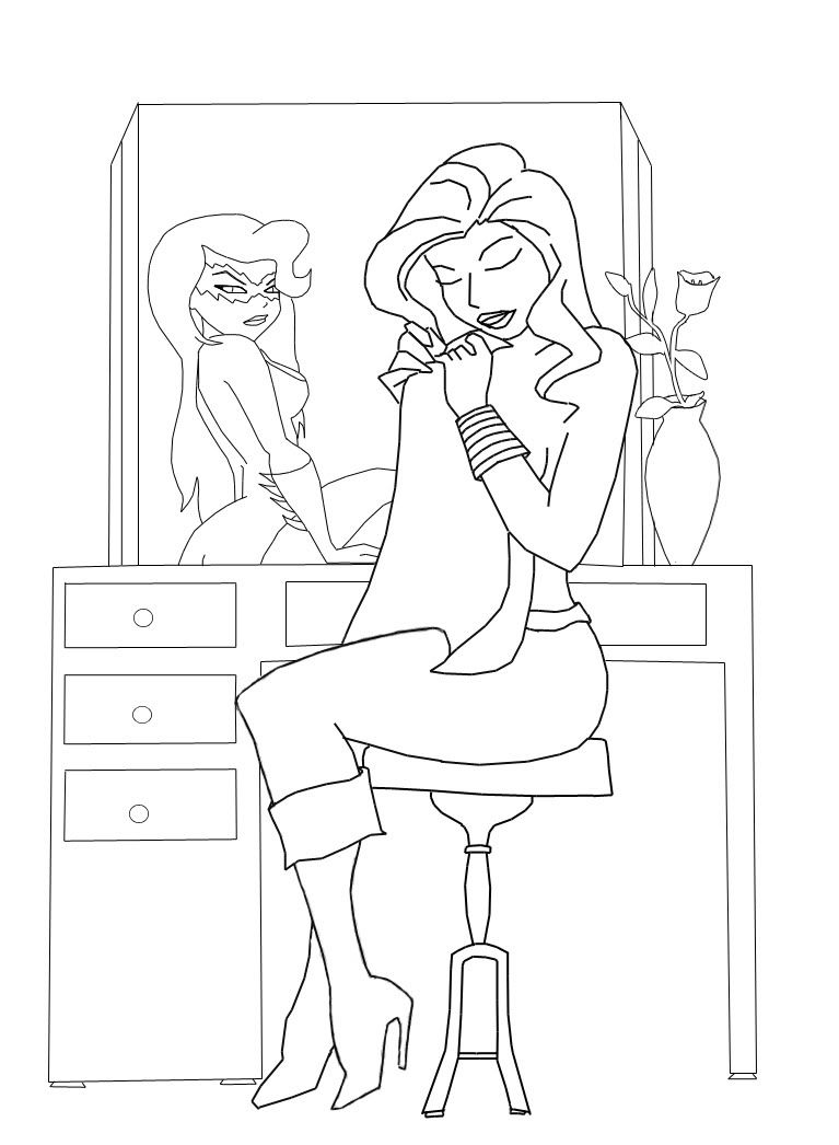
This is what I had been working on drawing for a friend and have yet to finish. The lines still need a bit of cleaning up (mouse drawing isn't the easiest lol) but I'd love to see what you all can do with it. It's suppose to be Divine sitting down holding her cape as she finishes getting dressed and Sin staring back at her through the mirror. Divine ref here: Divine-1 & Divine-2 Sin ref here: Sin-1 & Sin-2 And here's the drawing:
My links: -My DeviantArt Page- -My Shop- -Tumblr- -Facebook Me!-
All things Ferreter: Ferreter's Masked Hour
CoH Virtue: Ferreter (Palladium Sentry), Mighty Mollie (ASTS), Charm Frost (GAH), Philomina (EoA), Sable Falcon (Inflitrators), Starlit Oracle (GotGA), Princess Lumina (Palladium Sentry), Doncella (Hero Dawn), Red Heron (Aerial Avengers)
@Psi; You're welcome!
And for the record... I totally love your spin! Don't stop doing that  .
.
I agree.. collabs are a grey area indeed.
When I coloured "Ellie" I made some changes when doing the inking (though that was requested by FloatingFatMan to make the costume like Ellie actually has), but otherwise kept the lines as close as possible to the orignal. I even drew over the "Miss Ellie" text *giggles*.
Is it then still a collab? Or is it a draw-over from another drawing?
Very confusing indeed.
@Muse; You did thát with your mouse?!
I wonder what you can do with a drawing tablet! *giggles*

Read my in-game stories and check out my DeviantART page.
- coXso - It was a memorable time filled with art!
My links: -My DeviantArt Page- -My Shop- -Tumblr- -Facebook Me!-
All things Ferreter: Ferreter's Masked Hour
CoH Virtue: Ferreter (Palladium Sentry), Mighty Mollie (ASTS), Charm Frost (GAH), Philomina (EoA), Sable Falcon (Inflitrators), Starlit Oracle (GotGA), Princess Lumina (Palladium Sentry), Doncella (Hero Dawn), Red Heron (Aerial Avengers)
|
Nicely done colors Ransim. I think I like the dark ringed eye slits you put in your mask better than mine.
 The one thing I would point out on your coloring is her torso should be two-toned (three if you count the F chest emblem) not all the same color. Any tips or ideas on mine? Couldn't you just dial up the brightness in whichever app you are using if you think it came out too dark? |
I actually hadn't seen your rendition when I finally had chance to try coloring it. I went with the darker rings around the eyes and the inner highlighting because I was attempting to replicate the goggles in the reference which stand out from the face. The flat lines and the highlighting around the eye you used make them almost seem even or sunken in to the face instead.
Though I'm not even sure I managed a goggle effect either. You did overall manage much more depth and texture.
I also actually lightened it up at one point and forgot to edit the text. I'm still really learning shadows and highlights, the light cage you posted actually has helped a lot.
Here are the three versions I have on Flickr.
First:

Second:

Most Recent:

Love the composition, Muse!
I bought my first tablet through newegg.com. I think if you ask around, you'll hear good things about them. Here's a link for the bamboo if you are thinking of starting with that model: ($69 and free shipping)
http://www.newegg.com/Product/Produc...82E16823100056
And you can sometimes find them in the $40 range with free shipping at amazon.com (possibly new, used or refurbished so read the fine print!)
and PS: appreciated the cool arty nurturing messages from everyone regarding collabs and communication etc.
========================================
Custom Fan Art!
Lions Tigers and Bears Volume 3 now available!
Timothy & the Transgalactic Towel
The Gimoles graphic Novel
|
Love the composition, Muse!
I bought my first tablet through newegg.com. I think if you ask around, you'll hear good things about them. Here's a link for the bamboo if you are thinking of starting with that model: ($69 and free shipping) http://www.newegg.com/Product/Produc...82E16823100056 And you can sometimes find them in the $40 range with free shipping at amazon.com (possibly new, used or refurbished so read the fine print!) and PS: appreciated the cool arty nurturing messages from everyone regarding collabs and communication etc. |
What you actually want is the same entry level tablet I just bought myself, the Bamboo Fun which is actually cheaper on Amazon (170 versus 200 on newegg):
http://www.amazon.com/Wacom-CTH661-B...2501064&sr=8-3
Its just big enough to be okay with most wide screen monitors and its a good entry level price range. Plus it has more sensitivity. That small one is only 512 versus 1024 for the larger Fun. ^_^
|
Love the composition, Muse!
I bought my first tablet through newegg.com. I think if you ask around, you'll hear good things about them. Here's a link for the bamboo if you are thinking of starting with that model: ($69 and free shipping) http://www.newegg.com/Product/Produc...82E16823100056 And you can sometimes find them in the $40 range with free shipping at amazon.com (possibly new, used or refurbished so read the fine print!) and PS: appreciated the cool arty nurturing messages from everyone regarding collabs and communication etc. |
|
I wouldn't actually recommend that version of the bamboo. Its tiny and won't really give you much working space especially with a larger wide screen monitor. The smaller bamboos are designed more for doing signatures and text based interactions.
What you actually want is the same entry level tablet I just bought myself, the Bamboo Fun which is actually cheaper on Amazon (170 versus 200 on newegg): http://www.amazon.com/Wacom-CTH661-B...2501064&sr=8-3 Its just big enough to be okay with most wide screen monitors and its a good entry level price range. Plus it has more sensitivity. That small one is only 512 versus 1024 for the larger Fun. ^_^ |
Thanks though you two.
 I saved the links and am crossing fingers. Oh btw Nice color work on Ferreter, Ransim. ^^
P.S. I love Newegg. The comp I'm running is completely custom built from parts I got on that site lol.
My links: -My DeviantArt Page- -My Shop- -Tumblr- -Facebook Me!-
All things Ferreter: Ferreter's Masked Hour
CoH Virtue: Ferreter (Palladium Sentry), Mighty Mollie (ASTS), Charm Frost (GAH), Philomina (EoA), Sable Falcon (Inflitrators), Starlit Oracle (GotGA), Princess Lumina (Palladium Sentry), Doncella (Hero Dawn), Red Heron (Aerial Avengers)
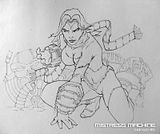
Dropping off another sketch, on the off chance the last one is a bit too "finished" looking, this one
is more rough so there is more to play around with. It's based on the Tiwali piece in Goblin Queen's gallery.
I've always loved the look of that piece so as a warm up sketch I thought I would try my hand at that style, have at ye! 
Click the image to go to my DA page and you can get a much bigger version of it to work with.

Feel free to straighten up the teeth (on her collar) as this was just a quick drawing I wasn't too careful in their placement. 
Also if, it's not readily apparent, that is the tip of her tail in the bottom left not her shoulder armor. 
|
................... I went with the darker rings around the eyes and the inner highlighting because I was attempting to replicate the goggles in the reference which stand out from the face. The flat lines and the highlighting around the eye you used make them almost seem even or sunken in to the face instead.
Though I'm not even sure I managed a goggle effect either. You did overall manage much more depth and texture................. |
|
Those are great and I'd love to get one but without a job atm that's going to be a bit tough lol. Hopefully my jewelry store picks up in sales and I get one of the jobs I applied for soon................... P.S. I love Newegg. The comp I'm running is completely custom built from parts I got on that site lol.
|

That's cool you're rocking a custom build too, all my rigs are customs
as well and I use Newegg for like 60% of the parts I order, one of my favorite e-tailers.

|
PsiBug, I don't think you should limit yourself.
However, if you think you have overstepped whatever value of 'collaboration' you think is appropriate, then I suggest two things: - PM the original artist and discuss it. Perhaps you can work on the changes Together! - Post the new art anyway, but be clear in the commentary that you feel you've made major alterations. Apologize, if you feel it's necessary. But don't throttle the Art, or apologize for the Art itself. Be Well! Fireheart |
Even major alterations would be fine with me (assuming it's ok with the other artists as well) but in the above example it was immediately apparent to me that there was nothing left of DD's work. Not her lines, nor her colors nor anything of her style remain in the finished piece so to me it's a very nicely done piece of art but it's not a collab.
That said it's a great piece (I knew DD would still love both the piece and the gesture from Psi-bug) and people can obviously still learn much from seeing a different artists take on one of their pieces.
|
Collaboration is a pretty open-ended term. There are probably as many different ways to collaborate as there are groups of people who want to work together. I think what Chris means by it, in the context of this thread, is the comic book style division of labor: drawer, inker, colorist.
If the original linework has to be preserved, maybe that should be explicitly stated? It pretty much rules out people who use a painterly approach, such as myself, from this collaboration. |
This is a collab that I did with Lexi-chan where I made several major alterations (fixed up her chest, the chest emblem, her waist and completely redid her supporting leg) and I also went around the whole exterior and removed all the stray white pixels from her line work but I think it's pretty easy to tell this is a collab. Her style is still plainly evident in both the before and after shots and the finished result looks like a CR/Lexi collab not a CR redraw of a Lexi-chan piece.
I actually would hope you (and any other painterly types as well) do participate BW... there's no question in my mind that many here could learn a lot from working with you (as I have). We've collaborated a few times already and even though you painted over much of my linework, like say in this piece, I think both of our contributions show quite clearly (there is a link in the description to my original pencils) and it looks to me very much like a CR+BW collab, not a solo BW painting.
Had some free time tonight so I figured I would give coloring the goblin queen piece by CR a try. Still working on this but its bed time so figured I'd share where I am so far.
I feel like I messed up some of the hair bits so CR lemmie know if I did >_< Also decided to give Bobby's hair tutorial a try, not bad, definitely need to work on it more though I was a bit haphazard with it.

It's off to a great start Ransim.
Some of the pencils I've posted had detailed hairpathing drawn or suggested already
so I just drew in the outlining shapes for this one and I'll leave it to the collaborators how they want to approach it.
Looks like you are headed in the right direction. 
|
It's off to a great start Ransim.
Some of the pencils I've posted had detailed hairpathing drawn or suggested already so I just drew in the outlining shapes for this one and I'll leave it to the collaborators how they want to approach it. Looks like you are headed in the right direction.  |
I decided to do this one because it looked like it would lend itself to some good practice doing shadows and highlights. Which I'm still struggling with.
As I had a little time to spare before going to the zoo  .. I thought I'd put in a little work on a collab and I took CR's drawing which Ransim already did some good colouring on and as he won't work on it before tonight... I thought I'd give it a shot in the mean time
  .
.

As I looked ad Tiwali's version of GQ, I noticed the bone headband (or what ever it is  doesn't actually go into her hair. So I think the grey area should become hair instead
Also worked on the lips.
Hope you like it!
*waves*
DeeDee

Read my in-game stories and check out my DeviantART page.
- coXso - It was a memorable time filled with art!
|
As I had a little time to spare before going to the zoo
 .. I thought I'd put in a little work on a collab and I took CR's drawing which Ransim already did some good colouring on and as he won't work on it before tonight... I thought I'd give it a shot in the mean time .. I thought I'd put in a little work on a collab and I took CR's drawing which Ransim already did some good colouring on and as he won't work on it before tonight... I thought I'd give it a shot in the mean time  . . As I looked ad Tiwali's version of GQ, I noticed the bone headband (or what ever it is  doesn't actually go into her hair. So I think the grey area should become hair instead doesn't actually go into her hair. So I think the grey area should become hair instead  Also worked on the lips. Here's a little gif animation of what we've managed to do sofar   (obviously the colours are a bit off..but that's what you get with gifs  ) )Hope you like it! *waves* DeeDee |
Made some time this afternoon, needed a break from some coding work that was making my eyes burn.
Still tweaking the skin... not sold entirely on the texture yet so I might swap it around some and try other stuff. I cheated a bit on the eyes and used a previous photo manip I'd done of a photograph I took.

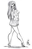
Hmn let's see what one to do?
How about we start with Solarita.
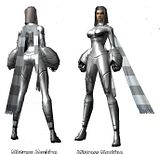
As seen in the game here.

Then we have the line work you offered up for colors.

Then you have Basic flats & tones.

Hope you like, and anyone is welcome to add some more details to this.
LG thank you for making the Sexy Solarita even more sumptuous.
Great Job !
I think I might find some wall space for that pic now.
--------------
Now that she has been colored, does the animation style remind any else of Stripperella ?

Centinull
Crazy week of crazy for me.
Its going to be awhile before I can get anymore work done on the goblin queen picture. Sorry!
If anyone else wants to pick up on it feel free.








If the original linework has to be preserved, maybe that should be explicitly stated? It pretty much rules out people who use a painterly approach, such as myself, from this collaboration.
Darth is correct that I used the draw over technique and then played around with the face and the fire. The original image is beautiful and my intent was to put my own spin on it. but in retrospect, I overspun.
Thanks for the feedback! If I do anything else in this thread I'll make an effort to stay closer to the source material.
========================================
Custom Fan Art!
Lions Tigers and Bears Volume 3 now available!
Timothy & the Transgalactic Towel
The Gimoles graphic Novel