Caemgen's Creative Cavedrawings
By
Amerikatt,
Posted on: 2009-09-26 05:42 in Multi-Media Fan Creations
Quote:
LOL|
Originally Posted by Caemgen

I decided to my all my posts start with CCC... Until I can't think of a semi appropriate title that works, at least.
Anyway, I got really, really bored at work last night and to entertain myself I decided to pick up a pen... 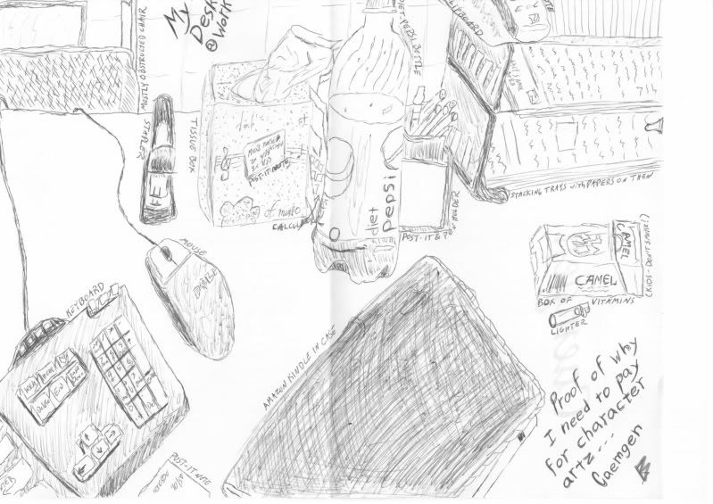 |
i think you did quite well here actually.
lot better then i could do.


Haha I've been there!
Fix'd it for you  :
:
Have you seen my stapler?

[ ProTip: The banner is a link to art refs!! | The Khellection | The HBAS Repository | Brute Guides (4/16/10) | How To Post An Image - A Quick Guide ]
Biggest Troll on the forums? I'll give you a hint:

Heh, I knew a few people that referred to those as vitamins.
Quote:
|
Originally Posted by Pyro_Nympho
Things I see that are awesome:The musical notes on the tissues box, the bar code on the pack of cigs...err vitamins, the keyboard...especially the enter key w/ arrow...very cool!
Love it...sorta like a "I see something" or "I spy" game! xoxo Py |
If you can't do good, do detailed!

Maybe next time I'll try using a pencil and not move around and change my perspective so often....

Not too shabby Caemgen, lots of little details to keep the viewer interested.
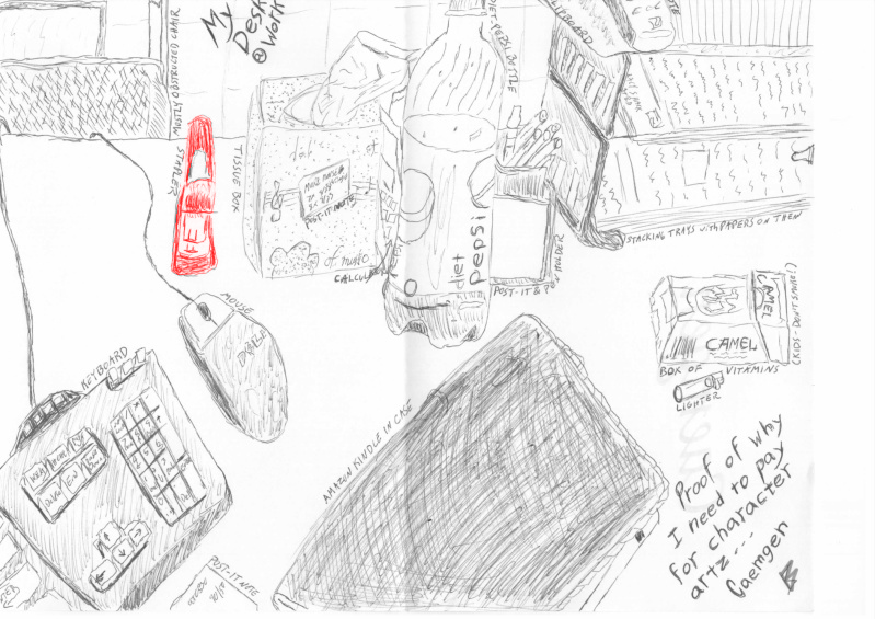
Lolz @ the red stapler.
While bored at work I managed to turn this:

Into this:
Nice job, Caemgen! 
I like how you marked the name of each item, like in the old Dick Tracy comics! ((Cigs = "Box of Vitamins"?!  ))
))
LOL! @ Kheldarn's coloring of your stapler (which now stands out against all the other things! ))

AMERIKATT: Star of Stage, Screen, and Saturday morning cartoons! (Art by Psygon and ChristopherRobin)
"(Katt-Girl) obviously reads a lot of encyclopedias" -- Kiken
Dark_Respite's video -- Avatar: COH Style!
I Support Nerd Flirting and Even More Nerd Flirting!
Well I had to label things so people would know WTFudge I was attempting to draw!
Can't tell from your comment if you got the reference or not... If not, the red stapler is a reference to Office Space. Hilarious movie. Rent it now!
I SAID NOW!!!
(or, at least give it a watch if it's replaying on HBO or something and you're bored...)
hahaha, "box of vitamins"
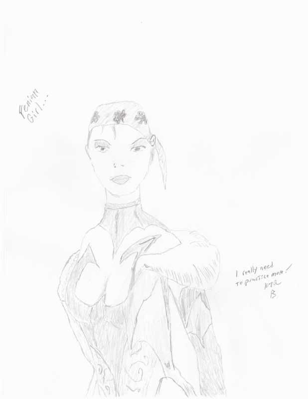
Arr that be a fine Pirate sketch matey.
If I might suggest a few things that would make it even better I would say...
the ears one is a bit low and the other a bit high... an easy way to make them look "right"
is if you use the outer-most point of the eye and mouth. This works on most any face, you
can even do it on yourself if you put a finger and thumb at the corner of your eye and lips
and trace it back you will touch the top and bottom of your ear.
the eyes, they need to be a bit closer together. They should be the width of one eye apart.
Also the irises don't match... the one on the right is better so I would make the dark inner
circle on the left eye bigger to match the one on the right.
the lips, the left side slopes down a bit just raise the corner up a bit and it should be fine.
the chest, the breasts should jut forward a bit more (well if it's to be a super rack anyways )
the rest looks pretty good, nice job.
Thanks for the tips I did kind of check my own ears in comparison to eyes but overall I was mainly just going by the pic. The ears are hard to even notice in the screenshot and the left (on right hand side looking at screenshot) I think I didn't even notice was an ear per se and just expressed as a bit of loose hair (or tried to...)
The eyes are wonky and I noticed that while doing the sketch but I was kind of doing this as an extension of the 5 minute sketches so I was only doing so much correcting...
Looking now, the lips are wore than I thought they were...
The chest was originally even worse before I did some correcting and shading She doesn't have a super chest though... In fact she's as flat as the game allows and I made a point of telling the artists working on her for my commissions not to go all chesty on her... Personally, I don't need too much more than a handful and to an extent this toon is based on an ex... Though in my sketch they come off more as droopy than the small but perky I was going for on the character...
I can do better than this... Or at least I used to be able to But to be fair to myself, I was aiming for as little editing as possible, more of a quick do I still have it kind of thing.... And I did at work so not the best conditions.
Sometime soon I'll actually sit down and see just how good I still am and post the results. Don't get me wrong, I'm nowhere near as good as most who post there stuff here... And as I mentioned elsewhere, I'm more of a mimicer than a creator... But looking at all these arts lately has got me thinking I should at least work off some of the rust from my old skillz...
Once I do force myself to really give my best at something though I'll definitely be looking for more constructive criticism from ya!
Got exceptionally bored at work and tried my hand at a self portrait... 
Still not the best work I could do, even at this point, but I put a bit more of an effort into it than the above. Problem was though that I was doing it from a pict of myself on my cell phone and the damn thing just wouldn't keep the picture up more than a minute or two at a time. That got rather frustrating...
I know the face is probably a bit too long... And there is way too much space between the nose and the eyes. I should have worked on the nose more as well... I tried to define it mainly through shading and I don't think it really worked out all that well. Can barely see the mouth (and may be worse on the scan than the original) but you barely could in the picture either - I was trying quite deliberately not to smile for the camera and thus I think my upper lip was kind of sicked in and the lower whited out. It's a common habit of mine for pictures though so I didn't try to change it.
Overall I can't say I'm happy with this but am satisfied considering the limited amount of time I put into it and the duress under which I was working And despite it's problems I'm sure anyone who knows me would recognize it as me so it's got that going for it...
And as for what's seen of my clothing, I know it can't be made out well. I was wearing a rather shapeless windbreaker over a white uniform shirt. I could have tried to define them better but I figured the focus should be on the face anyway so didn't bother...
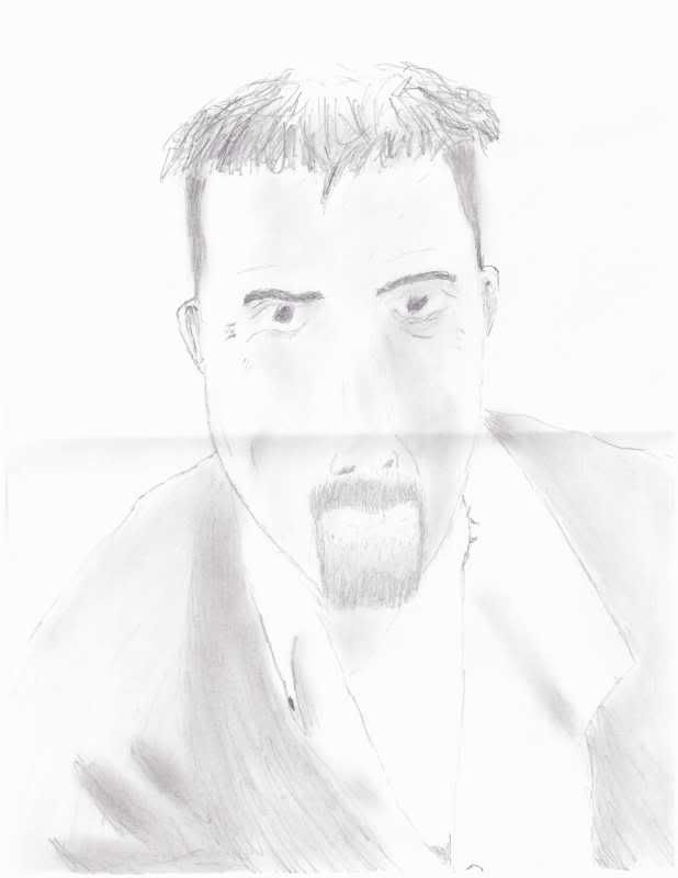
Anyway, feel free to crticise, offer advice, tips, or just laugh
You resemble your toon a bit or vice-versa!
Great stuff though Cam!
Heh, I did kind of go for the face and such on Alpha that most resembled me....
see I love when folks post art , I give huge props to anyone that posts art regardless of skill level because in a way its putting yourself out there and takes a level of bravery some don't have .
find the desk shot very amusing , id actually be intrested in seeing a number of the forum folks desk just to see if cluttered = creative
Dude you look like Jayne Cobb!
The Hero of Canton... the man they call JAYNE!
P.S. Looks like your mouth forgot to "Respect the 'Stache."
P.P.S. Nice drawing Caemgen.
If I were to suggest anything it would be the ears are too small...
bottom of you ears should be at the lip line. Good stuff though, keep it coming.
Hmmm, when does the new season of Chuck start anyway???
I decided to have all my posts start with CCC... Until I can't think of a semi appropriate title that works, at least.

Anyway, I got really, really bored at work last night and to entertain myself I decided to pick up a pen...