Cashoo's CoX artwork + art requests!
Figured I'd share this.
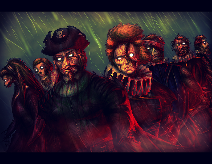
I commissioned this from Cashoo for my boyfriend. Its a realistic drawing of his mastermind with his minions. The mastermind is necro/dark, Sir Francis Drake. Each of his pets are a historical figured related to Sir Francis Drake in some way.
She did an amazing job on this, especially with so many characters, and he was absolutely floored at the historical accuracy on the people who had available pictures. It made for an amazing birthday present for him that he wasn't expecting at all.

From left to right:
Grave Knights: Mary Tudor, Phillip II ; Sir Francis Drake; Lich: Elizabeth; Zombies: Robert Devereux, Thomas Doughty, Sir John Hawkins
|
Figured I'd share this.
I commissioned this from Cashoo for my boyfriend. Its a realistic drawing of his mastermind with his minions. The mastermind is necro/dark, Sir Francis Drake. Each of his pets are a historical figured related to Sir Francis Drake in some way. She did an amazing job on this, especially with so many characters, and he was absolutely floored at the historical accuracy on the people who had available pictures. It made for an amazing birthday present for him that he wasn't expecting at all.  From left to right: Grave Knights: Mary Tudor, Phillip II ; Sir Francis Drake; Lich: Elizabeth; Zombies: Robert Devereux, Thomas Doughty, Sir John Hawkins |
its a very well made piece of art.

The Mel pic is freakishly awesome!! The eyes just totally grab you and everywhere you look the detail and coolness is oozing out at ya...
All it needs is a smiley face buton on the lapel! 
The zombie pic is equally as awesome in it's way... And know I cannot but help but think of a new meaning for "Dead Presidents"  All the dead Commanders in Chief rising up from the grave to protect unlife, liberty and the pursuit of Braaaaaaaaaaaaaaaaaaaains!!!!
Your lighting and color choices always make your characters look so rich and vivid - GREAT work!
Globals: Johnnykat & Johnnykat2
http://johnnykat.deviantart.com/

Stunning as always. It's really amazing how you capture the characters and give them life, or unlife as the case may be. Just stunning.
Roxy On DA...Finally!
Interesting work, Cashoo. I dig it.
Not bad at all Cashoo. 
I can certainly appreciate the technical skill even if the subject matter is not to my liking (the undead don't really do anything for me  ).
).
I'm curious if you were you trying a different technique with Mel? It doesn't have the normal vibrance and sharpness of your other colored works?
The muted effect can still pack a punch it just stands out as different from your usual fare.
|
I'm curious if you were you trying a different technique with Mel? It doesn't have the normal vibrance and sharpness of your other colored works? |
Also, there's a difference in contrast here that's unusual for most Cashoo pics. Generally, she likes to use dark colors and blacks to contrast with the bright colors, making them pop out of the pic vividly. In this case, the whole thing is washed in oranges, so there's less contrast and thusly each individual color pops less. Though, interestingly enough, the abundance of warm colors makes Mel's green eyes glow, which is a detail that I love.
http://www.virtueverse.net/wiki/Massacre_Melanie -the original Fire/Dark Corruptor -
http://boards.cityofheroes.com/showthread.php?t=115217
The Guide to BURN
|
That's cause the Mel pic that you're seeing here is a lower quality JPeG of the original PNG file. I don't like to spam up the boards with 500+ KB files, so I lower the quality appropriately. I kept the PNG file for myself.
Also, there's a difference in contrast here that's unusual for most Cashoo pics. Generally, she likes to use dark colors and blacks to contrast with the bright colors, making them pop out of the pic vividly. In this case, the whole thing is washed in oranges, so there's less contrast and thusly each individual color pops less. Though, interestingly enough, the abundance of warm colors makes Mel's green eyes glow, which is a detail that I love. |
Those are wonderful pieces! The Mel one really works well.
My Deviant Art page link-link
CoH/V Fan Videos

lol, I'm surprised you guys posted these here!
Ransim, I'm soo glad your boyfriend likes the picture!
The main reason why the fire isn't as dark and is all washed out in orange is because I suck at making and painting fire effects. Gotta practice when I have more time...
|
aswell as that the area that would be percieved as black is actually a dark tone of green. I actually copied this bad boy into photoshop and blacked the darkest area's and the green eyes looked too out of place amongst all the warmth and black, aswell as that the attention was more drawn towards the black on mels arm, so by going with the green instead the attention is now drawn to the green of the eyes which looks less out of place due to the other green in the picture that if you werent paying too close attention could easily be glazed over, so it is very clever work in my book. Cashoo gets gold stars and swanzy snacks.
|
In Mel's case, I was so glad her eyes were green against her firey colors theme, since green and red are complimentary colors and it really stands out.


(I hope you don't mind and I will be happy to take it down if you'd prefer)
Draggynn on Virtue: lvl 50 Storm/Psi, 1389 badges
Draggynn's Guide to Storm Summoning(Gale-Tornado, updated 6/25/2011)
Avatar by Wassy full reference here
|
Yup, I've been doing that with my pictures a lot nowadays. Including the zombie one. Usually I'll change the darkest color to a very, very dark value of a color that is already in the picture in attempt to "tie" it together more, or I'll use a color that contrasts against the main color of the picture. I do this in the 'Curves' adjustment in Photoshop. I personally like it more than boring old black. However, I do leave it black in some pictures if I find it looks better that way.
|
In Mel's case, I was so glad her eyes were green against her firey colors theme, since green and red are complimentary colors and it really stands out. 
|
Also, it's just a fun co-incidence that girls with red hair and green eyes were considered to be supernatural and were persecuted as witches. Typically punished by burning at the stake. I thought that it's a delightfully amusing twist of fate for the witch to burn them instead.
http://www.virtueverse.net/wiki/Massacre_Melanie -the original Fire/Dark Corruptor -
http://boards.cityofheroes.com/showthread.php?t=115217
The Guide to BURN
|
lol, I'm surprised you guys posted these here!
Ransim, I'm soo glad your boyfriend likes the picture! The main reason why the fire isn't as dark and is all washed out in orange is because I suck at making and painting fire effects. Gotta practice when I have more time... Yup, I've been doing that with my pictures a lot nowadays. Including the zombie one. Usually I'll change the darkest color to a very, very dark value of a color that is already in the picture in attempt to "tie" it together more, or I'll use a color that contrasts against the main color of the picture. I do this in the 'Curves' adjustment in Photoshop. I personally like it more than boring old black. However, I do leave it black in some pictures if I find it looks better that way. In Mel's case, I was so glad her eyes were green against her firey colors theme, since green and red are complimentary colors and it really stands out.  |
 so that is another positive.
| The main reason why the fire isn't as dark and is all washed out in orange is because I suck at making and painting fire effects. Gotta practice when I have more time... |
Heck I use that image all over the place it's my sometime Deviant ID it Lyl pic on the Titan network I even made a tiny version that resides in my sig.


Fatal error: Uncaught mysqli_sql_exception: You have an error in your SQL syntax; check the manual that corresponds to your MariaDB server version for the right syntax to use near 's Assassin'' at line 1 in /var/www/vhosts/cityofheroes.dev/forumarchive.cityofheroes.dev/topic.php:262 Stack trace: #0 /var/www/vhosts/cityofheroes.dev/forumarchive.cityofheroes.dev/topic.php(262): mysqli->query() #1 {main} thrown in /var/www/vhosts/cityofheroes.dev/forumarchive.cityofheroes.dev/topic.php on line 262


I normally keep my Mel art in my own thread, though I thought it fitting to post Cashoo's stuff in her own thread. So here's her take on 'Massacre' Melanie.

Thanks so much Cashoo!
http://www.virtueverse.net/wiki/Massacre_Melanie -the original Fire/Dark Corruptor -
http://boards.cityofheroes.com/showthread.php?t=115217
The Guide to BURN