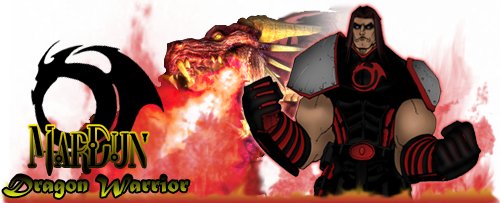
Another attempt at coloring
NOt a bad job with the shading. The only thing I would say is that I noticed a couple of spots of white, that were uncolored, the top of his left arm, by the shoulder pad, and at the bottom of his left arm where it meets the glove. I like the face that you didn't "ink" the piece, so to speak. 
umm the color choice in general is actually very good but the picture is very choppy in my opinion and there are white spots but it looks good overal
What did you use and how did you get the blends? I ask this because I want to do it to my pieces. I have no ink to do mine by hand. 
Looks great except for the choppy pieces that Larissa mentioned.
Very cool, Anti!! 
Yeah, I see the white spots too, but only after Larissa pointed them out. A quick way to spot those is magnify the pic a bit and semi-slowly move it across the pic, especially around edges for any white spots, then easily fill 'em in. This is really cool looking though, man! 
Scarf_Girl�s Official Kid Brother!
Thanks for the feedback...I'll see what I can do about touching it up a bit
[ QUOTE ]
What did you use and how did you get the blends? I ask this because I want to do it to my pieces. I have no ink to do mine by hand. 
[/ QUOTE ]
your sig reminded me why im a hero, muhahahahahaha
Whining about everything since 2006.
Ammo switching for Dual Pistols was my idea:
http://boards.cityofheroes.com/showthread.php?t=135484
I think it looks great. I love the style it looks like it was painted by hand with watercolors.
Like i said to you...Very awesome!

Become a Fan of MarDun on Facebook - Follow on Twitter : MarDun_COH
I really like the depth of field effect you've done with the focus on his left arm. Your highlights look great, but you might try a few spots of darker shadow in his skin tones. That would really make the arms and neck "pop".
Really nice job Anti ... I like it alot ... great depth of field effect with that blur ... really nice ... as mentionned by other there seems to be a bit of rough edging ... but I think it could be easily fixed by slapping a layer with the original ink on multiply over your piece ... you can even adjust the transparency of that layer if you don't want it to be too predominant or even tint it if you want to go that far.
Now I know you might have been trying for a lineless drawing and that's so .. it's quite ok .. I'm just mentionning in case that was not what you were trying.
Great work overall no matter what my friend. I really like what you did.

Char Site | My DeviantArt
Global=@Thornster
Alright, I think I managed to clean it up quite a bit. Added some more highlights and shadowing, as well as cleaning up the white spaces and softening edges and that. I think it looks alot better compared to the original coloring I did.
Thanks again for your continued comments, they are much appreciated.
I was going for the "no outline" look on these. I just don't have the time or the patience to try and ink things, and they usually turn out crappy. Besides, I love how these end up looking like they were painted. It was all done in PS BTW.
Oh, and here's one with his name in the background. Simple but effective 
Thanks again, and I hope it's improved to everyone's liking. I know it has for me 
I really like how it looks...the no-outline is a tough one, and something I've been working hard at learning. The difference between the original and the updated version is dramatic. Looks really good 
Art (NSFW)
Photography
Yeah, Looks a lot better!
Hmm...you should use the Blur tool and blur out the edges to lessen the intense contrast line between the object and the background.
So, I came across Mardun's awesome commission, as I'm sure many of you noticed already. It was an amazing pose, and I felt like I had to color it. This is my fourth attempt at coloring, so be kind. But I think it turned out pretty sweet. One of my best so far I think.


Let me know what you folks think...gently
Thanks to Mardun and lastscionz for letting me post this