*~Here's How I Did That... Tips and Tricks~*
By
Bubbawheat,
Posted on: 2011-01-31 16:13 in Multi-Media Fan Creations
Yep found that and it definitely helps. That's why I shouldn't be playing COH, listening to pandora, watching your tutorial AND trying out this stuff in PS.
You'd think this stuff would come easy to me since we use vectors to create clipping paths in photography at work, but that's not my job I just try to watch and learn things when I'm not busy.
Quote:
Shift-A will toggle between the two select modes for the path select tool too if you don't want to wait for the pop-up.|
Originally Posted by Camille Thompson

it does, above the pen is the little black arrow called the path select tool, you want to change it to the direct select, just like in illustrator, just click and hold down until it pops out the option, or click the tiny arrow. but it is still limited
|
Shift works to switch modes between all the tools actually, as long as you know the shortcut key for them. Shift-W will switch between the stupid-select and the magic wand (I think they actually call it smart select, but it never selects what I want it to when I'm working on stuff, so yeah).
@Johnstone & @Johnstone 2
ediblePoly.com
All my characters
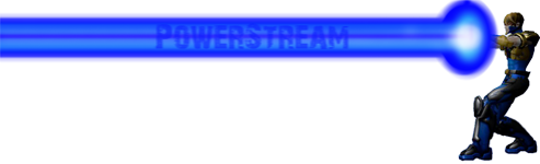
I'd like to contribute something to this. I do use Paint.net instead of some of the other more expensive programs out there, so some of the names might be different, though I imagine you can find the same effects under similar names. Even though no one commented on it, I thought my portal turned out pretty well and I thought I'd share how I did it.

Cool portal technique, Bubba. I like how the effect came out.
========================================
Custom Fan Art!
Lions Tigers and Bears Volume 3 now available!
Timothy & the Transgalactic Towel
The Gimoles graphic Novel
Quote:
that's really good actually, i'm just looking at that final effect and i'm seeing something glowy rising to the surface of a body of water of some kind. I reckon that has more uses than you think Bubba, good one |
Originally Posted by Bubbawheat
I'd like to contribute something to this. I do use Paint.net instead of some of the other more expensive programs out there, so some of the names might be different, though I imagine you can find the same effects under similar names. Even though no one commented on it, I thought my portal turned out pretty well and I thought I'd share how I did it.
|


Quote:
|
Originally Posted by ChristopherRobin
I would like to get something set up for photoshop....... |
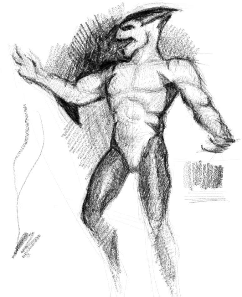
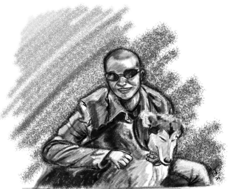
Does this look pencil enough for you? I tried to draw my Mako heroclix and obviously the drawing itself could be better but I mainly wanted to test my pencil brush. Everything was done in Photoshop CS5 with one brush without changing the brush size. I started with the pencil brush tutorial Camille linked, and used the tilt function (if you have Intuos or equivalent) to imitate flat broad strokes for shading. Unfortunately I can't find a way to invert input and I get flat lines when I hold my pen upright and thin lines when I hold it at an angle.
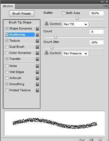
I wish I could just attach the tool preset file, but I don't think we can do that, so here are the settings I used:
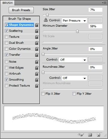
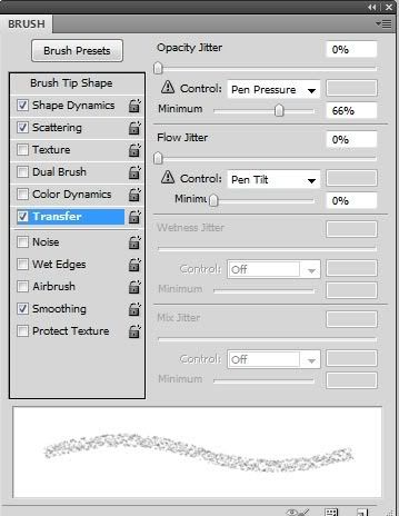
"Transfer" was "Other Dynamics" in earlier versions I think.
You can play with the amount of scattering and number of count to tweak the broad strokes. In general, use small count for lower scattering and high count for higher scattering.
My Web Site and Portfolio
My DeviantArt Gallery
Definitely looks like it could be pencil or even charcoal. Very cool LD!
Also Nice effect you came up with there Bubba!
I'm really digging this thread! Wish I was smart enough to contribute something.
yeah that is a fantastic pencil brush you have there

I'm wondering... is there anyone that can give me tips and tricks about creating Hair?
Not on my head I mean.. I have more than enough of thick blonde hairs on my head *giggles*...
I'm struggling with the hair part... want to make it a bit to the realistic side...but I don't know how...
I did it once.. and that went okay (Channing Tatum), but I have no clue on how I did that!
I'm trying and trying... but.. help? *blushes*
CoH Fan-Art Sale still several slots open!

Read my in-game stories and check out my DeviantART page.
- coXso - It was a memorable time filled with art!
Read my in-game stories and check out my DeviantART page.
- coXso - It was a memorable time filled with art!
It depends on what kind of hair you want to do? Typically hair can be conveyed with shapes, colors or lines (if you want to draw individual strands) or some combination of those.
Drawing the "strandy" kind is all about the patterns. Hair (unless you stick your finger in a light socket  ) tends to gather together in clumps and those clumps hang in different patterns depending on things like wind, tilt of the head etc. There really aren't that many ways it can bend or shape itself naturally so once you understand the various basic patterns you can mix and match them to create most any look or style. It's similar to wrinkles in fabric it looks really complex until you understand the basic shapes. That said I don't really ever think about it when I draw it I just mindlessly scribble really fast for the first layer and then build on top of that with more layers (that is for drawing dark hair, with lighter hair you usually need lighter lines and less of them to suggest the shape) and it usually comes out pretty good.
That's my take but then I usually only do the linework (strandy) type but I'm trying to learn more about making convincing hair with just shapes and colors.
I'm sure others here who have more experience with the other methods could add a variety of tips or thoughts to that.
Hair brushes
I...you see...
Hair brushes
<3
In all seriousness though it does depend on how you want to convey the hair. I know some people that do mostly standard shading then add one or two select strands that stand out.
I use a brush that creates multiples strands and with the pressure settings control the "clumps" of hair
When coloring hair I usually push the shadows and highlights more than the rest of the piece. Hair that is healthy should have a nice sheen.
Hair studies
Do a google search or magazine study of hair product adds.
All art comes down to getting to know your subject.
If you have long enough hair and some kind of camera do some self studies making your hair do different things
Did you know for Disney's Tangled they had to build new technology just for the hair.
It's a tricky beast.
hahah lol.
It beats walking to the mirror over and over 
Still not using PS...so no brushes available...
But I'll see what I can do about that .
I also got a linky from Bobby about hairmaking and will check that out aswell.
http://baquitania.deviantart.com/fav...set=48#/dnnqug
But first... Lunch!
Thanks all!
*waves*
DeeDee

CoH Fan-Art Sale still several slots open!
Read my in-game stories and check out my DeviantART page.
- coXso - It was a memorable time filled with art!
Read my in-game stories and check out my DeviantART page.
- coXso - It was a memorable time filled with art!
http://browse.deviantart.com/resourc...et=24#/d1cjwpc
got to go out but a quick search found that I will look for more later
Ooh brushes! Yum!
I've been working with the tutorial Bobby came with, and I must say.. I thinks it's working for me
Just a quick scetch (with mouse only).
http://boards.cityofheroes.com/showt...44#post3531944
CoH Fan-Art Sale still several slots open!
Read my in-game stories and check out my DeviantART page.
- coXso - It was a memorable time filled with art!
Read my in-game stories and check out my DeviantART page.
- coXso - It was a memorable time filled with art!
I am not dead just VERY busy, my school just started a fundraiser for Japan and I am kind of one of the people in charge of it (How that happened I am still not sure), but I have had a week full of teaching origami and interacting with local media with hardly a breath of air, AND I am co hosting a bridal shower...omg when did I get something that looked like a life?
Brush tut IS coming but for now in case no one has seen it this tutorial is pretty great for that old print comic look:
How to color like your grandma
Hi!
Preface: The benefit of using the pencil tool to ink in photoshop (or a similar tool in other programs) is that you can easily and precisely select and fill areas with color with out the tolerance and transparency issues that make paintbrushed lines trickier to color.
Digital lineart tip: If you are using the pencil tool (or any other aliased tool) for your lineart, it's a good idea to make your "working" file two to four times larger (in height and width) than the size that you want for the finished file. The result will be smoother lines when you shrink it back down at the end of the project.
In the example below, the lovely Ellie artwork (by Swissy and DarthDelicious) is 526 pixels wide. The left half was drawn at 526 pixels wide and not resized. The right half was drawn at a size of 2000 pixels wide then reduced to 526 pixels wide. Hopefully this image will show the slightly pixelated lines on the left side and somewhat smoother lines on the right:

(Although the left side says "color by...", I used the uncolored version provided by DarthDelicious for this tip).
Important: After you flatten and reduce a file, always save a new copy with a different file name so you still have the larger file in case you wish to return to it.
Hope that's useful!
-Mike
========================================
Custom Fan Art!
Lions Tigers and Bears Volume 3 now available!
Timothy & the Transgalactic Towel
The Gimoles graphic Novel
I always do everything at 300 dpi and scale down to 72 when posting.
If you don't know dpi is dots per inch and represents the number of pixels per inch. 300 dpi is a standard print resolution, 72 is screen resolution.
DO NOT ENLARGE a 72 to 300 and expect it to look good! If you saw my ink tutorials I briefly touched on why that happens when I talked about raster vs vector.
If you've ever had prints made of photos you pull off of facebook and they look blurry and terrible that is why (hubby can attest to the fact that people DO do this...why I cannot fathom...but then I don't know why people take pictures in the mirror with the flash on)
When I build websites, I always ask for the biggest, rawest images the client has. That way, when I clean and compress the image for use on the web, I am working with the highest quality data I can get.
I think of DPI as data (details) and the 'problem' with making smaller images is that you are (selectively) losing data... data which Can Not be retrieved, once the image has been resized or compressed. Trying to stretch a small picture to fill a larger space just makes it Glaringly Obvious that you don't have enough data (details) to do it.
PsiBug's technique shows the 'purifying' effect of data-compression and Camille's observation demonstrates the folly of trying to go the other way.
And 300 dpi is fine, for a laser-printer, more than fine, for online and computer-screen viewing, but magazine-quality line-art is usually 1200 dpi, or more! In the non-electronic world, high dpi is what makes things look good! A hand-drawn image contains awesome amounts of 'data', when compared to what can be displayed on a computer-monitor. So, when you draw and especially when you Scan, think in Mega-pixels!
Be Well!
Fireheart
Quote:
|
Originally Posted by Fireheart
And 300 dpi is fine, for a laser-printer, more than fine, for online and computer-screen viewing, but magazine-quality line-art is usually 1200 dpi, or more! In the non-electronic world, high dpi is what makes things look good! A hand-drawn image contains awesome amounts of 'data', when compared to what can be displayed on a computer-monitor. So, when you draw and especially when you Scan, think in Mega-pixels!
Be Well! Fireheart |
Yeah that's why I said standard. I didn't even go into the different needs of greyscale, RGB CMYK and all that. I'm trying not to bog people down with jargon so if you guys ever want me to expand on something I say let me know
That being said, Great info Fireheart!
This is also why I mentioned the perks to vector line art but also in Sai because of it's vector like ability when doing line art you can scale infinitely while it's still a sai line layer.
Have I said enough good things about Sai yet?
om nom nom nom sai
")
Quote:
Heh, yeah, my Dad was a Marketing VP, so I've got advertising, junk-mail, and printing in my blood. My brother and I both worked Digital Pre-Press (back when that was a totally new idea and we were 'cutting edge') and Digital Publishing - I know why CMYK is different from RGB and color is different from greyscale, and why both of those have different requirements than good black & white line-art, or Text, for that matter. And, as you said, it would take all day to explain it all. |
Originally Posted by Camille Thompson
Yeah that's why I said standard. I didn't even go into the different needs of greyscale, RGB CMYK and all that. I'm trying not to bog people down with jargon so if you guys ever want me to expand on something I say let me know
That being said, Great info Fireheart! This is also why I mentioned the perks to vector line art but also in Sai because of it's vector like ability when doing line art you can scale infinitely while it's still a sai line layer. Have I said enough good things about Sai yet? om nom nom nom sai |
Vector Graphics are Super! They are infinitely scaleable, because they describe the Line, instead of the pixel/point/dot. You can scale the Line to be longer, or shorter, or fatter - if you do that with a pixel, you just get a big, ugly blob. The only 'problem' with vector-graphics is it's hard to get them out of your computer, since all current presentation mediums, from monitors to 4-color printers on glossy paper are dot/point/pixel based.
Which is really sad, because unless you engage in pointillism, an artist's output is all Line-based. And so, all electronic media and print media becomes a matter of clunky translation between 'reality' and presentation. It's still wicked-cool! But it's only a poor translation of the real thing.
Art is just that special.
Be Well!
Fireheart
Followed both pencil tuts, did some tweaking and got this and I am in LOVE with it
if you guys want me to upload my abr file to my site for you I will
Basically this is just testimonial
if not I can make it again during the brush tut since it was pretty easy
This post will be a place holder while I go film the vid and upload it
Homigosh I just recorded an 11 minute video and the sound was off
will rerecord tomorrow, bed time -_-
Edit: here ya go!
Awesome is very well put!! *giggles*
That ís one LOVEly "pencil" drawing indeed!
CoH Fan-Art Sale still several slots open!
Read my in-game stories and check out my DeviantART page.
- coXso - It was a memorable time filled with art!
Read my in-game stories and check out my DeviantART page.
- coXso - It was a memorable time filled with art!
Quote:
DPI doesn't actually matter except for printing. What you're doing when you change the dpi: photoshop does some math and figures out how many pixels wide and tall the image needs to be to print at the desired dimension in inches. i.e. You're working on something that's set at 300 dpi and you made the image 8 inches by 6 inches. What the computer sees is that this image is 2,400 by 1,800 pixels and that when it sends it to the printer, it should make 300 pixels take up one inch. When you change the dpi to 72 without adjusting anything else, the computer will do the math and make the image 576 by 432 pixels. If you print that out, you will end up with the same sized image, but you'll be able to see a noticeable difference in quality. Now, if you leave the dpi at 300 and just change the pixel dimensions to 576 by 432, it will look exactly the same on the computer monitor since it is the same exact number of pixels; but when you print it out it will print at 300 dpi. So instead of printing out at 8 by 6, it will print out at 1.92 by 1.44 inches; much smaller, with no pixelation.|
Originally Posted by Camille Thompson
I always do everything at 300 dpi and scale down to 72 when posting.
|
If it's purely digital work though, dpi doesn't matter in the slightest. You could set your dpi to 1 as long as your pixel dimensions are large enough. Not too large though, a good standard to stick with is around 600-800 pixels wide if it will be presented online; this will make sure that it can be viewed comfortably even on a 1024x768 monitor. Of course, it's good practice to not set your dpi to 1 though in case anyone does decide to print it out, otherwise they'd end up with a giant mosaic.
@Johnstone & @Johnstone 2
ediblePoly.com
All my characters
it does, above the pen is the little black arrow called the path select tool, you want to change it to the direct select, just like in illustrator, just click and hold down until it pops out the option, or click the tiny arrow. but it is still limited