Quote:
Hmmm It must've been OCR. |
Originally Posted by Blood_Wolffe

Or you can always draw Fenris! Eh? EH? EH!?
Funny you should mention that though, those were the two I referred to when trying to pin down the style.[/SIZE][/B] |

Didn't I draw a wolf for you at some point already?
Over in THP...
")
Already did scar anyway.


What can I say? It only takes one CR piece to get hooked, and then you're addicted for life. Do you have a DeviantArt account?
Quote:
Haha thanks man. You got the story of Fenris posted somewhere? What about his design makes him distinct other than being a very large werewolf? (not promising anything here lol)|
Originally Posted by Blood_Wolffe
What can I say? It only takes one CR piece to get hooked, and then you're addicted for life. Do you have a DeviantArt account?
|
I do have a DA page but so far I'm more a creature of the CoH Forums than I am on DA. Still getting the hang of stuff over there and so far have only posted my FArt entries (out of necessity). It is ChristopherRobinArtz and I should have more stuff up soon... will just have to take an afternoon one day and start moving stuff over.
Oh and I posted Scar... or at least a WIP of him.
That Scar is really cool! The Fenris Project has a Virtueverse page right here. I'm not so sure about DA any more myself actually. I've had some serious trojan horse problems with that website. Very annoying for what is supposed to be a professional website.
This doesn't have anything to do with CoH, but I'm proud of it (and I would like critiques), so here it is. Click picture for DA page.
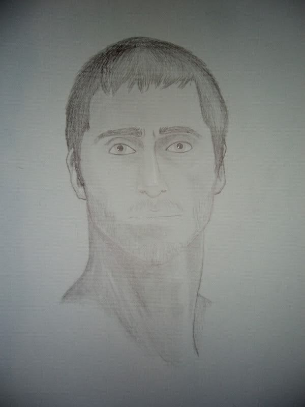
It's a self portrait I did for my midterm in my life drawing class, and it's actually pretty accurate. My dad, an art teacher for over twenty years, said I should shade the upper lip. Something I will try but am dreading. If you don't know, lips on men are tricky. In comics where I've learned most of my tricks, the less detail on men's lips the better. Otherwise they come out looking like women's lips. Not something I want to do on a self portrait. Conversely women's noses should be less detailed in comic style or they look like men's noses.
But this is traditional style. The rules are different 'round these parts. Specifically, No ****ing shortcuts.
Also, for spring break only I was considering opening up for a few really cheap commissions. I'll post more details on my deviantart page later... If I decide to go through with it.
The key to shading the lips on a male is to have the entire face shaded realistically. The reason people used to doing comics have trouble shading the lips is that they generally don't shade variations of the skin tone. So when they shade the upper lip, it looks way out of place like lipstick, since the rest is left predominantly unshaded.
That drawing is very good. I haven't seen the subject, but the eyes look slightly too large and the eyebrows just a little too close together, but overall the proportions look very believable.
Blacklisted
"I'AM SATANS FAVORITE CHILD!!"

That is a good drawing. The proportions look believable and nothing looks too far off.
If I could offer suggestions it would be the neck seems a bit long, although this may be what your neck actually looks like (not being able to see you or a photo of you makes it impossible to know for sure), and it needs some more contrast i.e. there should be a bigger difference between the lightest lights and the darkest darks on the page... granted this could just be the photo you took of the image that has this problem rather than the drawing itself.
Nice work Wolffe. 
P.S. Do you not have access to a scanner?
Thank you both. I actually made the eyes bigger in photoshop because I thought they were too small, but after looking at both side by side I would have to agree that they were too big. I put the original back up. My eyebrows are like that though if I don't trim. I needed a haircut and shave when I did this... Well, I still do but I hate haircuts.
I'm timid to shade because I'm really just learning how to light objects. My goal above that was to get what my teacher calls "plastic form" or an appearence of three dimensionality. I think once I darken it like CR suggests it will pop more. As for the neck, you're probably right, and I think that will actually be pretty simple to fix.
The drawing pad is 18x24 inches. I have a scanner, but not one that big.
The thing I notice is that the eyes are far too heavily outlined. Do you see how that makes them kind of flat? This probably isn't how they look in life. Unless you're wearing a LOT of eyeliner...
For realistic eyes, you very rarely draw the lower lid, even on females wearing eye make-up. Your eyebrow generally casts a shadow over the eye area, and the moisture of your lower lid will create a highlight rather than a shadow or line.
Thanks Wassy. I'll give it a shot but I won't promise any decent results.
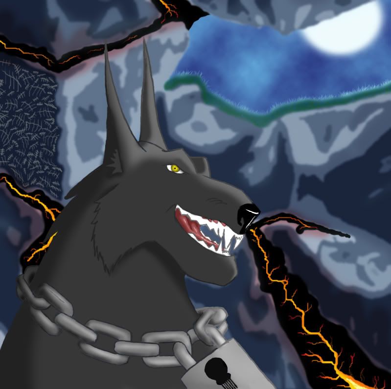
Also, Since VexXxa asked if I was going to color my Disney Fenris, I decided too. It came out better than I expected. But sadly I had to reduce my cave background to cutouts, because what I made looked cool but didn't fit.
Click on the picture for the DA page.
Edit: I'm opening up for commissions for spring break. I have nothing to do. If no one bites by Thursday I'll hand one out to the fastest reply on the boards. Details are on my DA homepage.
This is another one not related to CoH but I'm proud of it. I got a tutorial by Cryptcrawler on DA and it has paid off in spades. I am much better at using photoshop because of it.
Click the picture for the DA page.
that is looking quite good.
Very cool.
They ALL float down here. When you're down here with us, you'll float too!
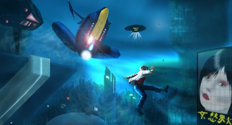
@Starflier
it's got a definite Blade Runner vibe to it... And that cannot be bad.

Click pictures for DA pages...
I started out drawing Fenris...
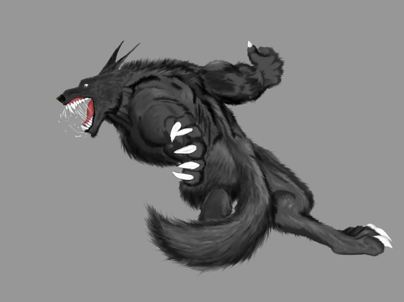
and realized he had no one to attack. So unless I was going to make him brag to his warwolf homies after a slam dunk, I had to find someone. I looked in the art request thread and picked Darth Delicious because she's done a lot of free art for other people...
Lots of experimenting going on in here, so I'm not happy with everything. I learned a lot though.
And on the topic of learning, I want it known that I am open to critique on anything on every piece. Don't be afraid of hurting my feelings, I told my art teacher and I'll tell anyone else, I'm here to learn, not to get pats on the head.
That said, I want constructive criticism, not "it looks like a dump truck," or other comments that generally confuse me.
The only exception to wanting public critique would be if I were hired for commission work. Private would still be fine though. Don't need people picking apart something I'm selling in front of the customer.
Quote:
Cool it looks like he is doing a old school Tatsumaki Senpuukyaku (hurricane kick) ...ok you probably weren't thinking StreetFighter when you did this but still. |
Originally Posted by Blood_Wolffe
This is another one not related to CoH but I'm proud of it. I got a tutorial by Cryptcrawler on DA and it has paid off in spades. I am much better at using photoshop because of it.
Click the picture for the DA page. |
And yeah I'm with Caemgen on the whole BladeRunner feel to it.
And that is really cool that you chose to include DD in your art I'm sure she will be thrilled.
She has been doing a lot of free stuff lately... someone should thank her.
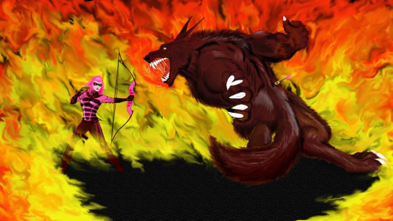
A question comes to mind though, since it is an action piece, what is the sequence of events here?
Her arrow has been fired and is lodged in his back so he had to be facing the other way at first but they are somehow
trapped in a ring of fire together and if that were to happen how could you not notice or have your back to the only other
person in there with you. If the fire is one of her powers why would she be in it and if not hers then who's? Kinda curious how you see it going down.
One thing I notice is that the top two claws on the near hand/paw seem to be overlapping in a way that makes it hard to tell which is on top...
I would suggest pointing the thumb claw up so it matches the farside hand and is less ambiguous.
I do really like the dynamism of Fenris' pose though... and DD... well she looks like she's about to have a really bad day.
Aim for the nose!... oh wait that's sharks, umm... go for an eye!
Thanks! Bladerunner is what I was going for. The idea behind Fenris' pose is she shot him in the back and he's spinning around. The fire is mostly there for coolness, but it's also her secondary with her fearlessly trapping each other in and keeping him from rampaging on civilians.
Why not just trap him and shoot from a safe comfortable distance rather than open herself up to counter attack or getting burnt... since it appears that her legs are on fire as well (flame retardant pink armor perhaps? )
I agree it looks really dramatic and cool the two of them facing off in the fire ring (I like the fire effect too) but if that is her power (blaster's fire secondary) she would have to be nuts to trap herself in there with Fenris like that... thankfully DD is a little bonkers.
Actually Wolffie's scenario is pretty much what I imagined for the scene... As for why DD would trap herself in the ring of fire with him I can imagine a couple of reasons.
1) She was just that close to him and had no choice. Maybe doesn't fit perfectly with game mechanics but I personally have no problems breaking out of those chains for arts...
2) She wanted to give him a target to focus his rage on. Sure, he probably doesn't want to run through the flames but I doubt he's going to just sit and wait til the die down... So rather than have him run through them and continue after his targets, she isolated the two of them together so he would focus on her. Yeah, it makes her job harder but she's the hero in the pic so what you expect her to do, take the easy way out and risk civvies??
3) Ooooops!!
Anyway, I always just assume that the superheroes (or villians) are basically immune to their own powers for one reason or another so I don't even consider that she may be afraid she cannot run through her own circle unscathed...
If I was going to nitpick on any of the mechanics of the pic at all it would be a bow user being that close to the target to begin with... Even if she was that close when she stumbled upon Wolffe isn't that awfully close range to be effectively using a bow at? And in the same vein, it would seem her pose would be further along the path of releasing arrow and either drawing a new one or getting ready for another attack than this considering how far along his path of getting shot and turning around in anger and launching at her he is... Unless he's just THAT much faster than she is.
But all in all, I don't worry about such mechanics anywhere near as much as CR does so I am just basically enjoying the pic
Though now that I am thinking in these terms... Which did she do first, call up the ring of fire or shoot him? If shoot then shouldn't we be seeing the after effects of her summoning the fire? If the fire, shouldn't he have already have been turning to figure out what happened before he could have been shot?
Wow how have I missed your thread Wolffe? Great arts here!
I think the one thing that stands out to me on the most recent piece is that DD is so bright. With the flames behind her I picture more shadows on her front side and even color bleed from the orange/yellow flames. I don't feel so much that way about Fenris but probably because I see the original grey version and picture the flames affected his color to the more brownish look of the finished shot.
I really dig how well the fur looks on both images there though. I know I've seen some images with fur that don't look that good. Great brush stroke look to it, feels more like a painting.
As for order of events there, I see DD as having summoned the fire ring from afar and Fenris searching all around for the source. Then DD firing into him as she walks through the flames (what do you mean I'm not immune to my own fire? that would explain the blisters after too much salsa and refried beans) and Fenris has just turned to, more than likely, destroy DD but since she is so bad*$$ she "ain't skeered"!

That's a good point Caemgen. That's probably close to the least effective range for a bow. Halfway through I thought it should be a from a low perspective with her closer to the viewer, but then how do I get her face?
And thanks Powerstream! The painted look is exactly what I'm striving to reach with digital stuff. I agree with her lighting. I've got to get it through my head to do backgrounds first. It makes lighting things a lot easier.
I'm also interested in what people think about the fire itself. I couldn't find a tutorial I liked, so I experimented.
On a self-promoting note, I have another non-coh piece to share because I am so proud of it. It's a skull study for my art class.
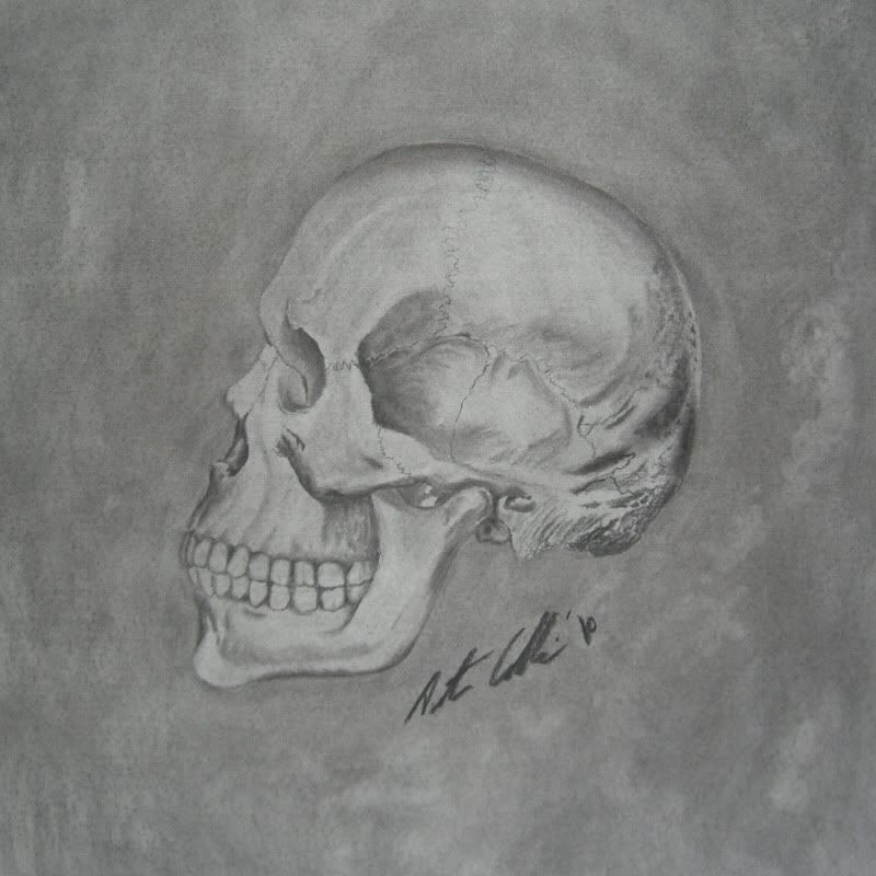
Click on the picture for the DA page and a small explanation of the process I used to make it. I also have a few other pictures on there in the same style if anyone likes the charcoal look.
P.S. Let me know if these pictures are too big.
The skull looks very cool...
Question: is it a normal human skull? To me it looks like the mouth/jaw are a bit too large - but I am NOT an anatomy expert at all so I could easily be wrong... Was just curious if it was perhaps a more primitive man skull or if it was just me or what...
I've never met a person that's not an expert on human anatomy. It's why the human figure takes years to draw perfectly. Everyone can spot the slightest mistake.
You're right, the space between the nose and upper teeth is too long, and the chin a little too long too. The crest of the brow, the part you headbutt things into submission with, is also a little too prominent in my opinion.
I was impressed with the skull even before I looked at your write up on da. Then I was really amazed. That is an interesting technique for sure.
At first glance I didn't notice the things you pointed out but now that you have they stand out. Lol. But it is still a great piece of art!
How could you not trust that smile indeed.
Think I'll take a stab at drawing Scar.
Funny you should mention that though, those were the two I referred to when trying to pin down the style.
Or someone else can color it! Eh? EH? EH!?