Something to Clear Up About Positron's Twitter
By
AngryRedHerring,
Posted on: 2009-09-08 07:12 in Player Questions
That depends how wide your browser window is. The background image doesn't move, but the central Twitter area will shuffle around based on the size of your screen.
For me, I can see Statesman and Sister Psyche on the left side.. and LR and GW on the right side, which is it's intended view. I say it's the intended view because the size of the background image is roughly the same as my resolution.
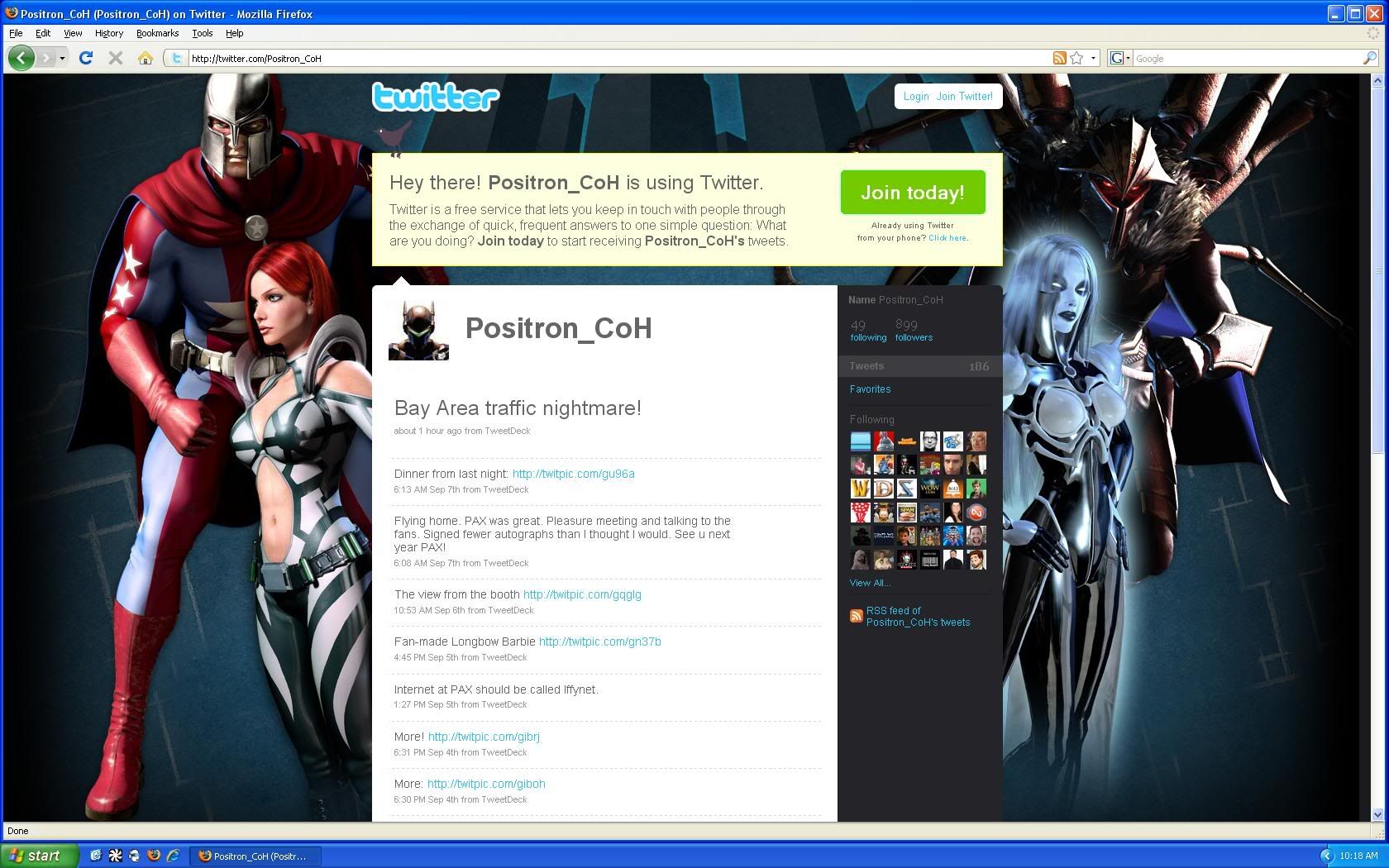
Positron's Twitter Page Image
If States is "taking a leak", it's going right down the side of Sister Psyche. lol
On your screen, you might not have even seen her behind the Twitter page, and now that you know she is there, it might look to you as if she is doing something dirty now. haha
Quote:
Some people are into that sort of thing, you know.
|
Originally Posted by Master-Blade

If States is "taking a leak", it's going right down the side of Sister Psyche. lol |
It seems geared to 1680 width monitors to get the full effect. Strange they'd go with that resolution as the optimal.
That's is one of the most disgusting things I've ever seen
Seriously. That's one foul looking dinner.
Quote:
Indeed, the image is 1640x1050.|
Originally Posted by SuckerPunch
It seems geared to 1680 width monitors to get the full effect. Strange they'd go with that resolution as the optimal.
|
My monitor's native resolution is 1680x1050.
Quote:
Same, but I never have my browser window maximized. I don't know that many people with large resolutions that do, really.
|
Originally Posted by Master-Blade
Indeed, the image is 1640x1050.
My monitor's native resolution is 1680x1050. |
Quote:
I always do, and I know several other people that do as well. And even for people who use the even larger 1920×1200, roughly 1600 might be normal viewing with a messenger service to the side. (Just trying to rationalize it.)
|
Originally Posted by SuckerPunch
Same, but I never have my browser window maximized. I don't know that many people with large resolutions that do, really.
|
How do you not get a headache scrolling your eyes so much back and forth on fluid-width sites? The human eye isn't meant to scroll that far without causing strain. It's why books and magazines and stuff have narrower line widths.
Quote:
I guess the same way I don't get a headache playing the game on fullscreen and looking back and forth at my powers, the chat, my target, etc.. or the same way people with lower resolution screens don't get a headache by scrolling back and forth on the same webpages (the physical screen size is the same, and the eye doesn't move any differently.. if anything, it moves slower on higher resolution because there is more text per line.).|
Originally Posted by SuckerPunch
How do you not get a headache scrolling your eyes so much back and forth on fluid-width sites? The human eye isn't meant to scroll that far without causing strain. It's why books and magazines and stuff have narrower line widths.
|
As for newspaper columns.. I don't think it has anything to do with horizontal eyestrain. The narrow line width makes shorter articles easier to manage so they aren't only one or two lines across the full page, and so the paper can be folded and still be easily read. It reduces white-space at the end of paragraphs and maximizes the amount of content/ads they can put on each page. Books aren't written like that.
If you are straining your eye when you look from one side of the screen to the other.. then YOU ARE TO CLOSE!
Quote:
|
Originally Posted by Master-Blade
I guess the same way I don't get a headache playing the game on fullscreen and looking back and forth at my powers, the chat, my target, etc.. or the same way people with lower resolution screens don't get a headache by scrolling back and forth on the same webpages (the physical screen size is the same, and the eye doesn't move any differently.. if anything, it moves slower on higher resolution because there is more text per line.).
As for newspaper columns.. I don't think it has anything to do with eyestrain. The narrow line width makes shorter articles easier to manage so they aren't only one or two lines across the full page, and so the paper can still be easily read in a folded state. It reduces white-space at the end of paragraphs and maximizes on the amount of content/ads they can put on each page. Books aren't written like that. If you are straining your eye when you look from one side of the screen to the other.. then YOU ARE TO CLOSE! |
Actually, no, that's not correct. Comparing reading to playing the game isn't accurate either, as the eye strain specifically occurs when reading.
Some light reading on legibility, eye fatigue, etc.
Anyway, that's above and beyond what this thread is about.
Quote:
Directly comparing reading on the internet to reading a newspaper isn't accurate either.|
Originally Posted by SuckerPunch
Actually, no, that's not correct. Comparing reading to playing the game isn't accurate either, as the eye strain specifically occurs when reading.
Some light reading on legibility, eye fatigue, etc. Anyway, that's above and beyond what this thread is about. |
The article you pointed me to specifically mentions the use of Book typography in their measurements, which "do not necessarily apply to magazine or newspaper typography." While the shorter columns may indeed help reduce eyestrain over a long period of time, it is not the reason why they are written that way.
It's not very common for websites to use the full screen width for text anyway. There is almost always some kind of sidebar or image displayed on the side, making the reading width shorter. The optimal line width is relative to the size of the text, the distance the text is from the eye, and the preference and experience of the person reading it. Experienced readers will suffer less eyestrain over time. Also, browsers are now equipped with zoom tools that increase text size and makes reading text on a higher resolutions even easier for some people.
Either way, you asked me how I don't get eyestrain..
My monitor is slightly elevated at over 2 feet away from my eye. The relative angle of my viewing area is reduced. I didn't do it to reduce eyestrain. It's just the way my desk happens to be designed, and I happen to never get eyestrain.
Your comment that "The human eye isn't meant to scroll that far without causing strain." is relative to the size and position of your screen, not the resolution. If I hold a book at a comfortable reading distance from my face, with the monitor behind it at my average viewing distance, they appear roughly the same size. If I had any eyestrain, it'd be from the smaller text size at a higher resolution, not the distance my eyes move from side to side.
Call me lucky I guess?
Quote:
Right, but especially on a fluid-width forum, where there's still lots of room dedicated specifically to the content of the post, and you have rather long chunks of text. This forum, for example, is at a 10pt font size. That's rather small for such a long viewing area. On a 1680 screen, the readable post area is ~1280 pixels, equaling roughly 137 picas... which is a fair bit larger than a recommended reading width of 18-24 picas for a 10pt font (which is what would seem to be the width of the textarea for posting is).|
Originally Posted by Master-Blade
The optimal line width is relative to the size of the text, the distance the text is from the eye, and the preference and experience of the person reading it.
|
Anyway, we could probably talk round and round on this. All I'm saying is that to the average person, maximizing a fluid-width forum is probably going to be uncomfortable to read over long periods of time. Everyone has their own thresholds for things though, and there isn't any one right or wrong way. I was speaking more in terms of generalities.
Quote:
And the average person doesn't spend most of their time on fluid-width forums anyway, and the discussion was sparked by the size of a background image on a site that isn't fluid-width either.
|
Originally Posted by SuckerPunch
Right, but especially on a fluid-width forum, where there's still lots of room dedicated specifically to the content of the post, and you have rather long chunks of text. This forum, for example, is at a 10pt font size. That's rather small for such a long viewing area. On a 1680 screen, the readable post area is ~1280 pixels, equaling roughly 137 picas... which is a fair bit larger than a recommended reading width of 18-24 picas for a 10pt font (which is what would seem to be the width of the textarea for posting is).
Anyway, we could probably talk round and round on this. All I'm saying is that to the average person, maximizing a fluid-width forum is probably going to be uncomfortable to read over long periods of time. Everyone has their own thresholds for things though, and there isn't any one right or wrong way. I was speaking more in terms of generalities. |
Quote:
It was directly related. My original point was gearing that image to work best on 1680 resolutions was weird, if they were going to choose a size.|
Originally Posted by Master-Blade
And the average person doesn't spend most of their time on fluid-width forums anyway, and the discussion was sparked by the size of a background image on a site that isn't fluid-width either.
|
But let's not circle all the way back.
Quote:
The average website that most people would visit is designed at a fixed width between 960 and 1000 pixels. The size of the window doesn't make the content appear any differently. Having the screen maximized or not is simply a matter of preference, and is usually the default. The background image on the Twitter page is obviously designed to replace the extra space you would normally see on the sides with something friendly to any average viewing size.
|
Originally Posted by SuckerPunch
It was directly related. My original point was gearing that image to work best on 1680 resolutions was weird, if they were going to choose a size.
But let's not circle all the way back. |
Quote:
|
Originally Posted by Carnifax
That's is one of the most disgusting things I've ever seen
Seriously. That's one foul looking dinner. |
kidding right? that thing is amazing!
No one goes there anymore, it's too crowded...
"The potato goes in the FRONT."
It's not the size, it's the positioning.
If they centered the background image, it would look atractive at any resolution. Left-positioning it as it is obscures the best parts of the image at any browser size that isn't very wide. It's a bad design decision.
Quote:
1640 is a good medium. Anything smaller would create too much space on the right side for larger window sizes, and anything larger would make the actual page content cover Statesman completely on the smaller resolutions, so you're right, if it was centered, it'd work out better.|
Originally Posted by SuckerPunch
It's not the size, it's the positioning.
If they centered the background image, it would look atractive at any resolution. Left-positioning it as it is obscures the best parts of the image at any browser size that isn't very wide. It's a bad design decision. |
The CoH Homepage is built with the same size in mind, but the background image IS actually centered. I'm not familiar enough with Twitter to know whether or not a Centered background image is an option, or if it's an option that Positron might have overlooked when setting it up... but that's probably what was intended, and why that size was used. In that case, the only flaw is that it didn't end up getting centered.
Quote:
Heck yeah! Seafood boil all the way!
|
Originally Posted by Gr33n
kidding right? that thing is amazing!
|
I did some quick searching and it seems that Twitter only gives the option for Upper-left and Tiling (for smaller images) and I found a How to Create a Twitter Background page that suggests using at least 1600x1200 and a Twitter Background Gallery page that suggests 1500x1300, which positron's picture complies with.
Then again, they also suggest not to design the background with information on the right side of the side bar.. which would be a flaw in Positron's image choice. (Or is it a flaw in Twitter's design for not having the Centered option? lol)
Either way, losing a couple characters depending on screen size isn't a huge deal, and it was fun talking about it. haha
Quote:
Oh man. Now I have a craving for the Ragin' Cajun.
|
Originally Posted by Carnifax
That's is one of the most disgusting things I've ever seen
Seriously. That's one foul looking dinner. |
.
Check... and Mate (poster) - Arc ID# 15095 (comments)
Invasion on Earth BX1132! (poster 1) - (poster 2) - Arc ID# 98943 (comments)
Global @ARH
http://img.photobucket.com/albums/07...ureBanner2.jpg
Quote:
I'm fairly positive you are in the extreme minority of people who think they see Statesman taking a leak in that picture.
|
Originally Posted by Teeth
The page I refer to is here.
Am I the only one who thinks it looks very much as though Statesman is taking a leak behind the main text area, and glancing around to see if any of us are watching? (Yeah, I see you there, States. You're not very sneaky~!) |
Quote:
I would say that's a poor choice on Twitter to not allow centering... but I don't use Twitter so I don't personally have much stake in it.
|
Originally Posted by Master-Blade
I did some quick searching and it seems that Twitter only gives the option for Upper-left and Tiling (for smaller images) and I found a How to Create a Twitter Background page that suggests using at least 1600x1200 and a Twitter Background Gallery page that suggests 1500x1300, which positron's picture complies with.
Then again, they also suggest not to design the background with information on the right side of the side bar.. which would be a flaw in Positron's image choice. (Or is it a flaw in Twitter's design for not having the Centered option? lol) Either way, losing a couple characters depending on screen size isn't a huge deal, and it was fun talking about it. haha |
Quote:
It's Twitter.
|
Originally Posted by SuckerPunch
It's a bad design decision.
|

Clicking on the linked image above will take you off the City of Heroes site. However, the guides will be linked back here.

The page I refer to is here.
Am I the only one who thinks it looks very much as though Statesman is taking a leak behind the main text area, and glancing around to see if any of us are watching?
(Yeah, I see you there, States. You're not very sneaky~!)