Post your base pics here
Picked up enough prestige over the weekend to do a bit of upgrading on my teleport room, so I took the opportunity to make some pics.
I've only started getting going on decoration, and it's a single player base, so it's not quite as fancy as some of the others in the thread. 
Overview
(Recently expanded from 8x8 to 12x12. Control, teleporter, energy, and med rooms, plus three workshops for the three levels of salvage. I'm a bit of a packrat.  )
)
Control center
(I've got the computer in place, but I'm still deciding what the rest of the room will be...)
Powerplant
(Converting power from a captured energy crystal....)
And the teleporter room was inspired by the various rooms in the Stargate thread....
Pic 1, Pic 2
-----
Couple questions:
- is there a better way to get rid of the room baseboards, other than placing decorative items at every segment?
- any way to get around the underside of objects being see-through? (The big blue file cabinets on my teleport control center, for example - the upper edge of the "window" is transparent.  )
)
Thanks! 
Line that window edge with desks?
@Turbo_Starr
My Guild's Base
You have to View it from the end because Photobucket decided to put it in that order.
Accent lamps. Place lamps in a stack, maneuver stairs section, remove lamps.
Blew a couple hundred million Inf on prestige, learned a few things about base building (the hard way  ), and did a bit of upgrading....
My new control room:
Computing center (far view)
Computing center
Planning room (beneath the computing area)
Break area
Also made a few changes to the power plant.
Thanks to everyone who gave advice. 
good stuff there 
That looks really nice, Kiralyn!
@Leiter
The Sixth Column
"Good company and good discourse are the very sinews of virtue."
Izaak Walton
Haven't added furniture yet but, I'm having too much fun with Photoshop, patterns and Splasher. =)

or with hard wood floors =)

Oh, MAN, you got me all excited for a minute.
"They added new textures?! I can finally have wallpaper and good-looking hardwood floors?!"
But no. 
It does look fantastic though!
@Leiter
The Sixth Column
"Good company and good discourse are the very sinews of virtue."
Izaak Walton
Really like how your table turned out in the planning area Kiralyn! GJ, thanks for sharing the pictures.
Thanks everyone 
It'll probably be a bit before I can do another good sized room - need to build up prestige again. 
Okay I've done updates to the House of Heroes satellite, including a one million Prestige Hangar Deck with custom stealth transport ship, the Grey Ghost Mk II. Pics of that base can be found here.
Also have pics finally of the demonic Horsemen of Apocalypse temple complex, posted up here.
Labeled maps with detailed information on each room's contents (functional or RP), for the House of Heroes satellite and Web-Spinner's Amazing Friends' hidden base in the sewers can be found here.
All bases are on Virtue and available for tours whenever I'm on, other than during TFs/mishes with my SG. Holler on the Base Builders Inc. global channel to arrange it.
|
Daemonchilde: ((fluffy thinks he's a tank)) Demon . Hunter: (( I think mine is >.> Daemonchilde: ((Yours is no longer fluffy, it is Obliteron, destroyer of worlds)) |
Oops, I didn't see that topic, I just posted screenshots of mine on that other topic.
movie theater


No one goes there anymore, it's too crowded...
"The potato goes in the FRONT."


No one goes there anymore, it's too crowded...
"The potato goes in the FRONT."
more... oh BTW this is THRONE from Liberty server...
TP Room

Crafting Room


Costume Contest Stage

more


No one goes there anymore, it's too crowded...
"The potato goes in the FRONT."
oh sorry for multi posts but i forgot to include one of our MAGIC themed rooms
I have tons more rooms to show but dont wanna take up the whole dang thread but would love to give a tour if anyone wants one... full detention center, apartment/living area, a Bar, Hanger, Med Room, Weapons... etc....

No one goes there anymore, it's too crowded...
"The potato goes in the FRONT."
OKay, I like the pictures, I really do.
But can we come to an agreement on, say... size limitations?
Prophecy & Dreams | Prophecy & Dreams Discussion
Nerd Flirting | More Nerd Flirting | Nerds Talking About Flirting
Unbidden | Star Patrol | Real World Hero
But not everyone looks at screens the same way, and not everyone can look at screens the same way. Some people will have limitations on resolutions due to monitor age. Some people will have limitation due to eyesight issues (I know someone who uses 1024x768 on a high end monitor, because of this). Some people have to have windows open to monitor other things, and can't have full-screen browsers open.
Further, we're coming from a text-only situation to a forum where we CAN actually have pictures, and this could seriously make things difficult for people with slower connections who might like to see some of these pictures we post, but the larger pictures are right out for them.
All I'm saying is that perhaps, as a a community, we should come up with guidelines for the maximum sizes for pictures we post. We can link to larger, more detailed pictures for those who want to go there, but for within the actual posts, perhaps smaller images are a good idea.
It's something to discuss.
Prophecy & Dreams | Prophecy & Dreams Discussion
Nerd Flirting | More Nerd Flirting | Nerds Talking About Flirting
Unbidden | Star Patrol | Real World Hero
Personally I'd rather we continue posting links to pics than have pics on the threads themselves. It's less annoying and less intrusive than having every thread plastered with pics, particularly in these threads where we're all showing pics.
|
Daemonchilde: ((fluffy thinks he's a tank)) Demon . Hunter: (( I think mine is >.> Daemonchilde: ((Yours is no longer fluffy, it is Obliteron, destroyer of worlds)) |
Hi all. I'm new to the forums and just happened to come across this thread. There is some really amazing work on this thread and my hat is off to you all. Base design has become like crack and I'm finding I am spending more time in "Edit Base" than on any TF.
My humble work for "Echoes In The Dark" (arcane theme).

(Photo Album here..)

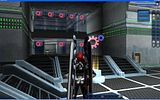
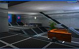
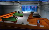
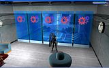
Not much special about my base, but I still get compliments.


Main entrance.
Reception...
...and the lounge above it.
The view from the lounge windows.
More views of the base will come in a later post, as the forums only allow you to link four photos. Click thumbnails to see larger pictures as well as the rest of the base.