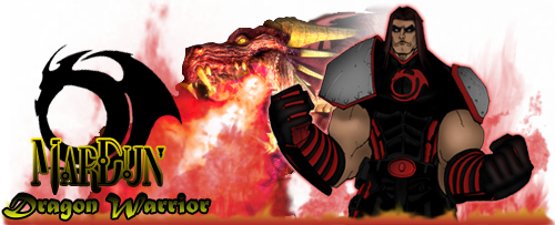
New costume feedback... AGAIN?
As long as you don't add the ear muffs from the Winter Event, it's all good 
Number 2 is my favorite. The red near the face really does a lot to prevent the character from being washed out by dark colors. It's still Mardun's style, but brightens things up a bit and creates a better look in my opinion. 
Do you have a bio for him? It would be cool to play around a lil' 
Scarf_Girl�s Official Kid Brother!
I'm not too fond of the goggles, actually, but the armor bits look good. Keep the color scheme of black and red, it's good. I dont' think MarDun would be MarDun without that look. 
Please read my FEAR/Portal/HalfLife Fan Fiction!
Repurposed
My vote's for 2... but not so keen on the goggles.
I like number 3, but with one change. Go with the same shade of red as a secondary color on the boots. It will offset the black really well and since it's a dark red you're using it won't appear to be too bright which is more in keeping with the theme you have there.
your = Belonging to you.
you're = Contraction meaning "You are."
Ur = The name of an ancient Mesopotamian city.
ur = This is not a word.
Hi MarDun!
Just wanted to say I have always liked your bio and story. I saw your pics and really wanted to just play around and add a third color. I hope you don't mind. I did forget to add the goggles which I liked alot in your design btw. Anyway here's a different take for you.
MarDun!
Meh. I just noticed that I actually have two shades of black in the design. I meant to go in and darken the black on the gloves and the torso to all match. The intent was that they all be the darker shade. Oh well you get the idea 
I really like the orange - It blends so nicely with the red. 
Scarf_Girl�s Official Kid Brother!
....they all look the same to me. while I see some detail changes his over all look remained pretty static, imo.
I am not sure what you are actually looking for...whether a new look or just some minor changes....if the latter any of the links you provided would work fine. if you are looking for more sweeping changes I would try changing things up a lil more. perhaps reversing the color scheme. use different shoulder pads. pony tail vs loose hair. things along those lines.
...as I said though...not sure what you are looking for. more than willing to post a few ideas for you to consider or give ya a spring board...but ultimately it is a decision you will have to make in regards to what Mar looks like....~
...the sword is truth...
~whiteperegrine~
[ QUOTE ]
Do you have a bio for him? It would be cool to play around a lil' 
[/ QUOTE ]
Crey porfile in my signature.

Become a Fan of MarDun on Facebook - Follow on Twitter : MarDun_COH
[ QUOTE ]
Hi MarDun!
Just wanted to say I have always liked your bio and story. I saw your pics and really wanted to just play around and add a third color. I hope you don't mind. I did forget to add the goggles which I liked alot in your design btw. Anyway here's a different take for you.
MarDun!
Meh. I just noticed that I actually have two shades of black in the design. I meant to go in and darken the black on the gloves and the torso to all match. The intent was that they all be the darker shade. Oh well you get the idea 
[/ QUOTE ]
Thanks!
I like this look as well! Nice design.

Become a Fan of MarDun on Facebook - Follow on Twitter : MarDun_COH
Hi all!

I have 5 costume slots and only one look for MarDun. I would love to change him up a little. (maybe I could win the next MMOArt.com CC next time)
Can I get some feedback on which look you like the best?
Old/Present MarDun:
http://i42.photobucket.com/albums/e3...MarDun1111.jpg
New Costume ideas:
1) http://i42.photobucket.com/albums/e333/Smurf209/M3.jpg (boots are all black "Sinister")
2) http://i42.photobucket.com/albums/e333/Smurf209/M1.jpg
3) http://i42.photobucket.com/albums/e3...ithGoggles.jpg (same as 1, but with the goggles)
Close up of goggles: http://i42.photobucket.com/albums/e3...thGoggles2.jpg
Thanks for your input.
Become a Fan of MarDun on Facebook - Follow on Twitter : MarDun_COH