Alraune
Looks like the witches outfit with plant leaves... cool. It's off to a good start. 
It definitely shows, you're off to a great start!
Agreed - I like how this is looking LJ.
Globals: Johnnykat & Johnnykat2
http://johnnykat.deviantart.com/

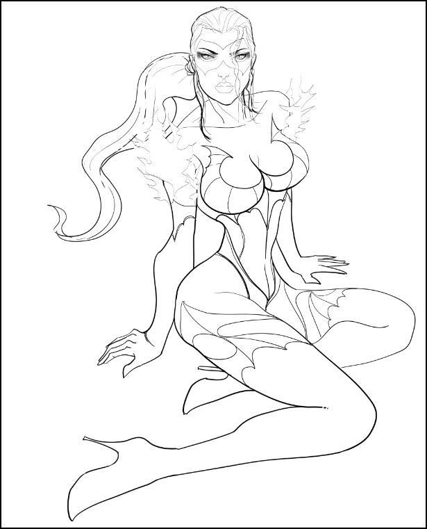
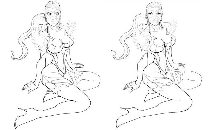
Thank you Gentlemen... here is the closely cropped ink, color will have to wait till either late late tonight or tomorrow. But I am really liking my work on this one... edit: made the eyes smaller, raised the eyebrows, aligned the head with the chest and neck, and made it slightly larger, also added the ponytail. 

I would suggest lowering the face on the head a bit more, as she's lost the majority of her forehead and hairline. Her eyes are still a bit far apart, giving her a bit of an alien look. Her ponytail should be directly behind her, since she's looking at the camera straight on and the hair trails that come from her sideburn area should be equal in length as well. Her chin is pointing to the camera right, so that needs to be evened out with the left side.
The fuzz on her shoulders is uneven, with the camera right side being much even with her shoulder, while the camera left side is noticeably higher. Her camera left forearm is also bulging too much, making it look non-congruent with the rest of her body's flow. The hand on that side should also be more flat on the ground, as it's very difficult to pull your palm upwards when the arm is pushing downwards on the ground. It's a stress position that opposes the more relaxed mood of the pose.
Both feet appear like they're pointed straight down into space. The only way that can work is if she's floating. Otherwise the tip of her boot toes would be pointed towards the camera a bit, to account for the perspective.
http://www.virtueverse.net/wiki/Massacre_Melanie -the original Fire/Dark Corruptor -
http://boards.cityofheroes.com/showthread.php?t=115217
The Guide to BURN
As the owner of the character (but not the comissioner, that goes to a friend of mine) I have to say this: I'm looking forwards to it however it turns out, whatever modifications are made.
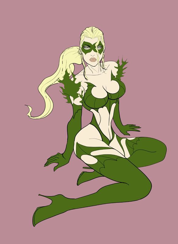
And yes, it is some of the Witch Outfit, with shoulder leaves. Dinah 'Alraune' Ewers is a human, modified by a plant symbiont.
|
I would suggest lowering the face on the head a bit more, as she's lost the majority of her forehead and hairline. Her eyes are still a bit far apart, giving her a bit of an alien look. Her ponytail should be directly behind her, since she's looking at the camera straight on and the hair trails that come from her sideburn area should be equal in length as well. Her chin is pointing to the camera right, so that needs to be evened out with the left side.
The fuzz on her shoulders is uneven, with the camera right side being much even with her shoulder, while the camera left side is noticeably higher. Her camera left forearm is also bulging too much, making it look non-congruent with the rest of her body's flow. The hand on that side should also be more flat on the ground, as it's very difficult to pull your palm upwards when the arm is pushing downwards on the ground. It's a stress position that opposes the more relaxed mood of the pose. Both feet appear like they're pointed straight down into space. The only way that can work is if she's floating. Otherwise the tip of her boot toes would be pointed towards the camera a bit, to account for the perspective. |
The uneven plant "fuzz" is also an aesthetic choice, I saw that the shoulder pieces were made with 1 large piece and 2 smaller side ones, and felt stylizing them would make them look less like a costume, and more organic. Details to the "planty-ness" of them will be added in the color render stage.
As for the feet, probably one of the main things I did not change from the reference, as they are one of my least favorite things to draw. So while they appear flat, the rendering will explain where the toes are.
Also the forehead and hairline are very short on this toon, you can ask the player. I know the face is not in the same perspective, but again artistic license, I can draw the top of her head, but decided not to... my reference model had considerably more hair, and I only used her eyes to create the face here, everything else is stylized from the original toon's reference given to me by the client. As for evening out the chin, I like the pronounced look of it on one side, maybe she has a bad molar from her childhood.
I think some slight imperfections are acceptable...
My last line of defense is simply this... the client ordered this several months ago at a bulk rate of 6 pieces for what I would charge for a single piece... on the given that the final would only be from the waist up (possibly without limbs - see gallery here), as it was part of a portrait promo. Having come back to keep my end of the bargain, I decided to make up for his wait with a full figure piece, in hopes that it might make him happy.
While I appreciate the crit as a means of being helpful, I do have my own reasons for working the way I have... if that's okay?

It's fine if you don't want feedback on your stuff, but I'm genuinely baffled as to what the purpose of posting the WIP is then. If I didn't want people to comment on a WIP, then I'd just post the final alone.
http://www.virtueverse.net/wiki/Massacre_Melanie -the original Fire/Dark Corruptor -
http://boards.cityofheroes.com/showthread.php?t=115217
The Guide to BURN
|
It's fine if you don't want feedback on your stuff, but I'm genuinely baffled as to what the purpose of posting the WIP is then. If I didn't want people to comment on a WIP, then I'd just post the final alone.
|
 So I guess I owe you a thank you.
|
Usually on the rare cases I want feedback I definitely ask. Most of the time I'm just sharing stages to show the progress of the piece. I don't mind if people comment, I can't stop someone from commenting, and I will try and listen to comments, as in your cases some of the things you mentioned were very helpful.
 So I guess I owe you a thank you. So I guess I owe you a thank you.  |

Nice work on the face and I like the dynamism of the ponytail.
Be Well!
Fireheart
Ohhh....nice curves, LJ! Very bodacious eye candy for the boyz  I especially love her eyez! Very exciting to see your progress on this one too!
~*~VexXxa~*~
The City Scoop Art Correspondent/Writer "ART IS IN THE EYE OF THE BEHOLDER"//"Don't hate because VexXxa is HOT and you're NOT." - JOHNNYKAT
Thank you Vex, without your kind of support I would feel greatly unappreciated.
ADORE the face. The pose looks kind of reminiscent of finding a deer in the woods, and they just turn to look at you like "What? I'm doing my own thing here."
It's...-cough- amazing what a little witch leather can do for the bust of a girl! 
|
Thank you Vex, without your kind of support I would feel greatly unappreciated.
|

Speaking offfff...any updates on your current bodacious babe?
~*~VexXxa~*~
The City Scoop Art Correspondent/Writer "ART IS IN THE EYE OF THE BEHOLDER"//"Don't hate because VexXxa is HOT and you're NOT." - JOHNNYKAT
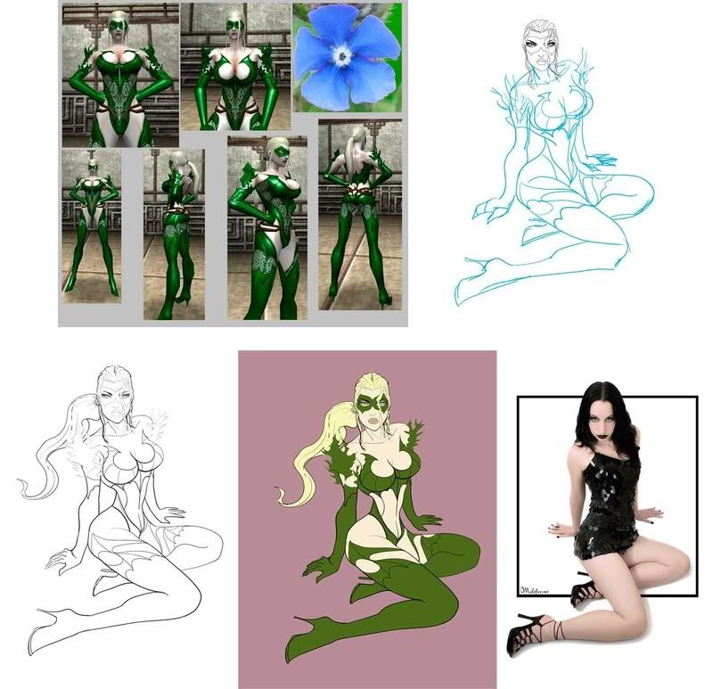
Here is the original toon's reference sheet and the photo I used for the pose...

Definitely a beautiful character that you are working on, LJ. And I feel that your drawing is better looking than the photo of the pose!! 
~*~VexXxa~*~
The City Scoop Art Correspondent/Writer "ART IS IN THE EYE OF THE BEHOLDER"//"Don't hate because VexXxa is HOT and you're NOT." - JOHNNYKAT
If nothing else, that shows the chest in your drawing isn't above and beyond the call of duty 
as for the whole "Why post WIPs if not for critiques" question I'd like to suggest that perhaps because some people love to see them... I personally love watching the process and will check out any and all WiPs... If critiques and/or suggestions are asked for then I'll offer any I may have but if not I still enjoy watching the process.


I'm really enjoying this one, I hope it shows... gotta great photo reference for the pose (which I altered here and there) and am looking forward to inking this up... okay back to work.
LJ