a step by step of what I'm doing...
I think you're doing everything VERY well. All the stages lok clean, until you get to the last one. The last one just doesn't seem to be the same level as the previous ones. Takea loot through a couple of my coloring tutorials and maybe they can help a bit.
http://juggertha.deviantart.com/gallery/#Tutorials
-Juggy
Your final step doesn't have enough contrast for it to show well. Instead of adding shadow and highlight, you're effectively just blurring the image since the eye can't pick up the edges well. Increase the depth of the shadow and highlight you add to the image, so that it's obvious where they're supposed to begin and end. That'll add more volume to the images as well.
http://www.virtueverse.net/wiki/Massacre_Melanie -the original Fire/Dark Corruptor -
http://boards.cityofheroes.com/showthread.php?t=115217
The Guide to BURN
So I took a look at Juggertha's Tutorials, btw I got a couple questions for ya about some of the steps in them Juggertha. Don't worry nothing major or problematic, and I think they'd make more sense to me if I had some form of artistic background but such is the times.
Anyway, I read through your tutorials and went back and re-did the coloring on the headman. Then followed your tutorials advice for shading and highlights. I'll certainly say the result is much improved over my previous effort, but something just seems.... well I donno. Just something is twitching a nerve and I can't place it. Maybe one of you guys can spot whatever it is that's irking me.


What exactly are you trying to achieve? A certain final look? A Style? Are you unhappy with the basic cell shading you've achieved here? Could you provide the a sample of the 2nd and 3rd stage for download, as to allow us to play around with some coloring tutes? My opinion is that the latest version has a few harsh edges, no soft separation, also, your black line has some piling going on... you know those little circles of fabric from a frayed worn out sweater washed one too many times. How large is this file?
I just do sketching at home, if you look at your picture, determine where the light is coming from. Looking at your picture it is hard to tell. The area that light is coming onto the rikti like in your original the last one had a highlight on it's left shoulder pad,and light coming in from the top, the new one it does not. Like the light was coming in from the left on the original. On the new one it's hard to tell where that is other than behind it a bit, if so the shadowing is a bit off, or should be more pronounced maybe. The head is really good though. But I'd make the light/shadow consistent like if you are lighting up from the front and left make the back and right darker. Give some highlight to the spots the light would glisten off of, kind of like what you did with the first pic. Or change where the light would be coming onto the rikti back to where it originally was possibly if you want it to look more like the original one.
Like the way the green on the head glistens/highlights it shows it coming from the top right on the last pic.
But the face has shadow on the right side of it, even though the light is possibly coming in on that side, due to looking at the left shoulder pad where it has the face's shadow on it. Maybe just too many light sources coming in on it.
http://tiny.cc/ArcaneDefenseItems
This is a bug, nothing more. Please put away the tin-foil hats, there's nothing sinister going on here.-Protea

http://tiny.cc/WhatBeatsADragon
|
What exactly are you trying to achieve? A certain final look? A Style? Are you unhappy with the basic cell shading you've achieved here?
|
I'm working on a fan-comic series, actually it's a revamp of a series I started about 2 years ago (You can check it out here). Originally I used straight screen caps for the images, then later I started using Photoshop to modify the images and apply various effects. But there were always things that I couldn't do that annoyed me. A big one was faces. More speccifcially facial expressions. Yeah, through demo editing I can swap faces in and out and get some expressions, but no where near what I want. Another thing are hands. If I want to have a character pointing, a screen cap would have the character pointing with their entire hand. What if I want a shot of Ms. Liberty flipping Statesman the bird?
Now, if I could get like Juggertha or someone to draw all the images for every page in my comics I'd be like wildly excited. But I have no means to compensate then for their efforts. So I'm doing what I do best: Attacking a problem, studying why it's a problem, identifying a potential solution and working to achieve that solution.
What I'm going for as an end result, is a standard that will A) not be a screen cap, B) appear more comic or animated like, and C) Give me control of some form over the images.
The story line I have in mind is a post-appocalyptic setting following a third Rikti Invaison. So I had the idea that the Vanguard Base has been more heavily fortified with a full war wall system around it.
(Click on image for full size version)

That's what I'm after. The ability to remake the screen caps into something that's more controllable and modifiable. I need to be able to stream line the process to a point that it won't take me 4 days to do a single image. Right now, using the process I outlined in my original post I'm looking at about an hour to an hour and a half per character image (probably a little more if I mix in Juggertha's tutorial) and maybe 4 or 5 hours for backgrounds depending on how complex the background is.
So short version, This cell-shading style that I've put together works but I know it can be better. Since It's really a wasted effort to make a post and go "Hey how do I do this better?" I posted a break down showing each step I went through with an explanation. That way it's much easier for people to follow my process and help me identify potential improvements in it.
|
Could you provide the a sample of the 2nd and 3rd stage for download, as to allow us to play around with some coloring tutes?
|
Here I have completed the line art

Followed by a solid dark gray color fill. I used Dark gray as it's used across the majority of the image:

After I did the dim gray, I went back with the polygon lasso and colored in the red, white and green sections. Each is on a separate layer.

Now for my specific needs, I could just stop the process right here and call the image done. However, I think I can make the image better with only a minimal time investment.
So, I add a shade layer (Using the technique shown in Juggertha's tutorial)

And then I added a highlight layer:

I got a little creative and used a trick I learned in web design to make the optics on the helmet appear more glass-like:

|
My opinion is that the latest version has a few harsh edges, no soft separation, also, your black line has some piling going on... you know those little circles of fabric from a frayed worn out sweater washed one too many times.
|
As a .psd file it's 769 kb
It meassures at 373 px wide by 808 px high with a resolution of 72 PPI.
|
I don't know if it's what's bothering you, but looking at the most recent image the shadows are inconsistent and don't support the volumes described by the linework.
|
|
I just do sketching at home, if you look at your picture, determine where the light is coming from. Looking at your picture it is hard to tell. The area that light is coming onto the rikti like in your original the last one had a highlight on it's left shoulder pad,and light coming in from the top, the new one it does not. Like the light was coming in from the left on the original. On the new one it's hard to tell where that is other than behind it a bit, if so the shadowing is a bit off, or should be more pronounced maybe. The head is really good though. But I'd make the light/shadow consistent like if you are lighting up from the front and left make the back and right darker. Give some highlight to the spots the light would glisten off of, kind of like what you did with the first pic. Or change where the light would be coming onto the rikti back to where it originally was possibly if you want it to look more like the original one.
Like the way the green on the head glistens/highlights it shows it coming from the top right on the last pic. But the face has shadow on the right side of it, even though the light is possibly coming in on that side, due to looking at the left shoulder pad where it has the face's shadow on it. Maybe just too many light sources coming in on it. |

Basically, the light would be to the left of the Rikti, but behind us and by a good distance too.

Ah, well it is close to 3am here, however tomorrow, I will write you a much easier tute for doing the coloring. Your line art, is that done with the pen tool? It is very clean. The base grey tone for the entire figure is fine, however making a layer for each individual piece or shape is a tremendous waste of time. You should make layers based on color, which in this case equals 4, grey, red, green, white. You already made layers for highlights and shadows, you can actually combine those on one layer. As for the pilling on your line art, that comes from enlarging a reduced original version, and possibly having your anti-alias box unchecked on the top bar by your selection tool...
As to achieving a more cohesive cell shaded look, I will include into your tutorial how to use the gradient brush, it will save you hours of heart ache. I use to use it extensively, but I out grew the look because I wanted a more painterly feel. However it can be used in combination with cell shading to downsize your time.
Lastly your shadow and light use has an oversimplified animation look to it, the harsh edged shadows. While that is fine, they're not convincing cause they're not following the form enough. Particularly on the area behind the head on the "ear" of the helmet, that long shadow is cast for the hell of it, nothing could create that unless it was in front of him, and if so why does it only hit that area? You need more consistency...
OKay so will see you tomorrow for sure.
PS: can you also upload the original rikti reference, as to help with the final coloring.
Here's a comparison:

Linework basically established the contours of an object. Shading establishes the volumes within the contours. In order for those volumes to read, you have to be consistent in your shading: objects in from cast shadows on things behind, round objects cast round shadows, the most convex part of an object will have the brightest highlight, etc.
Blacklisted
"I'AM SATANS FAVORITE CHILD!!"

I'm impressed by the amount of patience you have, to go in and do all those little outlines.

There are lots of tutorials, Juggertha's included, on how to apply shading to drawings. The real difficulty is understanding the form of the thing you're trying to shade and then applying the shading appropriately to express that form.
The best way to get a grip on rendering volumes is to do the old art school thing of rendering basic shapes--spheres, cylinders, cones, etc. and then building up to more complex shapes. It takes observation and practice to learn this.
Blacklisted
"I'AM SATANS FAVORITE CHILD!!"

It is very important to understand value (light and dark) because that is how we perceive form.
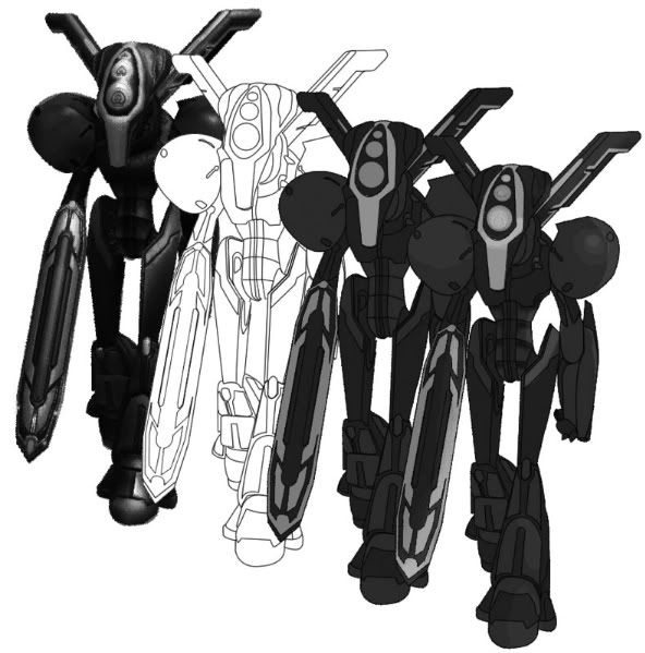
I turned your first image to greyscale, and if you squint your eyes and look at your rendering, I see 2 greys, and the lighter grey is where greens are. These greys do not describe the form very well, which is why your image ends up looking flat. I'd even say the screencapture you started with doesn't have the most well defined values either, perhaps making this more difficult for you. Another issue I had with your second attempt was the very bright and saturated red parts, missing any highlights. In order to make red lighter, you'd have to lose some saturation.
I thought about how I'd approach this if were you, and I decided to try different layer blending modes, since you were already using different layers.
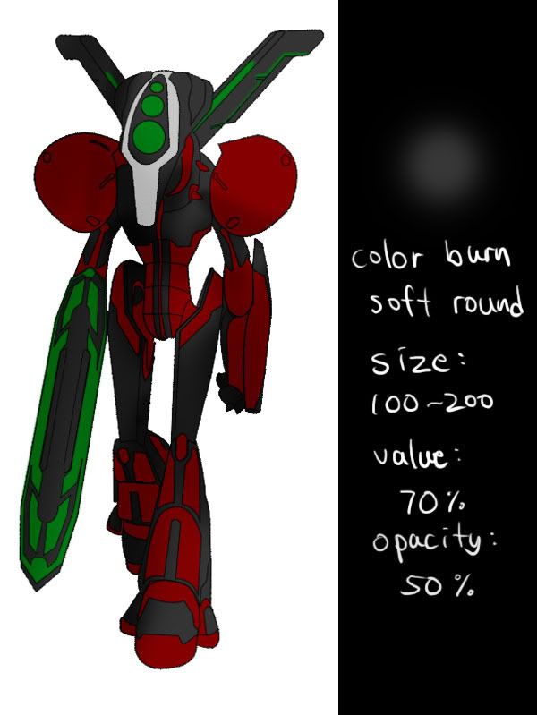
First, I add a new layer and change the blending mode to "color burn". With a big soft brush, I quickly go over dark areas.
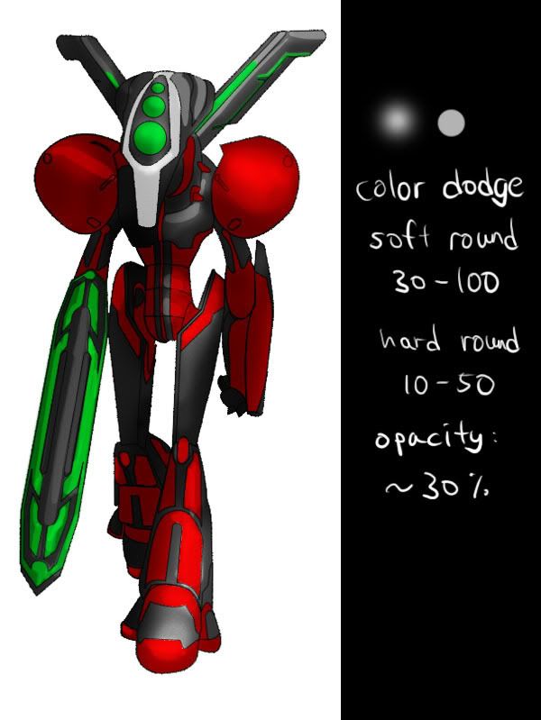
Next, I add a "color dodge" layer. I start with a soft brush that is still pretty big, and work my way in with smaller hard brush for details. I am noticing that the red parts don't get any lighter in this mode, possibly explaining how you ended up with those bright reds with no highlights.
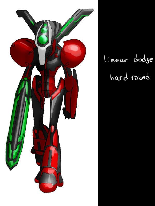
So I add another layer for highlights, in "linear dodge" mode.
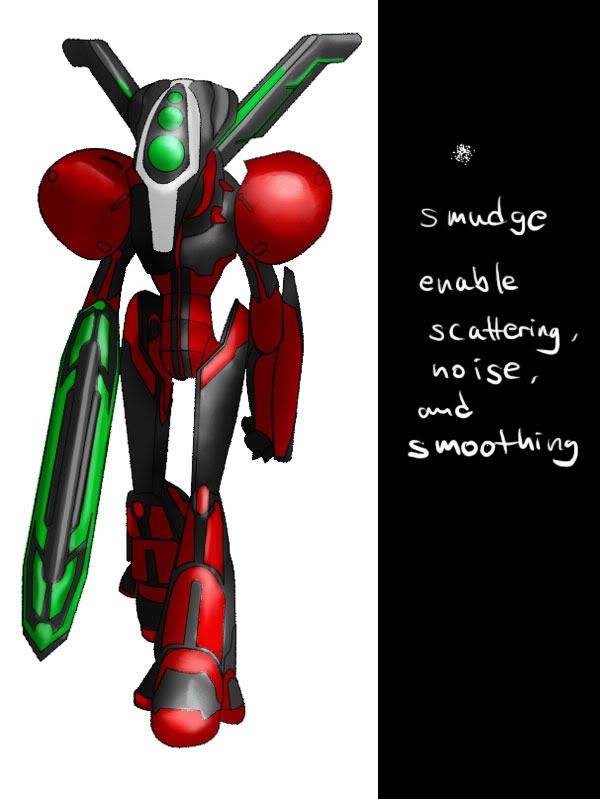
Next, I smudge some rough edges in the two dodge layers. The default setting for the smudge tool sucks, so you need to tweak the settings a bit. Main thing is change the brush shape to a textured one like in the picture, and I think I had Exposure pretty low, maybe 15-25%.
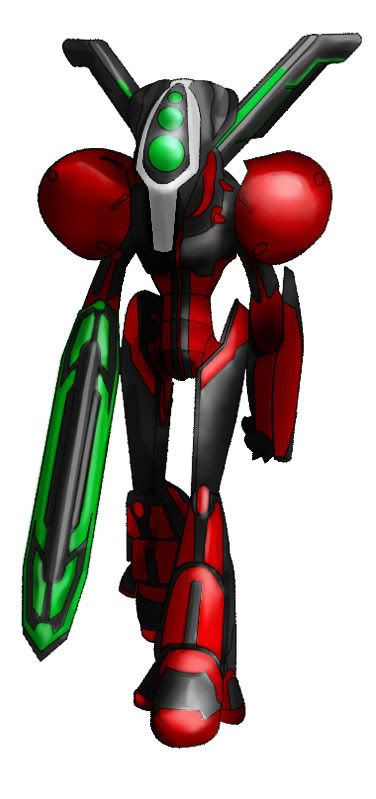
I decided that the darkest areas could be darker, so just did that. I think I oversmudged and lost some crispness. I will do another one from scratch, but this time without smudging. Another thing I will do differently is, since we are working with "color burn" and "color dodge", why not add some color to light and shadow?
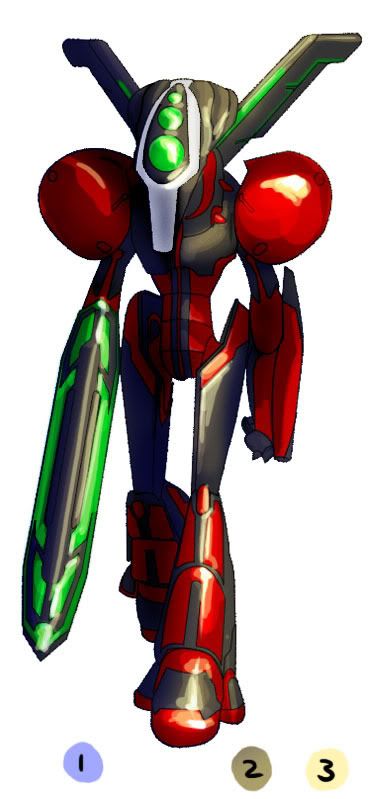
1 shows the color I picked for the shadows in color burn layer, very light pale blue. 2 is for the color dodge layer, a darker yellow-grey. 3 is for the highlights, but I used "hard light" mode instead of "linear dodge". Lastly, I directly painted brightest highlights with a white hard round brush.
This is in no way a definitive process, as this was my first time working this way.  I was just trying to come up with a method that might work for you, so keep experimenting and see where it goes.
My Web Site and Portfolio
My DeviantArt Gallery
hmm, thanks for the info guys. This is really trying to teach a computer how to write a song. I'm very technically minded and the last art class I took we were still using finger paints and crayons.
Any books or speccific tutorials you all would recommend I check out for information about shading?
And I'm assuming that the application of shades and highlights aside, my process is pretty solid for what I'm shooting for?

Funny, I was just about to do what LD did... I think he's giving you a pretty good example there.
Sorry for the incomplete and the lateness Mr. TP, I promise I'll have it finished by tomorrow... anyway, here are the screen caps for my coloring tute. I will explain each step tomorrow in depth, it's a lot to write up, I may do it later tonight, after my D&D game, depends on how tired I am... but there it is, hope the screens sort of make sense. Be back later...
LJ
hey, no need for apologies for this LJ. You've all been immensely helpful in my efforts to acquire skills in an area I've had no interest in previously. I've been looking at take some art classes as a local community college the problem is all the classes get pretty filled and I find that I tend learn less in an actual class room environment then I do through my own means of trial and error and experimentation. So believe me, you have nothing what so ever to apologize for.
Which actually brings me to a question I had that isn't actually art related. When I manage to pull off this comic, do any of you mind if I list you in the credits for the comic?

okay, so I had a bit of a brain storm... or maybe a brain leak. Not really sure which. But anyway. I had a brain storm about shading, not the Rikti but that image of Gaussian I posted. Please excuse any grevious typos you find in this post. Brain not running on all cylinders.
Anyway, for a 1am brain blast am I heading in the right direction with the highlights?


So last week I posted a test piece I had completed while I was exploring photoshop options to use for my comic plans. I got some very useful feed back on it. Now I want to take it a bit of a step further. I've posted this stage by stage break down of how I'm accomplishing my comic images. My thinking behind this is that those of you who are actually artistically inclined (Unlike myself) might be able to help me along a bit by seeing what I'm doing in each stage and suggest ways I can improve it or even accomplish the same thing faster. So, with out more rambling from me, here we go:

(click on the image for larger view)
As you can see this is the Rikti Headman Gunman. I wrote a demo of the model walking in place. Just walking. Nothing else. I then ran it through the demo launcher with demo dump on and it generated several frames. I picked one that fit the scene I'm going to drop him in and pulled the screen cap over to photoshop.
Once I've got the screen cap in photoshop I drop at least 1 extra layer on top of it, but more often I add a brightness layer to the screen cap. While the brightness layer washes out the image a fair bit, it's of little consequence to my process.
On an empty layer, I use the line tool to trace out the image. I usually do this smaller pieces versus trying to do the entire image in one go. Once I've traced the image, I stroke the line using a brush setting with 100% opacity and 100% flow. This produces the line art image you see to the right of the screen cap. For clarity reasons I add an extra layer below the line art and create an all white "knock out" in the shape of the finished line art, otherwise whatever is below the line art shows through and that gets a little confusing when I place the image on the background.
With the line art finished I move on to the basic coloring. I will usually duplicate the white knock out, and recolor it with whatever the majority color of the image will be. In this particular case, a dull gray.
With the large color area filled, I create a new layer for each new color. In this case the nest color I did was the red. So I take the polygon lasso tool and go through the image selecting all the areas that will be red. Once all of them are selected I filled the area with the red. I repeat this process for each color.
Finally, I go back and add details such as shading and lighting. The only really consistent part of this step is adding a high light color to most of the sections. IN the case of the Rikti Gunman I went in with a brush set to 25% opacity and 10% flow and a black color and drew in some shadowing on the abdomen plates.
Well, that's the process in a nut shell. From start to finish, the entire proccess takes me about 90 minutes per toon image.
View my Deviant Art Gallery