Additional Trays
By
Bramphousian,
Posted on: 2012-03-12 11:24 in ALL ACCESS Gameplay Technical Issues Bugs
I surmise this is a symptom of the bug I posted in this thread:
http://boards.cityofheroes.com/showthread.php?t=285470
The left and top sides of the screen are messing with UI window placement, and thus extra power bars.
wow, I didn't even know you Could bend trays like that...
Why do you find the need to monitor your 'xp to next level' and 'current debt', at 50? 
Just curious as it always amazes me how some can play with so much stuff on screen. I can't stand screen clutter and most of the time, I even remove the Nav bar and just hit N when I need it.
Suffice it to say though, I do think this is related to the bug. As my MM's all have 'bent' trays and getting them to sit properly back in the corner has been... a chore.
Maestro Mavius - Infinity
Capt. Biohazrd - PCSAR
Talsor Tech - Talsorian Guard
Keep Calm & Chive On!
Quote:
I just never got around to removing them. The i22 bug fixed that for me!
|
Originally Posted by MaestroMavius

Why do you find the need to monitor your 'xp to next level' and 'current debt', at 50?
|
Thank you, Champion.
Quote:
I don't like screen clutter either, which is why I continually try to find a better arrangement, at least every couple months.|
Originally Posted by MaestroMavius
Just curious as it always amazes me how some can play with so much stuff on screen. I can't stand screen clutter and most of the time
|
I just need to be fully informed of the necessities, and, with a game with as many debuffs and chat channels and powers to monitor as this has, there are too many things that are, bare minimum, necessary to watch.
We really need even MORE customization of the UI.
1) We need to be able to individually resize UI windows.
2) We need more shape options for those windows as well as ways to move certain functions to other windows.
3) We need systems to be slightly less complex so that at least some of the UI necessities can become unnecessary.
Next to poor performance, the worst thing for any game is a bad user interface/controls. And, this game has the worst UI I have ever seen in a launched game, aside from non-functioning ones.
I despise a cluttered screen, too. I want to see as much of the game as possible...I also make my windows see-through. Here is my scrreen:

 �Many things worth doing in the world had been declared impossible before they were done.�
Quote:
I have a similar arrangement to my own UI, but I don't make it completely transparent because that makes chat hard to see.|
Originally Posted by Healix
I despise a cluttered screen, too. I want to see as much of the game as possible...I also make my windows see-through. Here is my scrreen:
|
I can't remember if I can make the main chat box more opaque than everything else, but it doesn't matter.
The worst offenders are the fully expanded league window(which thankfully doesn't need to be open unless it needs rearranging), the map(which is all too necessary for all the little things to find on the map and most reliably know where you are going) and the inspiration tray(which I would love to do without inspirations, and the tray, forever) which display all completely opaque(I think) information.
If I had the opportunity to redesign the UI for this game, here is what I would do:
1) I would make a very small true compass(circular and spins with your direction) with 2 functions(little buttons or something), one for a map(huge and hidden most of the time, which shouldn't be all black ever, at least have the blue "points of interest" indicators and the walls visible, since it doesn't make sense "creating our own map" that happens to look like a satellite picture, especially in a world with satellites doing it for us) and the other for a "quick locator" button that gives us a list of what we may be looking to head to in the zone, without opening a map, for us to click and activate a way-point on the compass and on screen as it does now.
It would make it a lot easier to navigate with very little screen space occupied.
2) I would reduce the chat channels necessary as much as possible. We really need to figure out exactly what text information we need to see at all times to cut down on chat spam and reduce the necessary tabs down to 1 or 2. It would also likely be good to make an automated global LFG function, like a bulletin board where you list your "looking for team" or "looking for member" status, that you could use without having to deal with chat spam.
I'm not really sure how best to minimize the space given to each chat tab currently though because chat is too hard to read if made smaller, or gets cut off if too long.
3) I would reduce the necessary powers and other actions, through redesigns likely, that need to be watched and activated down to a single 10 spot bar or two. Any more bars than that really takes up a lot of space.
4) The inspiration tray should be part of number 3 above as well. It should not be its own visible tray.
It would likely be better as different buttons(1 for health, 2 for endurance, 3 for defense, 4 for resistance, 5 for damage) with counters showing you how many inspirations you have of each type(should only be one type of heal inspiration...etc)
Though there are probably too many different inspiration types(defense, health, endurance, damage...).
That inspiration tray is a pain in the butt.
Do all 4 of those and suddenly you have a LOT more screen space devoted to that little thing called...."beautiful graphics" that customers want so much and game companies work so hard on.
It's pretty bad to work so hard on pretty visuals and then cover them up with a way too prominent user interface.
Edit:
5) Make the friends list better.
You could possibly do this through having just a little circle, like the market button, that has a number on it which indicates how many friends(probably global count) are actually online at all times. You could push the button to actually open the list of your friends, each with a button for "send a message" next to the name(which closes the window and begins chat).
I would like to see that as well since I always have my friends list open, rather than adding every character they play to my "server friends" list(hoping they aren't hidden since anybody can add anybody there) and running out of room before I have added half of their characters.
6) Make the netgraph and showfps functions part of a unified very small monitor, showing instantaneous current statistics and 5-10 seconds of history, which can be clicked for a long term history(stored on the client side as a text file maybe, to cut down on necessary server requests).
Make it movable around the screen as well instead of stuck in the lower right corner permanently. Guild Wars has one that works rather well as just a colored dot(red for bad, yellow for getting bad, and green for good ping).
I always keep the netgraph open(due to a slower connection I share with many people that can result in character death if not monitored) so this would greatly improve things.
This is all born out of the simple realization "there has to be a better way", and I would really like to see it doen to make this game more enjoyable.
I am having a bit of odd behaviour with additional power trays.
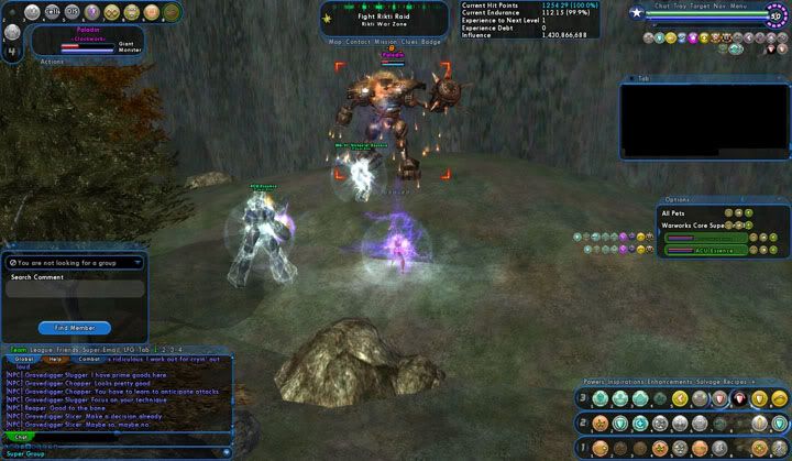
Previously, I had my trays set up as in the below image.
The upper left had a tray that was "bent".
Adding a tray and selecting "vertical" allows me to "bend" a tray anywhere on the lower halfof the screen. It will not allow me to "bend" a tray along the top. Selecting "horizontal" allows me to "bend" a tray anywhere on the right side of the screen, but not the left. I can add "bent" trays in any corner except for the upper left. This occurs in both windowed and full screen display.
In the past, regardless of horizontal or vertical setting, I was able to bend the trays freely in any corner.
Having previously saved a window file, using /wdw_load will place a tray in the upper left corner, but I am unable to reposition it.
I loaded my wife's account on her machine, thinking it was either a problem with my client or my computer, but I experienced the same problems.
Any idea what the cause or solution could be?
Edit: The same behaviour occurs on Beta.
Thank you, Champion.