
TrueGentleman
-
Posts
1732 -
Joined
-
Quote:Gaiman and Card over any of Philip K. Dick's books on that list? Absurd.Originally Posted by Ironik
 The results are in.
Top 10:
1. LotR
2. Hitchhiker's Guide
3. Ender's Game
4. Dune Chronicles
5. Song of Ice & Fire
6. 1984
7. Fahrenheit 451
8. Foundation Trilogy
9. Brave New World
10. American Gods
EDIT: Oh come now, PKD couldn't even crack the top twenty? What is wrong with the world today? (Apart from being, you know, being under the control of the Black Iron Prison.) -
Quote:In the first place, the Circle of Thorns is a mystical cult that is the secret front for a lost civilization, not a church, much less "the Church". In the second place, that kind of ecclesiastical regalia is typical for the Catholic and Eastern Orthodox churches, not all denominations.Originally Posted by Blue Rabbit
Considering all the symbolism attached to those colours, which historically have been linked to mysticism/spiritualism and royalty, it's high time they are used. By the way, purple/violet is one of the colours the Church uses too. In fact, its use is mandatory for the Advent, Lent, Liturgies other than Mass on Holy Saturday, the Sacrament of Reconciliation and the Sacrament of the Sick. So not as flamboyant as you might think.
But the fact is, this is a case not of Tyrian Purple here but Power Ranger Pink.
Flamingoes are poisonous?Quote:Originally Posted by Megajoule
It should also be noted that in nature, colors like bright pink and purple (in animals) are signs of "I am SO ******* poisonous you do not even want to be in the same ZIP CODE, let alone mess with me.
Seriously, CoT's motif is "ancient civilization", not "nature worshippers". They're not going to take their sartorial cues from flora and fauna in general, much less the most gaudy representatives. Similarly, it would be a terrible idea for their costumes to be themed around plants that have thorns. -
Quote:Also, the revelation of Mender Silos' (obvious) identity was a terrible mishandling of a plot development. Sometimes it's better to let an open secret stay an open secret.Originally Posted by SlickRiptide
I blame Mender Silos. "A Time Traveler did it" is the new "A Wizard did it".
-
Quote:And the major comics publishers' various attempts hamhanded attempts to move their characters forward, then retcon them, and reboot them after that fails is the chief reason I've stopped buying their titles on a regular basis. If the Praetoria-Well-Storm turns into a Crisis-style "event", that would be worse than ED and i13 PVP changes put together.Originally Posted by Captain_Photon
The backstory being kind of crocky and self-contradictory really is part of the superhero comics milieu.
-
Quote:I also like the design of the Nemesis Army, not only for its visual style, but also for its contextualization of Nemesis's backstory. Anachronism is a personal statement by the Prussian Prince of Automatons. His army looks out of place because it's invading from (metaphorically) the 19th century.Originally Posted by FlashToo
Looking out-of-place is part of what makes Nemesis Nemesis. It reinforces how completely out-there he is, and how heavily brainwashed he's gotten his solders. I LIKE that the Nemesis Army looks as if it were designed by Phil Foglio. Like the Circle's extravagant robes, the Nemesis Army's bold and jarringly anachronistic costumes are what define their visual identity.
The Circle of Thorn's original design wasn't anachronistic so much as timeless. Were their robes fashioned after the Victorian-era Golden Dawn magik cultists, medieval "Dark Ages" sinister monks and clerics, Mesopotamian mystery religion worshippers, or, metatextually, a lost civilization from pulp thrillers? Likewise, the progress in costumes up the ranks reflected players' understanding of what the CoT was about, as the ordinary (for Paragon City) faceless minions in anonymous robes give way to mages in more ornate but unidentifiable vestments and finally high priests in strange garments last seen in ancient temple bas-reliefs and stele. The original redesign didn't make much effort to capture the CoT's backstory: The minions already showed off the hallmark motifs, and the lieutenants looked more baroque than the original bosses. The devs' revision to include "classic" elements, such as draped garments and concealing hoods and collars, has restored a fair bit of the CoT's sinister arcane presence, although the new bosses are rendered in especially lurid colors ,with more spikes and spines than the others put together.
As this redesign was conceived for primarily stylistic reasons, here's hoping that the art team will at minimum tone down the color palette, if not reconsider how spiky the CoT truly needs to be to appear menacing. -
1: Is the lore of this game significant enough to be a reason to subscribe?
Yes, there's more than enough potentially interesting lore to create a character and play out a narrative arc if you put your mind to it.
2: Is the lore of this game fundamentally broken? That is to say, contradictary, messy, and poorly written?
Yes, in the sense that in its current state it's like a broken-down jalopy. It will eventually get you from here to there, but the ride will be bumpy, the derails and breakdowns inevitable, and the repairs jerry-rigged.
3: Do you like the current direction the lore is taking?
No. With the Going Rogue expansion's successful retcon of the "evil goatee" alternate dimension now well in the past, the pile-up of plotlines for Praetoria, the Well of Furies, and the Coming Storm is reaching the point of no return.
4: Would you like the development team to spend a significant amount of time fixing all the old lore, even if that meant spending an issue not moving the game's story forward and just patching things up?
Yes. I think the devs need to create a small but dedicated Strike Team to repair the lore that's broken down and set a proper course for future development. It's probably too late to call in Rick Dakan as a consultant, though Troy Hickman might be amendable. Otherwise, Dr. Aeon would be an excellent in-house choice to lead the team. -
Quote:So is this truly Fansy the Famous Bard or merely a pretender to his title? (If this game were Twitter, there'd be a way to verify celebrity accounts.)Originally Posted by Zwillinger
Greetings Fansy. On behalf of Paragon Studios, I'd like to offer you the follow tidbits:
- You will be sad to find that we have a lack of Sand Giants roaming the streets of Paragon City, the Rogue Isles and Praetoria.
- Please be mindful of the roaming Jerk Hackers or else you may find yourself gone to the Americans.
- Go.Hunt.Kill Skuls.
-
Quote:And it's precisely because the redesign breaks so sharply with the CoT backstory that a significant portion of the boards have complained about it. As for the aesthetic angle, unless we're talking about the old Dungeons & Dragons artwork, you're reading "goofy" into your ideas about mages. Ancient Sumerian costumes, with their tall headgear and flowing robes, might seem "goofy" to modern eyes, but there's nothing funny about their human sacrifices.Originally Posted by Samuel_Tow
The unreasonable hatred of pink aside (it's only been "girly" in the last few decades), it's the Circle's BACKSTORY that was always serious and grim. Their attire, however, has never been so. Aside from the few robed minions, most of these guys ran around in funny hats, huge shoulders and long skirts. Most traditional "high mage" outfits are goofy, and that's the POINT.
Thanks for the in-game screenshot. The new CoT definitely clashes with the environment more than the old design ever did - they look like invaders from another game entirely. The Circle of Thorns could give the Nemesis Army a run for its money in the "out of place" category the way things are going.Quote:Originally Posted by Xanatos
While these pics do look sick. I just saw them in game and they look hella stupid. Costumes are far far too busy. -
Quote:Warhammer pioneered the spiked 'n' staked pauldrons look. It's now become so common as to be generic, which makes it a shame to have this redesign dilute CoH's distinctive and creative art direction. By way of illustration, here are some examples from, variously, card games, RPGs, tabletop strategy, and tie-in movies. Although the CoT redesign is on the more elaborate end of this spectrum, they all have the same look and feel.Originally Posted by Djeannie
Also I thought I saw similar designs before and found an image which I'll host to not steal bandwidth....Warhammer 40k.


Despite the ostentatiousness of the CoT redesign, it still gets lost in the pack with all the other trend-followers of this style of fantasy art. -
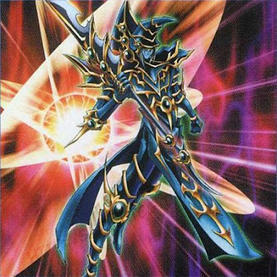
As for the color choices, which have come under the most criticism of any aspect of the updated redesign, there's no denying their origins:
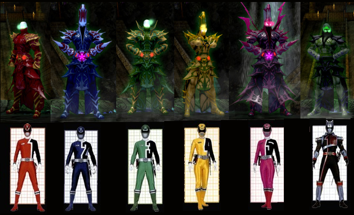
The Death Mage clearly developed a crush on the Pink Ranger from watching children's TV. That might be even creepier than any of the CoT's occult rituals. -
Good lord, what a pile-up of plot lines. It's like one of those illl-concieved crossover events between different comics publishers.
-
It's clear that until a significant portion of the playerbase ragequits over the logout bug, NCSoft isn't going to assign dollar one to fixing it.
-
For future reference: Checklist for identifying dubious technologies.
-
Quote:Since the Incarnate Trials are just a "raid 'n' upgrade" grind en masse, there's no way for the devs to incorporate the player choices that made the Going Rogue expansion so much more interesting than standard-issue CoH missions.Originally Posted by Chyll
No. The character can always make a choice.
edit: even if it is the unfortunate walk away and abandon the arc rather than <spoiler redacted>
If the Trials were complemented by some single-player missions or arcs in which characters count make meaningful decisions, the Incarnate content would be much more attractive. Otherwise, the Incarnate path is merely riding a plot on a rail. -
Quote:I believe you're thinking of Kulan Gath, the magic-using nemesis of Red Sonja, both of which were created for Marvel Comics's Conan series in the 70s (the cheesiest decade on record). He was later integrated into the regular Marvel superhero universe - and given a much spikier collar. The character design doesn't quite count as high fantasy so much as the comic book version of the sub-genre. There's nothing wrong with that as a template necessarily, but the new CoT redesign for the mages goes to extremes in adding spikes, spines, and random pointy bits.Originally Posted by Samuel_Tow
And, really, "ridiculous wingspan wizard" designs like in Red Sonya (I think it was) are what I expect the high mages to be. Funny hats, fancy robes and all the other absurd garments that tell you "This man could not walk through doors... Because he doesn't need to!" I honestly feel that this kind of wizardry is very welcome in City of Heroes, where most of our "magic" tends more towards the technomagic aspect, or post-modern aspect of magic. The typical ridiculous wizards you see in much of high fantasy are generally absent from the game, and these guys, I think, do a good job of filling that void.
Hot pink and violet are not part of the typical high fantasy magician's color scheme, so yes, definitely, "flamboyant pope" rather than ancient lost civilization wizard.Quote:So, yes, "a flamboyant pope," indeed. -
Viral marketing for the next Star Trek movie maybe? That makes more sense than any of the pseudo-science spouted here.
-
Quote:It's worth quoting that TV Tropes entry at length here as it's all too apposite:Originally Posted by Venture
So basically they're turning the Darkness Induced Audience Apathy up to 11?
As the CoH game engine doesn't allow players to change the environment or influence the world, this kind of stalemate shouldn't really surprise anyone. The best we can hope for is the territorial struggles in PVP zone and the chance to trigger zone events. Going Rogue's new morality choice system held out the hope for meangingful choices for players on a small scale, e.g. instanced NPC contacts, but shoehorning the Incarnate grind into the Praetoria-Primal Earth conflict evened out that slight gain.Quote:Meaningful conflict is the soul of drama.
Darkness-Induced Audience Apathy occurs when there is no meaningful conflict in the first place because all sides are abhorrently, equally evil- or at least, far enough gone that any difference between the two is splitting hairs. As such, consumers of media affected by Darkness-Induced Audience Apathy tend to approach conflict between parties or factions with remarkable indifference; because no matter who wins, the universe will still suck. (And while it would be really nice to see them all lose, it ain't going to happen.) In other words, there is nothing at stake.{...}
For games, this trope has its advantages. It allows people to choose sides with no interest other than the technical interest of playing one side or the other. Eastern Front games set in World War II are popular among wargamers, partly because there were interesting displays of tactical skill. But partly it was because of Evil Versus Evil and therefore the player could be on either side without feeling awkward. In this situation, the tension is derived not so much from the plot itself ("which side will win?") but rather from the competition between the players.
Here's hoping that in some future issues the devs will consider allowing players the flexibility to hijack the narrative if they choose. Video games have a unique opportunity to make choice and consequence matter in terms of play style. -
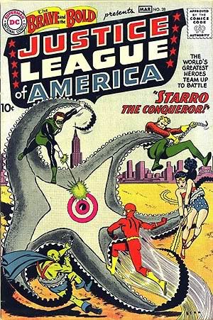
Quote:But to have read these straight off the newsstand when you were young, that's, well, fantastic.Originally Posted by Optimus_Dex
I read both of those when they came out. Man I'm old.
Incidentally, here's a retrospective of the FF's origin story as reworked from the beginning (highlights include several versions by Jack Kirby and John Byrne). -
Sure, it's the fiftieth anniversary of this*:

But it's also the fifty-first anniversary of this:
That's right, same superhero team concept, same giant monster attack, same basic composition ... except five heroes on the cover.
* Stan and Jack were still making the transition from "giant monster attack". -
For the record, the official discussion is thisaway.
-
Quote:Only rarely do I ROFL, but I assure you, I ROFL now.Originally Posted by Angerdog
That said, this little rough doodle only exists thanks to a few comments made by some posters that would not keep my mind quiet, as such, I had to do this.
-
Quote:While I wouldn't describe the CoT as "Lovecraftian" either, HPL certainly populated his stories with robed cultists, e.g. The Festival, Dreams the Witch-House, The Shadow Over Innsmouth, etc. It's a widely used and recognized trope (just as spiky armored spellcaster is for a certain variety of fantasy art).Originally Posted by UberGuy
Um, the Circle of Thorns has never evoked Lovecraft for me. Ever.
-
(Still, Zyphoid, you've got to admit that Angerdog's 'shopped Death Metal CoT concert is pretty funny.)
-
Quote:No doubt Noble Savage and el Topo are sufficiently professional that they'll disregard the snark from the few but inevitable malcontents, just as they'll make sure that the perpetual and unreflective praise of the most vocal "team dev" cheerleaders doesn't go to their heads. Given the way most gaming forum discussions go, we should be glad we have so few on either side.Originally Posted by Zyphoid
Nope, I agree constructive criticism, and even outright disliking them is great feedback. I was referring to those who go out of their way to make fun of them.
In the meantime, this thread is going encouragingly well for late-period beta. -
Quote:I was also thinking about Ditko's idiosyncratic character designs, especially the baroque original designs for the collars and shouldergear for Dormammu and Nightmare. The big difference between them and the current CoT redesign is that the former fit perfectly with Ditko's proto-psychedelic mystic scenery and spell designs, while the latter is likely to clash with the art direction of the current CoH maps (unless those are going to receive a Chris Metzen-style redesign as well).Originally Posted by Obscure Blade
Actually it reminds me of the kind of guys who showed up in Doctor Strange comics. Impractically fancy outfits with multiple layers and parts sticking out all over.