-
Posts
198 -
Joined
-
I think the original makeup was better and it is definitely steam-punk/victorian themed.
It's silly if you think the old make up choices are better than the preset ones. I would rather keep the original and layer it with lighter tones.
Here is an example of what you could do before and you can't now:
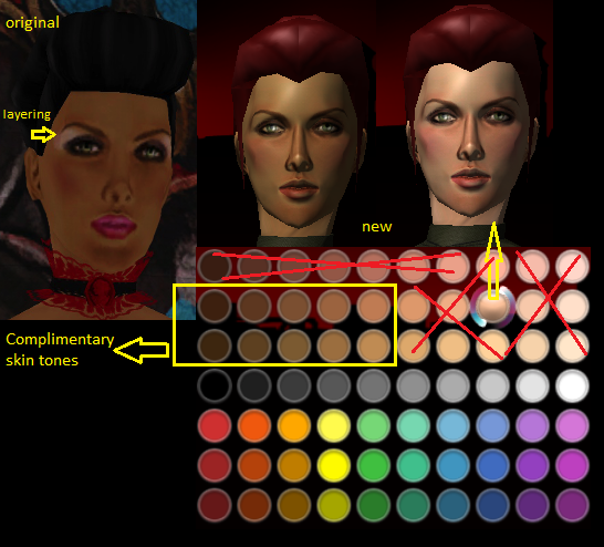
The stuff with X are the too red-ish and too light to use. They become too red and it clashes. The lighter skin on the other hand are not very good, especially when you use the old make up like lipstick, Make Up 1, Make Up 2, Make Up 3, Make Up 4, Make Up 5.
The little guide is what we can use for now so it does not look very ugly-ish until the changes. -
Before I forget, I would like to thank everyone for always being so excited about this project. Every comment in here and on CoH Facebook page, motivates me to keep improving and keep making more issues every month.
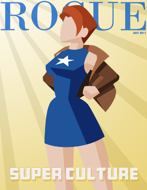
I would also like to take this opportunity to thank @Suichiro for making an awesome cover for the July 2011 Issue. The cover is just over the top good, and @Suichiro is so freakin' talented! I would like one day to see that artwork in-game! I'm so proud of you!
Thanks to everyone who helped me on the July issue, you know who you are! If anyone else would like to contribute do not hesitate to ask! Let's make this community even better!
Antoinette -
Thanks! It's from Mender Tesseract Strike Force's Merchands Presidential Room (Villains Only). You can also access the map from Mission Architect (AE).
-
Hello Everyone!
This Issue is very special to me, because I have collaborated with other talented players. For example the Art Cover for our July issue was done by our talented @Suichiro (aka Suichiro Tanaka), and also wrote a very helpful article about colors. When I first did some testing for the cover, I was so excited until @Suichiro showed me an illustration of a hero bursting out of her clothes and ready to do some street fighting. In my opinion this cover is worth seeing in the billboards in-game!
I have also worked with a couple of hardcore RP'rs who I've asked to write an article about Faultline for the Travel Journal section, and @KillerKitty (with the kiiierkitty name) did a fantastic job on the article. Also @Chaos Bunny from Union server who did our ROGUE SIGHTINGS, she had herself invited into parties and in-game events to take screenshots of what's buzzing. Also a fashion lover @23 who did an amazing job with the back cover to promote City of Heroes: Freedom. And last but not least the amazing styles and brains of @Alty, who made a way to publish this magazine without paying $19.99. She tried to tell me to convert the files in a lower resolution without sacrificing much of the quality. She also did direct some amazing font styles for every page.
Thank you everyone, thank you so much for letting me work with you guys, I hope to see more of your work in every page of Rogue magazine and in real life publications. So please please try to love the new issue!
Antoinette
P.S.
I highly recommend viewing the files in the flash version because it has a quality to it. You can also view it as PDF format but it's not as good, because we had to sacrifice quality for more content. I'm very sorry.
http://boards.cityofheroes.com/showt...99#post3612699

Edit: The title is supposed to be Issue 3! Sorry :/ -
Awesome!
Dominator's Psychic Mastery from Ancillary Powerset is missing.
-
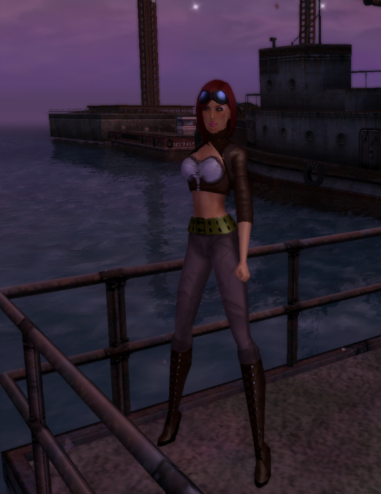
I'm not a fan of "Steampunk styles" so I tried to create a wearable contemporary steampunk outfit. I have a new love for steampunk!
-
-
Awww, thank you all so much! OMG! War Witch saw my magazine! The cute Zwillinger and Protean too! ...And for anyone who saw the magazine, thank you, thank you, thank you, never ending thank you!
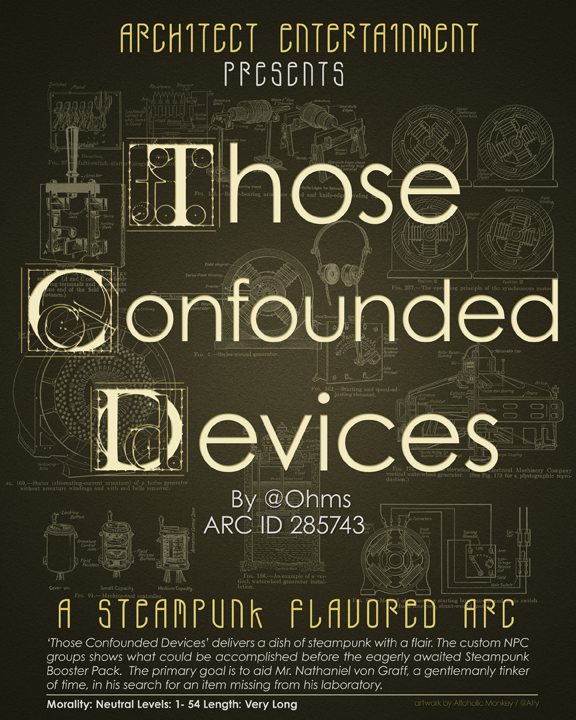
I would also like to give Credit to Altoholic Monkey (@Alty) who made this incredible Story Arc Poster Artwork! She is an incredible artist, a good listener and very hard working! Watch out for her, she'll be famous one day! Thank you Altoholic Monkey for your contributions!
Here is the artwork:
-
I updated the thread for the new Issue: Vintage Mix, hope you all enjoy. There is News and Update section on the bottom of the Original Posts explaining some stuff.
-
I think the difference between PSW and ISC is that both have 100% chance -recharge but ISC also has 100% chance -speed compared to PSW's 20% chance to stun. That is why PSW has better damage.
Do not forget Ice Assault gets Power Boost, that's how the devs balance the power sets. Psionic Assault on the other hand still gets higher dmg because psi attacks travel slower compared to other sets, which is almost an advantage in PvP. We cannot really say it's balanced though. In the case of Fiery Assault, fire has a chance of DoT but not 100% but very very effective, it has Fiery Embrace though so almost all attacks excluding blaze has almost same damage as radiation blast. Fiery Assault gets all the brownie points for having 1 minimum secondary effect.
I havent mention the animation time but that is a long topic...
I still missed my old PSW, it is definitely weaker, even with the new base dmg. It's definitely boring now. It needs a buff >
In regards to Castles post, he said doms PBAOE are now following melee mod. -
It would be awesome to get the Mind Control set some polished FX. I don't know how difficult of a project this will be, but the swirls are not very smooth.
My suggestion would be, another FX option to choose from.
The simple FX (first picture) below is what I have in mind. If there is an option to remove the not so smooth swirls (second picture) it would be so cool.
Do something epic, but not very over the top, just simple like the first picture...

-
Wow, thanks red names! I just got home and I'm so very very excited and thankful that everyone liked it. *cries*
4863 unique views in one day! (New link) Thanks Freitag and Avatea! Wow!
5023 unique views in seven days! (Old link)
To Players: Thanks again and if you have cool Ideas, please PM me or talk to me in-game at:
@Antoinette
I'm always in virtue and spying players and taking screenies! I might visit other servers to take pics for the ROGUE SIGHTINGS page! -
-
Happy 7th Year Anniversary! Was fun, let's do it again!
-
-
ROGUE MAGAZINE
The unofficial City of Heroes fashion magazine.
E-mail: cohroguemagazine@gmail.com
Rogue Magazine blog (E-zine):
www.cohrm.wordpress.com
Issue 5: Extraordinary, September 2011 *new*
Issue 4: Fallen Angels, August 2011
Quality FLASH CLICK HERE
PDF STYLE CLICK HERE

Issue 3: Super Culture, July 2011
Quality FLASH CLICK HERE (Recommended)
LOW QUALITY PDF STYLE CLICK HERE!
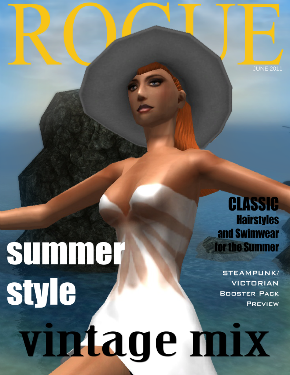
Issue 2: Vintage Mix, June 2011
PDF STYLE CLICK HERE!
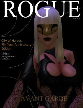
Issue 1: Avant Garde, May 2011
PDF STYLE CLICK HERE!
__________________________________________________ __________________________
News and Updates:
08.31.11
*Stay tuned as we update our blog every week, with the rest of the pages of
this months issue. You can subscribe/follow this blog for updates.
Some of you are probably wondering what is going on With my very very busy
schedule, Rogue Magazine will now be a (City of Heroes) fashion blog, so we can
still provide the community and fashion lovers who play City of Heroes more
fashion ideas, articles, costume codes, and the latest updates from Paragon Market.
I apologize for bringing you guys this news. I promise I will do my best to keep
Rogue Magazine active. Please subscribe/follow to get an e-mail for new updates
located on the side links on the right (http://cohrm.wordpress.com). If you dont like
e-mails, bookmark this blog. Thanks!
06.03.11
So it seems they charge for more than 100 MB in Issuu.com, so I've decided to
give you guys a download link for the PDF, for those of you who want to
download it or print it for Free!
Issue 2: Vintage Mix Download PDF File
05.31.11
Unfortunately, Issue 2 is such a big file and the website hosting my magazine
has a limit of 100 MB, so I am very sorry for converting a few pages into low
quality. Maybe after a few days or a week I will definitely re-upload them once
I resolve the technical issues. Thanks again and I hope you guys enjoy this
issue as much as you did on the first one! Once again I apologize.
ROGUE MAGAZINE WEBSITE -
When: Tuesday April 5, 2011, 9:30 AM EST
Problem: When I opened and clicked City of Heroes (live) in NCsoft Launcher, it asked me if I want to repair. I then clicked "Repair" and it began downloading a very huge file, then I canceled it. It told me that if I canceled it I will have problems with the launcher and if the Launcher says "Play Now" it is not really fixed.
Me being a noobie at all this tech stuff, I ignored it. I then copied the beta folder to my Live folder. Re launched NCsoft Launcher and it says "Play Now" instead of "Update". I clicked it and it started playing. The servers are down so I have no idea if it works fine.
Another Problem: I lost City of Heroes Beta and City of Heroes Test in my NCsoft Launcher. Now I don't know what happened. I don't know what to do.
How do I get my Beta back without downloading huge files? Can someone test this if I'm the only one. -
No, but there's a trick to that... If you have any saved costumes, press the load button and pick a costume that has no backpack. Begin editing.
Warning: Do not click the back button to change anything back, for it will reset the back pack. Just click next until you can purchase it. Returning to tailor may result on giving your character a backpack. If this happens, try loading another costume from the saved list. -
-
The only thing I hate about the coming content and I hate myself about it for saying it here, is... I don't like how I will grind all these and get the new powers that are not very suitable for my character.
I want Psionic based Judgement and Interface powers. I don't want fire, or ice, or electric, or dark! The silly thing about it is, the Developers mentioned expanding the choices. That means, if I happened to get all those stuff in I20 before the updated issue comes where they expand the choices... I'd have to grind again to change my fire Judgement which I happened to choose for now since I do not have any option. I did not even mention how much all these costs.
This game is about alting and customization. I felt like the new content is totally different thing and it separates from the game itself. If I have the last say, I would postpone i20 and add more choices and more content.
Don't get me wrong, I already re-colored my Pyro Judgement to Pink and I called it "Pyrokinetic Arena..."
I'm not even gonna mention Lore...
So yeah I have to wash my hands now... I feel dirty. I still love this game and I still love the grinding. I just want the right reward, after grinding that is all. -
...at least they haven't changed the "Invisible Jet" behind her.
-
Quote:I'm afraid you are kinda right on this... The longer we wait for the changes, those people that left will be harder to convince to come back. Because the longer we wait, the more advanced and new games come out. I know for sure, because my Global list was full and 90% of them are good PvP'rs. I still talk to them, and most of them found a new game. And how can I convince them now, when on my server PvP zones are empty!The best part of pre i13 pvp was the amount of people. Unfortunately all those people have left and will -never- come back.
All I can say is, PvP used to be so much fun. I want to be able to bring my main toon in PvP zones again!
I only have one toon with all the badges, IO's, infamy, prestige, accolades, temp powers etc... I don't want to make a Blaster or a regen scrapper, just so I could PvP.
...And why is it disgusting when I type PvP? That's it! I'm never gonna say that ever! :P


